I was invited by Style at Home to be on a Twitter chat about colour a few weeks ago and one of the questions the editors asked was “What’s your biggest mistake choosing colour” and I immediately chimed in with “I have a few” and immediately listed three:
So here they are, with a few more just for fun:
1. The first mistake happened during one of my very first consultations. I chose a colour for the walls and then went down the strip to the lightest one and specified it for the trim colour.

Big mistake.
The trim just looked dirty. There’s a reason trim colours are usually in the realm of white and cream, it’s because you need contrast. I’ll be talking about this and much more in my white eBook that I’m launching very soon.
The homeowner was such a good sport about it too. I’ll never forget what he said “I like painting trim, so I’ll probably repaint this very soon just to keep it fresh”.
No kidding.

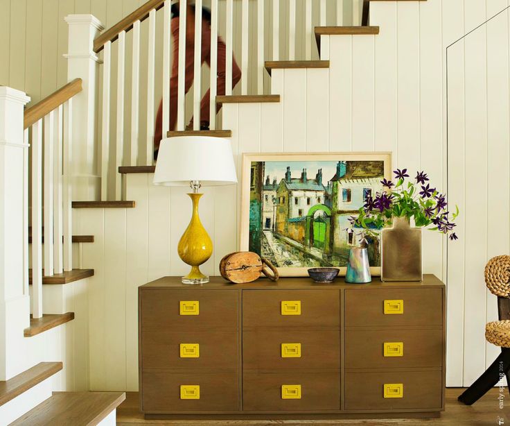
The only example I have to show you is an existing exterior where I noticed the same thing had happened with this homeowners colours. The actual colours so you can compare are in this post.
2. And then once I did the reverse of what I’m showing (above) for exterior. I chose a darker colour this time than the house so I went one shade down on the colour strip. This was for the tudor style woodwork on a home to downplay how much trim the house had and the result was, it just wasn’t dark enough.
Two to three shades darker is where you should be looking for exterior.
3. For a booth in a large stadium I chose a mid-tone blue-green colour that looked mint green once it was up.
Lesson of the day, a display booth with no ceiling and lots of bad flourescent lighting needs to be much darker to get the colour you want.
4. Another mistake I made, very early in my colour career was with flow.
A homeowner who was building a house and buying all new furniture, (as many people do when they build or renovate) asked me to choose colours. Paint colour is needed whether you have furniture or not.
I chose a random palette of probably 15 different colours. In those days, I thought it was my job to pick a different colour for every room in the house.
So many different greens working together.
‘Should we repeat this colour here?’ Was a phrase I learned with experience.
Helping a client create a starting point first, was a skill I discovered later.
5. I have blogged about this mistake before, but a common one that designers, contractors and builders make every single day is this one:
They get bored with specifying the same thing every day of their life because it’s the trend and everyone wants the same thing and they get creative at the expense of the homeowner.
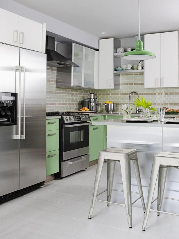
The ONLY people that should get creative with hard finishes are designers decorating for HGTV (above). There’s nothing timeless about those kitchens and bathrooms filled with up-to-the-minute trendy tile that everyone loves for 5 minutes. Okay, maybe not 5 minutes, but certainly not for more than 2-5 years.
In the beginning, I often specified a ‘different’ colour then the one I knew I should have chosen because I’m thinking “Well I haven’t seen this colour so let’s try it”.
Then, I would come back later after the walls were painted and think “Note to self, don’t do that AGAIN, it could have been perfect”.
So now, I don’t do that anymore. Every client who’s looking for white walls or the perfect greige or whatever they need for their house, well that’s what they get, to the best of my ability. Even if it seems like it’s the ONLY colour in the fan deck.
6. Matching paint colour to wood finishes.
Image via Dwell
When I first started out, I specified a lot of butterscotch colours because I would walk into an empty house or apartment and look around, desperate for inspiration and finding none would choose a colour that related to the honey oak or fir floor (which was common back then). Here’s a link to my little sisters first apartment I decorated using this same misguided method way back then, haha.
Five years after I’d chosen colours for one particular client, I went back to a clients townhouse to choose drapery for her living room. She was willing to repaint the walls and I walked in and noticed that all the walls were orange-beige.
“Yes, we’ll need to re-paint”, I immediately said.
Working in the paint store, when a customer would walk in looking for paint colours, the first thing they would do is start describing the colour of their wood stained furniture in their bedroom or living room.
“But what’s the colour of your sofa, duvet, carpet?” was my response.
There are many more mistakes I’ve made but I’ve covered them in so many posts that I’m leaving it this recap today.
How do you know you’re an expert? Because you have a long list of mistakes you made to get to where you are now.
What’s the biggest mistake with colour you’ve ever made?
Related posts:
The Three most Important Words in a Colour Consultation
The Difference Between an Expert and a Master
The First Mistake a New Colour Consultant will Make Every Time
If you would like your home to fill you with happiness every time you walk in the door, become a client. On-line or In-person.
Download my eBook, How to Choose Paint Colours – It’s All in the Undertones to get my complete step-by-step system on how to get colour to do what you want and to make sure the undertones in your home are right, get some large samples!
If you would like to learn how to choose colour with confidence, become a True Colour Expert.


You are a cracker Maria. I love that you’re always able to laugh at yourself. My, the distance you’ve travelled, you should be so proud of yourself. Love to hear how your Mumma is going in her carriage house.
I haven’t been reading your blog long enough to have seen your sister’s apartment the first time around — oh my you’ve come a long way!
Lots of color mistakes made here — the worst was a color of green I picked for a bedroom in our house. My husband and I both liked it on the chip. When I got home one day, my husband and the painter said “you’d better take a look at this to see if you like it” (they didn’t, and I agreed).
We changed to a much more greyed-down version, and our friends were happy to take the almost 2 gallons of the mistake paint for use in their teenage daughter’s bedroom, so a happy ending for all. My husband came up with a big fail too; in a house we renovated to sell he painted a bathroom this garish shade of aqua-green. I had to get some design-savvy friends on my side before I could get him to agree to re-paint.
Just to add I like a lot of color so there are undoubtedly some other choices I’ve made that, while they please me, some would consider mistakes! Green is my favorite color but seems the trickiest to get right too. Even though I’m generally a white subway tile person like you, Maria, I actually like the kitchen tile in example 5 — it’s the grey lacquered upper cabinets that don’t do it for me (especially not with the tile).
Maria, what wall color would you specify today if your sister had the same orange colored wood? I have honey oak floors in my foyer and kitchen and also it is the color of my floor to ceiling fireplace surround and it is staying so I need to work with it. The other fixed elements are neutral beige carpet (no pink) and white kitchen cabinets with black granite. I’m selling my home in 2 years so I’m hoping to choose a neutral color appealing to most buyers. Any suggestions are greatly appreciated!
Hi Jodie,
I would have created a plan first for colours instead of ‘matching’ the hardwood. Or, given we probably found the furniture first anyway before painting (I was only in town for a few days to help her at the time) I would have painted the walls a yellow beige instead of orange. Maria
Hi Maria,
Since I’m not a pro I think I should get a pass on this…I wanted a happy energetic color for my office/work-out room. I painted it a vibrant green. As soon as it went up I knew I was in trouble. But I thought I would finish painting the room, & wait until it dried before I made made decision on whether to keep the color or not. It ended up being so bad that it made me physically ill. Who knew a room color would have that effect? So yes, it was repainted a different color the next day. My husband & I still laugh about it.
My biggest mistake with color, Maria, was not calling you sooner! 🙂
We will soon be starting to build a new home that we intend to sell as soon as it is finished. (long story!) I have been collecting decorating photos for years. I recently was reviewing some of the kitchens & baths I had liked 5 years ago, and I was shocked at how “dated” they look now. One resource book was Candice Olsen’s bath & kitchen book from 2009 – and the overuse of mosaic tiles & trendy colours looks awful to me now! Go Maria with your “classic white”.
My biggest mistake was suggesting Stonehouse in a home with medium-stained wood trim. Not enough contrast! Talk about beige-on-beige! They liked it though, so I skated on that one.
Maria… There is absolutely nothing wrong with low contrast trim on a contemporary exterior! My biggest color mistake was choosing a limestone color for a master bedroom remodel. With the orange oak floors and the orange/copper bedcover picked by the homeowner after the painting, the whole room turned this awful peachy color from the reflected light. I should have insisted on knowing the bed covering
color before choosing a paint color.
My biggest color mistake happened when we moved into our pristine white walls, white tile and white carpet home with 1990’s whitewashed (pinky beige) cabinets. We eagerly chose colors for various rooms from Sherwin Williams color cards. (This was 2004 and I had a great interest in color but no real knowledge and didn’t know about you, Maria). Although my husband and I both liked the chip I chose for the living room, once it went up, he hated it (he called it chartreuse though it was a bit softer) and I realized that it didn’t go with any of the furniture we had in any room. Back I schlepped to the nearest SW store at that time (36 miles RT) and came home with what the “color consultant” said was the perfect beige/tan. It looked like putty or a wasp’s nest all over the wall. So back to the store again – my husband was now demanding something “white”. I ended up with SW Inviting Ivory which looked quite nice and became a very very soft yellow and worked with our furniture in the living room but never with the pinky beige kitchen cabinets or the barn red accent wall in the open Arizona room off the kitchen.
Second mistake was the “light tomato red” I chose for my office; so perfect on the chip but it came out looking like the iridescent belly of a salmon on the wall.
Very much later learned from you, Maria, that 1) the paint chip is not the actual paint color and 2) you really can’t choose the right color for an empty room.
I watch new owners around me close on their old house and then immediately send in painters and contractors to change everything before those owners have spent even an hour in the house. I’m really so grateful I was cash poor when I moved in and couldn’t afford to change anything. I love the soft yellow beige they painted the open LR/DR and I feel it works with my art and furniture, but I’m going to change it in the kitchen & laundry room because it’s too bland, and I’m seriously glad they didn’t paint either bedroom because it would have limited me in those rooms. With the original white walls as a backdrop (not stark white but not horribly dingy), I can visualize colors and I’ve learned so much more about choosing correctly.
One of my mistakes happened at a spa I decorated a few years back. We chose Mellowed Ivory 2149-50 in one of the treatment rooms, and it looked great- but then we chose to bring that color into the lobby as well for continuity. Because the lobby has way different lighting than the treatment room, the Mellowed Ivory color looks dingy and icky! Worst part is I can’t convince the owner to repaint, so whenever I walk in there for a treatment I cringe. So…lesson learned that just because a color looks good in one room doesn’t mean you can just “copy and paste” into another room!!
Oh yeah, around that same time the same thing happened when I moved from one house to another. I had used Dunmore Cream in my bright, South facing, high ceiling entry in one house and it looked fab. When we moved, we had a the same type of 2 story open entry set up- so I “copied and pasted” Dunmore Cream. But because the new entry was dark and faced North, the color ended up looking SO dingy and awful! I couldn’t stand it so we repainted immediately.
Ok, I have to stop, this is making me cringe thinking about all these!
BTW, great example photos above, Maria- that kitchen with the mint green lower cabinets paired with the khaki accent subway tiles is killing me. AAGH!
Jill
I’m pretty new at the ‘colour’ part of my decor-consulting business (also new) and decided that I’m sticking to basics because they’re classic – as we all know – trends can be added in small hits like pillows, lampshades, tableware, etc. I’m getting raves from my latest client, plus everyone who has come by to see their ‘new’ kitchen. They’d renovated a few years ago but when I came for the consult, starting with the kitchen, I asked, if she’d ever considered painting the cupboards (cherrywood red). There was a beat and then because she trusted me, she said ‘yes.’ We went with grey lowers (BM Chelsea tray) and white uppers (yes, Cloud White) as they are very complimentary to each other.. both warm. I did bring her very large sample boards to live with for a few days, trying it out in different light. Then, some new ‘white metal’ hardware and the transformation is amazing.. we are now onto replacing the flooring on the whole main level. Now, I’m trying to convince them to go ‘Cloud White’ on the walls, throughout. They’re really leaning in, so we shall see.
Did I just see you featured as a design expert for House and Home magazine?? I looked at it briefly in Chapters yesterday but was dragged away, so I’ll have to wait for my June subscription copy to have a good look. Congratulations!!
“Considering” an exterior color for my California stucco home…the painter thought I was serious and I arrived home to a high intensity bubble gum house. Too funny.
PS: When picking ext. colors I painted swipes of color down the side of my stucco on the side of my house to see how the sun reflected with the stucco. Over the fence the remake of “Psycho” was being filmed and the set directors loved watching the “patchwork house.” Lesson learned.
Hi Maria,
Really enjoy your blog! I know you refer to yourself as “queen of the white subway tile”, but, just curious, do you use the matte white or shiny white?
Thanks!
Generally shiny is what I recommend.
What is the green color called on the paint colors strip above?
I would say it’s in the realm of BM Pale Avocado. Check out that strip. Maria
Thank you!
My husband and daughter picked out a mint green paint for her bedroom a few years ago. There was leftover paint so my husband took it to work to repaint his office. The next day when he went to work, his co-worker had stuck large paper “chocolate chips” all over his walls! Now he knows to let me pick the paint. xo Jennifer
Hi Maria!
I am so glad I found this site…So, I am an interior designer and have even published a book…you are right in saying that we get better with time. This week, I chose the wrong color twice for my family room! I was thinking I need to find a support group for designers that have chose the wrong color! It is awful. It was beige on the swatch, matched to all the other rooms and on the wall it is very grey! I can not stand it and I had the painter paint it twice this week and didn’t like either color! I have made a mistake before with color in my home as well as a client’s but this one just did me in this week!
Hi Maria,
We are running into a similar issue with Benjamin Moore’s Mellowed Ivory where it worked amazingly in our previous home, and looks extra-green in our new house which has way more windows and natural hickory floors. The color looks beautiful in the daytime, but apple green at night. We initially planned to use it for our entire main level and we’re reconsidering. We’re thinking of using it as an accent wall rather than painting the main space. What would you suggest as a good color to use as the main, with a Mellowed Ivory accent wall? We have natural hickory floors, beige upholstered couches and dining room chairs, and dark wood tables, bookcases and a buffet.
Thanks!
In order to help, I need to see photos, you can purchase just one colour if that’s all you need on my edesign shop page here https://mariakillam.com/product/interior-paint-colour-consultation/
Love Mellowed Ivory, have used it many times, Maria