Thinking of trying out a new wall colour? Tricia just painted her walls a lovely pale pink. And, she’s sharing helpful tips for dealing with new paint colour shock – you know, when the new colour is on the wall but you haven’t pulled the room together yet… and you wonder if it was the right move?
Tips for adjusting to your new paint colour
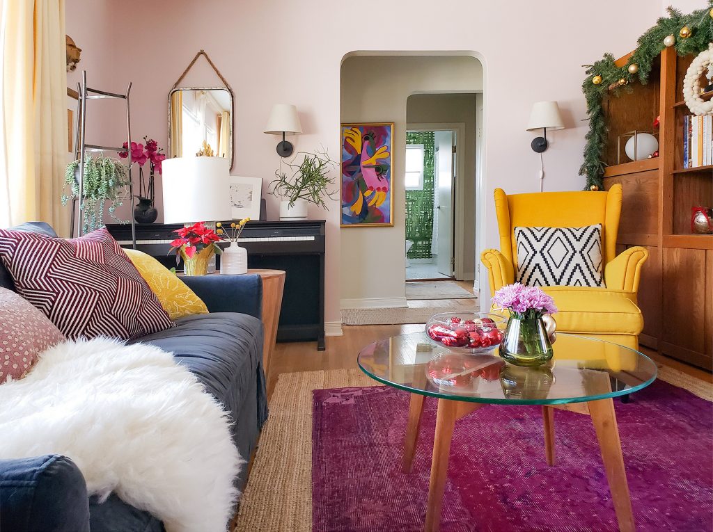
Dreaming of ways to change up my holiday decor this year, I decided to do something drastic. I painted my walls pink! This gave me an entirely new backdrop to work with.
My deep magenta pink over dyed rug wanted some company, so I chose a pale pink with a hint of cool magenta, Benjamin Moore Strawberry Yogurt 2104-70. It’s a new trend colour Maria recently added to her VIP Collection of colour boards, and I was excited to try it out!
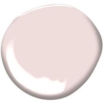
BM Strawberry Yogurt 2104-70 new in Maria’s VIP Collection!
Expect New Paint Colour Shock
I had a day or so of looking at my room in disarray. You know, that frantic time where you’ve just finished painting and haven’t pulled it all together yet so you are super critical of the colour? Wondering to yourself, was this the right choice?
That’s right, new colour shock happens even to colour experts sometimes!
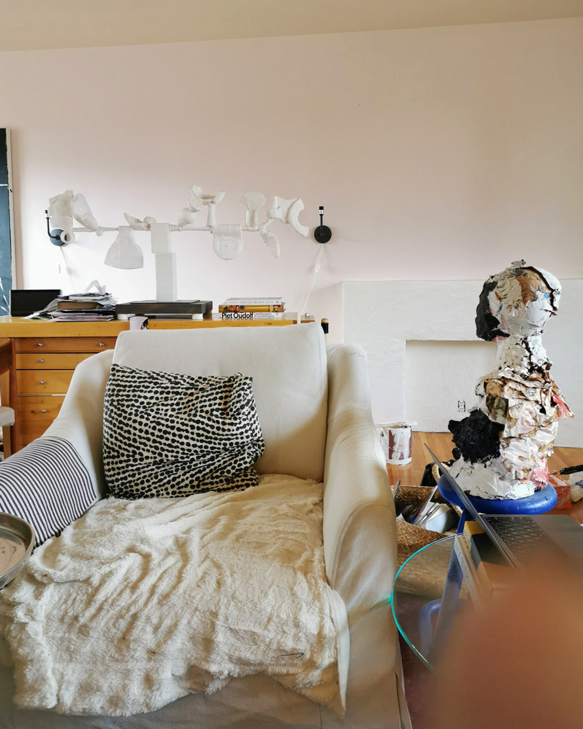
This is the hasty shot (below) I sent to my mom immediately after putting the roller down. This is what a newly painted room looks like before you’ve put everything back in place.
1. Take a deep breath and reserve judgement
This is why it’s SO IMPORTANT to wait at least a few days after painting, preferably a week or two even, to get used to the new colour. Folks like me (and you know if that’s you too!) who are sensitive to colour can be deeply affected by a new wall colour. You have to give your eyes a chance to adjust to the change.
2. Never judge a new colour while you are still painting over the old colour.
And by the way, NEVER judge a new colour when it is still going over the old. That’s when it will look really odd. Trust me, as the old and new colour bump up against one another on the edge of where you’ve painted, don’t make a judgement yet.
Especially if you have a more muted (dirty) colour going up over a cleaner paint colour. The cleaner, brighter colour always makes the dirty one look worse until you’ve painted the entire area.
3. Put down that paint roller and put your room back together
It doesn’t make sense to judge a wall colour out of the context of the full decor of the room. Staring at a new wall colour without the context of the rest of the elements of a room doesn’t work. Colour is about relationships.
How does it balance and relate to the other elements?
Plus, the prettiest paint colour in the world will not stand on its own and look decidedly “right” without the furnishings and decor it needs to relate to. So reserve your judgement until AFTER your room is reassembled.
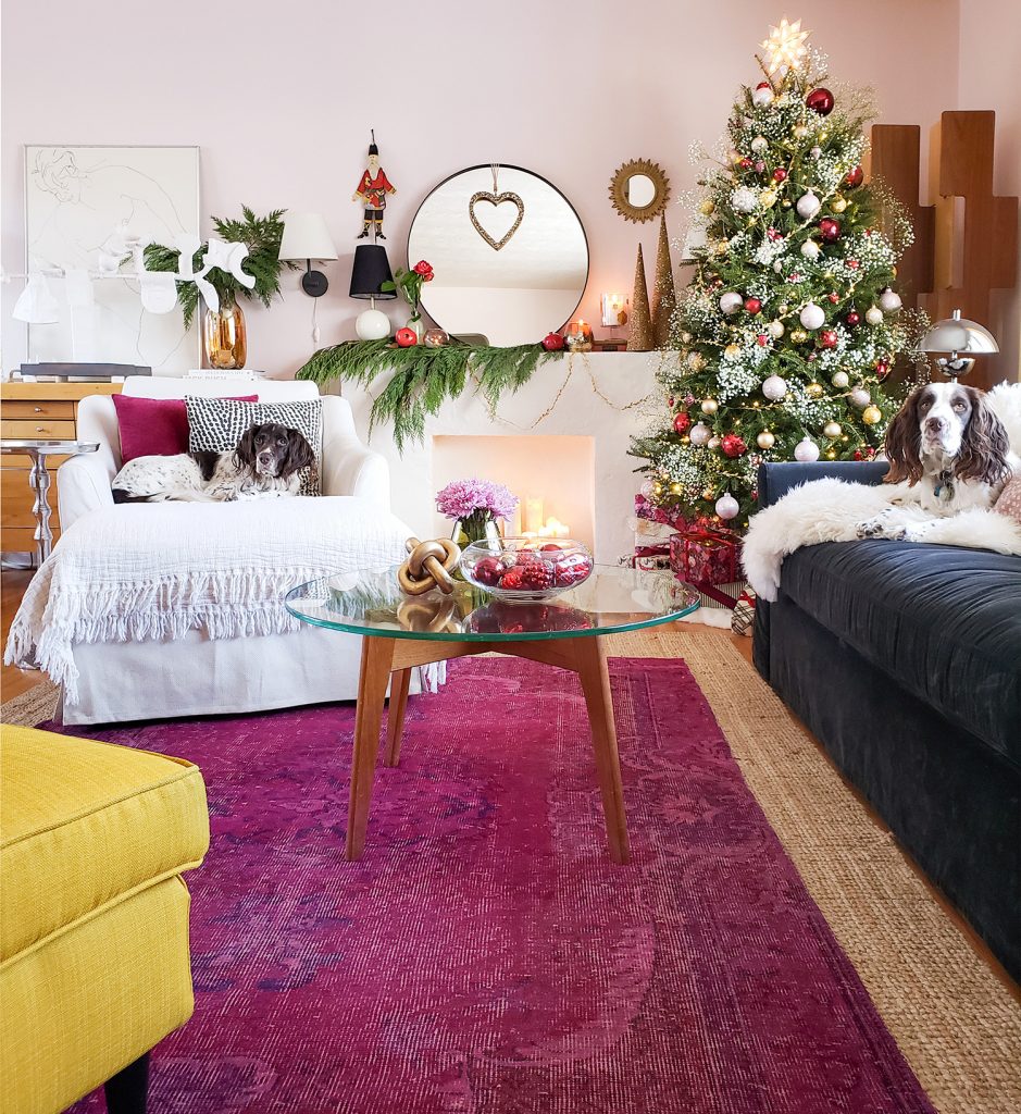
Now that my room is put back together, I am in LOVE! It’s just the perfect subtle wash of the most lovely pink.
I made another somewhat unexpected move of swapping out my linen look drapes for a cleaner butter yellow. It was a bold experiment, but I think it works. Let me know what you think 😉
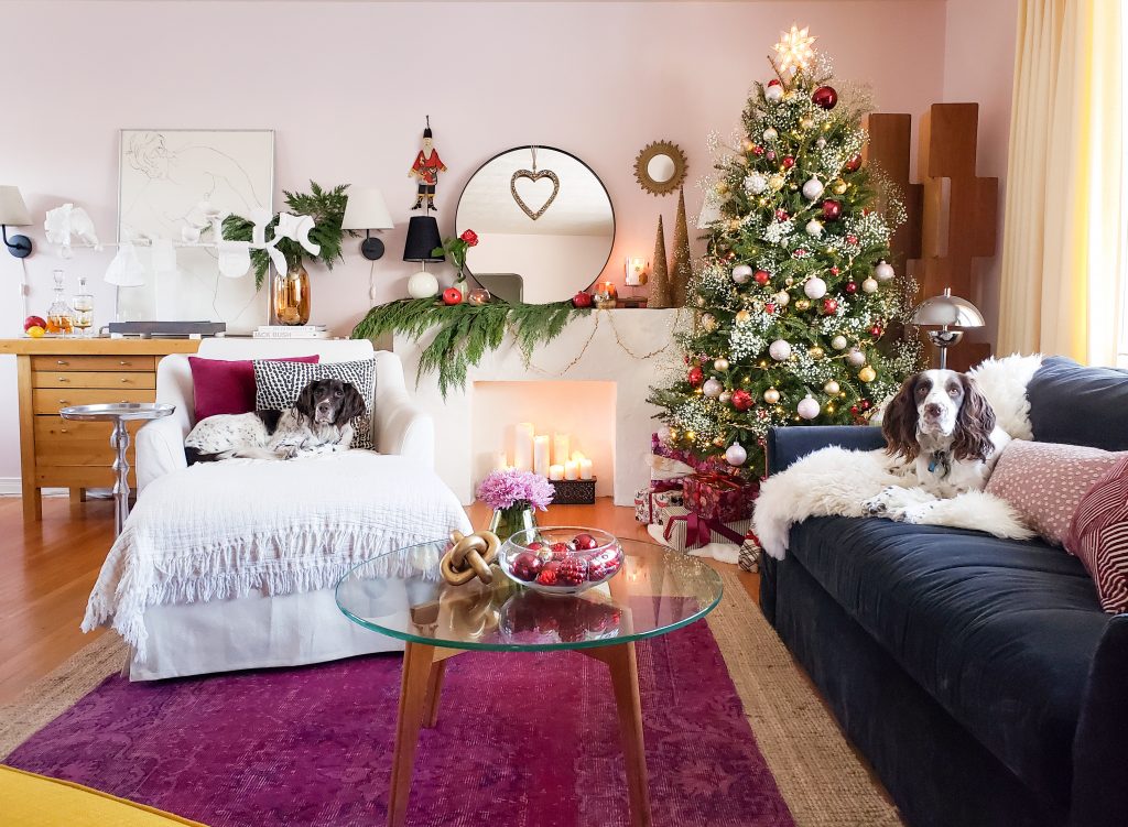
My springers, Mabel and Stanley, are just the most wonderful models. They populate each shot almost without any direction from me. They are pros at this by now – ha, ha.
Colour Repetition is Key
The key to introducing a new accent colour is to repeat it at least twice. The pink walls have a strong repeat in the magenta rug, and I sprinkled a bit of festive red around to make it work. There is also red in the picture I painted last year for the hall. (Often the right new accent colour is already in your room in a fabric or artwork, so look around you first!).
Of course, now I want to paint the hall a butter yellow to match the drapes.
Decorating my new room for the holidays.
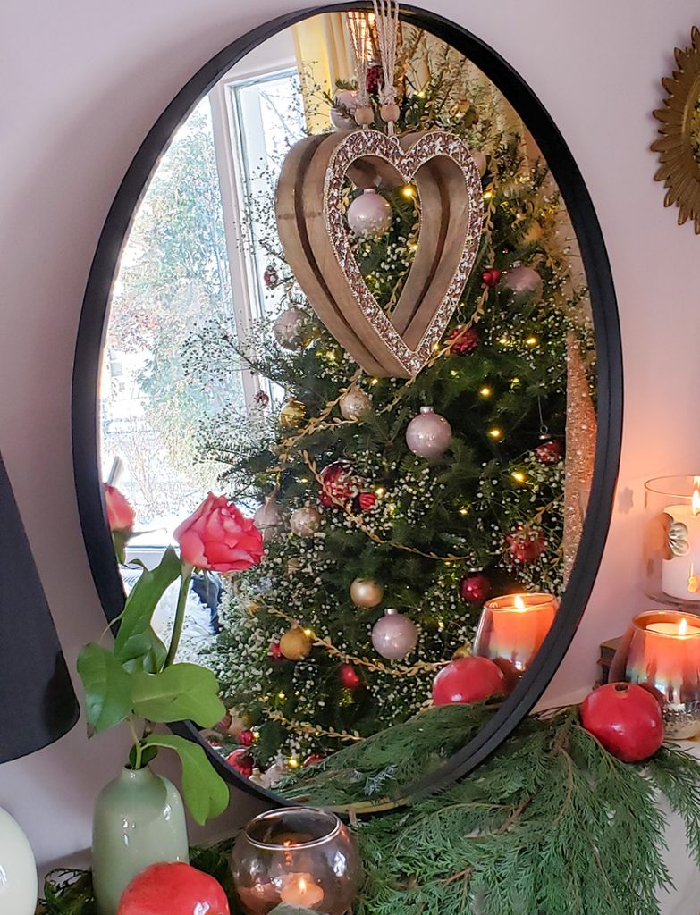
I wanted to play around with a more traditional feel this year, so that meant introducing some red!
I haven’t put anything red on my Christmas tree for at least a decade, maybe more?
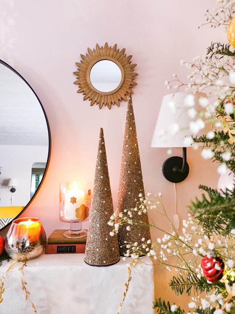
To keep it modern, I repeated some of the cool, pale pink just a bit. I had a young associate at Michael’s teetering on a scaffold sorting boxes to find me enough of the perfect pale pink balls to match my new wall colour… dearest soul.
To repeat the yellows in my decor, I used lots of gold too, which also adds to the traditional feel.
I don’t have a picture, but at first, I thought I would keep the look pulled back and go with only lights and balls on my tree. But the deep green of my real tree combined with only the shiny balls felt a but cold.
So I added an adorable delicate gold garland that I was so excited to find last minute. And, it still needed a bit more softening, so on a whim I stuck in several sprigs of delicate, snowy baby’s breath.

FYI, if you do this, maybe plan ahead and dry it first haha.
I will admit I had some reservations about how my red, pink, magenta and gold scheme would come together, but in the end I’m very happy with it. Because I have lots of colourful art that I didn’t want to move, and a few whimsical pieces in the mix, I feel like I landed on some kind of bohemian/traditional hybrid holiday decorating style.
I couldn’t resist this collection of vintage looking red glass balls (below).
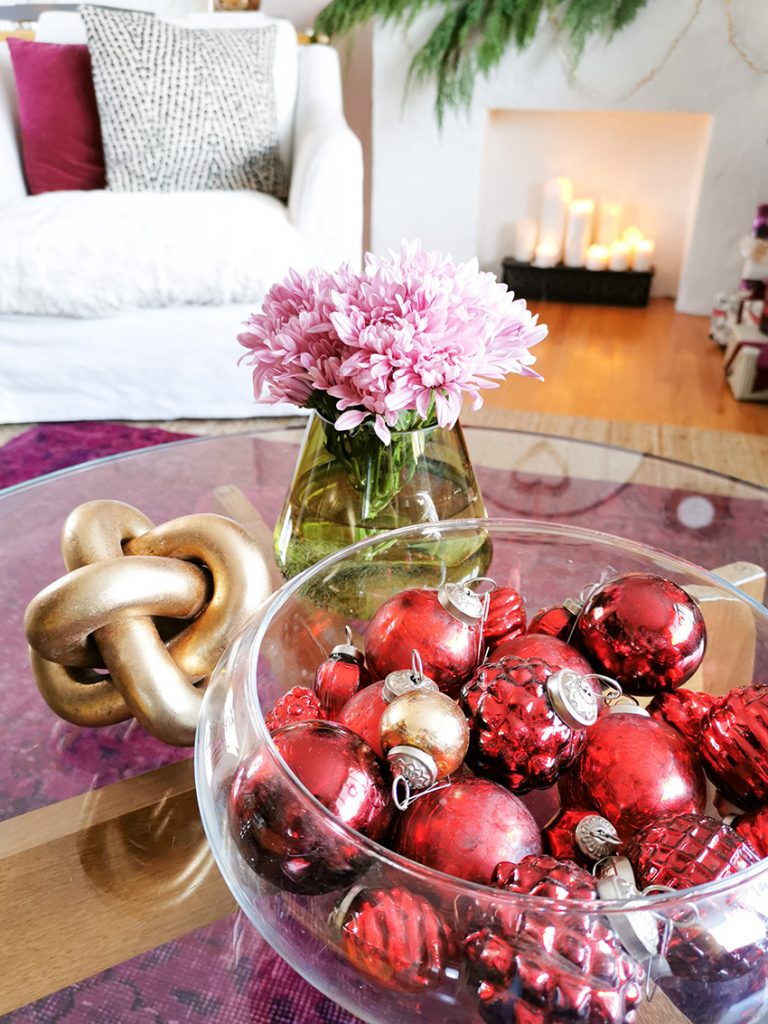
Similar ornaments here and here
These sturdy oak shelves can be a bit tricky to style, they need a lot of white and bright colour to pop out of the deep wood toned spaces.
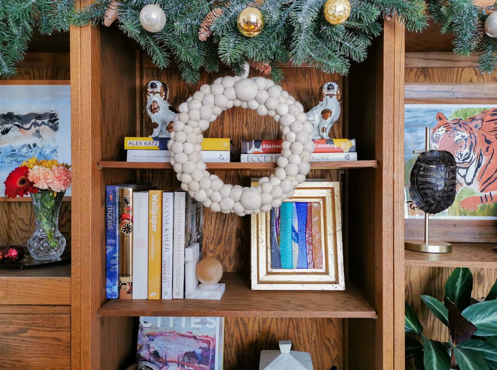
I like to display small artworks as well as precious little things I’ve picked up here and there. The watercolour on the left is my daughter’s. The jewel-like collage in the gold leafed frame is by Graham Peacock. And the tiger illustration is a recent thrift find, such a treasure!
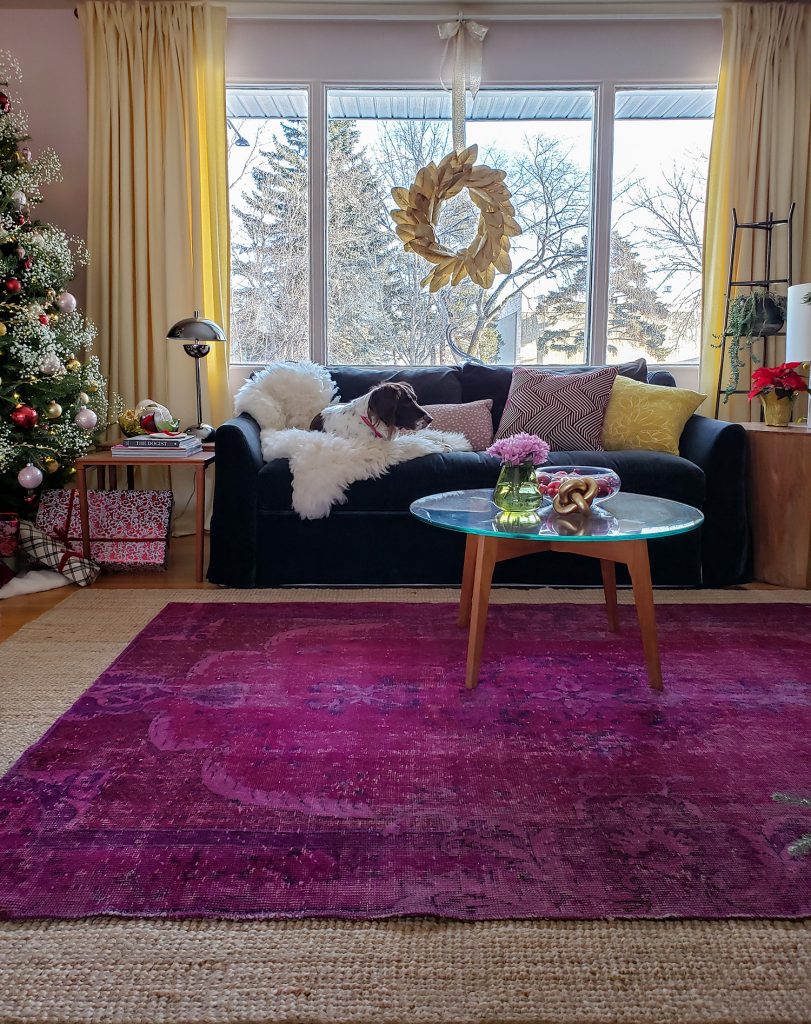
It’s hard to believe that my deep pink area rug was a last minute splurge when I redecorated my living room last year, it really anchors the space and gives it a decadence that I would miss if it wasn’t there.
My dining room is a work in progress. It still needs that anchoring piece or maybe some sleek new chairs. But I love the warm softness of the pink walls and yellow drapes.
![]()
Here is the tree again, and a good view of the pink walls.
So, are you thinking of trying a new wall colour?
Pink has been such a strong trend colour for a while now, but I find it still has the power to polarize a crowd. I’ve had a few visitors that have commented that while they are not really “pinky” people, they actually do like it (even my dad).
I find it fascinating that, much more than most colours, pink is not for everyone. I would not say that it is my absolute favourite colour (I’m probably sort of a green type if I’m forced to choose), but wow, I am really loving this pink room right now. How about you? Have you been introducing pink into your rooms lately?
And remember, give yourself some time to adjust to your new wall colour (pink or not).
Happiest of Holidays from my family to yours!

Related Posts
Inside Elizabeth’s Library Room Transformation; Before & After
2020 Trend Colours of the Year: Here’s What You Need to Know


The pink is nice, but if yellow beige and pink beige are incompatible, doesn’t that hold true for pink and yellow? Seeing the two together doesn’t work for me. I saw the combination in House Beautiful awhile back, and it didn’t work for me there either. But younger people are combining colors that to my eye are not harmonious.
Thank you for sharing with us your lovely home !
It’s warm , homey and inviting !
I’m not a pink person but I do like how you have pulled your space all together !
And it does really look nice .
Thanks again for the tips and sharing .
Merry Christmas !
I immediately thought the same. The drapes just did not go. Otherwise nice color. My daughters room is painted in BM Melted Ice Cream which is similar.
I agree with Kay. The fact that so many of the fixed hard surfaces and Christmas decorations are orange and gold based, and with distinctly yellow curtains, the pink walls clash significantly. I know that you can sometimes break the colour rules, but it does not work in this case. I will say that the interior does feel home-like, but I think this is due to the decor touches.
Tricia’s drapes are not yellow beige, they’re yellow. Yellow and pink are fabulous together as they are in my living room as well 🙂 Thanks for your comment! Maria
The yellow drapes are perfect. I think modern black and glass table and chairs would make that lovely dining room pop.
Love, love, love the pink. Beautiful and ethereal.
WOWZA! Everything about this sounds crazy (magenta, yellow, pale pink, and red?!) … but it came together flawlessly. Really, really beautiful without being stuffy.
Hi Tricia, I like your space!—the colors, the art, the whimsical/traditional mix, your dogs. What a fun glimpse into your world. Thank you, and Merry Christmas ????
It’s a beautiful pink on the walls and looks lovely. Your decorating skills are amazing and you’ve pulled those colors together so beautifully! Thank you for sharing!
Tricia’s home is gorgeous! Love the new wall color. Love the Christmas tree. Your styling details really make the room 🙂
Since you asked :-)….I’m not loving the butter yellow drapes. I tried. I really tried. I do love butter yellow, but there is a confusing disconnect. I think it may be that the yellow in your room is brighter and doesn’t seem to tie in with the soft butter yellow. And next to the lovely pink walls, the yellow doesn’t really enhance the pink and the pink doesn’t do anything for the yellow. I don’t have a suggestion other than “boring” white drapes to tie in with your chair, throw and darling dogs! Thanks for inviting us into your home and asking our opinions…you brave designer, you!
That said, I do love your artistic and eclectic style and salute your courage to try the pink and yellow. Your magenta rug is fabulous! And your daughter is so pretty, like her Mom.
Love the pink, love the magenta rug (it makes the space), and love your dogs!
Your house looks beautiful and warm. Very impressed!
PINK!!!! I love it. It’s subtle, like white walls at sunrise or sunset. Very pretty. Love the yellow with it. Lots of nice touches. I think you nailed it!!
Very pretty! I’ve been looking for pale yellow drapery like those for weeks now to no avail! Guess I’m going to have to learn how to make them myself :D.
Merry Christmas!
I really love those pink walls! So pretty and fresh. I personally dislike yellow so of course I don’t like the yellow drapes, but that’s just me. The way you’ve designed the room and decorated the tree is just beautiful!
I love the pink, magenta, curtains, and bright gold chair. I can’t see clearly what color the sofa is, but it’s too dark and heavy for me, and I would probably paint the wooden shelves and pick up some of the room’s new colors in a fun wallpaper backing behind the painted shelves. Hmmmmm You’ve given me a lot to think about! I love fall and winter, so I’m not sure any of these colors would work for me, but it’s been a real treat to see your makeover!
In the New Year I’m going to give my all-white L-shaped hallway a lift by painting the doors a pale pink that is ever so slightly deeper than the one you have on your walls (Resene Pale Rose). This is a very brave decision for me. I’m a bit minimalist so didn’t want to inject colour through putting lots of things on the walls, but all that whiteness was a bit too much. Wish me luck!
Pink…ugh, just does not work for me. But if you love it that’s all that matters!
I agree with a couple others for whom the drapes just didn’t work for them. I don’t mind the pink walls (although not my choice for a living room), but not the yellow drapes. I envision a lovely pale silver or even lavender instead. I feel like there are too many colors going on and I can’t figure out where to focus. To me, the yellow drapes blend in with the light oak furniture too much. Maybe pale pink drapes? In the end, it’s what you love that matters! After repainting my master bath and then painting the other full bath, I salute you for your enthusiasm to redecorate!
Wow that subtle pink is beautiful! The decorating is perfect and that rug – oh my goodness. Somehow I can’t get my head wrapped around the yellow drapes, but maybe it’s just the lighting of the pictures.
Thanks for sharing!
Well the important thing here is that you love your colour combo. It does go against what I have been taught but who cares. I love that you have expressed your personality in your home, just lovely:) I also love your dogs names:)
Love the new wall color. Love the Christmas tree. Your styling details really make the room ????
Your home is simply adorable, and I love all of the whimsy and color choices. And that tree is magical!
What a lovely home! Black and white and pink are classic, so as long as you always keep Mabel and Stanley in the room, it will be perfect!
Seriously, I loved the room when you shared it a few months ago with the two different couch slipcovers, and I love it more now. It does pick up the rug nicely. At the time, I commented that it needed just a bit more yellow, especially in the corner where the tree is, so the new drapes are great. I would have liked them even more in a stronger tint, closer to the color of the chair and throw pillow, but I know how hard it is to shop for drapes. I’m currently shopping for new ones and having a heck of a time. Can you please share what type of pleat that is? They don;t look like true pinch pleats, but they don’t look like flat panels, either. Please share your source for these beauties.
I’m not a pink person; however, when one moves toward peach, you’ve got my attention. In fact, I’m seriously working on the perfect peach to work with my orangey/tomato red French paisley bed linens. In your room, the pink is perfect – strawberry yogurt is the perfect name for the color and it’s very you. However, the butter yellow drapes, while lovely in themselves seem to wash out the delicate pink. You mentioned “bohemian” and, though it might take some effort to pull it off without it looking just like you hung floral drapes with pink flowers, my mind’s eye sees it. It’s such a delightful and fun room.
I love the yellow window treatments with the soft pink walls! Beautiful space and WONDERFUL advice regarding acclimating to a new wall color.
I’m going to share this with clients—I love that you say even color experts struggle with this change.
Thank you for sharing:)!
Your pink is beautiful and the way you have accessorized is the bomb! So soft yet cheerful. And your magenta rug with the new wall color is PERFECTION. I am having a little trouble with the yellow drapes….maybe it’s just me but my eye senses they are off. Having said that, I have taken a million interior photos and know how difficult it is…it may just be that. Thanks for sharing! Also, you and your daughter are the cutest!
Hi Tricia,
Thank you very much for this post .. it brings so many lovely ideas for the Christmas!! : )
I really admire your selection of colours this time!! Haha, you seem to be wary of red .. : ) And I must say this is one of my favourite combinations: pink, some red, deep green and gold.. You just get to the point with me, sweetheart, and I do not know how you do that!! Fenomenal!! I think these three colours make the perfect combilnation: some tones of pink can be quite cold, but when coupled with warm green and gold the picture starts looking very homy. Especially when small decorations are in place – they make the room complete ..
I am so surprised that baby’s breath can so wonderfully fit into Christmas decor!! : ) That was soo sweet .. LOVE IT : )
My most heartfelt holidays wishes to you and your family !!
Tricia, I think it is beautiful! I love your work and posts. Thank you for sharing the dining room before it is complete. I think the dining area is gorgeous, I like the pink and yellow together. The baby’s breath on the tree is so creative. The whole space is gorgeous.
I love the pink walls and your decor. However, I also think if you sewed an edge of fabric banding onto the drapes that had magenta in it, it would take this room from 7 to 10!! The baby’s breath on tree particularly stunning detail.
Gorgeous room! Your home is so cheery and so personal! I am sick to death of homes with just boring “neutral” wall colors. Paint that hallway butter yellow. It will be lovely.
I love Tricia’s decorating style ❤️ I was even inspired by to rearranged my bookshelves adding more cream and white to contrast with the oak. I think the curtains and the wall colors need more contrast, Everything else is perfect ???? I see that jewel of a bathroom peaking through the hallway ????