It’s that time of year when paint companies announce their 2020 colours of the year. You might wonder how to make sense of it. Here’s what you need to know from a true colour expert.
I used to think that the 2020 trend colours of the year (COTY) were a prediction. But now I have come to learn (by noting all the colours that are announced) that it’s just a really good way to sell an already popular colour.
After all, years ago when I was in my late 20s and a newlywed who needed to choose a paint colour for the main areas of my new home, I chose paint colours much like anyone else.
I opened up a paint brochure (because in my mind that helped narrow down 2000 colours to something curated) and just picked a colour I liked.
No testing.
No moving around a painted sample to see if it was right.
And that’s how the average consumer (not YOU of course) does it too.
The definition of NEWS is NEW
For example, pink has been back for a few years now so it’s not a ‘NEW’ trend colour, but Benjamin Moore has highlighted a ‘new pink’ in their fan deck that likely no one has ever looked at twice.
Now, if someone wants to paint a room pink, they might walk into the paint store and buy it. After all, paint stores are in the business of selling paint.
Same with all the others below, they are not news. They are being newly promoted because they are already established trends.
Any guesses what they are? Let’s find out, shall we?
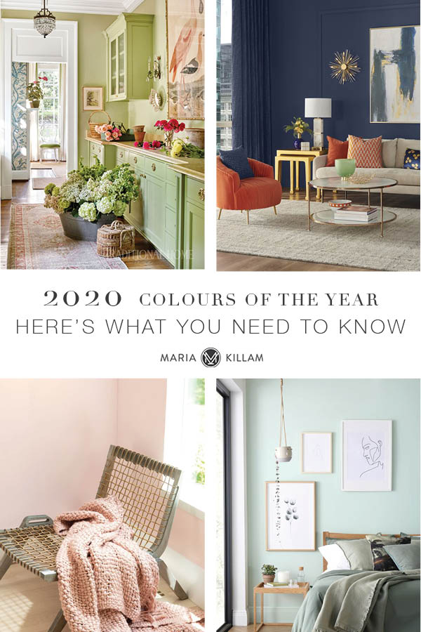
Behr Back To Nature S340-4
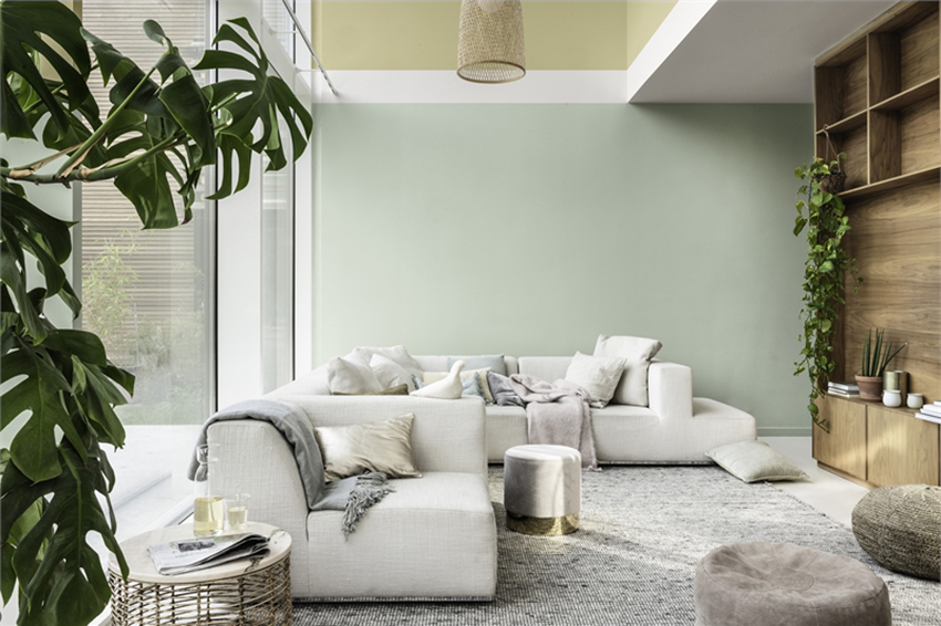
This might be the most refreshing pick this year. Leafy, yellow-based greens have taken a backseat to cooler minty tones, sages and jewel toned forest and emerald in the past few years. This green leans a bit towards olive but is fresh enough to feel like spring.
Benjamin Moore First Light 2102-70
Pink, as I said, is not news. But it is interesting that it has been going strong for several years now as a trend colour. It’s popularity has been consistent in home and fashion and apparently it’s not going anywhere. It’s moved beyond a fad, to a full-blown trend. Is it on its way to becoming a new classic?
It had a good run in the 80s too. So what I’m saying is, pink is not just a peripheral colour. And it’s sticking around just like it did in the 80s when countless buildings were painted pink. Where obviously in that case, lots of men were involved in what colour that building would be.
That’s the power of a trend colour. Whether you call it feminine or not, it’s here.
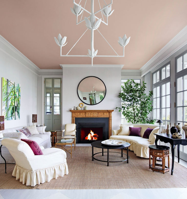
BM First Light 2102-70, the pink they’re rolling the carpet out for this year, is very similar to BM Strawberry Yogurt 2104-17, a trend colour I added to my VIP collection of colour boards recently. It’s also the colour I used on the walls in what my sister calls, “the most beautiful room in the world”. Pink is just that inspiring.
It’s nice to see pink freed from overly sweet and gendered associations, and appreciated for the fresh and versatile hue that it is. I think it shows that fashion and design (and even by extension, pop culture?) are in some ways getting more playful and open. And that’s a good thing, don’t you agree?
Pink is fun. And, decorating should be about having fun.
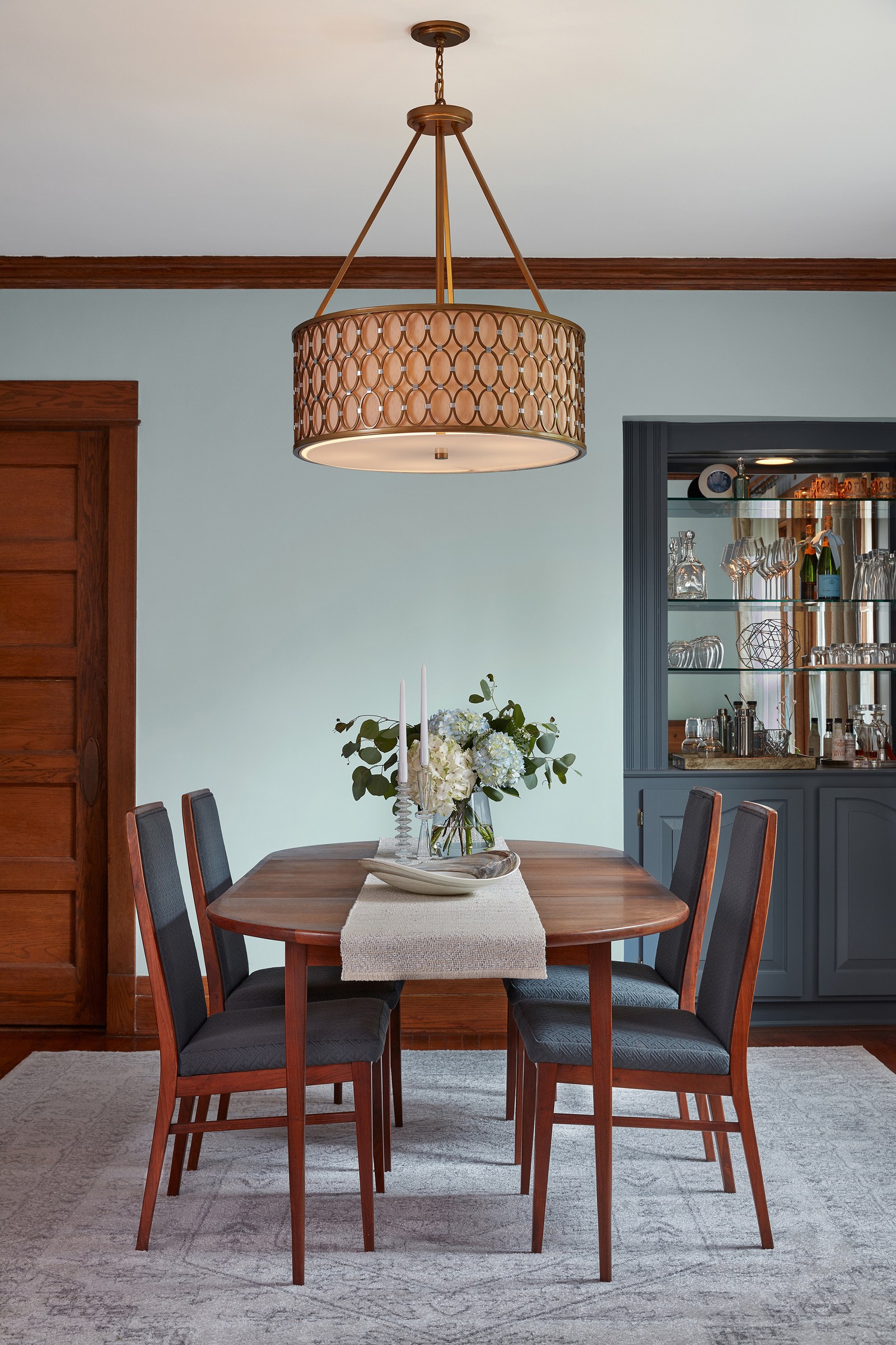
Dulux Tranquil Dawn
Sage Green.
It still stirs memories of the 90s, but it’s back. The new sage is cooler and fresher than the murky sage greens from back then. The new trending sage greens are mintier, more pastel. This Dulux COTY is exactly it.
It has an understated tree hugging vibe without being TOO earthy.
It’s airy enough to pair well with clean whites and pale natural wood tones and, like blush pink, can be used as a more interesting alternative to neutral beige or grey walls.
Sherwin Williams Naval 6244
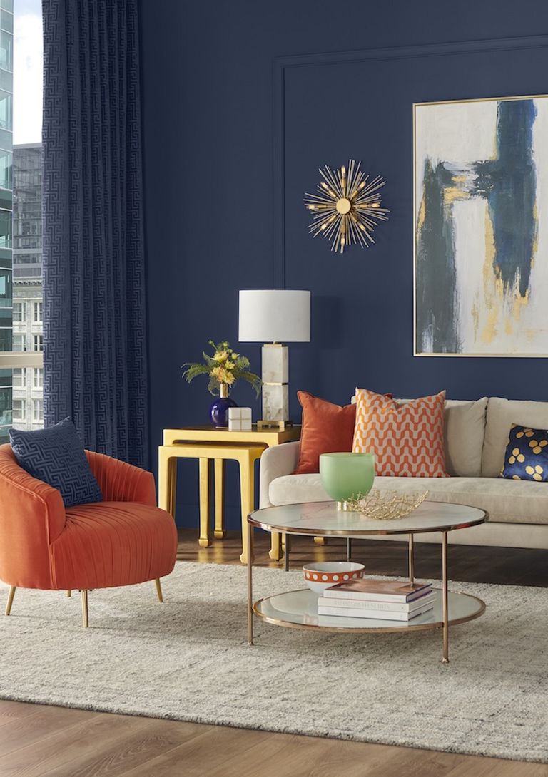
Is Navy ever news?
It’s beautiful, crisp, timeless, and classic. Start with navy, add lots of white plus an accent colour or two, and top it off with some brass = TA DA! Your room is EVERYTHING.
Sherwin Williams did not dig deep into their fan deck for this one, but they really can’t go wrong with it can they?
Valspar Inspired by Nature Colour Palette
Valspar releases a POTY each year. That’s Palette of the Year (ha, ha).
According to Elle Decor, their Inspired by Nature 2020 trend palette is “a livable” palette. Truly, there is nothing jarring or “new” in this palette dominated by pastel pinks, greyed blues, sage, and soft greens.
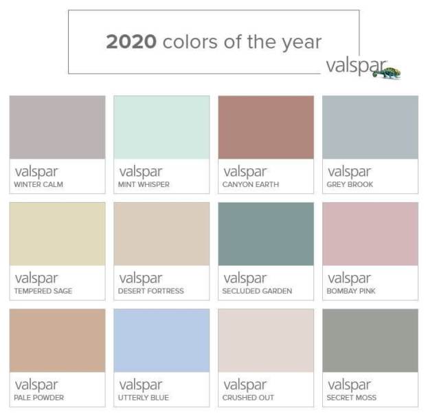
Muted blues work well to balance warm wood tones and make them look more current. You can go very grey in the blue range and still end up with “blue” walls. If you want a versatile blue, go a step more muted than you think you want. This colour, Grey Brook by Valspar, is a good example of a “grey” that will definitely be blue on the walls.
Canyon Earth by Valspar
Terracotta and Sage? Check. After all, they are the “earthy” colours of the current trend palettes.
And they are novel nostalgia for a new generation of homeowners. The 90s after all, are vintage.
It’s clear that there is nothing vanguard and new in any of these COTY (or POTY) selections. Fresh pastels and navy have been trending for quite a few years now, so these all feel like fairly safe choices with broad appeal for marketing.
However, it is nice to see that none of them are art gallery white this year.
I hope what this year’s colours do predict is a return to playful colour on the walls.
What do you think? Is white’s crown about to topple? Are you itching to paint your walls a more playful soft hue?
High Point Market Instagram Takeover
And now, I would like to acquaint you with these lovely faces.

This is Tricia, my senior colour designer (above left) and Kristy, my social media manager (above right).
Together this weekend they are going to take over my Instagram account as they tour the Fall 2019 High Point Furniture Market while I’m in Maui.
They will be bringing you the latest trends in colour, furniture and decor. Don’t miss this virtual tour of the biggest market of the year!
I was sad to miss High Point this Fall, but it overlapped with a course called Relationship Mastery with Tony Robbins that he only does once every two years. It’s held in Maui and Terreeia and I didn’t want to miss it. It’s already caused a huge breakthrough in our communication, love and connection, which I will likely share with you soon! Worth.Every.Penny. How do you move forward with velocity in any area of your life? You have to invest in yourself, and that’s what we’re doing!

So follow along on my Instagram because it’ll be all about upcoming trends in a few days when Tricia and Kristy arrive in High Point!
Over to you my lovelies, what’s your take on the trend colours of 2020?
Related Posts
White and Cream; The New Trend Taking Over Your Neighbourhood
All Grey Home in 2011 and All Black in 2019
Maria Killam’s Trend Forecast for 2019


Really, no whites? That’s all I’ve been seeing on the design shows and show houses on television and touring local home shows.
Hi, Maria and Terreeia…Your trip sounds wonderful! Hope you get tons out of it! Cute pic of you, I caught myself smiling back! Haha
Hey, I saw a purse in a store, last week, and thought I love that color, it’s so different! I tried to put a name to it, but couldn’t. And now I see it is, Canyon Earth! How about that!
Have fun you two! Love ya, Candy
What you say about muted blue is interesting. Ten years ago our bedroom was painted in a full-spectrum soft gray blue. I didn’t realize that blue fades, and over time this one did. Six years ago we replaced the 60s overhead light with a small chandelier, and for a while the blue really bothered me, to the point where I was thinking of painting our bedroom a completely different color. We had to paint around where the old light had been, and there was a clear contrast between the fresh and older blues. However, inertia won, and I’m thankful for it, because about a year ago I realized that the paint had faded to a point of real beauty, to a color so soft and elusive and restful that my husband and I wouldn’t dream of repainting. The patch of stronger blue has faded to match the rest. Then the really serendipitous thing happened. My house was to be filled to capacity with overnight guests, and I didn’t have enough quilts. So I went to Home Goods and found a lovely solid quilt that turned out to be exactly the same color as our bedroom walls. Talk about being colored happy! With the wood furniture and touches of black and dusty pink, there is plenty of contrast. It is not a fashionable room, but it is very lovely.
I painted our good-sized living room a pale, dirty pink 10 years ago, and still LOVE it! With our dark walnut-stained oak floors, a beautifully carved dark fruitwood sideboard (Victorian), and a run of four of Ikea’s Malm 2-drawer bureaus acting as our media cabinets, it’s heavenly: fresh during the spring and summer, and cosy during the darker, colder months here in southeastern Québec, in the top end of the Appalachian Corridor. (Sutton is a renowned ski resort, an hour from Montréal.) My husband loves it too! The other furnishings include a yummy pumpkin dusky grey/blue of early blueberries, a rose-pink armchair and similar large, leather-covered ottoman-as-coffee-table in front of the fireplace, and in the half of the room devoted to media (that is, the big flat screen!) a chocolate brown mohair velvet camel-back couch and, to tie both halves of the room together, a rug in an abstract pattern in ivory, hot pink, turquoise and grey. Throw pillows abound, tying all the colours together and adding a little oomph.
The Master Bedroom is Restoration Hardware’s Silver Sage, almost interchangeable with BM’s Palladian Blue, a colour I discovered 25 years ago and use continually in bedrooms: so tranquil, and any other colour mixes beautifully.
The main floor bathroom is a soft duck-egg blue, with floor tiles (18″x40″!) from Spain, called Vintage Carpet: blue, ivory, rust, ochre faded Persian-style pattern; I loved the flooring so much I bought more and ran them up the 3 walls enclosing the dual sink vanity. The 5’x3′ glass-doored shower is clad in an offset (1/3) running brick pattern with 10″x18″ matte white tiles called Cotton, and they look like they’re made of the same fabric as your favourite t-shirt :).
My Ikea kitchen is in high-gloss white, with (new) brushed brass hardware (jewellery :), and hits of bright, gorgeous, egg-yolk yellow, which I adore in kitchens (and in my clothing :): the colour of joy!
Love it all, and don’t plan to change a thing! Thanks for the reassurance and confirmation, Maria.
Warmest regards ~
Kris
I love green and am happy to see it return. Have a wonderful time in Maui!
What color is the woodwork painted in the pic of Grey Brook? It’s a nice compliment to Grey Brook and I like that the chair cushions match it.
A bit disappointed in all the pastels in this year’s colors/pallettes of the year! Maybe it’s the fall weather, but I’m feeling the deeper shades lately. I’m in the process of painting my living room a deep raspberry color (Cherokee brick, bm) and it’s heavenly. Can’t wait to cocoon!
excuse me, but … I just don’t get it, except, perhaps Ben Moore First Light.
I am loving that pink! My hubby and I have our own bedrooms, and I went all soft gray, pink, white & beige in my bedroom. I love it. Even though its a north facing room and used to feel cold, now it has a lovely glow.
Hello Maria,
Your selection of colors in this post is very aestheticaly pleasing to my eye. I love the combination of sage green/BM pink and pale blue/wood in interior design. The grassy/rosy combinations always transform the house into a flower garden. I must say that quite a number of famous male designers are fond of pink, for example Karim Rashid (Egypt/Canada).
Thank you for confirmation of my guessings!!
The very first COTY photo with Back To Nature made me wonder for a minute if you were unearthing an old photo from a 90’s home magazine! All it needs is a yellow-beige and black harlequin diamond pattern. I’m 36 and got into custom dollhouses (therefore interiors) very young and continued with it through high school, so I CLEARLY remember all the apricot and celery tones from when I was a teen.
Still love my Snowbound walls and off-white & cream decor accents, but also so happy to see the apricot/terracotta/rust & sage/celery/leaf greens coming back as they suit my own auburn coloring and were a bit hard to find for a while. I sat out the gray trend because those cool tones and brighter colors didn’t do a thing for me!
Thank you Maria for an excellent and very interesting blog. I have a really hard time with pink even though I probably should use it in my rental as I have pinkbeige floors in kitchen, hallway and bedroom. I have orange as accentcolour and would LOVE to have some navyblue in my home. It looks so nice in that Picture from Elle but most of my walls are kind of white and I´m kind of lost now when I´m starting to learn more about colour :). Earlier I just ignored the colour on the floors :D.
Love the greenin the first picture, what is the name of it please?