Ever notice when you move, the furniture you bring from your last home often doesn’t work in your new one?
You had a sectional and now there’s no space for one. Or your end tables are suddenly all too small because your new house is bigger. Or they are all too big because you’ve downsized.
And if you are committed to having a well decorated home, sometimes you might even have to start again.
If you are a longtime reader of this blog, you’ll remember this project I posted in 2009 when it made the cover of BC Home magazine. It was a tri-level loft in Yaletown.
Interior Design by Maria Killam
My client Kareen is a corporate lawyer and this was a rental (above). But then she fell in love with her fiancé Andrew, a biologist and shortly after that, they bought a condo and called me to make it look as fabulous as her last place.
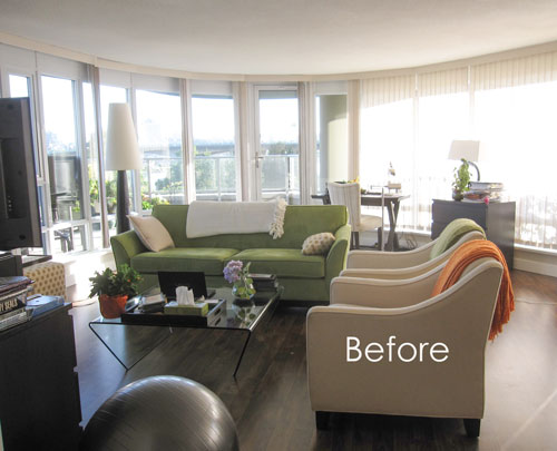
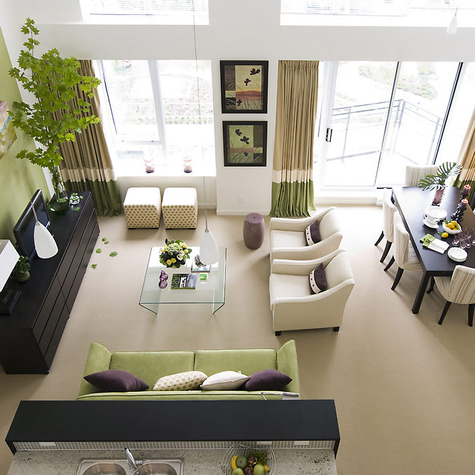
Unfortunately, the furniture from the loft (above) was not modern enough for the new space. And the layout really called for a sectional over a sofa and four chairs.
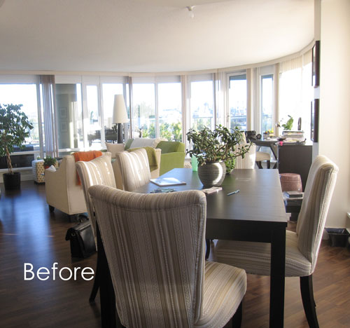
The window coverings in this new condo were verticals that were installed on each individual window. It was a big hassle to open and close each one and it sure wasn’t pretty.
After
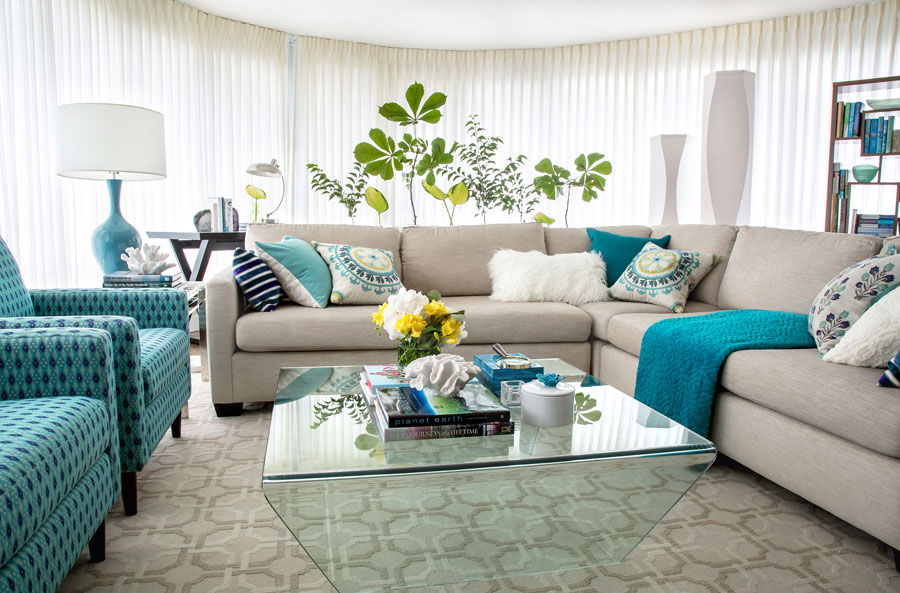
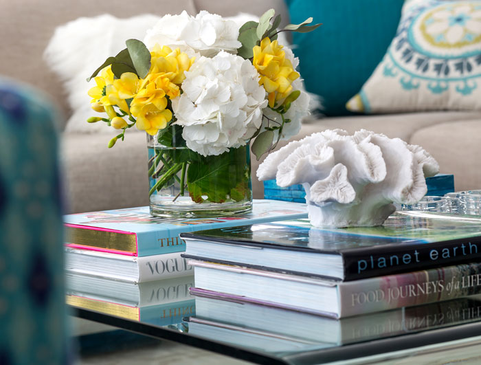
New sheers took care of that problem. The sectional, two chairs and area rug were custom made and the coffee table was existing. The reason why I thought a sectional would work better is because it defined the living area since behind it is Kareen’s home office area, then beside it is the dining room.

The X desk also came from the loft which was decorated 7 years ago.
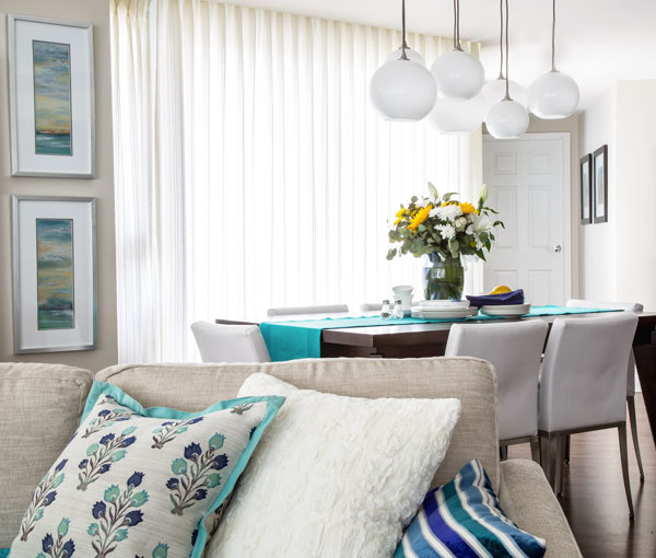
The dining table and Chandelier are from West Elm. The chairs are no longer available.
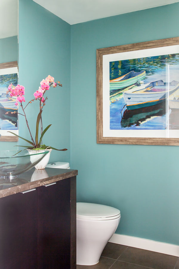
All this powder room needed was a colourful coat of paint and some artwork to create flow with the main colour palette. The paint colour is SW 6486 Reflecting Pool.
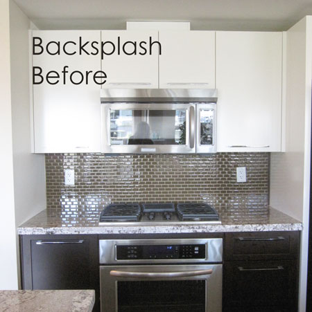
The backsplash was replaced because it was green while the undertones in the existing granite were more red/brown and taupe.
The new backsplash is textured backpainted glass. It was painted BM Ranchwood.
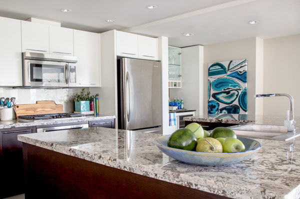
Styled by Maria Killam Paint colour SW Agreeable Gray
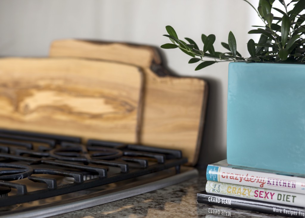
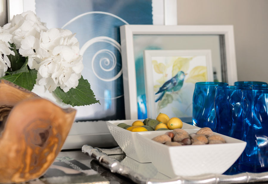
Cutting boards warm up the kitchen backsplash. A miniature olive tree is displayed in a turquoise vessel.
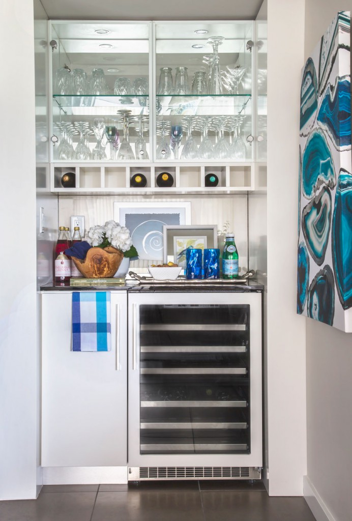
And you saw this butlers pantry a couple weeks ago.
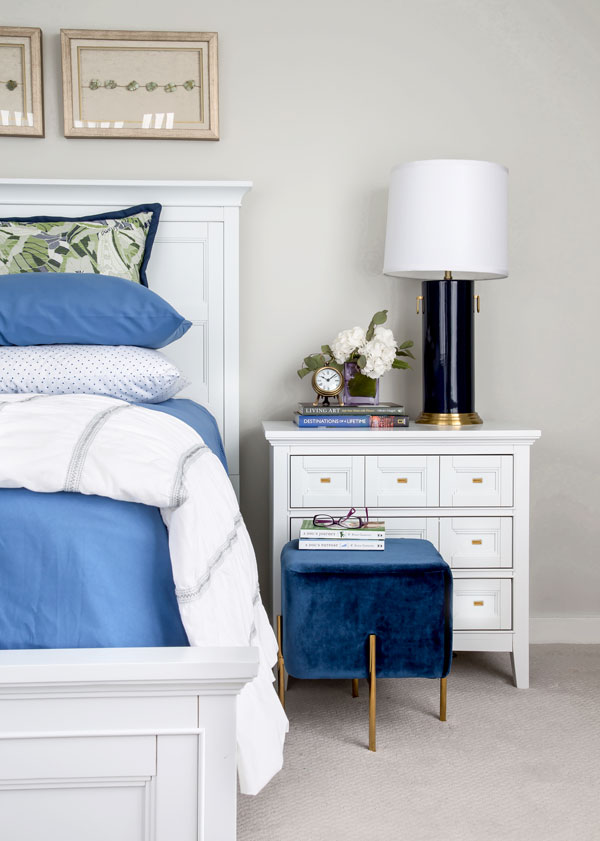
A glimpse of the blue and white master bedroom.
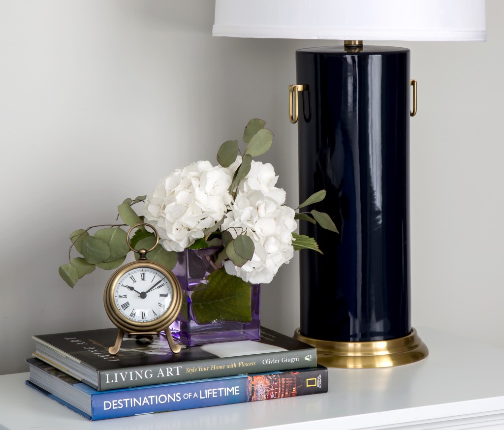
Clock and Table Lamp (similar) from the Pottery Barn
Photography by Airisa Photography
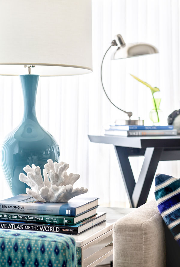
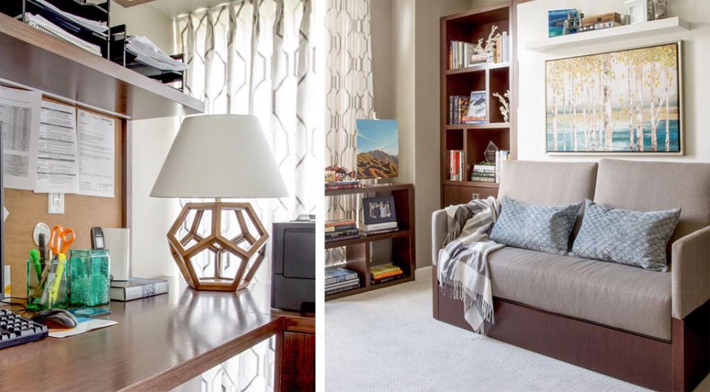
The second bedroom was converted into an office for Andrew who works from home. Because he’s a biologist and loves scuba diving, we incorporated coral onto the custom made bookshelves. A murphy bed was installed for when guests come to stay. Jan Romanuk designed the millwork and Mike from Quality Cabinet in North Vancouver built and installed them.
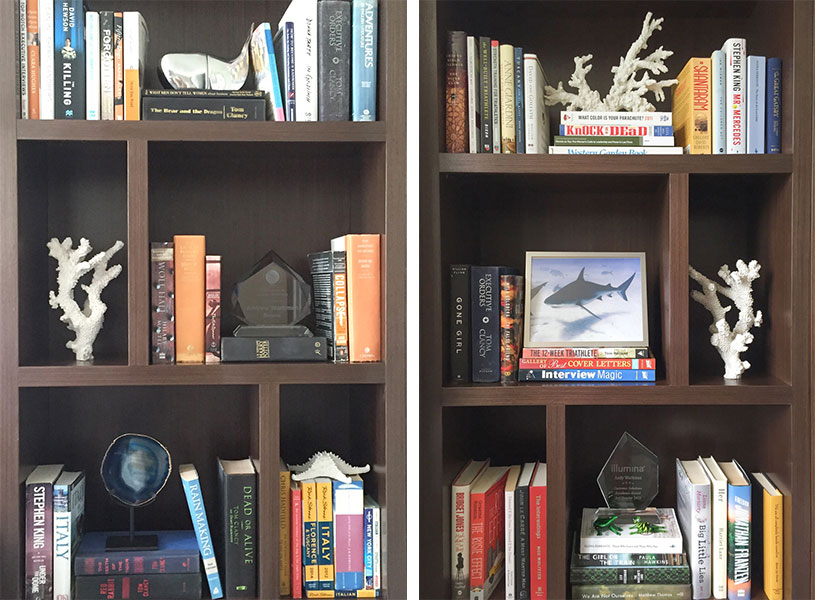
The couple loves to read and have many bookshelves throughout their apartment. I corralled all the biggest books to style these shelves when they were installed.
I’ve loved working with this hardworking, power couple and it was fun to help them create their next home.
I’m on Day 2 of the Jason Vale 7 Day Juice Challenge. My sister Elizabeth announced last week that this is what we were doing this weekend!
You know what summer can be like, too much wine on the patio! Suddenly you feel like it’s Christmas and you better do something about it. I haven’t done a cleanse in years because I’m always starving and suffering. When I did the 10 day Master Cleanse years ago, I lasted 5 days before I gave up. This one is awesome, you’re not hungry and the best part about it is you’re giving your body a rest.
I loved the goldfish analogy in his book. If you don’t change the water in a goldfish bowl, the goldfish will get sick right? And how would you help the fish? Would you give the fish a drug to help it’s condition or would you clean the water? Well you’d start by cleaning the water!
I’ll let you know how it goes!
We have also set our final date for my Specify Colour with Confidence™ workshop this Fall, we’ll be at the Upper Montclair Country Club in New Jersey a short distance from Manhattan.
See all 5 dates and locations and Register here.
Korina Khamis from Hibou Design & Company in Quebec was in my Toronto training, her partner Eugenia Triandos completed my training in 2014. Here’s her blog post.
Related posts:
How to Make Standard vs. Custom Colour Choices


Love the new loft. Can you explain what about the room made you think a sectional would be better for it?
I’m not maria, but I’m thinking it was that curved wall of windows. I think a sweeping wall of curved windows calls for a more simplified continuous seating area because it’s more visually harmonizing.
Before, it looked like a more rigid grid that fought against those windows.
Let’s see what Maria says.
Yes I like the way you said it the best Lorri! Also because it defined the living area better given there is also a dining room and home office area in the same room. Thanks for your comment!
You’re welcome!
Looks fabulous, Maria! It’s so much fun working with repeat clients. I know Kareen is thrilled!!
I love the rooms you have designed for your clients.
2 amazing projects for Kareem, and each one, lovely but touchable! The powder room paint colour is yummy, one could melt right into it…. so well done Maria.
I agree. Powder room is lovely, as is the soft gray. Can you provide the name of the colors used throughout.
The powder room is SW 6486 Reflecting Pool, the main wall colour is SW Agreeable Grey, the master bedroom is BM Titanium and the backsplash painted glass is BM Ranchwood.
Thanks!
Maria
The wall to wall carpet looks so fresh and clean! Do you happen to have the name of the manufacturer/color etc by chance? Your styling is so amazing Maria, I love everything you design!
HI Rachel,
I have been working on this project for almost 4 years and I can’t find that info anymore, sorry! Maria
I love everything you did – it’s absolutely gorgeous.
Have one nit-pick though. Never turn good crystal/glassware upside down to store. The rims are not made to take the weight and can chip. Lesson from my southern belle mother – and verified on …. (wait for it) … the internet 😉
True. And hardly anyone knows.
Darn. I should have been part of a power couple…
What is the turquoise paint color in the powder room?
The new back splash is such an improvement.
Wow, Maria, what an improvement you have made to this apartment. The large rug looks great with the sofa and the contrasting colour of blue makes the room look stunning. I also like how the bedroom looks.
Great work, Maria.
Hi Maria,
You’re like the good witch from The Wizard of Oz. You wave your magical wand & everything turns lovely. All that’s missing is a vase full of poppies.
I am one of many that would love to know the color you used for the powder room. I have a similar color sceam In my powder room and this color would also look fab. Please share!
That is beautiful!
Fabulous Interiors Maria. Love the choice of colors, the layout, the new furniture. Curious about the blue stool near the bed,quite beautiful. All the best.
The space is gorgeous Maria, well done once again!! xo
Beautiful! The sheer curtains are lovely.I just wish the sectional were turquoise and not beige.
Beautiful transformation of space Maria. I also love the choice of blue accents.
Maria, this is a stunning and beautiful design. You just get better and better.