As you might have figured out by now, I travel a lot! I’ve seen many hotel bathrooms over the years that I’ve been writing this blog and never felt compelled to show you one, until today.
When I held my Specify Colour with Confidence™ course at the Harrington College of Design in Chicago and we stayed at the Palmer House Hilton.
Hotels especially need to install classic, white or cream tile because it’s very expensive to renovate–in this case–1639 bathrooms (which is how many rooms are in this hotel)!
Install a trendy strip of tile around the perimeter of a bathroom shower in a hotel and it’ll immediately scream 1985 or 2002 or 2009. That’s why they are usually not part of the decor.
When hotels do a renovation, they change the vanity and countertop, but often leave the shower tile and tub.
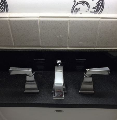
What’s the dead giveaway here that the tub and surround tile are not current? The tub faucet (below).
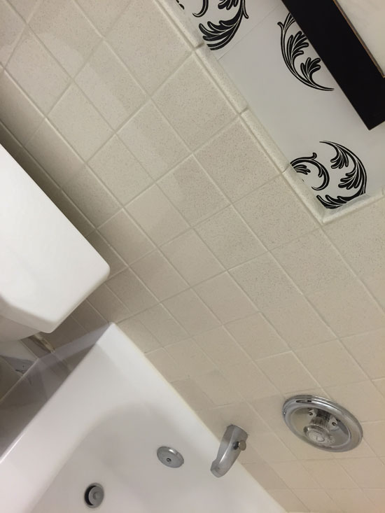
You can see that this one was installed sometime in the 80’s.
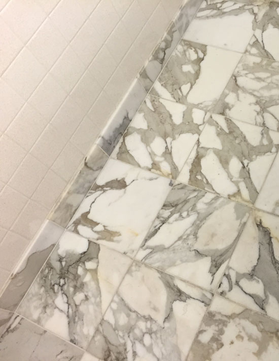
The surround tile was primarily cream with miniscule pink specks in it. The marble floor tile looked new and it was off-white and grey in comparison to the old cream tile.
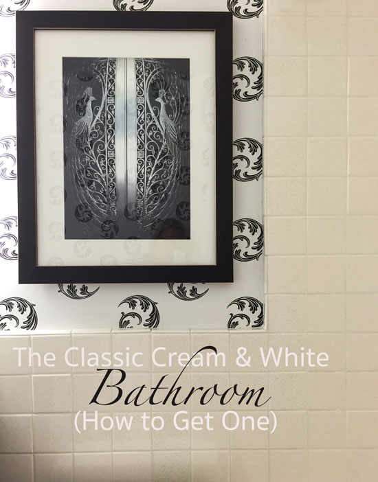
I like the way the frame around the artwork related to the vanity (below).
The black and white wallpaper relates to the black granite countertop, white sink and tub. If you look closely, the toilet is off-white (not as white as the tub) but because the bathroom is so pretty, you wouldn’t notice.
Beautifully done.
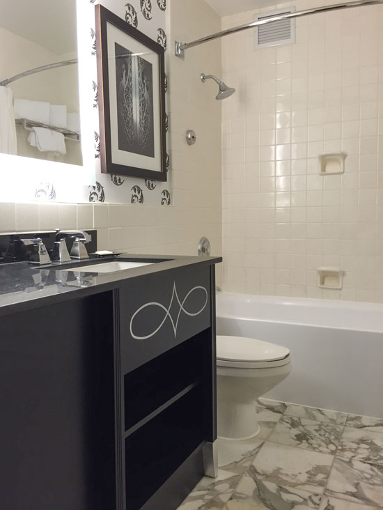
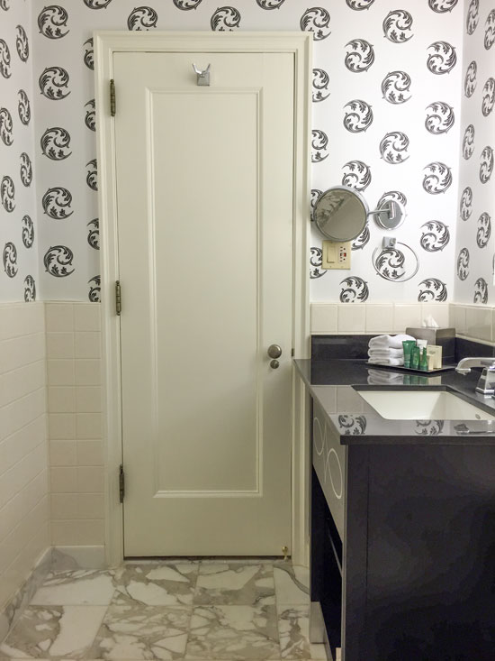
The door and trim is painted cream to blend in with the tile. It also creates contrast with the white in the background of the wallpaper.
The vanity could have been white as well to pick up the white in this bathroom but because it was a dark wood stain, it actually takes the attention from the off-white toilet. I didn’t notice that it didn’t match the tub until I started snapping photos to show to you.
Had the new floor tile been a larger scale tile like a 12″ x 24″ it would have not been as great of a transition with the old 4″ x 4″ tile as the new 12″ x 12″ marble is.
Hope this helps if you’re trying to work with old tile in a new bathroom to update it. Even if you are not updating an old bathroom, this is a great way to combine white and cream in a brand new bathroom too!
By the way, all these images were taken with my new iPhone 6. I no longer carry around my little Canon camera in my purse because the camera in this one is so much better.
Who loves their iPhone 6? Every designer should have one!
Related posts:
Is your Bath Perfect? Or Perfectly Nice?
One More Reason you Should Skip Accent Tile All Together


Personally, looking at that bathroom, it’s waaay too busy for me. Hate the wallpaper and I’m surprised a hotel would have even used it. Just me I guess but I think the floor carries enough pattern for the entire bathroom. If using wall paper I would have put in something with a soft textured effect. I realize this comment takes away from your initial lesson of mixing whites and creams – sorry but I just thought YIKES when I saw the bathroom.
Haha, when I announced in Chicago that I thought this bathroom was so great, someone else staying in the hotel said “What? I didn’t notice that bathroom”. So maybe it’s just me. Mostly hotel bathrooms screw it up so I thought this was a good one but I might be on my own here 🙂
I agree, Louise. When I first skimmed the photos I thought for sure this was a post on what NOT to do. The tub faucet is the least of this bathroom’s issues. YIKES is right.;-)
I agree, I thought it was pointing out everything they got wrong!
The wallpaper feels out of place and top heavy to me. Also the style seems out of whack with the natural stone, almost whimsical where everything else wants to be serious. Not a fan.
I agree Louise, way to busy for me, it gives me vertigo just looking at it. I would have liked it better with a plain non-patterned wall paper and if the toilet was white along with the tub and sink. But other wise I do like the mix of cream and white.
Hi Maria,
Encountering a hotel bathroom is always a silly expectation for me. My husband is a plumbing contractor so we’re always noting the fixtures (“wow, Grohe fixtures”) in restrooms. I look at how they take the standard 90’s design and update it. One of the best I’ve seen is at the Lord Jeffrey Inn in Amherst Mass. They did a great job combining a historical building with modern sensibilities. Hope you were here in Chicago during one of our brief beautiful spring days.
I found this very interesting because, as a senior in a 30 year old house, we plan to update but not gut our bathrooms with cream fixtures and tile. I see that we can update with a new floor and vanity top and still have a pretty bathroom. Thank you, Maria.
I’m surprised they left the cream toilet. A white toilet feels cleaner to me & would have tied in with the white bathtub & sink. That would have been a better update than the wallpaper.
It looks like a mistake!
I’m with Debbie, who likes to check out hotel bathrooms. We get to see what wears well and what is practical over time. I love the Palmer House and your iphone photos. I remember staying there in a room that had 2 baths (so impressed). What is the very best thing about hotel bathrooms? — the maid cleans them.
Ha-Ha, Sandy!! Well said! And I do hope people remember to tip the maid for doing a job we all hate!
Saw a lot of “wrong” hotel bathrooms when we traveled. Even though I find the wallpaper a bit much with the busy floor, the overall effect for me is a serene and warm little room – not my choice for my house but not off-putting while I stay in the hotel. I’m with Donna; I’m also a senior in a 30-year-old house and with very yellowed faux marble countertops in the baths (think they actually were yellow to begin with since they are definitely white in the homes of some of my neighbors). Waiting for my ship to come in so I can re-floor the entire house, so no bucks and no sense gutting the bathrooms now and, with both vanities needing custom countertops (one 6′ wide and one angled on one side), making them work is key. Since my palette is more cream rather than white, I guess I’ve got a head start. Good study, Maria.
I must agree–I did not like that bathroom at all.
The Palmer House is such an historic hotel, I would think redoing the rooms in white subway w/chrome or stainless and a black trim—going back to the historial “look”…would have been much more successful.
Do it floor by floor if management can’t afford time/money to do multiple floors…but same materials in all. There are some mfgs that are making same tile they did decades ago…part of their charm and longevity…
Looks a bit like lipstick on a pig…
Maria, I think the floor is too busy for this small of a space. However that being said, what actually bothers me is the pinky backslash and the ivory toilet. The wallpaper with the floor and counter is o.k. The use of ivory and white was well done.
We all have different opinions and that makes the world go around.
So glad that you had such a good class and a nice stay in the windy city.
I would agree with Louise. I find the room has way too much going on in a small space. I also find the cream tiles read really peachy-pink. The new vanity and artwork are great but overall I’m not feeling it. 🙂
Looks a bit like lipstick on a pig…to me.
I too notice hotels & hotel bathrooms breaking the undertone rules all the time. This is another example to me. I think if anything the floor has a bit of yellow in it. I think the pure white in the wallpaper makes the cream tile look dingy—-er. Sorry, not a fan, although I like elements in the room.
I’m glad you wrote this as I will be working with a similar
situation when I redo my bathroom. In fact I have the
EXACT same faucets in my tub, but I will be keeping the
old faux marble shower and tub surround with is of
course a Pinky beige pattern (I can’t stand that color either) but replacing the floor tile. I can see that I should stick with a solid tile that is a cream to go with the patterned pinky beige around the tub and shower.
I’ve learned so much from reading your blog. I think its
a good lesson even tho we may not all like the bathroom
shown.
No, No, No. This is all wrong to me. I do not like white with cream, at least not when it’s pinky cream. It looks dirty. I have seen white with cream that I liked, specifically when you paint white and cream stripes on the walls, but you have to use a yellowy cream for me to like it.
….Know what I like? I like that you’re not rigid in your thinking, Maria. Sometimes broken “rules” bear good fruit. As good as the camera on the iphone6 is— (yes, I’m blessed to have one)— WE were not there in that hotel bathroom as you were. Just the other day I sent my friend what I hoped would be a really good photo of some gorgeous drapery panels I spotted for her bedroom. Even with the iphone, you could NOT see/feel how beautiful they really were. Also, I know you had a good time with your Chicago group….when that happens, it’s amazing how good the whole world looks!
Wish I could’ve been there. Aiming for a Vancouver session. (Praying/working for a sale!)
I think it’s dreadful but enjoy seeing it and reading the comments.
Hello Maria. My first thought was “I honestly think it works.” Then I thought “Oh no, it’s a test and I’ve flunked” lol! I think they did in fact tie in the cream and white. It is a bit busy but totally cool as well (in a refreshing sort of way?–if that makes any sense at all). I like it. It’s not my style but I def think it works. I do.
Don’t care for the busy wallpaper and the busy floor. The tile does appear to be a pinky cream and not a good combination with the white. But you were actually there to get a ‘feel’ for the room and if you loved it I feel certain that it ‘worked’. That said, after reading comments, I am eternally grateful not to be a decorator 🙂 You are a gifted and brave soul Maria!
Your point is well taken. Up dating hundreds of rooms can be expensive. I would be happy in that bathroom, I wouldn’t do it from scratch, but designers usually have budgets.
I totally agree about keeping the tile classic. In the last two kitchens I’ve done we’ve used regular old 3″x6″ white subway tile for the backsplash. I’m working on two bathrooms now – what are we using on the walls? 3″x6″ subway tile. I think keeping the tile classic is the way to go. You can add interest with lighting and paint – much easier to change out when you tire of it.
I have always liked white and cream together, but I think I would have gone with a wallpaper with a bit more warmth to it–maybe just a touch of brown in the ferns or some subtle cream/natural tones in the background, and perhaps a less fussy vanity, although I do like it. The artwork is cool, but far too cool in tone for me.
Unfortunately, it is almost impossible to match bisque bath fixtures unless they all come from the same manufacturer. I think the marble floor does work with the white bathtub and bisque toilet and tile because there is a bit of both in it.
Overall, I agree with you that it isn’t perfect, but it works.
I know I’m replying to an old thread, but I’ve stayed at the Palmer House several times in my career. This bathroom is in keeping with the old Hollywood feel of the hotel. It has many pictures in the hallways of all of the stars who have performed at this historic hotel over the years. I’m not a fan of wallpaper, but this fits with the feel of the entire hotel which also has a very ornate lobby.