I know, you’ve been waiting with bated breath to know the answer to this question (not 🙂 but ever since I walked into this furniture makers workshop and saw the back wall painted this colour, I wanted to show it to you because it’s so great.
 BM 802 or CC-846
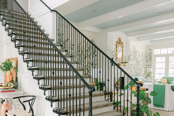
A basically unfinished room with lots of yellow toned wood everywhere really makes this sky blue colour pop. So in case you have always wondered what colour your windowless basement or garage should be, this is one option. I snapped this photo at the Vancouver Culture Crawl in November and just found it in my camera. This is a place where an accent wall like this really works!

This is just one example of a great blue but there are many others, like 2064-50 or 2058-50. The colour of the sky is a great colour for a windowless playroom in a basement as well! No need to keep it light if you don’t have windows because as you know by now, A Light Colour will never come to Life in a Dark Room.
If you would like your home to fill you with happiness every time you walk in, contact me for on-line or in-person consultations.
Related posts:
White is a Snob
Do you need an Accent Wall? Take this Test
My Decorating Mantra for 2009
New to this Blog? Click here ; Follow me on Facebook and Twitter; Become a True Colour Expert


Lovin that shade of blue! 🙂 Excited to see how it turns out
That post you wrote about light colors never coming to life in a dark room was really revealing! I had never thought about it before. I do like that blue..for sure.
Have a great day Maria. Oh and I really loved your sister's blog. I visited last night. :O)
xo
Donna
Excellent advice. The only thing is, my laundry room is in the dank dark basement: and I need all the "light" I can get to see what I'm doing. It's a shame, really.
Maria, I wanted you to know that I recently re-discovered your blog and I've been reading asd much of it as I can! Apartment Therapy is currently having a contest, looking for "the best" design blogs (and others). I've nominated your blog. Voting will begin shortly.
Good luck!
I love that blue ,but not so sure in a work room :)I would think this would look great in an office/den .
~Sharon~
Such a pretty color…can't wait to see!!
MARIA: LOVE ALL OF YOUR TIPS ON COLOR……BEEN IN THE DESIGN BUSINESS FOR 29 YEARS AND YOU ARE STILL TEACHING ME! YOU ALWAYS SHARE SO MANY WONDERFUL COLOR TIPS AND I CONTINUALLY LEARN FROM YOU.
ABOUT THAT BM BLUE FOR YOUR WORKROOM…………..HMMMMM. JUST NOT SURE ABOUT THAT ONE. HOW IS YOUR WORKROOM USED?
OX
Alexandra Stoddard often recommended painting ceilings blue . . . what think ye?
This is a beautiful blue.
Fondly,
Glenda
Oops sorry, I didn't mean 'my' workroom, I wrote the headline for someone doing a google search. I really meant a carpenters shop just like I've shown (isn't it called a workshop?)
Anyway, I tweaked the headline so it makes more sense, sorry about that!!
Maria
I think blue is a wonderful color to work by….it keeps you just enough energized and just enough calm!
Hello, My sweet Maria! 🙂
I love this color! My son's room was like that when we used to live in Kelowna, then after moving to this new house he wanted a very light green… but I preferred the blue room because it was soooo cozy and he used to sleep better there.
I loved reading your comment the other day on my blog. I agree 100% with about color shouldn't be about trend, since it lasts longer than trend. You're so right about that.
If you have a minute, come see my post about a "Rustic Villa"… I'd love to know what you have to say about the interiors. Would you add strong colors to it or just leave it "neutral"?
Have a great weekend, Maria.
xo
Luciane at HomeBunch.com
I once worked in an office with a reception room whose walls were glazed a beautiful glossy medium blue with white trim. One wall, facing south, was entirely glass above about 36 inches above the floor to the ceiling, so light was not an issue. And the furnishings were an exquisite mix of medium mahogany and light whimsical painted pieces. The floor was creamy marble with a pale cheetah print rug. But the room was depressing. It lasted only months before being reglazed a cheerful yellow. Now I am hesitant to paint any workspace, especially one that is not window-filled, blue!
Hi Classicist,
Well this post is about the carpenters workshop, I have seen this done more than once and think it's great. Whether it would work in an actual office is a whole other conversation for sure.
Thanks for your comment,
Maria
Great advice, it shocks people to say "paint your dark windowless room a mid to dark tone". But then I show them a media room I had painted in a dark rich blue and they love it!
You're so correct in teaching us a dark room painted a light colour just looks blah as the shadows cast a dark shade over the light paint colour anyhow.
Why not paint it darker and use lights to 'light it up'.
Loved the blue against the yellow wood, what a fresh contrast!
I think I am the exception here, but I reeeally don't like that color in that space! I love blue, especially for learning spaces, but in that dark room it looks so industrial to me.. like scrubs:( I look forward to hearing what other colors work in a workroom though, I have a sewing room and potential wood shop to look forward to decorating!
I had never painted any rooms in my space blue, but decided I needed a change after always defaulting to green for our bedroom. I took a chance and used BM Early Morning CC-818 on the walls. I wanted a 'barely there' blue for the ceiling and chose Watercolour CC-718 (@50% – although it probably didn't make much of a difference at half strength). There is crown moulding between the wall and ceiling. I love it! Red is one of my all time favourite colours and I have little hits of it in every room of the house – including the bedroom..