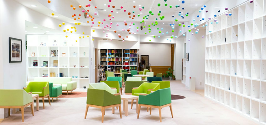
I was in Park Royal Mall on the weekend and noticed they had renovated one of their hallways leading outside and to the restrooms. I had to take a photo because I thought the blue chosen here was fabulous! Nice tile layout combined with wood panelling and wall sconces.
It’s a perfect example of my mantra, “A light colour will never come to life in a dark room!” Here is a windowless space that has been brought to life with the right colour and lighting which is what you want to do in a dark space NOT just paint the walls a pale, lifeless colour!

Blue can be a hard colour to choose because it has to be quite grayed on the chip (or it looks like baby blue) before it will be the colour you expect as most colours get ‘twice as bright’ when they hit the walls.
The other thing that works about this colour is that it’s fresh (compared to the tile), if the designer had picked a colour that just matched the darker tile for example, this hall would have ended up a greeny-gray colour and would not have been nearly is interesting as it is now!
The other problem I have found with most hallways in commercial spaces is that the colours are usually chosen in the designer’s office instead of standing in the hallway after the lighting has been installed which is when it should be done. However, that is not reality, because the painting has to be done before the final installation of lighting, etc.
When I go into new condo developments, the colours in the hallways almost never coordinate perfectly with the finishes because of the timing of the colour specifying. It’s only prior to a renovation of an existing hallway that there is any hope of colours and finishes coordinating because then you have the luxury of being in the space with the correct lighting.
While you’re here, subscribe to this feed so you don’t miss out!
The only way to choose the right colour every time is to combine my system of understanding undertones with the most indispensable colour tool available. You can purchase your own set of my curated large colour board collections here.
Need help choosing the right neutral or colour? My How to Choose Paint Colours: It’s all in the Undertones ebook takes the hundreds of choices down to 9 neutral undertones along with list of all my other go-to best grays, broken down into 3 undertones, green, blue and purple. The beige undertones of pink, yellow, green, gold, orange and taupe along with the best greens and blues.
My bonus book of colours is worth the price of the ebook alone but you will also get my system of understanding undertones so you can stop making mistakes when sourcing tile, carpet, countertops, etc.
If you would like to transform the way you see colour, become a True Colour Expert.


Great advice! I almost purchased bright white paint for a small, dark hallway. I’m going spring green to contrast off the gray tile.
Thank you, thank you, thank you. I was considering cream for my living room that receives light filtered by the screened in porch, but have decided on blue. Your “twice as bright” on the walls tip helps tremendously in picking the color. I’m new at decorating with color, been a neutral girl all my life. Am I being to brave?
Maria, you are right on as usual with the example of the pretty blue in the hallway. We have stark white hallway and a rich emerald, Oriental rug/runner that will be as long as the hallway. Light only comes through windows in bedrooms which open into the hallway. Any suggestions on how to transform the institutional-looking hallway? There is one electrical outlet in the hall, so I will look for a sconce to add some light there. Thanks in advance for your brilliant suggestions.
Well put. I painted my hallway like 6 times before I found a color i could live with.