A lot of people think that the right way to create flow and transition colours from room to room with paint colours is to take a single strip of colours from the paint store and select a range of shades from light to dark.
When you do that, though, your house will basically end up painted lighter and darker versions of the same colour everywhere.
Also, who has a house (unless it’s brand new) where out of the nine neutral undertones available, one of them will work for every single room? What if you have pink beige carpet in the halls and bedrooms, blue grey tile in the entry, a green grey stone fireplace in the living room, and gold beige countertops in the kitchen?
Now what do you do?
The chances of this method of choosing paint colours coming out beautiful is very slim, indeed.
Here’s the best way to get it right:
CA-037 Rice Paper by Cloverdale Paint (Photo by Maria Killam)
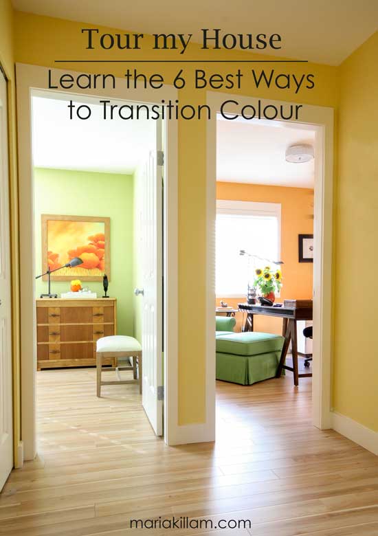
1. Flow starts in the living room.
When I work with a client on creating a new colour palette for their home, we always start here. This is the room that influences the entire house.
So if you are spinning and have no idea which colours to paint your walls—or worse, have nine samples up and are waiting for one to step out and say, “Pick me, pick me!”—well, the chances of this happening without at least a basic decorating plan for your living room will be even slimmer.
Paint colours should be chosen last (in a perfect world). There isn’t a single colour I chose for my house without first knowing which fabrics or furniture were going in the room.
2. Don’t choose all your colours at once.
What if you really don’t know, or don’t have time to choose furniture or artwork?
Then don’t stress about choosing five colours. Start with one. And when you slowly start to make choices, you can repaint your dining room or powder room once you know what the accent colours will be.
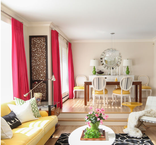
My powder room (which is right past the laundry room, photo below) is painted a raspberry shade that ties in with the raspberry accent colour in my living room.
The main rooms of my house (living room, family room, and kitchen) are painted a colour that I consider to be greige. All the paint colours in my house are from Cloverdale paint because they generously sponsored all the paint when we renovated this house over three years ago.
A lot of my clients are simply looking for the perfect white or greige when repainting or choosing colours for a new build. I list a few perfect Benjamin Moore and Sherwin Williams options that can be found in my White is Complicated: A Decorator’s Guide to Choosing the Right White e-book, which you can download here.
The days of painting each room a different colour are OVER.
Because we are decorating with much cleaner colours in the colour trend than we did during the Tuscan Brown trend, we need a neutral on the walls that will not look dirty with all these fresh colours and a colourful sofa in the living room.

Entry (Cloverdale 7928)
3. If the colours in your living room are fresh, the rest of your house should be, too!
As you’ll see when you read this post, the palette throughout my house is not just raspberry, green, and sunflower yellow. Creating flow is not about simply repeating the same colours from your living room over and over. It’s about making sure all your colours are either clean or dirty.
The biggest mistake most people make (including design professionals) is combining clean and dirty colours. We will be talking about this throughout our in-class exercises coming up in San Francisco next week, and Houston next month!
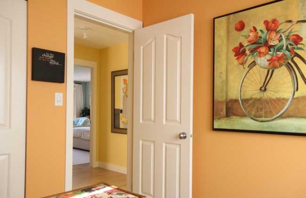
I chose a softer yellow than my sofa through my entry and hallway because this colour is too intense to have in a main living area, but it’s fabulous through a hall you’re only walking through.
Now, obviously, it would be smart to continue your main neutral down your hallways if you have carpet. A bright colour with a more muted, earthy shade of carpeting will not be fabulous.
Cabinets | Artisan White by Cloverdale Paint
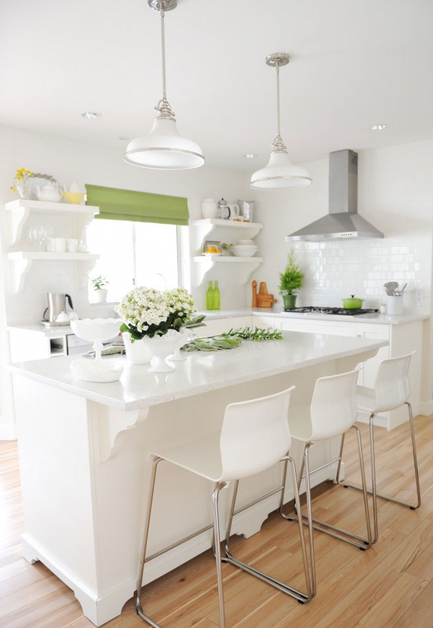
The same green found in my living room is the only accent in my white kitchen.
Rice Paper, Cloverdale CA-037
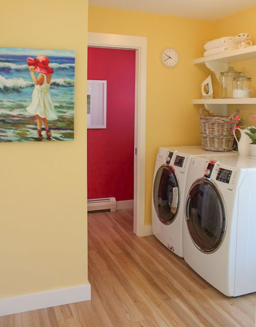
Laundry Room (Cloverdale 7928)
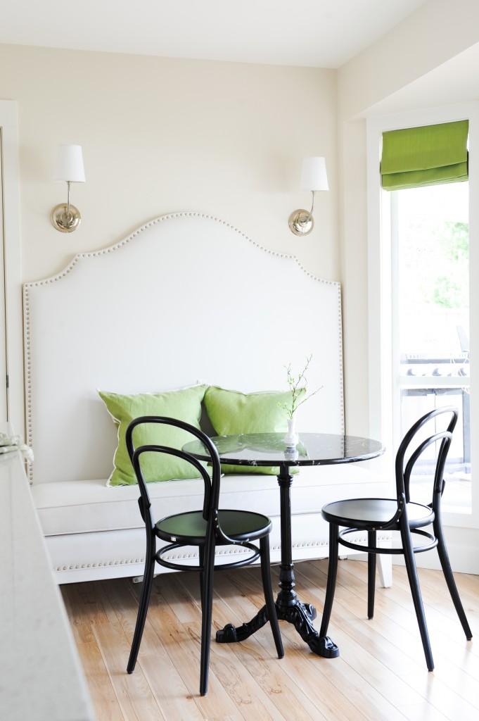
4. If you have already chosen a few colours, repeat them.
I repeated the yellow from the hallway here in my laundry room. You can see my raspberry powder room colour here. It still needs to be renovated, so it’s not part of the tour.
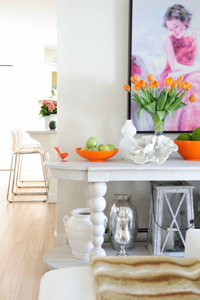
View from the family room into the kitchen
The raspberry accent colour in my house was inspired by this piece of art found at a big box store and custom framed. I love this piece of art. She looks sweet and kind, something I aspire to be daily. : )
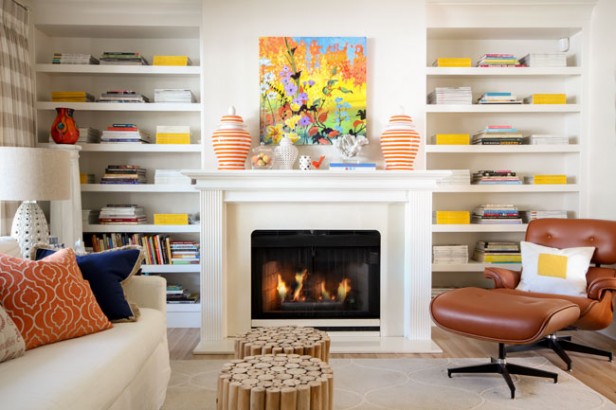
The colours in my family room are orange and yellow, with a small hit of navy. Truthfully, I had these navy pillows kicking around, so one day, I installed them in here. I am a total pillow tramp, as many of you know.
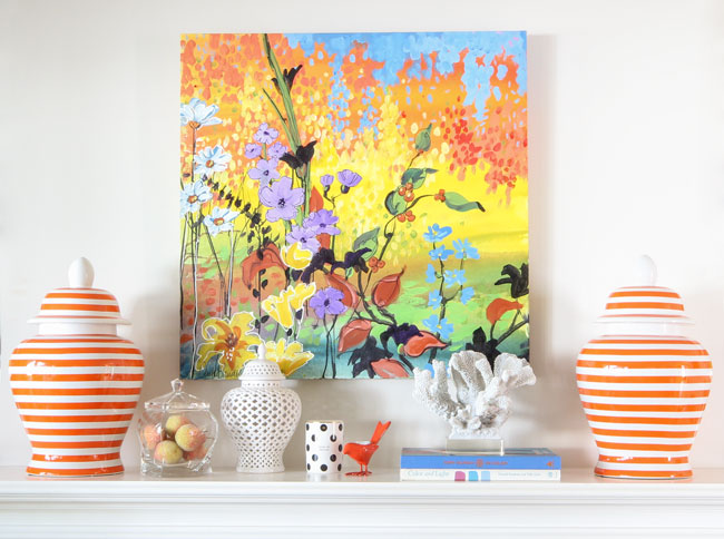
These striped ginger jars I ordered in the summer from One Kings Lane.
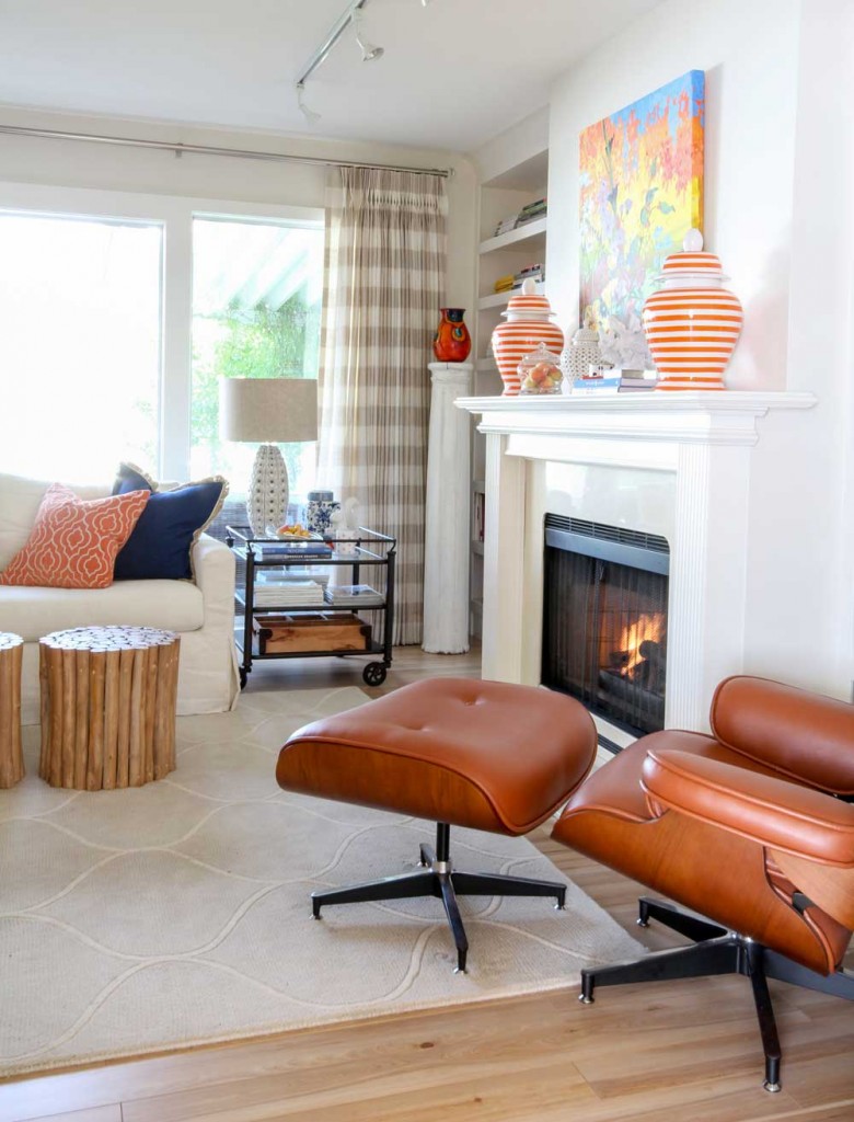
I found that column in the corner from an antique store and chalk painted it. The end table came from the Pottery Barn.
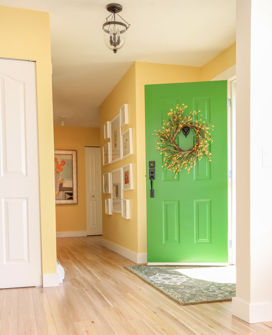
Kelly Green front door | Cloverdale 7669
5. What colour is in your entry or adjoining rooms? That could be your front door colour.
I love my green front door. When it’s open, the colour relates to my living room. And as you can see, I’m breaking the clean and dirty rule with my carpet here. I have found that so many greens look good together this is when you can break the rules.
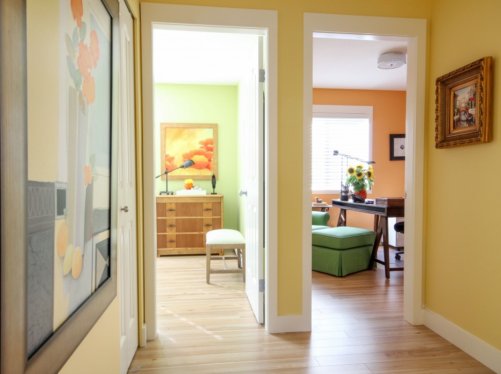
Transitioning paint colour | BM Pale Sea Mist (Guest Room) 124 Orange Appeal (office),
6. Paint your bedrooms a colour. These smaller spaces can handle a brighter shade
There’s no greige, only colour at this end of the house. It’s just happiness here.
Our guest room is green (it’s not finished yet either) and Terreeia’s office is sorbet orange. You can see through the doorway that the green chair and ottoman repeats the green from the room right beside it, and the orange and yellow artwork in the bedroom repeats both colours, too.
I specifically created the vignette on the dresser facing the hallway in the guest room because this door is never closed, and I love looking at it when I walk in and out of the master bedroom.
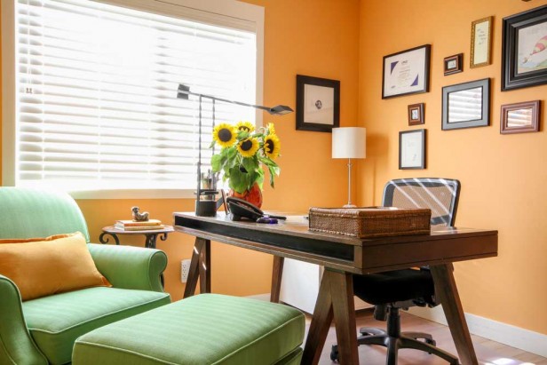
Here’s a peak at Terreeia’s office. It still needs drapery. My studio office is behind the house here if you haven’t seen it. This post also includes my garden.
Terreeia’s view from her desk is through the hall and into our turquoise master bedroom.
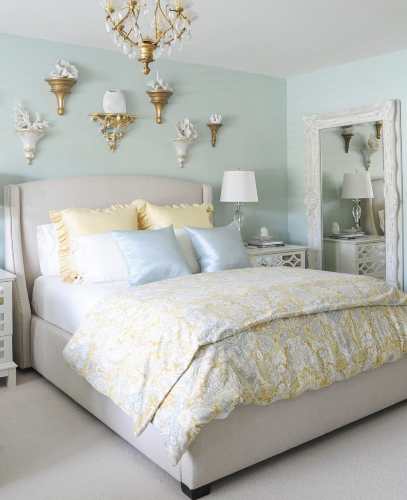
SW Rainwashed
Turquoise and yellow. This is really where turquoise is introduced. It’s nowhere else in the house, but the colours still flow.
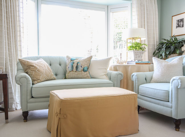
I had an old black-and-gold striped ottoman that I slipcovered to go in this room’s sitting area. The sofa and loveseat are from Martha Stewart Furniture.
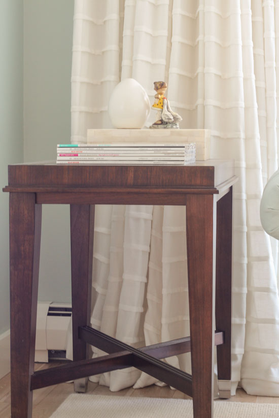
I simply adore these custom-made, off-white drapes. See how the horizontal stripes are uneven? It creates a ballgown effect. The end table is from HomeSense.
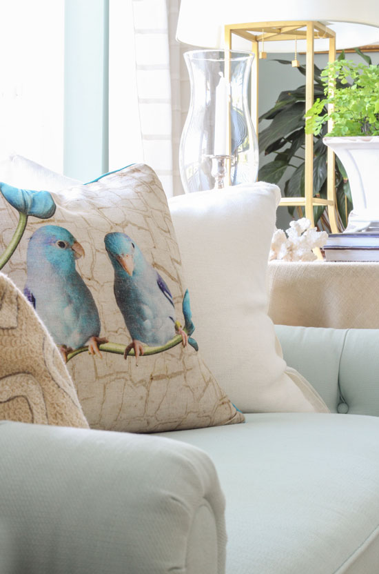
Some of you know how obsessed I am with a cute face. I recently picked up these gossiping parrots at HomeSense. ; ) ; )
I did not schlep this vessel home from Tuscany this past summer; it’s from a gift shop in Fairhaven.
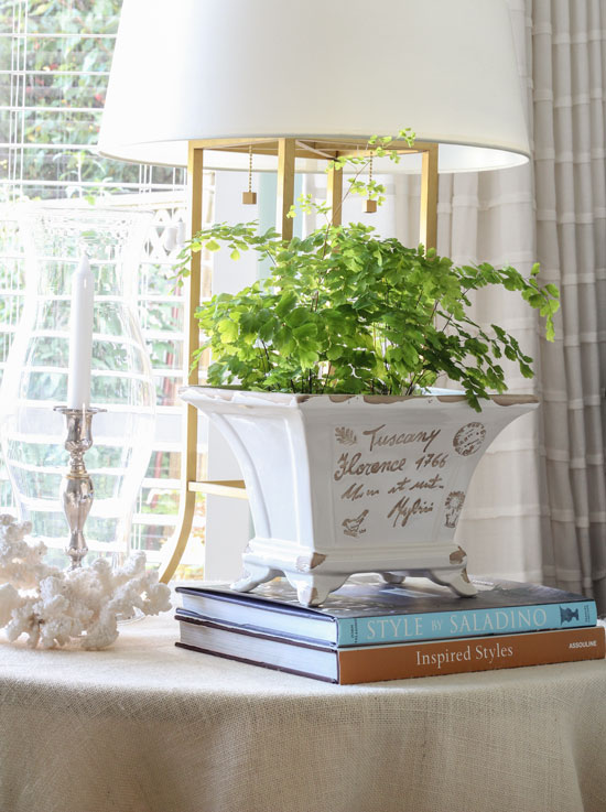
I love the soft and sweet look of maiden hair ferns. I simply replace them when they dry out if I forget to water them in time. If that’s monthly, so be it.
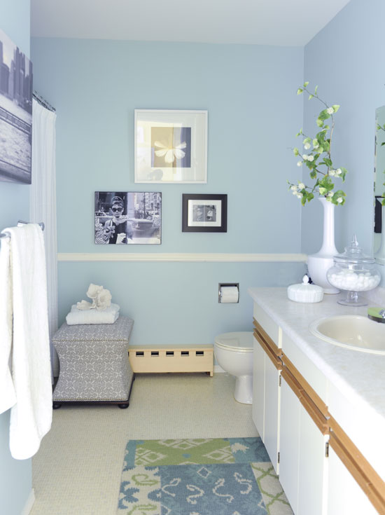
And finally, I repeated the turquoise shade of the bedroom in our dated main bathroom right beside it. What will the colour be when it gets renovated? Only time will tell.
The only room you haven’t seen is our master bathroom ensuite. I also painted it the same turquoise shade, but when it gets renovated, I will paint it a coordinating colour from the master. I like looking into a different room and seeing a different colour.
When people walk through my house, they’ll say “It feels so fresh!” And that’s because it flows and all the colours are clean instead of more muted and dirty. It’s NOT because I’ve decorated the entire house with colours strictly found in the living room.
The same feeling of flow can be created with any colour scheme, even if you prefer earthier colours. Just because the colour/fresh trend is here doesn’t mean everyone loves it or can realistically re-decorate.
Once you’ve chosen your paint colours, arrange them in front of you and compare, compare, compare to make sure one doesn’t jump out more than the others. That usually means it’s a cleaner colour than the rest.
I’ve noticed clean colours are EVERYWHERE finally. It’s only taken 5 years for that to happen but even sofas are colourful which I think is fabulous!
Are you into the colour trend or do you prefer earthier colours?
Related posts:
Grey is Out! (Maybe) The Colour Trend is Here!
Are you Waiting for your Paint Colour to Propose?
How NOT to Choose Paint Colours (But Everybody Does It)
If you would like to transform the way you see colour, become a True Colour Expert.


Wait, I’m confused.
You said this: “The days of painting each room a different colour are OVER.”
But also this: “I like looking into a different room and seeing a different colour.”
??
Thanks clarifying!
*for clarifying.
Great question, I’m referring to the main rooms of the house and in this case mine are the kitchen, living and family room. Most people aren’t going to paint their hallway a ‘colour’, mine is an exception because I’m a colour expert 🙂
I love specifying colours for bedrooms, laundry rooms, powder rooms and dining rooms.
Maria
Hi Maria,
We are building a new home. I made my choice of off-white cabinets, medium brown floor. Countertop, not sure. Looking at Giallo Ornamental granite but it blends in with floor. Any suggestions?
Also, what are your thoughts on gray cabinets-looking at them 5 years from now you could say “installed in 2015”? Thanks for your thoughts!
I’m not sure. I know I can’t live with brights. I wear only black, charcoal, navy and white an my house is basically the same way except it includes a lot of soft, muddy red and some leaf green. My walls are a soft grey and I don’t think they’re a dirty color but what do I know? They look great with my red couches but when I look at my couches I’d call the color “dirty”. I just repainted my husband’s south and west facing office and I’m pretty sure the color is “dirty” and my do I dislike it even though it’s a beautiful color and very light, almost white it seems to suck the vibrancy out of the room.
Obviously I need to take your class!!
By the way, I LOVE your bedroom curtains!!
Thanks Maria. Great to gave a sound bite in one’s head. I choose dirty so good to know that I mustn’t be tempted to try and mix with fresh until I have taken your course and learn how, or if, it’s possible!
Sorry ‘learned’
I love earthier neutrals and grays. I really love the grays. I gravitate to them like a moth to a flame lol. I have updated my rooms with new paint and accessories. I also love the geometric shapes and patterns that are everywhere! Love. I learned that I can add color here and there as needed or simply keep it soft. Your undertone ebook was and still is so very helpful to me. Thank you. Your home reminds me of a palette of sorbet–(if there is such a thing lol) very pretty and refreshing. All of us have to be true to ourselves. Again, thanks for your help and ongoing instruction.
Maria,
Thanks for the tour of your home it is SO beautiful…and so colorful!! Just right for you!
I’m a “dirty” girl (one of the MANY things I learned from you 🙂 ) but I don’t like the brown earth tones, I like the gray-greens and other muted tones of the current colors (blue and green).
What if your guest room, hall, and office had wall to wall carpet. How would you select a carpet color to go with these three areas which have three different colors?
Hi Barb,
Carpet is hard, most people are not going to go with white or cream so then you end up in the world of beige or grey. I would stick to green undertones because they usually are the most versatile. In kids bedrooms, the bedding is the star so that’s when I just ignore the carpet. Hope this helps, great question! Maria
Maria, I’m also confused like Jo. In the last few years, I have found that more and more clients prefer less colour change, with the exception of children’s bedrooms. In a small bungalow, I’m a fan of keeping the flow by using one paint colour through the main living areas. I also have to comment on one other item in your post. Although I’m on the East Coast, this is obviously a West Coast phenomenon as well. While there are many unique and local decor shops, too many designers shop at Home Sense or Home Goods (USA)?! My clients want me to find accessories that their neighbours can’t pick up at Home Sense. We owe it to our own fabulous creativity and to our clients to avoid the big box stores.
Hi Jules,
Since the main living areas are neutral in my house (other than the hall which is an exception for sure) I’m not sure what else to say to clear up your confusion. I specify one neutral for my clients every day, however if your house is more dated and you do have different bossy undertones in the main areas of your house, then you might not be able to use just one colour. That’s when you have to diagnose the undertones in each room to choose the best colour and then work from there to make sure they flow. And sometimes you have to ignore the flow in order to get the dated space looking the best you possibly can, which trumps perfect flow in my opinion.
I would LOVE to have an alternative to HomeSense but here in Vancouver anyway, there are very little options, if I have a lot of accessories to buy for a client I might hit 2 or 3 of them in a day. As a stylist, the reason HomeSense works well is because they have a LOT OF PRODUCT. In a short time (and I am being paid to do this after all) I can have bathroom decor (for example) picked out with 3 different colour schemes to choose from. That’s much harder to do and takes much longer if you have to go from store to store.
That’s my take anyway. Thanks for your comment. Maria
Truthfully, Home Goods gets shipments in twice a week with different products, if you don’t buy something when you see it, I guarantee it will be gone when you go back- so I don’t really think you have to worry about your neighbors having the same items!
I shop frequently in Home Sense namely for accessories and like Maria and Kathi find; the turnover in stock changes from week to week. That said, it is one reason why when I do see something I’ve been looking for I snap it up knowing I can always return it if doesn’t suit the space. Another hint when shopping there, if you do see something, toss it in your basket as you browse since items can disappear quite quickly off the shelf. “Now you see it, now you don’t’… ☺ -Brenda-
P.S.: I missed out on a piece of artwork and a vanity bench within a matter of minutes … LOL … and to date neither one has been restocked nor could I find them in any of their other five stores located in my city. -Brenda-
hi maria..love your color flow…my question is do you take the same principles with ‘dirty’ (i don’t like that term, i prefer “muted” or earthy) colors? i have a desert SW home, and while i love the ‘clean’ color ) look, i just can’t imagine in our desert home (especially the primary color brights, which i can totally see in overcast and rainy vancouver!)
…i started using navy, light blues on walls, white baseboard moulding etc, but we have neutral ‘dirty gray’ sectional, plus we have a LOT of wood tone furniture that was custom many years ago and we love it…
Yes, same principles apply, just keep all your colours more muted and they will transition nicely.
Your home is colourful, but it’s such a happy, sunny look Maria. I love the corner where you see the guest bedroom, Terreeia’s office and the yellow hall walls. I am interested in how you integrated furniture from your last home. The green chair in Terreeia’s office which was mistakenly covered in the green. Perfectly placed. I prefer fresh colours like the ones you use. I can’t imagine living in a neutral home. It is so refreshing to see colour, and thanks for the explanations you shared. I admire your talent.
Your home is beautiful Maria!! Thanks for sharing! I love all colors—clean and dirty—they all sing in the right place and at the right time. Because of this, I can be my own worst client 😉
Beautiful. Love the happy clean colours. Maria. What color is your family room and kitchen painted? Is it rice paper? Thanks.
Yes it’s the same colour.
Maria,
Is there an equivalent color in BM or SW for rice paper?
Yes it’s very similar to SW Shoji White.
thanks!!
I’m guessing the master bath will be a soft shade of yellow.
Maria, do you ever suggest painting ceilings anything but white?
Yes, and if you look again, you’ll notice that the ceiling in my living room is blue. But because the sky is blue, it feels natural and is easy to miss.
In the Tuscan Brown trend we painted ceilings more often because a white ceiling looked wrong among all the earth tones, creams and beige’s, now they work white because we’re using so much white in our decorating. But in the right room a painted ceiling is fabulous!
Thanks for your comment!
Maria
Thanx, Maria. I did not pick up on that. BTW love the parrot cushion!
Great post! Lovely colours! Happy! Happy!
Hi Maria, what fun to see your home loved it. We moved into a newly built home 15 years ago and I knew at that time I needed to have a decorator ,which is cheaper than living with your many mistakes. I chose clean happy colors with the entry being the same yellow as you have, also reds and greens. You do a great service to help people. Thank You
Maria, I love everything about your home. The colours are so cheerful. You have picked wonderful, happy prints. Your house is beautifully decorated with just the right amount of decor. Thank you for sharing it with us.
I agree that the main living areas should be one and the same colour and prefer a neutral. I must check out ” rice paper”. My bedroom fabrics are cream and flax. I assume they are ” dirty” colours.
Do you think it would work?
In the family room, what color is the rug? It looks like a beige. And the curtains look like a beige and cream stripe. So that’s dirty, no? And the chair is a cognac color, not really an orange, so I would call it an earth tone. I’m not saying this room doesn’t work, but I’m thinking it’s an example of how you CAN mix clean and dirty if the colors are not too bright or cold. For example, the yellow in the room is a canary yellow, not a cold lemon yellow, so it works with the warm, rather earthy chair and the beiges. Am I missing something?
Great question, the rug and drapery are a green beige that are pale enough to go with bright colours and cognac many times is as neutral as denim but looks particularly good with orange and hot pink. All those cognac bags we wear with everything? Like that.
My best advice for students in my colour course is that you can mix clean and dirty colours but you just won’t be doing it in our classroom. This way you’ll learn how to get them right.
Sometimes a magical rug or fabric that incorporates both the dirty colour/s you still have to work with in a space more dated and one that’s more clean and fresh and when that happens, then you can have it all!
Thanks for your comment!
Maria
Maria, Great post! You make us all think through our decision whether it be clean vs dirty or bright & happy .
It also let’s us know you can break the rules once in a while.
Thanks for all of your info! Your house reflects happiness.
Enjoyed the tour! I had to scroll through the pictures again, so pleasing to the eye! Beautiful spaces. Thank you!
Hi Maria & Terreeia,
As usual an excellent post!!! Loved the home tour…particularly the fabulous kitchen and the Happy… Cranberry Colored Drapes in the Cheery living-room. I’m smiling from the eye-candy!! Guess what….flood in the bathroom…..renovation time!!!! Creamy whites…here we come!!!!
Thanks for this tour Maria! I almost feel like I got a vicarious trip to your home. 🙂 Actually that’s exactly what happened. It sparkles–like YOU!
Thank you for sharing your home with us, Maria. The best part is that you love it so much.
I think the biggest problem people have is when you have two rooms that join (but are not necessarily “open”) and the current furnishings are clean and dirty. So in my living room, the first room you see when you walk into the house, it’s all clean. Actually, you helped me pick the wall color a couple of years ago when I renovated my kitchen as this room is open to the kitchen. But the TV/family room has a big, bossy, dirty, brownish-mossy green couch from our previous home. It’s difficult to find the marriage between the two, especially since we don’t plan on replacing the couch until the kids are out of the house (and the 85 pound white dog has moved on the the afterlife).
Ahh… I feel like I just took a great yoga class. Your home is so graceful and relaxing. I love the fruity colors you chose, especially the lemon yellow, apple green, tangerine and raspberry. Your laundry room put a big smile on my face.
May I ask what you arranged on the shelves in your living room?
Painting my powder room rainwashed. In your bath it looks different than the master suite. Must be lighting . It’s a lovely color.
I have a neutral, BM Coastal Fog in my common living areas because it goes with my kitchen cabinets and counter. I like neutral with pops of color. My favorite neutral is linen, which I feel is like a good pair of jeans- goes with everything!
Maria, your house is lovely and cheerful, just like you! 🙂
Hi Maria, your house looks absolutely beautiful. One question, I thought its best to keep the number of colors in the house to a maximum of 5. In your house, I can see green, yellow, orange, navy blue, turquoise, white(that also counts as a color right) and raspberry pink. But it still all works wonderfully together. How to apply that rule ? Using more than 5 colors wud make the look bohemian ? May be all colors in one room would make it look bohemian ? Would appreciate if you can shed some light on this topic.. Thanks 🙂
Yes that rule generally applies to an individual room. Great question, thanks for your comment. And given what I do, my house has to be the poster child for COLOURFUL! Maria
Maria: I LOVE your house! I keep trying to get my house to be more ‘fresh’! But based on your comments and suggestions when we have consulted online I am getting the impression that I really can’t change to fresh. I think this is really hard stuff to get right and I admire your talent and skill so much! Best, Norma
Hi Norma,
Your colour scheme is totally fresh. It’s just a different kind of fresh, fresh doesn’t just mean clean, bright colour! 🙂 Maria
Have you considered dark frames for all of the hallway art? You have white frames on one wall and dark on another. The white frames on yellow look dated to me, perhaps unifying frame colors would make the look more cohesive and contemporary? PS the ginger jars really elevate the family room look- very nice.
I’m sure it would but those frames came from my last house so I’m not that committed to changing them at this point for such a small detail 🙂
Thanks for your comment!
Maria
The white frames, to me, look light, clean, and fresh. The parrots pillow is adorable too, and I love your happy colors throughout the home!
I love the white frames with your color palette! It keeps things looking fresh and bright in my opinion. I adore color and it’s wonderful to see a website that has so many ways to use it and look elegant and dramatic. The gray has been so overused (entire houses), especially with the dusty rose and white. They started out pretty though. Thank you for the inspiration!
Thank you so much. This was so incredibly helpful. I’ve been stuck for months, and I just got unstuck.
I love fun colors, & always have! It’s nice to see people starting to open up to them a bit more. It’s always been my mission to help people overcome their fear of color. Color is happiness!
This is a great, informative post. I am one of those people who has 8 gray colors on the wall trying to find the best shade. It’s an open floor plan with kitchen, dining room and living room all visible simultaneously. The floors are an espresso hardwood, and our sofa is a true red. I think we are finally are going with Collonade Gray by Sherwin Williams. Going off the Traditional Twist collection, we decided to use Burlap by Sherwin Williams for the accent wall, which is where the fireplace is and the focal point of the room. We also thought about painting the “mantle”, if I can call it that, Foothills by SW. In your opinion, do these colors go together? Is there a yellow that could go with this in our loft and hallway upstairs? These are visible from downstairs. I’m considering Butter Up by SW. Thank you!
What do you do when fixed kitchen cabinets and all doors of a house are whitewashed (with a red/pink undertone)? Red would be warm, but it is so light, like white? And the counter top is black…white back splash doesn’t seem right and the earthy tone disappears?
I have never heard anyone address white wash…
Thank you for any thoughts on this.
Hi Stacy, You can still use all the grays with those cabinets for walls. When it wouldn’t work is if you started looking at colours that were too close to what you have now but that’s probably not what you want. If you need me to help you chose the right colour, go here to purchase a single colour consultation: https://mariakillam.com/shop-landing-page/#interior-solutions
Hope that helps, Maria
Maria! Thank you for such a prompt response! Just after I wrote the question, I purchased your ebook, How to Choose Paint Colours. I am excited to see what you have to say, today (hopefully). If I still can’t figure it all out, I will use your “link!” ; )
Thank you so much for all of your work, it is so fun to riffle through it all…inspiring!
I finally understand clean vs dirty. My home colors are dirty, still in the Tuscan color scheme, problem is, I still love my colors after 20 yrs. I love all the information you share.
I’m closing on a home at the end of the month and there’s so much I want to do! I found your blog through Google images (looking at yellow living rooms) and am so inspired! I’ve got your site bookmarked now. Really love the tour of your home!
I’m so glad I found your blog while looking for colour ideas for our home. Your house has the kind of freshness and cheer that I’d like for ours. Yes, indeed; how to be happy walking in the front door is important, and being happy waking up to a colourful, organized home is important to starting your day off well.
I’ve bought 2 of your ebooks and a set of the neutrals and whites colour boards so far. One step at a time. The other half and I (he who only likes blue and we’ve had an entirely blue 5 bedroom house to prove it) need help to prevent another 3 year long discussion on what colours to paint things. The discussion was a what to paint trim on the red/brown brick house with red roof, pale yellow vinyl siding and brown trim; we choose a light buff yellow for everything but the dull orange front door which frightened the neighbours before they decided they liked it. The inside of the house was lovely, to make up for the ill-gotten exterior.
I don’t want another very long discussion, hence your colour lessons.
Could you sometime have a word about what happens when husband and wife fundamentally disagree on colour, especially if one of them is colour blind? We’re redecorating a 4 level sidesplit, but neither of us has ever lived in a mid century house or one with so few doors, so life is about to get interesting again. With your help, I know we can do this.
In your main bathroom the one that the guest uses Terreeia’s, in the blue bathroom, the gray and white ottoman who is that by and where can it be purchase.
I know this is an old post but I love the examples and your explanation of the concepts I’m designing a modern home, sort of mid-century, and been thinking along these lines as well. I am an artist, I love color and have tons of colorful art, and I want to prevent the modern home from looking too stark. I’m thinking Ivory or Cream in the great room space (along with light woods), with colored walls in the pantry, mudroom, bathrooms and bedrooms. I may even paint some of the doors bright colors. When asked where the powder room is, I love the idea of saying “behind the orange door.”
I love your house colors! I know this is an older post but I’m in the process of trying to change my kitchen/dining area paint colors. My issue is that you can “see through” to the living room, which is the about the same shade yellow as your laundry room with an accent wall of a darker farm red. I’m also working on painting my cabinets to white and need to something that will also work with that. My dining room has a white chair rail with a sage green on the bottom and a very light yellow on the top. I currently use teal as an accent color. Any suggestions?
Hello Maria,
It’s certainly been a journey through design trends the last seven years since you wrote this! Your advice is often timeless, but what about this case? Would you still say that painting the main rooms of the house different colors is not recommended? Of course I’m referring to homes with a classic layout where you can see the walls of another room from inside the others, but there’s still a clear ‘doorway’ or transition that provides an easy way to paint them different colors rather than an open floor plan. I feel like maybe actual colors on the walls of living rooms and kitchens are coming back in style, so I’m interested in your thoughts on how you might update this article for 2023?
Thanks!