I imagine you’ve heard of the 80/20 rule before, but did you know it can be applied to paint colours? Because, when you know the right 20% of paint colours, that’s all you need. Period. So, you can stop searching Google or Pinterest for the most popular paint colour.
The Pareto Principle
It’s called ‘The Pareto Principle’ and it means that in anything a few (20%) are vital and many (80%) are trivial.
Or 20% of the people own 80% of the wealth or 20 percent of the defects cause 80% of the problems.

Project Managers know that 20% of the work (the first 10% and the last 10%) consume 80% of your time and resources.
You can apply the 80/20 rule to almost anything, from the science of management to the physical world. And, you can apply this rule to the world of paint colour in homes.
Applying the 80/20 Rule to Paint Colours
Have you ever noticed that when you are looking for a paint colour, you’re typically looking for the perfect neutral? Yes, we choose whites (when the room has enough light) and chromatic colours too, for rooms like a bathroom, office, bedroom, or even an enclosed dining room, but neutrals are the paint colours at the top of the list of choices.
And here’s where the Pareto Principle comes into play with colour. When you know the right 20% of all neutral colours, you know the vital ones.
My nine useful neutral colours — pink beige, orange beige, yellow beige, gold beige, green beige, green grey, blue grey, violet grey and taupe — make up the 20% of useful neutral colours. Familiarize yourself with these and you can stop turning your brain into a pretzel by trying to choose a colour from the other 80%.
These neutrals are the reason why so many people attend my Specify Colour with Confidence workshops, because they are much harder to choose than any other colour.
Start by identifying all the neutral undertones.
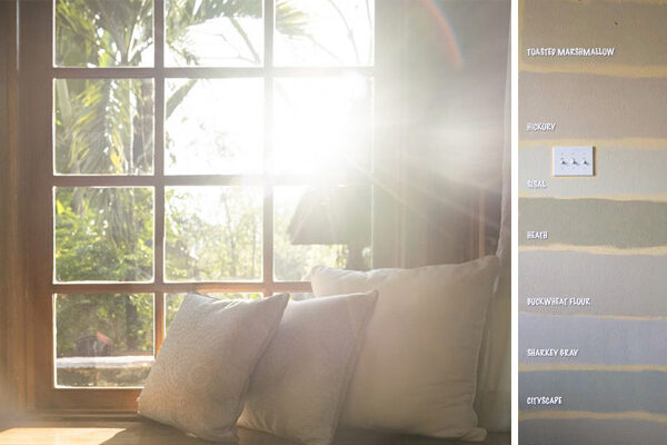
See this pillow (below)?
If this was the starting point for your room, which neutrals would you eliminate right away?
I’ll wait.
Don’t scroll past this image yet. Just stay right here and look for a minute.
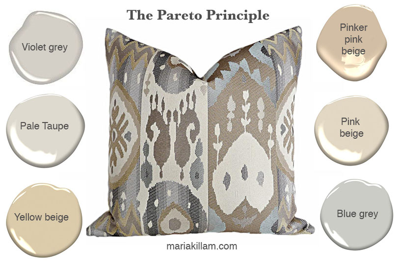
Okay, so we would eliminate the pinker pink beige because even though it relates well to the very strong pink beige colour in this pillow, you probably wouldn’t want to paint your walls this colour.
So that’s when you’d choose the lighter pink beige (below right).
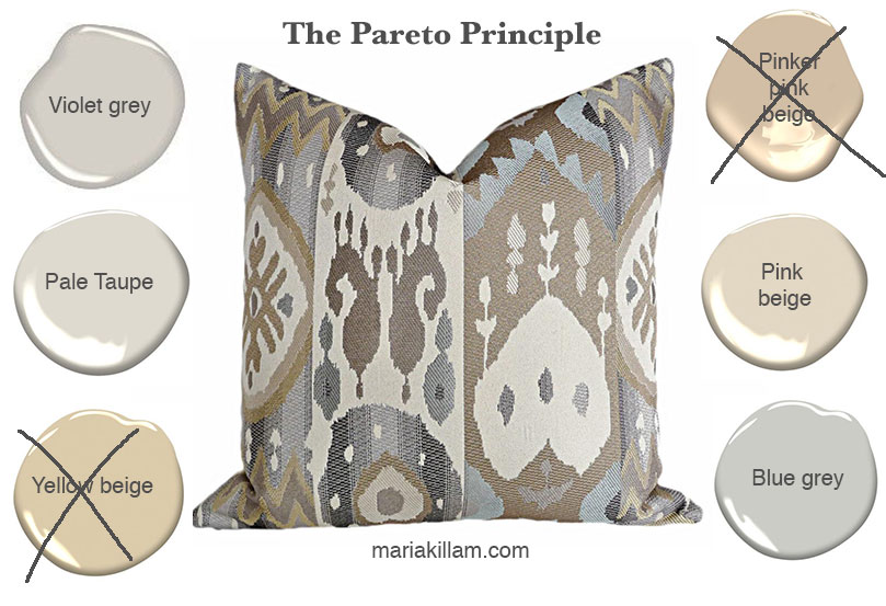
And the yellow beige because there is no yellow beige in this pillow at all.
You can see that there’s violets and blue greys and perhaps even a taupe.
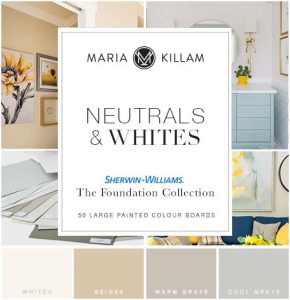
All these neutrals are found in my curated collection of 50 paint samples in Benjamin Moore or Sherwin Williams.
READ MORE: If undertones are new to you, download my eBooks here to learn my system.
You can also get the VIP collection, which give you some more pale greige neutrals, the best yellows, pinks, greens and blues and the best darks.

Notice the colours on the left? Well, you can’t see them all that well in the above photo, but mostly they are used for kids room colours or (as I tell my students) those yellows, on pillars in a parkade to signify caution– too screaming bright.
The ones on the right? Way too many pink beige colours and cold blue grays, so there are a few greens, yellows, purples including blues to choose from.
The ones in the middle that I’m sitting in front of? Those are the Designer Classics and the Heritage Colours, these are the ones we use over and over.
Before I sold large paint samples on the site, I painted them myself and this is how I did it.

So, just relax about knowing every single colour already. 🙂 Because now you know you only need to the most useful neutral colours in your tool kit.
All you really need for colour confidence is my curated collection of best neutrals and whites, click here to find out how you can buy your very own set. I’ve already done the hard work for you!
I promise my large painted colour boards are way cheaper and easier than painting them all up individually!
Buy my collection of large painted colour samples here.
Related posts:
Must-Have Tools for Colour Consulting
Insider Secrets to Testing & Selecting Paint Colours
Happiness is. . . Having the Career that you Love
New to this Blog? Click here ; Subscribe to my Monthly Newsletter; Become a True Colour Expert


I went to see a new client on the weekend to choose colours for their home. My husband was asking what I chose afterwards and on telling him, he said, "You never really choose any exciting colours, do you?" It's the 80/20 rule. There are 20% of the colours in my fandeck that just work and go with everything and are easy on the eye. The excitement then comes in the form of soft furnishings and accessories. My favoured paint companies here in Australia, provide (free of charge to decorators and colour consultants) 12" x 8" swatches so we don't need to paint our own or buy sample pots. Another benefit of using an expert rather than imagining with a 1" square chip.
When I chose the colour for my living room recently, we painted 1 foot squares of the 5 "winners" along the couch wall – lived with the colours for about a week, then chose something completely different. Of course. These sample boards would have been a lot easier to deal with.
Great advice. I love the colors that you chose for the samples too!
aaaah, I just love color. I dream about colors and fabrics ! The big paint chips are a great idea.
This always works for my client's. A bigger sample and a guarantee that they will like the color when it goes up. Well…98%of the time. Thanks for the visual Maria!
I totally agree with you. I was working for Benjamin Moore when they introduced this new palette and almost all of us hated it because the new shades were either way too vibrant or too washed out. In fact, I would guess that this reaction was pretty universal since they increased the number of available CCs (Classic Colours) not too long after.
Great idea, that's why your the professional! Thanks!
Love the idea of the bigger samples. But here's a news update: last month it was noted that in the US 10% of the people own 90% of the wealth. Ugh!
I do use the same 20% of colors over and over. I will have to start painting on boards!
You have nice nails. And that picture of you in front of all the paint sample clours. You look beautiful.
I've never heard of the 80/20 rule. Makes sense. Interesting stuff.
Every time I read your post I have a light bulb going off in my head. You are so clever, I will from now on forward paint my samples.
YES!
You fit so lovely in front of you passion – colors all around you!
Thanks for showing us how you make the samples. They look really good and so much better than the little chips.
That's a nice picture of you and if I remember correctly you're wearing your favourite green – very nice!
Thanks for the great tip! You blog is such a great tool to me as a new-be designer starting out. Thanks for all the advise you share with your readers, it is much appreciated!
Thanks for the 80/20 theory. I have heard it before but I never think about it but it is so true!
You did great on this one Maria! I have been out of sorts a few days, so I just had to get back to reading your posts!
Great info, Maria, thanks!! 🙂
I'm going to have to start a collection of my own big paint chips. God knows I have enough cans of paint in the basement!! 😉
Kelly
That is fantastic advice! Thanks so much for sharing with us. I have learnt so much from you since i started reading your blog. 🙂
I am so glad that you did this post. I am thinking of painting our bedroom gray. We are moving to a new home in a few weeks and everything is cream. I am loving gray right now and I like those two colors that you picked out.
This is such a great idea, and so very true!
i'm glad i've done something right. when choosing our paint colors i did big paint swatches painted on poster board like this. some people thought i was crazy, but it really did help in choosing the right color. it helps to see a big swatch in different lighting and times of the day.
i LIKE this on the poster board…I have been using 12×12 wallboard pieces…very heavy and cumbersome. So tomorrow I'll be off to get poster-board, much easier to transport.
How did you get so smart? heehee
xoxo
great idea to make your own color samples!!!
xo,
cristin
Brilliant…LOVE the big swatches!
Excellent tip!!!! By the way, I adore your green belt! 🙂
You gave us a good advice! And very intresting to know about the 80/20 rule! And yes you are right! We hardly ever use the same colourpalet!
Great post Maria!
Greet
Maria, the ostrich fabric is from BB Bargoons in Toronto.
Kelly
Good old Vilfredo Federico Damaso Pareto with the 80/20 rule. Glad to know others are using the bigger paint boards as well and clients do get a better feel for their color choices too. More magical tools for our designers toolboxes!
Bette
I have Stonington Grey in my half bath and just love the color
Little slow getting a chance to read this, but great idea!! As usual you put out great info. Thanks!
marcie
Love your picture! Great tips too.
Ciao.
Great post, and great tip on the paint boards. A great way to save time and energy on having your favorite colours at your fingertips for next time.
what a great idea!!! you're the best!!!!
xoxoxo
You are so right about the 80/20 rule with paint colors. Only about 20% are the most often used colors and the rest are there for their 'rack appeal'. Nice post and I completely agree that sample boards are the way to go.
You nailed it, it's so true, & the colors you selected look so yummy. I just used white dove on some cabinets and they will look dreamy when they get installed.
Though, sometimes frustrated, I am finding there is a new challenge in picking color, that is the mandatory change of switching to CFL light bulbs. It seems the original 20% is gonna need some tweaking 🙁 Have they changed your decisions on any colors you have selected?
Lighting is in transition, and we are on our way to LED. (CFL, you can get warm, and sunlight, and that helps)
LED is measured in Kelvin, not watts. It comes in a spectrum of colors, so it is indeed going to be a learning curve for us all. Even lighting professionals are still sorting it out, so if you feel bewildered, you are normal.
Currently, what is out there says we probably want to buy 2,700 Kelvin, which is more like an incandescent.
And now, Philips is selling a lighting kit of four bulbs, controllable through a smart phone, where people can choose the color of light from a full palette. You can make it cool morning light, warm afternoon light, on and on and on and on, till your head spins.
Light is important, you are correct. It will be a while before things are at a place where we feel like we ‘get it’, is my bet.
Back to CFL, just buy the Warm ones. Take the time to select the right bulb, then, KEEP THE PACKAGING so you know what you want next time.
Maria, I just learned of your blog recently and absolutely LOVE IT! Your posts are so informative…I've got to take some time to get caught up!
I am new to your blog, but wow you have lots of great info. I need a lot of color help! But if Karena and Ruthie are here, I am in. I am going to take a look around your site now, "color" is not at all easy for most of us non-pros.
I CANNOT miss your blog posts….it would be like cutting class at school…I learn SO MUCH from you and enjoy myself at the same time. You are in my top 5 blogs that I go to without fail. Thank you so much for sharing your knowledge with us over and over and over!
I went to Maria's class in Atlanta last week and can't tell you how much I enjoyed it. I am still absorbing, a week later, with ohs and ahs. Meet wonderful people…..It was worth every minute. I didn't want it to be over. I am looking forward to keeping in touch with everyone especially Maria.
Maria,
You are the best. I used to live in Toronto and should have know about you when I was there as I could have taken your class. Now I'm near NYC. Come here please!
I have used 11 x 14 cardstock to paint BM samples on, thinking I should try to order tabloid size 11 x 17 instead. It’s pre-cut and I find it does not buckle at all. I put the 8 1/2 x 11 ones in plastic sleeves and soon they are very flat.
what cabinet color do you like with the Abingdon Putty if it has all those undertones in it? thanks
Another great post. You keep knocking them out of the ball park.
I took your advice, and after I painted the guest room, painted a huge sample of that paint on white core foam. I have taken it with me to pick out bedding, and boy did I feel smart. It worked like a charm.
Today, I needed to pick out upholstery material for a side boudoir chair, so I grabbed the board of wall paint, the chair, and off we drove.
I was able to find a MOST GLORIOUS color for the chair seat, and could NOT have done it without your sage advice on a big swatch of color. (And knowing which undertones to reject and to look for. You would have been so proud of your student!)
I also took your advice and made sure i was looking at the colors the way they would be in real life (fabric on the seat cushion, board of wall color vertical. it really DID make a difference).
I have the chair and new fabric home, and as squealing with delight. If I may say so, I nailed it. Or, WE nailed it.
ALL Kudos go to you — I have been reading your blog for years, and it is now paying off, as I am choosing colors and a palettes, and see it all come together.
You are a STAR!