I’m very excited to announce that as we speak, I am getting large sample boards painted in Sherwin Williams best greys and whites. There will be 25 per set and they should be ready by the end of the month!
I have received many requests for large samples in SW colours, since there are many parts of the country where the demand is great for Sherwin Williams. And of course, they will be categorized to fit inside my Understanding Undertones™ system.
So I’m having a giveaway for one set of 25 large samples, to be shipped as soon as they are ready. Just tell me which SW grey or white is your favourite and why in the comments below.
I’m in Vancouver this week leading my Specify Colour with Confidence™ Event!
Don’t forget to tell us why and which colour is your favourite! xo Maria
Related posts:
What Everyone Should Know about Gray
The Best Pinks to Celebrate Valentines Day
The Best Gray Paint Colours from the Experts
If you would like your home to fill you with happiness every time you walk in the door, become a client. On-line or In-person.
Download my eBook, How to Choose Paint Colours – It’s All in the Undertones to get my complete step-by-step system on how to get colour to do what you want and to make sure the undertones in your home are right, get some large samples!
If you would like to learn how to choose colour with confidence, become a True Colour Expert.


SW Popular Gray is my favorite. It’s warm and light enough for a room without much sunlight. It changes to slightly beige under warmer lights. My kitchen and living rooms are in SW Popular Gray but each room looks slightly different in color.
Hi Maria,
My favourite gray or (grey) by SW is Keystone Gray.
This neutral gray works great with the golds and reds that I love..
Thank you,
Shelley
As a local designer in Atlanta- we’re always pushing the traditional feel out of the homes, and introducing some more traditional looks. SW Amazing Gray 7044 allows me to introduce a grey color pallet that doesn’t scare my clients too badly- it’s the perfect transition from beige and still allows them to use a lot of their beige pieces. It also looks pretty amazing with SW White Duck 7010. These colors work in so many spaces- they’re my go-to’s right now! I would LOVE to win your SW boards to help me grow as a designer and follow you’re amazing teachings of undertones- they’ve changed (and vastly improved) the way I work! A million thanks !
My favorite SW grey is Repose Grey. I’ve used it in two different houses and it always looks good. My aunt is going to use it for her bathroom remodel. It’s a pale grey with green undertone, seems to look good everywhere!
Thank you for presenting your expertise using SW! We built a new home in 2012-2013. We used SW Dover White and SW Sedate Gray with SW Anonymous on island and built ins. The Sedate Gray is the perfect background for the beautiful and colorful water colors and prints my sister painted. The warm white adds warmth. Our family and friends comment that the colors are so soothing and calming. I love that because I want our home to be an oasis away from the noisy world outside. Thank you for your blogs, book and teaching this novice so much about undertones!
Janie, please tell me about the exterior of your new home!! Interior sounds simply gorgeous so I’m sure the exterior is as well! We are building as well and looking at ideas!
I am a big fan of SW Useful Gray for its slight green undertone but still has a bit of warmth in it. It is an inviting greige which works well given our dark Seattle winter days. Mix it with a creamy white and warm cognac tones and it comes alive.
I was going to nominate SW Passive but as Maria says, it is going to look very blue in some lights so you need to take that into consideration. It also looks fantastic with creams and a can’t fail for updating ’80s oak filled interiors.
I’m liking Silver Strand. I think it would look very glam in my bathroom with polished chrome fixtures and mirrored surfaces.
Collonade Gray 7641
My favorite SW white is Antique White- SW6119. I love the yellow undertones and it really works well with warm woods. This color compliments many types of decor and really helps to create a warm yet crisp environment.
Silver Strand – so classic
I like Lemon Chiffon because I love how the color changes throughout the day.
Hi Maria! I love Sea Salt; it’s such a nice soft neutral gray that doesn’t seem to read too much like a color, at least in my home with lots of cherry-stained wood trim.
Aw, I wanted to use Sea Salt. It looked good with my cabinets, but not with the fireplace stones with pink/orange/yellow undertones!
After reading your post about how white walls don’t work without tons of natural light, I went with repose gray and didn’t look back.
Thanka for doing SW colors now, too! So helpful for me, as I always use sherwin williams colors due to their availability in my area.
I just painted my sons’ room Mindful Gray. It’s a warm gray that will grow with them, yet pairs beautifully with the navy and red we already had in the room.
Just used SW Jogging Path in my new home office. A beautiful color that goes well with different woods and also stainless.
I’ve been such a Benjamin Moore girl that I haven’t branched out and tried the SW palette yet, but I keep seeing great colors from them. So, I’ve looked at several pictures on Houzz this a.m., and so far I’m liking Mindful Grey best- it seems light, soothing and warm without reading as too beige-y. I just specified Revere Pewter for a house yesterday, and in looking at these photos I think Mindful Grey would have worked as well. Maybe I should get these new SW color boards! 😉
Jill
Mindful Gray in some lights can have a slight purple undertone and I HEAVILY caution that most photos on Houzz are professionally done and altered a bit with filters so you need to consult your paint deck also when viewing those photos for a truer read. I know what wall colors I spec all the time for clients and the photos often portray a much different undertone than in person.
I totally agree with Lisa. I painted my lower level with Repose Gray, Dorian Gray and Dovetail, which all have more of the greenish undertone. While I liked Mindful Gray, it just felt it didn’t go with the other colors in the strip. It does read purple instead.
Hard to choose just one but sea salt it is. Glad to see SW paint color boards coming our way. Can’t wait Maria!
I would love to win the 25 SW paint colours because I aspire to have no fear when suggesting colours to others OR to myself. I never want to feel inept again with undertones because I want to be happy!
Love SW paint!
My favorite gray is Useful Gray (7050) because it is very soft and warm.
Erin, did you put up a coordinating color?
My favorite grey is the one you specified for my house, Maria!!!
I’ve got SW divine White on my ceilings and some walls. It’s a nice neutral for my limestone fireplace.
I am always looking for a neutral but mauve/purple tone colour. At the moment I like SW 6008 Individual White. I also like SW 6015 Vaguely Mauve but it might be a bit strong.
I am really looking forward to having a set of the SW boards!!
I have SW color 0062, Studio Mauve, in a windowless bath (Dover White ceiling.) Surprisingly, it has worked as a neutral–reads somewhat gray. SW shows it as one notch darker than Vaguely Mauve. You might look at Collonade Gray–it is the equivalent of BM Revere Pewter–which I perceive in some rooms as having a (slight) purple undertone.
Absolutely without a doubt – I LOVE SW7043 – Worldly Gray, and I’m surprised I didn’t see it on the list of comment (so far!)
It is very close to Agreeable Gray (which was a close second for me) but in my main hall (downstairs and up) with some challenges (low-light, multi-coloured flooring, large awkward area) it gave that chameleon kind of “oomph” that I was looking for…I even looked to Urbane Bronze (SW7048) for my interior doors and man does it sparkle!
Thank you for all the helpful information and resources about color and undertones. Love it!!
My favourite is Essential Gray, we used it in our dining room and still love it three years later!
Hey Maria, we are almost finished redoing our 2 story lowcountry style home in Louisiana and we used colors from SW strip Elder White 7014 for trim, Repose Gray 7015 for ceilings, then Dorian Gray 7017 in Living Room, Dovetail 7018 in MR down stairs and in foyer, Gauntlet Gray 7019 for DR and Kitchen (with the white cabinets) and Black Fox 7020 for front door and back French doors inside and out. Love Sherwin Williams!
I’d love to see pictures, especially the Black Fox French doors.
Repose gray is my most popular at the moment!
I love Swanky Gray! It is inviting, warm and has a nice purple undertone.
Pediment. Neither gray nor beige…
I painted my office Conservative Grey and LOVE it – so bright and airy! I just bought Pussywillow for my en suite but haven’t painted yet. Fingers crossed!
Oh, there are so many wonderful whites and grays it is hard to pick one! I think one of the most useful colors for homeowners coming out of the “brown” decade and entering into “gray” land, without having to change too many finishes, is Intellectual Gray SW7045. It is very warm and works well with woods of all colors, many bossy granites :), and many of those old sofas that have to stay around for a while!
And, it works well for holiday decorating….any season. I would love to have the SW colors!
The large samples would be SO helpful! I’ve specified Agreeable Gray quite a few times. I also really like Sailcloth too.
I do like agreeable grey!!
Love Sherwin Williams paints. When I lived in AZ. they did a lot to attract designers. (and it worked!) I am planning on moving to Hot Springs Village in AR. in about a month. Am doing a lot of cosmetic work in our rental, at the request of the owners….they are even splitting the costs! Please help an old gal out……am pushing 73, and have designed in many states……adore your blog…best there is!!!!!
Thanks Victoria 🙂
Dovetail in bedroom. Looks great!
Very excited that you will making Sherwin Williams paint boards, yah! Definitely want to learn more about what they have to offer, and no better way than Maria colour boards! Love to win them 🙂 I like SW 7029 Agreeable Grey for its flexibility in using in staging projects.
These SW color boards would be so handy since that is all I can get in my area. Whenever I try to have BM colors color-matched by SW they are never quite the same. At first glance they seem to match but then at different times of day the undertones go in different directions.
I love many SW grey colors, but one of my favorites is SW Amazing Gray….I love your work and blog!
I enjoy Peppercorn. It’s moody, but neutral enough to be perfect for a gray bedroom.
I am about to repaint many rooms and these boards of SW colors would be sooooo helpful!!! Love all I learn from your blog, Maria!
Recently used Sherwin Williams’ Morning Fog in a formerly pinky-beige interior of a friend’s home. It looks so much better. I like how the SW website allows us to see the RGB values. And thanks for allowing us to have the opportunity to win one of your sample sets, Maria!
I too really like the SW website for RGB & providing color tweaks (darker, greener etc). I tend to prefer the color schemes SW provides “better’ than BM–but love Ben Moore paint. Thankfully, my local paint vendor is very good at color matching.
Love the Sherwin Williams grays – one of my favourites is Intellectual Gray (SW 7045). I love that it’s the perfect combination of gray and beige!
Great giveaway Maria!
This is a little awkward for a comment. I have always specified Benjamin Moore colors but am starting to get many requests for Sherwin Williams and know nothing about their colors so winning this would be a huge help to me. 🙂
I love Peppercorn because it is a rich dark gray, perfect for painted accent furniture. I too am a BM person and would love to learn more about SW. I appreciate the sample card giveaway. Thank you!
I love your blog Maria and feel like it has made such a difference as I’ve been redecorating my home!
Whee! I just downloaded your book, How to Choose Paint Colours, and have already scanned through it. Wow! I’m going to purchase a copy for my daughter, too–she’s about to build her first house and will love your advice as much as I do, I’m sure.
Thanks for the sale–it was just the nudge I needed to add to your bookmarked blog (I check every day!) and your newsletter. Thank you, too, for making colors easier to understand.
I would love to win your colour sample give away because in my mind I have painted my home several different colours and never seem to be sure. Love all your colour articles and photos.
I really like Sea Salt – enough grey to be calm and sedate and um grown-up, and enough blue and green to be interesting. Has a lot going on especially in different lights. Topsail is good too but maybe that’s too blue to count as a white or grey…
I always go to my BM fan decks first but SW usually has what I need if BM doesn’t and, of course, have always been a fan of SW Antique White.
But now, I have a new favorite SW color – Urbane Bronze! It is so flexible! Rich, deep gray that looks luscious with browns and every wood tone I put with it – AMAZING!
Your book was brilliant and I keep dreaming of the day I can invest in all your boards…
My favourite SW paint colour is Mindful Gray. It’s such a soothing colour! Thanks Maria for all that you have taught me. I look forward to your blog posts; I read each and every one.
Just in time. SW whites and grays ready for my whole apartment redecoration project. Going for a new look in 2014. I want a home that reflects me as well and has an inviting comfyness. Is that a word? I know the feeling I get from homes that invite me to sit back and enjoy good conversation and friendship. Wanting to convey that.
I’ll have fun going shopping with the SW colors.
Special Gray. The perfect colour for a feature wall in my bedroom, warm, with a touch of violet changing tone as tone as the daylight changes.
Agreeable Gray 7029 walls
Pure White 7005 trim
Tricorn Black 6258 doors and windows
Aloe 6464 for a splash of spring
I just used these in a Show Home and it is truly refreshing….
Painted the exterior brick Agreeable Gray too and it is so warm and welcoming, but on trend with the new grays.
Front door is a beautiful Peacock Blue, Grand Canal 6488.
Would love to win your new sample boards… Thank you for the opportunity.
Donna~ we just built a home and painted the living area REPOSE GRAY and it really looks tan. I visited a model home and LOVED the color and the REALTOR said it was AGREEABLE GRAY. Some sites say REPOSE is “gray”er than AGREEABLE. Any thoughts? I LOVED LOVED LOVED the AGREEABLE in the model home I saw but we do have a little more light coming in than that house. Thanks for any input.
I actually don’t use Sherwin Williams paint because I don’t have a fan deck. I LOVE the big sample boards I bought from you and would LOVE to have the Sherwin Wiliams ones so I have choices for my clients
Yes! Our local Ben Moore dealer just switched to another brand with very limited choices so Sherwin Williams will be the only option without a 300 mile drive. I love both brands so this will be most helpful.
SW alabaster. Perfect for white painted brick!
I started using Sherwin Williams about a year ago and am using Dover White to paint my guest bedroom. It has a hint of yellow to it, and looks wonderful with my warm woods.
I love reading Maria’s Blog. I have the ebook and highly recommend- well worth buying for a detailed explanation of colors. Would love to have the sample boards as we are buying a new house.
I love SW Anew Gray & Mega Greige! Thanks for the opportunity to win 🙂
One of my favorite go to neutral colors is Sherwin Williams Natural Choice (7011) because it’s a white with a hint of gray and absolutely NO PEACH undertone. It has worked great in every room I’ve used it in and provides a wonderful contrast with my bright white trim.
Hi Maria: Love your BM paint boards…looking forward to see your SW picks.
I’m currently loving Gauntlet Gray SW7019
Thank you for the wonderful tips and giveaway!
So excited about new colors. SW Agreeable Gray is one of my favorites. I hope I win one of the sets!!!
SW Roycroft Vellum is a heavenly perfect color. Is it green? Is it yellow? Is it vanilla? Is it white? It does not matter because it is divine background in any light and with any color (even pink probably) of any fixed or non fixed element in any room within which it is placed. It is a triple play of joy, relaxation and comfort. It is generous of spirit because all other colors look good with it. The light of the Elysian Fields is probably Roycroft Vellum.
My daughter and I are currently considering grays to paint her room. We like Twilight Gray, Mindful Gray and Light French Gray. We feel that she could add bright color around the room with these wall colors and it would look sophisticated and fresh. The sample boards would be extremely helpful to us while we make this decision. I would also like to use a warm gray in the living area – again, these boards would be of great value as is your ebook! So informative!
I am currently considering SW Passive or SW Tinsmith for my kitchen/ family room great room walls, which has many windows with western exposure. I am wanting gray, not greige walls. Thanks to your blog Maria, I now know this exposure will cast a warm, orange light which means I need to select a cooler gray for my walls. Until then, I couldn’t figure out why every gray I considered became too greige or even beige. Of course a collection of SW samples would have made this much easier. : )
Sherwin Williams Sedate Gray is a lovely clean gray I can use in therapy offices. The staff want grays that are not depressing, which really depends more on the other colors in the room. Sedate Gray is easy to work with.
Worldly gray, warm and cozy . Love Sherwin Williams paint. In my area they have sales often, 40% off 4 times a year and 25-30% off almost monthly. This can be a huge savings, but I love the quality of the products they offer, Super Paint is one of my favorites and very reasonable.
Thank you for this lovely valentine’s day gift on the discount of your e-book. Lots of love to you and yours.
Thank you Maria! Happy Valentines Day.
SW Agreeable gray, we have it in bedrooms after seeing it done in a friends house. They have it on all walls and ceilings. xo
Ooooh how exciting to possibly win those SW sample boards!!! I’ve always loved Repose gray 7015, Worldly gray 7043, and good ol’ Dover white.
The 2 grays have a good depth of colour and are on the cool side which I find my client’s are craving now. Fingers crossed!!!
Hi Maria!
I am acutally looking at SW greys for our house. I love accessible beige ( I think thats whats is called, agreegable, accessible and perfect, I can never keep them straight!) It looks grey, then beige.
Can’t wait to see the SW colors you’re picking for the new boards.
I love your blog and learn so much from your expertise. I would love to win these new boards.
My favorite SW paint is amazing grey.
Betsy Gordon
West of the Square Designs
Comfort Gray- a beautiful mid-tone bluish gray which I used for my living room.
Maria,
I love your BM boards…use them all the time. Can’t wait to see your SW ones (please no colored logo stickers on the front!!!). Right now I’m loving SW Front Porch, a pale blue gray. Thank you!! Andrea
My walls have yellow undertones, and I have a dining room that is SW Well Bred Brown. The light yellow undertone in SW Dover white is perfect on my ceilings!
I’ve never used SW colors before–I’ve been Benjamin Moore all the way
I am so excited that you are doing the SW colors. It is my ‘go to’ fan deck. I paint the colors on mat board so my clients can see the colors in any light, anywhere in the room. I would love to have something more professional to show them. How to choose Paint Colors has been a great help, I am getting calls, just to color consult. I love it!my favorite white tone is SW Creamy. I have used it over and over. It goes with so many colors. My favorite grays are SW Mindful Gray. I also love SW Silverplate. It reads as a true gray in almost every circumstance.
Maria, one of the trends you mention for 2014 is cream. Will you do a blog post on creams soon? Thank you.
I love Sherwin Williams paint and have used their colors throughout my house. I have invested so much money in paint samples trying to choose colors. How wonderful it would be to have my very own large samples! Think of all the money I’d save!
I love the deep, richness of Chelsea Gray against the contrast of a crisp white trim. I have used it in a contemporary master suite with black furniture and in a traditional guest bedroom with an antique bed and it looks amazing in both applications.
sw 7551 Greek Villa I don’t know how to describe it…almost white…maybe I just like it for its name!
I am a new interior designer practicing in San Antonio, TX. Sherwin Williams is king here and I would LOVE a set of your sample boards!
Thank you for an educational and entertaining blog. I really enjoy reading and learning more about color and how to avoid pitfalls. Truly inspiring!
Kindly,
Gina Roth
I forgot to list my fave: SW Worldly Gray is a great neutral.
I love SW Dover white. I used it to paint my kitchen cabinets, doors, and the trim in my house.
I have all the Ben Moore color boards and would love to have the SW ones too! The boards are sooo helpful in seeing what the color would look like on the walls.
SW 6169 Sedate Gray is one of my favourite Sherwin William greys because I think it goes nicely with bright colours to brighten up a room.
Hi Maria!
I am the Queen of Comfort Gray! I’ve used it in all my houses, looks great on the ceiling as well as walls, with white trim or cream, and with all shades of wood floors or trim. It’s a blue/green – very similar to Restoration Hardward Silver Sage or Ben Moore quiet moments – but Better!
I was chosen to decorate a room in the 2013 Baltimore Symphony Orchestra’s Annual Decorators’ Show House. I designed a powder room called ‘Falling Water’ based on inspiration from Frank Lloyd Wright and Comfort Gray was on the walls. Beautiful!
Aha! I may have found the colour I’m searching from…thanks for the great description:)
I have all of your Benjamin moore color boards and would LOVE LOVE L O V E the new sherwin williams boards!!! Can’t wait to get them!!!!
Have you found a great way to keep them “bagged” so to speak? It would be great to have all the paint boards in sleeves and be able to flip through them to find the color your looking for. Any suggestions, ideas?
I forgot to tell you which Gray is my favorite!!! It’s Mega Griege! Mega Greige is painted in all of the common areas of my home (family room, kitchen, dining, & entry) The color is amazing with dark woods! Check out the home tour pics of the rooms mentioned above at http://www.InChicOrder.com.
I store mine in a relatively flat nylon bag lying flat in the bottom of my trunk, there is no way to keep them organized, that would just take too much time. It’s the reason why the colour names are on the front. I arrive in my clients home and spread them out so I can grab the ones I need.
People are so happy that you have large samples, they don’t mind if it takes an extra few seconds to locate the one you need. Maria
Snowbound — it’s so subdued, not harsh at all. Also fond of Sea Salt, in fact it’s my favourite, but I’m not sure whether it would be classified as a grey or not (it changes).
The SW colour boards would make paint (and really all decor) decisions so much easier in our upcoming new home build! Love the large scale and true colour.
love repose gray!
The SW colour boards would make paint (and really all decor) decisions so much easier in our upcoming new home build! Love the large scale and true colour. I like SW ‘comfort gray’ because it seems just that, comforting.
Well, iI already have the updated ebook and am subscribed, so now i just need the sample boards and I’ll be set. Thanks for the opportunity. CTD
I don’t have a favorite neutral. I’ve used SW bold colors before but am seemingly paralyzed when it comes to choosing wall and trim colors. And I’ve purchased your book, truly enjoyed it too. Need color boards please!
What a cool prize!
My fave is Gauzy White SW 6035.
Such gentleness to surround a room in.
Thanks
Which ONE SW white or gray? As SW paints are more readily available in the CO front range, I’ve found many favorites in their selections, many mentioned by others. (Wonder how many of them made it to your new kit!?) My LATEST favorite is Natural Choice, SW 7011. We tried it out on a ceiling with Sedate Grey 6169 on walls and also the much darker Retreat 6207 in an adjoining area on walls. Love it–mellow, grayed white, enough pop with the Alabaster trim, so it’s going up on soffits and tall walls in adjacent loft.
You were a Godsend helping me choose my cabinet colors. I get excited every time I receive your blog via email!
Greek Villa SW 7551 is the color on my white kitchen cabinets and trim throughout the house. I love it with Fawn Brindle SW 7640 walls and ceiling.
I just had my old 1950’s cupboards laminated with the upper cupboards in Eider White and the lower done in Dovetail. They both match my new granite countertop perfectly! Now I’ll use your ebook (I have it) to pick a grey and white for my newly sprayed white tiles in the bathroom. (They were coral and black-yuk!) I might add a little lime green for “pop”.
I’ve always just used the little color strips from the SW store to choose.
I love SW7066 Gray Matters.. It’s just the right amount of undertone – not too cool and not too green. It’s versatile – looks great with wood floors.
Gray Matters is a tricky color! We chose it for our exterior bc a neighbor used it and it looked great, a true GRAY! She has a wooded lot though. Our painters started painting our new house which has NO trees for now and full sun and it was BLUE!!!!! That was a $400 mistake!
I would be so well armed for my next career in design to add the the Sherwin William large colour samples to my Benjamin Moore samples which I purchased from Miriam!
I cannot imagine being any better equipped in the field of design then to add the the Sherwin William large colour samples to my Benjamin Moore samples which I purchased from Maria!
In my Florida house, all walls and ceilings are Natural Choice SW7011 and trim Pure White SW7005. It’s a nice palette for accents. Hope I get the boards so that I can try some new combinations!
I like Olympus White SW6253 because it’s a very soft, light gray with some hints of blue undertones. Nice if you’re looking for just a small variation with clean white trim. Crushed Ice SW7647 is also a very pretty light gray that’s very neutral without too much obvious undertones.
Great Giveaway Maria! Thanks!
My favorite SW grays that I’ve used many times are Agreeable Gray and Amazing Gray. Thanks for the opportunity to win the new SW boards!
Sea Salt is my current favorite. Just used it in my living room and it reads gray, green and blue all at once. Gorgeous!
My favorite white is 7005 Pure white. I have this (oil based) on all of the trim in my house and on my kitchen cabinets!
I am considering painting my bedroom Repose Gray. The SW cashmere finish goes on great and is a nice finish on walls.
I have to admit I have never used Sherwin Williams paints. But I always have an open mind about ned products.
Please count me in~! I typically use BM but Dover White is big with my clients. Would love to WIN! Thanks mucho, Maria!
I’m a ben Moore girl but SW is second in line. I love Repose Gray & actually would like to learn more about SW colors.
ditto to using SW agreeable gray on ceiling as well as on walls !!!
I’ve used mostly Ben Moore Maria but looking forward to researching some of these SW colors mentioned above as I am searching for a nice warm gray…
Thanks for offering this giveaway!
Roberta
Hoping this us where to enter for Sherwin Williams sample boards. I am looking for a color to paint in our bedroom with north exposure window in closet with south exposure. Our duvet color is white with Caribbean blue and strips of black which I am very fond of. It would be helpful to win color samples.
Hi Maria,
Great idea, I love the BM boards I bought from you and would love to have SW boards, since I do use SW often. I use#6204 Sea Salt often. It a greeny gray. Favorite white for trim is SW #7006 Extra White.
Great white wall color that’s not too white is #6385 Dover White. Looking forward to a new set of tools;-)
Maria,
Another idea would be to add a sticker on the back with the undertones pre-printed for us. I usually take your boards in hand and compare with your book and write them on the back for quick reference. Thanks.
Love BM Balboa Mist – a soothing light pink gray thatmakes everything else around it look pretty. Pairit with BM Dover White
Agreeable gray is my current favorite!
I’m really enjoying Anonymous. It’s a great brown grey that’s a warm livable color. We used it in our basement at our new house and as our exterior color. 🙂
SW Agreeable Gray because it is an inviting, warm gray. Thanks for the opportunity to participate in your drawing!
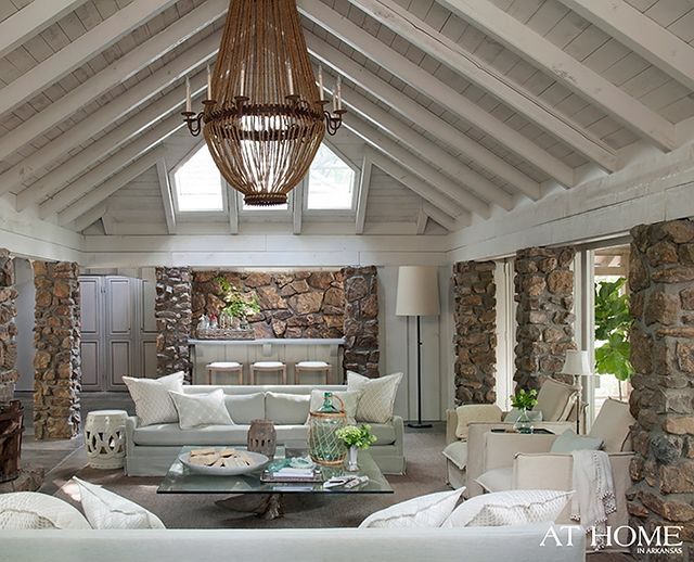
Maria, according to an article in the LA times that fabulous lighting fixture (Jeffrey Allan Marks) is custom and was assembled rather than purchased. Here’s the link: http://www.latimes.com/home/la-lh-jeffrey-alan-marks-meaning-of-home-photos-20130909,0,1769441.photogallery?index=la-lh-jeffrey-alan-marks-meaning-of-home-photo-011&gallery=large
Do you know any talented welders?
I’d love to win the sample boards.
Penny
I have specified Agreeable Gray in a living room recently that looks great.Cool and classic. I used Dovetail in my Master Bedroom and it is like a cocoon. I have also used Urbane Bronze on cabinetry to tone down orangy granite with great success!
I have used Benjamin Moore paints for the past 22 years – but the Ben Moore store in my town has closed. Will be happy to switch to Sherwin Williams.
SW Mindful Grey looks fabulous in my hallways, foyer and dining room, no matter the light or time of day. Great choice!
6105 Divine White – which is the lighter tone of SW’s most popular color, kilim beige. I just painted the entire great room/kitchen area kilim, along with Nomadic Desert on the living room walls.
SW Dorian Grey. Being in Tucson Az. pale colors just seemed washed out. Something stronger but still giving me the beauty that grey can have.
Versatile Grey. I find it, well….you know, versatile. It can fit into so many spaces and look modern or more transitional. Just a great, warm grey
Sherwin Williams colors are right up there with BM. The Navy trend is so elegant and moody, classy and new. I say YES to houseplants to soften up interiors, add life, and even help control indoor air pollution. We have some exciting and refreshing design trends for 2014!
I have not used any of the grays but they look fun and I have a Sherwin Williams close to my house and have used their wonderful paint
Comfort Gray – it’s not too light, yet not too dark!
I usually purchase Benjamin Moore or Behr. But after reading all the comments I’m checking out SW tomorrow.
Seems like Repose Gray or Mindful Gray are good choices. Ritaemilia’s description of Roycroft Vellum is interesting. Will look at that also.
We’re looking at Functional Gray for our living room! Of course, we’d love to have your boards to help with the decision!
Sea Salt is a long time favorite, but Urbane Bronze has found its way into my palettes lately, possibly as a way to warm and enliven the grays and whites. Dramatic, but natural and earthy.
I’m also mostly a Benjamin Moore gal, would love to win the Sherwin Williams boards to try them out.
My favorite is Moderate White.
I love sw colors and have used them for years. I love Westhighland white and sea salt!
I have used Mindful Gray twice in my home. The first time was in the kitchen (which is flooded with light most of the day), and I love, love, love it. So much so that I painted my bedroom (which gets no direct light), and I hate it: with not enough light it gets muddy. A hesitant thumbs-up for Mindful Gray!!
Great giveaway, thanks Maria!
I have only ventured into BM colors, however I am struggling to find a dark grey that will work with the rest of my painted walls…am very intrigued by SWUrbane Bronze for some cabinets. Have to check that out- looks really brown on
My computer monitor as opposed to gray… And not sure what undertone it is. Will have to check it out. Would love the opportunity to see the SW paints in large boards!
I paint up large boards when I buy a BM
sample paint BUT WISH I had just bought your sample boards Maria! it has been a long journey …painful for my husband;) of trying to learn the undertones- have your book too :).
Thank you!
The grays I mostly spec for clients are either sw7037balanced beige or sw7038Tony Taupe. These are located in the ESSENTIALS collection that houses many of the go to grays mentioned here in the comments. This strip of colors is the only one in that collection that leans a little taupe and with only a slight hint of gray. I did not read any comments about these taupey grays, so here is the 411… Most of my clients have tile and or carpet/ granite with a Tuscan gold color or even the dreaded pinky beige. The taupey gray is the best foil for these issues as the tile/granite is usually staying. Many of the grays mentioned here work better in newer builds or total renos! Lots to learn here in the comment section about everyone’s colors. Fingers crossed to win!
Always tickled to see you grow and become more and more polished at your blogs and all online presence.
Keep up the good work!!!
p.s. tickled to see you add SW colors!!
How fun to read the colours that everyone else is loving, but Sea Salt is a favorite of mine.
Perfect for the bath we just added on to our home. Comfort Gray will be used in the next room that I am renovating.
Thanks for all the inspiration Maria!
SW Popular Grey looks just lovely on the swatch. I’ve never used it (usually BM paint) but we just opened one here in town so the samples might make it worth it to check out their line.
Thanks for the chance!
I have not used SW, but reading all the responses has really piqued my interest to take a look. Love to win some SW color boards.
I have painted up some of my own BM board samples.
Maria, that’s the only offer that can get me excited about V.day! Thanks! Best wishes.
Yippee ! SW colors… I am elated!
I used SW Natural Choice in my bathroom re-do back in 2007…it worked best because I was in a quandary with some with pinky “beige” accent tile that we installed above the shower. SW Natural Choice had some green in it which seemed to balance it out.
While I do love BM products, and the colors I have used, I must say for me it was frustrating because my source for buying BM is from a local “contractor supply” . They do sell to the public, but the hours of operation aren’t practical for me, so I have no choice but to go there on a Saturday morning, very early I might add! I’ve done it so often because I would agonize over trying to find a comparable SW color that would be “closest” to the BM that I wanted… to no avail, I always end up going for BM.
Now I can finally have an option between the two!
I purchased your e-book on color back in 2012, have relied on it so often. It is a great resource!
Thank you Maria!
Great to hear you are including SW colors. I use both BM and SW regularly. Argos Grey for me.
I like grizzle gray for a dark gray and repose for a lighter gray. Thanks for the giveaway!
Ocean Floor – I have always been drawn to the use of darker colors in rooms…maybe because I am a moody person LOL! Look forward to purchasing your book and having it on display for the interior designers at my store Acorn Design Center in Andover, MA. Thank you,
Paula Bakies
Sea Salt for me. It is the perfect gray for coastal living; beachy look. Plus it blends with existing pieces very well.
In Oregon (grey so much of they time) many clients have not wanted to commit to a paint color that was to “grey”. We love SW6071 – Popular Gray. A color that reads a little warmer than many greys. Is a fabulous neutral color. Can’t wait to have the SW colors since that is what we primarily specify!
So many beautiful grays, it’s hard to choose, but Urbane Bronze is a lovely brownish gray. Mixed with lots of light colors (SW Dover White) it creates a dramatic feel in the space.
sea salt is my favourite
Dovetail Grey, It’s warm, yet bold. Other colors look fantastic with it.
I tested a few SW colors by painting boards myself and I found Mindful Grey went well with the warm orange hickory floors that I have. Thanks Maria !
SW color board giveaway? One word….please.please.please.
I win anyway because I am a longtime follower of your blog. Thanks Maria.
I love Shoji White, especially in a Master and Worldly Gray. My clients also love Comfort Gray.
Sea salt. Using in a beach house bathroom. Will be happy to get sw boards. Used th BM boards when specifying colors in a 10,000 foot house and it helped so much! Well worth the investment. Have sinced used in four more smaller homes and clients very happy. Love the book As well. Also including a reference sheet as to which colors work well where and paired with what is helpful.
I have a long list of SW favorites. I think my current favorite is aloof gray. My entry all the way up my stairs and loft upstairs are all painted in this color. My main living area is painted in SW rain washed and I think they pair nicely together.
SW Gauntlet Gray – perfect as an accent wall, to display a photo gallery, or when mixed with lots of white trim
agreeable gray…but I would say it has to do more with where I am putting it than which is my favorite….my favorite is the one that works best in the space…that is the only way it will look right. Right????
SW popular gray is my favorite.
Sherwin Williams has always been my go to place to buy paint, I recently did my bathroom in SW Silver Pointe #7653-It is a nice light silver color and I am thrilled how it turned out-I hopped off of the Farrow and Ball,Restoration Hardware and BM paint train, due to prices,you can get fabulous sale prices at SW,if you study all of the paint charts, you can pick almost the same exact colors of all your expensive designer paint companies. Maybe its just me, but I would feel too guilty using paint chips from another company and having them made in cheaper paint.I am very satisfied with the quality of sw paints.
The last SW neutral I used was Relaxed Khaki for my kitchen woodwork, I just loved it. I’d love to have a set of SW sample boards.
Sea salt is my favorite in my own house. After that would be svelte sage in a clients dining room….it just looked so pretty in there!
Love Agreeable Gray! Thanks for the opportunity to win the paint boards and also for you informative blog!
I’ve been smitten lately with SW Intellectual Gray. I saw it used in a room on Pinterest and loved the look.
Austere Gray is my favorite SW paint! I have it in my entry, living room and upstairs game room. It has a blue undertone that looks great with everything – even my travertine backsplash in my kitchen that I don’t care for but am stuck with until I can convince my hubbie it needs to go! People that come to my house often ask “What color is your paint?” I have used it in several clients homes and they love it too.
Thanks for specifying SW colors. We always use SW paints as they are easier to buy in our area of SC and offer great sales. I love SW 7532 Urban Putty — a soft, warm green gray beige.
SW Incredible White
I saw it used in the Charleton’s Coastal Zliving Idea House. It transformed the rooms , capturing a warm glow. It was used in the Master bedroom that faced the water. It was also used in the master bath & closet. It transformed itself wit the different light sources .
We just painted our oak kitchen cabinets Snowbound white. My husband, who swore he would never paint oak, loves it. An added bonus was it was snowing the week we painted them here in Raleigh, NC. I love Sherwin Williams paint. My daughter is an assist. manager with them and we have painted our whole house in SW paints.
Maria – Thank you for giving us all the chance to win these. What a great idea! Sherwin Williams has a lot of great grays, but my favorite is SW7030 Anew Gray. Most of my clients have traditional interiors but want to switch to a gray palette. Anew Gray has brown undertones and goes with just about any colors. I love it with pops of yellow.
Been reading your blog for a couple months now and love it. Have an offer in on a house I can’t wait to decorate. I’m downloading your ebook TODAY!
I really like SW’s SuperPaint. My choices are Pewter Cast (SW 7673) for its cool (I think), neutral mid-tone value and WestHighland White (SW 7566) for its subtle vanilla creaminess.
Maria, I’d be intrested to hear your recs on which SW whites would make for pretty kitchen cabs.
What a great giveaway, I always appreciate the affordability of Sherwin Williams. I am intrigued by mindful gray or sealskin, I think either would pair well with cobalt blue, I am definitely a “warm” color person which I have learned from follwoing your blog!
Repose gray all the way! I love that it is a WARM gray with green undertones and looks great in a room with tons of natural light. I think if people still have lots of brown stuff leftover this gray makes the transition well into using a lot of the blues and greens and “sea” colors that are so popular right now.
Repose Gray, all the way!
Agreeable Gray! It’s soft and interesting; plus it’s versatile. I tell my clients, “It plays well with others!”
Mindful Gray. Love the color, and the name!
Hi Maria,
My situation is very similar to some of the above comments. I’m a BM girl at heart so really looking forward to the SW boards.
There are so many to pick, but my choice would be SW 7029 Agreeable Gray. This colour looks great with accent pieces (in an Oceanside SW 6496).
All the trim in my house is already SW Pure White – clean and crisp. Now I’m looking the change up the walls and your sample boards would be so helpful! I keep seeing Agreeable Gray everywhere, might have to give that a try. Also love Sea Salt and would love to find a place to use it. … Took your course and learned so much – thank you!
Does pure white have any undertones? Trying to decide better pure or extra white for kitchen cabinets and trim. Kitchen will have white subway tile backsplash and Carrara quartz countertops. Such a hard decision :
Yes it’s blue.
I love the Undertones book! It changed the way I look at color forever! I feel like I finally have a tool not a trick to work with.
Sea Salt
I just moved into a new home in December. I used Agreeable Gray in all the main/public areas of the home and love it. It is so soft and light. It doesn’t feel cold and I believe I will be able to use any other colors with it in fabric, artwork and accessories.
My kitchen opens up to the Great Room, so I put Anew Grey in there. They work well together. But the Agreeable Gray is my favorite!
Amy Meinecke
Window Works Studio, Inc
WindowWorksStudio.com
I can’t decide which SW colour is my favourite. That’s why I need to win the sample boards, to help make my own decision !
Zircon! I haven’t used it but i’ve seen so many pictures of this used in design and the room is a nice silvery white.
We are currently looking at SW 3026 King’s Canyon and SW 3010 Woodsmoke Gray for some outside decking. Having sample boards would be much cheaper than buying sample paints!
Hands down, Comfort Gray SW6205 is my fav with Sea Salt a close second.
Hi Maria,
I love your Blog! Thank you.
SW7029 – Agreeable Grey I’m not sure of the exact reason why – that is why I’ve signed up for Maria’s course on learning about color 🙂 But I do find it a nice mix of brown and grey.
I just used Fawn Brindle SW 7640 in my master bed and bath. It is listed as a cool neutral. Goes on looking taupe but dries to a beautiful soft grey. I have gray linens with a sand linen upholstered headboard accented with splashes of turquoise, burlap, barn wood, and mercury glass. It is a very neutral beautiful color. I would love to have a set of sample boards!
I like Alabaster SW7008, which is on all of our trim. It’s a compromise – warm but not quite as warm as Dover White. And we used Curio Gray SW0024 on the exterior siding. It’s not in the fan deck or the Concepts in Color deck, either – I found it in an HGTV Home display at the SW store. It’s a dark taupe that contrasts nicely with white trim and is similar to SW7639 Ethereal Mood, but darker. I’m not a professional designer, but I’d still love to have the sample boards! I love learning about and experimenting with color.
I recently used Sea Salt in a living/dining room and my client is so in love with that space now. Amazing what a bit of paint (and the right colour) can do to totally change a feel of a room!
Comfort Gray
I’m really liking Sedate Gray at the moment.
Love the SW gray colors. I have used Agreeable Gray, Accessible Beige and Worldly Gray which is my favorite. The large color samples would be a great addition to the 50 color boards I already use.
Thanks for the opportunity to win a set!
My favorite gray is SW Amazing Gray 7044, so versatile and subtle. I am not as familiar with Sherwin Williams, but sometimes a client will request that paint so I have seen the fan deck. Thank you Marie for this opportunity.
Anew Gray is it wit the warm undertones. There is still so much OAK around these parts.
Thanks for the SW direction! We will love it!
I think Repose Grey is nice, although I haven’t used it. I’m trying to decide on a color right now.
SW Roycroft Vellum seems like it might be the perfect colour for my guest room. I’ve been using Benjamin Moore for years but maybe it’s time I try another.
In a commercial space I recently used SW 6204 Sea Salt on walls and SW 7645 Thunder Gray on sections of the ceiling and as accent on some walls. Other colors were originally chosen but I changed them to the above choices after I returned home from your Colour workshop last fall. Thank you Maria for the knowledge and confidence to make the best color selection! And I’d love to add the SW Colour Boards to my BM collection!
I also love SW antique white (6119). I’ve used it as a transitional color between my master bath and front entry. It’s a warm white–thinking about using it in my dining room!
Yay! I love SW Agreable Gray. Soft. Flexible. Feels weathered. Love it!!
I really like Mindful Gray. SW has so many great colors it’s hard to choose!
I love 6197 aloof gray as a nice light gray. As a designer I have all your BM boards and I am so excited that you are now doing SW boards too!!
Currently, my favorite Sherwin Williams gray is SW7050, Useful Gray. It’s a cool neutral and has a urban elegance to it. By the way, I have all of Maria’s color boards and use them constantly!
I’ll pass on the chance to win the SW boards because so many other readers can really use them, but I’m delighted you’ve added the SW deck to your deck. Although I love BM, until a couple of years ago, I’d have to drive all the way to Scottsdale to get color chips or samples. Now some Ace hardware stores carry the BM paint but are having problems with distributor demands about what and how much they carry so will be dropping BM from many stores including the one closest to me. SW has a great store about 15 minutes away and I love the light boxes that allow you to look at the color in different lights. Not so fond of their “color consultant” who has been doing it for more than 15 years but has no training of any kind. It will be great to have your knowledge and now familiarity with their colors, Maria. Good luck to everyone for being the lucky winner!
I’m loving the SW colors! I have always been a BM go to gal, but it’s refreshing to use something different! Thanks Maria!
Comfort Gray seems like a good choice for my space- medium light, lots of wood, and blue/green grays (with indecisive pops of colour about- maybe you’d consider writing a post about how to commit?). Hope your day is bright.
I used Peppercorn in a bedroom ande i love it
I love BM Revere Pewter, but there are no stores close to me that sell BM paint. Lots of Sherwin Williams, however! I am looking at paint now for my dining room, which is currently a burgundy color at the top of wainscoting on the bottom. (Yes, it hasn’t been painted in a LONG time!) I am buying small samples jars to paint on some drywall pieces so I can move it around the room. I have a whole page full of colors I want to check into, but my favorites so far are Mindful Gray and Repose Gray. LOVE, LOVE, LOVE your book and your blog — you have helped me in so many ways! It would be nice to win the large samples so I can repaint the rest of my “living in the 90’s” house!
There are so many grays and depending on the home I would use them would determine the choice, I like SW7029 for its more beige undertones and sw7642. Would be a big help if I won the boards to help with correct color choice. I just started my business last spring and this winning this would be great! Loved your book on colors and undertones I learned so much.
Thanks,
Claudia
Rydel interiors home staging and redesign
I have really enjoyed reading about all the S/W colours your readers have used. I have not used S/W myself but I am definitely ready to give them a try. I will be happy to expand my colour knowledge for my clients. Thanks Maria!
I’ve been drooling over the HGTV Dream Home and they used only Sherman Williams paints. This house has amazing light coming in, but I really like the master bedroom it’s painted SW7010 White Duck it really looks so beautiful with all the reds and yellows they have in the room. They also used it in the master bath and it looks good with the granite and other finishes as well. This blog has taught me so much that I use with my clients. Thank you.
Sea Salt SW 6204 is my favorite SW color because it is very chameleon like. It is neutral when needed yet it takes on blue if surrounded by blues or green if surrounded by greens. Light also comes into play with this color as well. Makes for a fun color in many applications. Plus it doesn’t hurt that it makes me think of the ocean. My favorite place!
I did my home office in Repose Gray and love how it works with all my dark wood and white trim. It is a very tranquil color and plays nicely.
Personally, I’m not a gray fan, but I’m trying to get more into it for my clients! I recently used Light French Gray (0055) for a living room, and Perfect Greige (6073) for a bathroom, and they loved it. Since I like warmer grays, I prefer Morris Room Grey (0037) and Silver Gray (0049). The trim on my house is Amazing Gray (7044), and I also like Worldly Gray (7043). I’m getting my home ready to sell, and have a large finished basement with horrid pinkish gray tiles around the fireplace. It’s a walk out with lots of windows, so I had the walls and trim painted Shoji White (7042) and it looks fantastic! This color is great since it’s not too anything, but is soft.
Yay Maria! In so excited you are doing this! We don’t have a benjamin Moore here and I always use those sample boards, so having sample boards for sherwin Williams is a huge life saver in my area! I love Amazing gray as it is a warm versatile gray that goes with everything! I also have magnetic gray in my bedroom and I love that it is calm and has a strong blue in it but still feels warm:-)
I haven’t ventured into the gray world yet but I would love to paint over my builder taupe that looks pink to me….to make it worse, my sofa is red. I’m the only one that seems to see it! I have 3 English mastiffs so I would like to keep mopping the walls down to once a quarter. With my western exposure and green lake/foliage as the focal point for most of the house, my picks are
SW peppercorn
Silverplate
Amazing Gray paint color, SW 7044
I love SW Repose Gray. It looks gorgeous with SW Ramie and Sea Salt.
I forgot to add that I did my son’s room and bathroom in Sea Salt (6204). Since I’m getting my house ready to put on the market, I was happy to see that this color got a lot of votes!
I am so excited for the new color boards! YAY!!! I just used Dover White for creamy kitchen cabinets, where the homeowners really love warm whites. It turned out beautifully!
We are currently working on our new construction. It has taken twice the time and twice the money than we expected, but I am loving everything. I am soooo happy I found Maria Killam!!! After searching for 2 weeks and painting large wall samples, the color I fell in love with was SW Origami White 7636. It has such a natural, warm feel and that’s exactly what I’m going for indoor/outdoor living.
I looked on Pinterest for SW colors to see the ones mentioned in your replies. I found one which might look great with(close to BM2104-60 Rose Silk color/mauve-pink–my LR rug) it is SW2832, Colonial Revival Gray. SW’s website is awesome!
Maria, you are the decorating diva in my book. Happy Valentine’s Day.
P.S. I love the BM color boards I bought earlier. Their size makes them so practical.
Hi Maria, this is exciting. I like my local SW dealer, but they don’t have large boards. I fell in love with first star last year and painted a room with it. It was way too intensely cool and blue, a mistake that would not have happened with large boards haha! I currently have a crush on 7001 Marshmallow, it looks like a really well balanced white, warm but greyed down. Of course without a large sample who knows?
I needed a grey with blue undertones. I selected Sherwin Williams, Jubilee. I really like the final outcome. FYI…my favorite Christmas present was Maria’s painted color boards. If you use Sherwin Williams paint colors, I am confident you will appreciate the new color boards!
So many choices, But my current favorite is Agreeable Gray.
Can’t pick one….I have both of these:
Revere Pewter, it is rich and striking.
Sea Salt for its soothing watery quality.
Hi Maria,
I love SW 7036 Accessible Beige. I’m a fan of beige because it’s a classic and timeless color. This dirty beige with a hint of gray really warms a room up and gives it a rich look with much depth. It’s always a winner.
Ellen
hmm.. I didn’t read ALL the comments, but of the ones I did read, I was surprised to not see Alpaca listed! I LOVE alpaca.. the perfect hint of color to bring it to life! 🙂
I have your large samples of the Benjamin Moore paints and use them several times a week….and always wish I had more gray choices. I really like the colour stories colours from BM and wish I had those as big samples. However, if SW is the ones you will do, I guess I will try those out. It’s not a line a typically have with me. So in short, I don’t have a favourite SW gray, sounds like there are many!
Maria,
How fun a contest! As, if your blog wasn’t already fun and truly chock full of great information.
I’m currently liking Wickham Gray HC -171. It’s a great, soothing neutral grey.
Thanks for this opportunity.
Oops, I didn’t notice that you wanted us to leave our favorite SW grey or white. (That makes sense). In that case, it would be SW Passive – for the same reasons- neutral and soothing. If I want a more traditional grey, I choose SW Misty. It is light enough for a baby’s room and also looks good in a kitchen with stainless.
Magnetic gray is a favorite because for me it is a calming silvery blue gray. But of course it all depends on the undertones right Maria! I’ve learned so much from you. Thank you
Clients just painted with Agreeable Gray, in preparation for resale, and it looks amazing!
Maria, I like SW Creamy White because it has a yellow undertone.
SW Amazing Gray (7044). It truly is an amazing color. I’ve used in several times for whole-house continuity. Just enough brown to warm it up a bit. (For your Ben Moore fans, Collingwood is close.)
I am loving Modern Gray (7632). It’s the perfect greige! It’s a warm, inviting and “au courant” color! I love it! 🙂
Ooooo! I’m just about to paint my bedroom in SW Sea Salt. It’s a calm greeny blue gray. Love it!
I purchased your BM color boards a few years ago and they paid for themselves within the week! Both my clients and I love how easy they make color consultations. My favorite SW gray right now is Silver Strand. I have used it in a south facing MBR and if you are looking for a blue/gray with a “spa” feeling, this is your color!
SW 7043 Worldly Gray is great for staging. It has the warmth to blend with existing woods and colors while giving an updated feel.
Such a great giveaway opportunity, Maria! Thanks!
I used World Gray for staging a house last year and it must have been a hit because the house sold the first day it was listed – of course there were other up-dates, but the colour really showed well!
Purchased your e-book in 2013. I am in the process of redecorating my kitchen and I would love to win your SW sample boards. Most of the professional painters in this area use Sherwin Williams Paint so the SW sample boards would be very useful.
I currently have SW Dover White (6385) on the walls; however, I am ready for a change after ten years.
I have learned so much from your blog. Thank you.
Offhand, I don’t have a favorite SW gray . . . YET! I purchased your e-book, went to a BM store 100 miles away on a shopping trip, and got sample cards of all the colors you talk about in your book. In our small town, there is a Sherwin Williams store, but no place selling BM paint. My intention was to take YOUR BM choices and find the closest ones in SW colors. I am SO EXCITED that you are including SW in your boards and in your advice. PLEASE update your ‘Bonus Book of Colors’ to include the SW pallet – and somehow get it to those of us who have already purchased your e-book. I am so excited!
Dianne-I second that! Would you consider that for us Maria? Thanks..:-)
SW 2844 Roycroft Mist Gray – a great paint color for the exterior.
I LOVE SW 7705 pure white. I just finished building my new house and I did my trim and kitchen cabinets with this color. 😀 sigh…
I used Useful Gray SW 7050 in a restaurant with hot pink and it looks fabulous. I have recently redecorated my own home and used many different grays. One that I really fell for was Winterwood. (I know, BM 1486 shhhhh.)
Ever since I have found your blog, I now recommend that EVERYONE do an all white kitchen. Love your simple, no-nonsense advice!
I like Passive 7064 for the slightly blue undertone- very pretty. Thanks for making SW Boards Maria! Looking forward to adding them to my collection.
Wow Maria. What I love most about this contest is the bonus… I get to read everyone’s recommendations and why they love the neutrals they’ve chosen. My vote goes to Useful Grey. It’s a beautiful, clean, and understated green grey — it works well where there’s lots of light as well as in low light areas like basements.
Oooh what a great contest! Fun to read everyone’s picks. I mostly use the Benjamin Moore colors as I know them best..(thanks Maria)..but I have twice used Austere Gray. Both were situations where a grayed blue-green was needed, but the owners adamantly didn’t want it to read too blue- even comfort gray was too blue. Worked like a charm both times!
Snowbound SW 71004
OOPS! Should be Snowbound SW 7004. Fat fingers! LOL 😉
Maria, How do you ever choose? Everyone has their personal favorites. I happen to love SW-7029 Agreeable Gray. I have recently had clients who want spa like atmosphere but not much blue. Agreeable Gray seems to work well with most all colors. I think the name is a good one!
Love your BM color boards!!
I renovated my own kitchen last year and nearly drove myself crazy finding the perfect white for my custom cabinets. With a western exposure in “Hotlanta” I had to have a clean white without pink, blue or yellow undertones. I fell in love with SW7006 Extra White. It looks fresh and clean with the marble (gray and white) backsplash and sugar white marble countertop. I inherited a painted black island, that I had sprayed with SW7017 Dorian Gray. Not only is it perfect with the marble, I have a fearless gray cat named Dorian Gray (Dorrie for short) ! I was the costume designer for Turner Classic Movies while building my interior design business, and we showed that film all the time. How fitting for my cat and island.
SW Duck White is so pretty. It’s the perfect white with hardwood floors and wood stained moulding. I also used it in my all-white kitchen. I’m now drawn to white walls and then changing up the accessories and artwork with the seasons!
SW Storm Cloud 6249 is my favorite. This is a perfect example of what I like about gray, it tones down blue, softens it, gives it mood, and makes it a beautiful backdrop for a room.
I’m a Ben Moore Girl and Love their Paint! I recommend
Stonington Gray often!
The SW Boards would help me branch out and accommodate my clients who prefer SW.
Love You! Love Your Style! Love Your Blog!
I have stone lion with incredible white trim. Foothills is nice, too. I believe these are warm grays but the white is crisp.
So glad you are branching into paints. Summer Whie is wonderful on my wicker furniture in my sun-room. It’s a solid classic white for the sunlight & traditional aesthetic of the South-eastern US.
It is hard to choose, but I think I’m going to have to go with Agreeable Grey…. because… it is just agreeable with everywhere I’ve considered using it! I just LOVE your blog and am referring it to other designers and friends!
Repose Gray walks gently into a room and doesn’t shout, ‘Hey, I’m Gray!” It is sophisticated, soothing, calming. Just like its name.
Oh, Maria! I love working with the SW paints, and it’s time to change colors at my house. What a perfect time to win some color boards!
I favor Egret White SW7570 for my exterior trim, and my favorite gray is Agreeable Gray…we even used it in my husband’s “fancy” garage/workshop, and it looks perfect with everything!
I love your advice. Thank-you
I love Sherwin Williams 7001 Marshmallow, first of all the name says it all; who wouldn’t like being surrounded by a marshmallow! But, unlike a real marshmallow, it doesn’t have a blue tint, it actually creamy warm white with a very light shade of brown cast to it. Love your blog and inspiration! Thank you!
Antique White and Agreeable Gray are my two favorites…and boy, would I love to win the latest set as a new Sherwin Williams store is opening very close to me.
SW Agreeable Gray for me! I painted my newly renovated kitchen this color and it goes so well with my marble countertops and white cabinets. How I would love to win your boards as I am working on painting the family room which opens from the kitchen.
I love how light and airy feel with SW 6232 Misty grey gives. The blue undertone plus crispy white trims make me feeling like I’m floating on cloud 9 🙂
I truly love SW 7015 Repose Gray. It is a very nice, soothing gray IMO. The color is restful to the eye and invites one to rest or sleep after a stressful day or a day of extreme exertion. The name says it all.
At the moment, SW7029 Agreeable Grey is winning in our testing for a new wall color.
Stonington grey by Benjamin Moore is my favorite right now.
Dover White 6385. It’s versatile.
I’ve used Dover White for closet interiors and other areas with limited light. It works well for keeping things light without being stark or creamy.
I love SW Comfort Gray. Soft, subtle, beautiful.
Mindfully gray is my fav!
I love Zircon SW 7667 because it is going to look smashing with the yellow trim I already have in the room that looks like this:
Modern Sheets by Chicago Furniture & Accessories Crate&Barrel
Well that didn’t work right with the link, it is supposed to be showing Marimekko Pieni Unikko Yellow Sheet Sets
Comfort Gray
My favorite SW grey/white is Grecian Ivory. I know, not very distinguishable as a grey, but looks greyer when you put it up with white trim (P & L Seed Pearl), and works so well with my Ben Moore Hazy Skies.
I may be too late for the give-away, but this post has been very useful as I have to pick one SW colour for the entire house that we are having built. I will add more colour later after living in the house for a while and getting a better feel for what looks good. Glad you are branching out with your colours Maria as some painters have their preferences in what company they choose.
My favorite SW gray is intellectual gray. We used it on the outside of our house and I love it. Sometimes it looks greige, sometimes gray, ang sometimes a bit green.
I’m a big fan of Amazing Gray. I love how it leans to the gray side, but has the warmth that you get from beiges.
Hello Maria!
I’m the Canadian gal living in Utah who just emailed you — I’m renovating an old house and in the midst of choosing paint colours from SW. Currently SW7029 Agreeable Grey is my favourite but I would LOVE to win your colour board to make sure it will work with my spaces! Thanks! Love your blog!
Found your site tonight as I was seated at my kitchen island surrounded by SW fan decks, mags, SW brochures and well, you get the picture. Been browsing and reading your site for about 3 hours now and has been more helpful then all the other things at my fingertips so thank you so much! We’re building our first and last home as delightful seniors and I’ve been overwhelmed by color choices! As this is the home we’ll spend our last 40 years as I expect to live to be 100 (LOL) I want it to be a happy home!!! I had already liked not only the Agreeable Gray but others mentioned as well, even to use on our already existing beach home. I know we’re using SW paints with our new home and I might not be blessed to win the boards but so thankful to have found your informative site, how skilled and personable you are, Maria! Here’s to a lasting “colorful” friendship!!!
Ten years ago I used a SW paint in my basement that I thought would be a good neutral. It looks pink! I’ve learned a lot from your blog about undertones and I won’t make that mistake again when I remodel the basement next year. Thanks for the color tips!
SW “MORRIS ROOM” Grey (SW 0037) is my favorite….it is so nice and warm! Makes you want to cuddle up with a good book!
Hope I win!!!!!! -Sue
Have picked SW Sea Salt as pretty close to BM Gray Cashmere for our new home. Anyone have another suggestion?
Repose gray is one of my favorites.
Maria, I’m so excited you are introducing SW colour boards. As a designer I spec BM and SW a lot and I’ve resorted to buying drywall squares and sampling colours for clients this way. As for my favorite SW gray paint colour, well it’s impossible to adore just one but, for a dramatic charcoal impact I’ve loved SW0077 Classic French Gray (very similar to BM HC-168 Chelsea Gray) it’s rich and bold and lovely against creamy trims, dark wood floors and natural linen fabrics. And I adore mixing it with a ceiling of BM HC-173 Edgecomb Gray and an adjoining room in BM Revere Pewter HC-172. The accent colours in fabrics and accessories are endless with this combination. Love your blog and would really appreciate the chance to win the colour boards. Kat
I THINK my favorite is SW Agreeable Gray, but I’m not sure. We need to paint our living room, dining and kitchen, and we have an open floor plan. So I have to know it is the right color before we start!
I love SW Steemed Milk and used it paint the entire inside of our cottage with it. Wonderful warm feel with the blue furniture and orange accents. Lovely lake feeling.
My favourite SW grey is Repose Grey. I painted my University bedroom this colour and my mom liked it so much she painted her own bedroom this colour. I’m thinking of painting my living room/dining room this colour when my new house is built this August.
Agreeable Gray is what I’m leaning towards for my dining room. I think it will play well with red oak floors and natural english water struck brick.
I like SW blonde because it changes from a buttery yummy color, to a creamy custard to a toasted nutty color depending upon the light. It will also make you very hungry. 🙂
My favorite SW white is Gauzy White (SW 6035): It is a beautiful white with just a touch of warm gray undertone. I painted my master bedroom closet this color. It’s from SW “Vintage Moxie” Colormix. Just the name alone reminds me of light gauze curtains blowing from the ocean breeze in the Caribbean. I can smell the salt in the air….ahhh, so relaxing. Oh sorry…I started day dreaming there for a second! Back to reality and the the gray skies of Seattle!
My favorite SW gray is Black Fox, because it is a beautiful, rich charcoal gray. I painted my bathroom door this color. It feels very French to me. Au Revoir! judy
I like the following white and grey SW colours:
Light French Grey
Online
Storm Cloud (blue grey)
Krypton (light blue grey)
Incredible grey
Sea Salt (green grey)
I would sure like to be entered into the contest for your boards for the SW colours.
I meant to write Incredible white above not incredible grey – sorry.
Muslin 6133 because it’s most like my favorite
Pratt and Lambert Vanilla 2100
Vanilla lends patina in new spaces and is right at home with antiques.
Agreeable Gray worked great for a pricey loft that a client needed to rent. Very curious to see Sea Salt on a larger patch and looking forward to learning more about undertones.
Hi Maria
I am such a newbie I do not have a website yet.
My favorite color is Exclusive Gray. I saw a
an intense yellow/gold distressed mirror in
one of the many decorating magazines I have
gathered since January. I immediately
thought of my own larger mirror and how
great it would look on exclusive
gray as my accent wall. It’s super you know
the undertones of paints because I can tell
that will be a major have to know in
decorating. Thank you. Kayla Woody
We are building a new home and chose Mindful Gray for the Exterior, Repose Gray for the living area, office, bunk room and master. Sea Salt for the entry, bathrooms and stairway. Amazing how different these colors look in different rooms…still nervous waiting to see painters finish!
I have to copy one of the many paint bloggers I’ve run across and say I’m going gray-zy!! Will start by confessing when we moved into our home almost 9 years ago the first huge mistake was picking out 2 colors of gray, one light one dark to paint the entire basement for our Ohio State Buckeyes “Scarlet & Gray” room. Ugh. First comment, “Why would you go with light blue?!” Again, ugh. This was a hurried choice, admittedly. Now we are finally doing our master bath and bedroom and I’ve researched every angle. Slapped large squares of Mindful Gray on each wall but started seeing blue. Plan to bring home Intellectual Gray tomorrow but am worried about green hues. It’s daunting to think when this perfect gray presents itself I’ll have an entire basement waiting to be redone. Go Bucks!! Otherwise, my current SW fav is Blond. We have a LOT of oak trim and it compliments that well. Any suggestion are welcome.
Agreeable Gray- why because it is very soothing and of course agreeable!