I emailed my client Barbara and asked if she had painted her bedroom yet (the room was finished but just needed the new wall colour). She replied “Yes, I have the bedroom painted … AND …. it looks fabulous! Love Love Love it!”
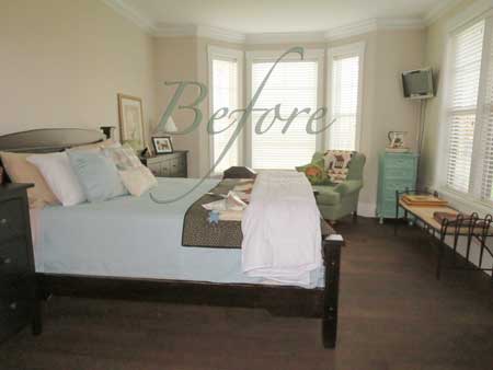
Here it was before the transformation (above). We needed an area rug, a new duvet and custom bedskirt and different end tables. There was too much brown in this room.
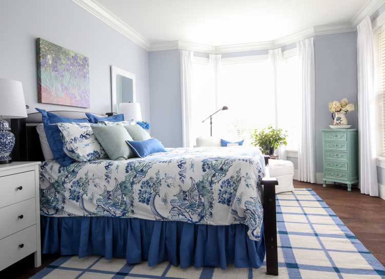
After
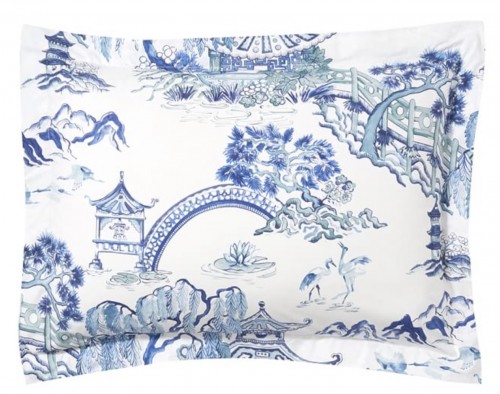
We started by choosing a duvet from the Pottery Barn. The duvet is unfortunately sold out now, but since we’re always talking about undertones on this blog, I thought you’d be interested in the difference between the colours in the finished room above, and how the room was decorated to display the duvet on their site (below):
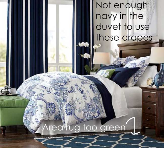
The undertones in this duvet are a purply blue and turquoise. You can see the colours even better in the pillow sham below.
While the navy blue curtains appear to be the right colour, if you look closely, they simply are not purple enough. And because the area rug is a slightly lighter value, here you can really see how much greener it is than the duvet cover.
Now just to be clear, I’m not criticizing the designers at the Pottery Barn, they were using what the store sells to decorate the room, and simply didn’t have any items in this purply blue.
Just thought I’d include a little undertone trivia in today’s post for your entertainment.
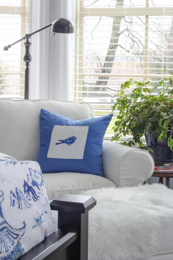
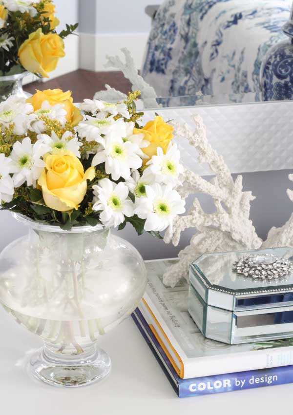
We were on a budget so we installed a white, slip covered Ektorp chair and ottoman from IKEA. The ottoman has a white, faux sheepskin on it. This adds texture and protects the ottoman from getting dirty when you’re sitting with your feet up.
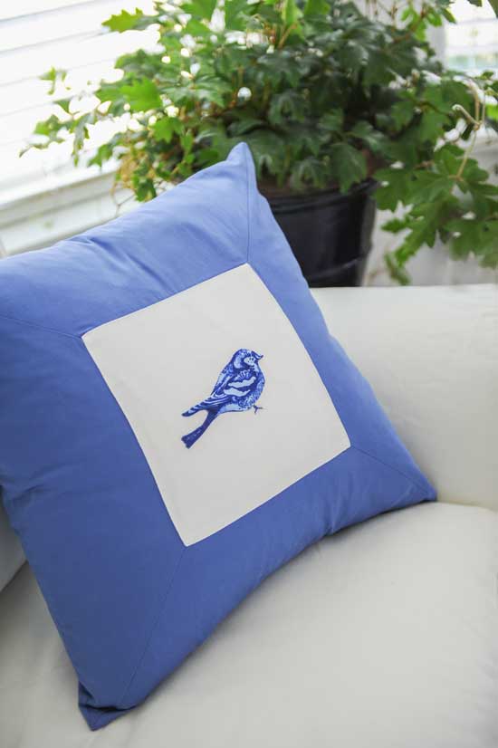
My client is known for her quilts. She actually has a Longarm Quilting System in her house and is booked two years out. After I had this pillow made for her chair, she immediately sewed this bird on the square. She used a hand turned edge appliqué technique to sew it onto the pillow.
Isn’t it lovely? And just the right colour for the room!
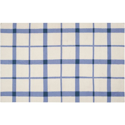
And one thing I’ve noticed about decorating with Toile, is that you can’t really mix it with other patterns; a large check or solids, that’s about it. Most rooms in Toile are entirely in the same pattern. Since we obviously didn’t have that option because we only had the duvet to work with, everything else was a solid fabric except for the oversized, check area rug from Wayfair.
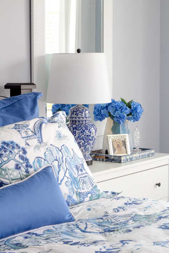
The wall colour is 27-3 Morning Star by Pratt & Lambert (below):

Here’s the new room again (above). Barbara already had faux wood blinds so she only needed drapes for decoration. To save money on rods that we didn’t really need, we simply installed stationary side panels on C-tracks that you can’t see.
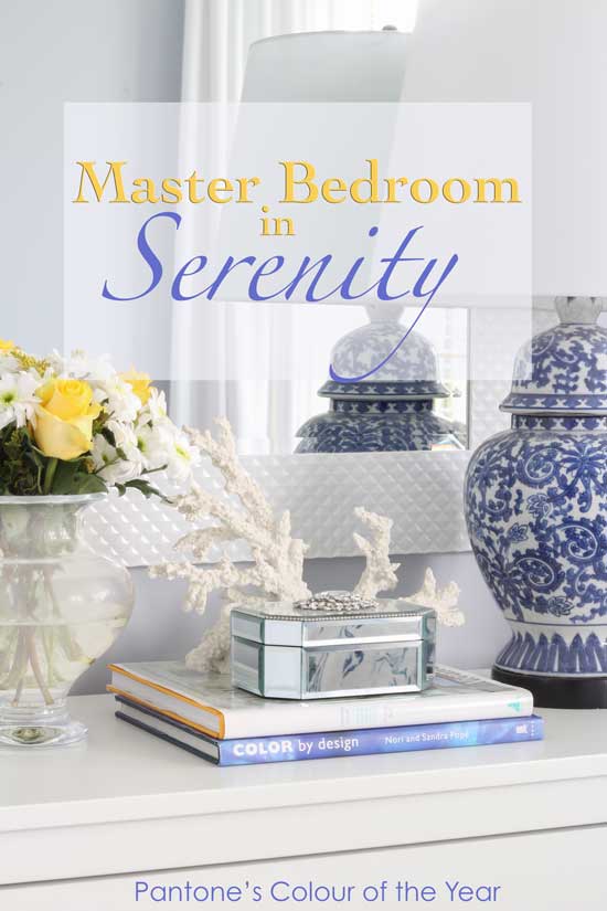
Photography, styling and decorating by Maria Killam
The wall colour is very close to one of Pantone’s Colour of the Year, Serenity, which I specified well before it came out in December. Am I on the pulse of colour or what, haha.
Have a wonderful week my lovelies. I’m very excited to meet the new True Colour Experts in my upcoming events!
We will be learning all about neutral undertones, as well as what to do when you’re decorating with colour and no neutrals at all (just like we learned in this post).
To be a successful designer, it’s critical that you Understand Undertones™ backwards and forwards. And my course is the ONLY place to learn everything you need to know.
If you would like to transform the way you see colour, become a True Colour Expert.
Related posts:
5 Ways to Transform your Bedroom Right Now!


Beautiful room. It doesn’t even look like the same room! Did you put a mirror behind each nightstand or just on one side?
I just love the colors the way they are put to-gether and the room looks so beautiful now.
Yes there’s one behind each night stand! Thanks Diane 🙂
Wonderful transformation Maria! Particularly love the oversized area carpet as looking at the arrangement in its entirety including its hardwood flooring and if were hung on the wall IMHO it could be considered a complimentary choice as a picture fame matte. In other words I am viewing the space as a piece of artwork. -Brenda-
The splash of colors, blues, adding the Rug plus painting the walls changes the entire look and mood of the Bedroom ! Gorgeous and Serenity.
Wow. Just goes to show what a clever designer can do. And love that you do practical on a budget. Sure you can create a great room if you’ve got thousands to spend but this is transformation without the overdraft. Well done.
The transformation — fabulous. I don’t want to criticize Pottery Barn, either, but your client’s room outshines theirs.
So true!!
Gorgeous! Breath of fresh air. Love the wall color.
I like both, Maria’s room and the PBarn room. Regarding the latter, i agree that there isnt enough navy blue in the duvet, but thats why PB designer used navy blue sheets and small piloows. Also agree that the area rug’ s blue has more green in it, but thats why PB designer added that unabashedly loud green couchette. do you agree Maria?
Sue, I was thinking the exact same thing.
Agree! I like the PB room!
I agree with you. Plus the navy nicely anchors the room.
Agree. I also see greeny-gray in the duvet which I think the PB rugs picks up nicely. I like the variety/mix of blues. Although for me there is just too much blue and white going on – I would have done a different skirt/matching pillow color (just one pillow in that blue, the rest something else) rather than the blue chosen and done a different color/pattern rug, Maria’s room is quite lovely. I love that little greeny-gray chest that picks up the greeny-gray in the duvet and pic above the bed!
The green ottoman and matching throw pillow on the bed really don’t have anything to do with the teal area rug, which is why I didn’t mention it. The second colour in the duvet is a muted turquoise (like BM Palladian Blue). Maria
I was wondering why you left the turquoise chest in client’s room, but I now see the muted turquoise in the Duvet – Pottery barn must hire you!!
It looks fabulous.
I’ve always wanted to use toile and decorate the space as you have. Its just perfection.
Calming.
Atlanta!
The room is beautiful! Great idea to not use rods on the windows. Could you tell me about C Tracks, and where you would purchase in the States.
Susan
I would also like to know where you purchase C Tracks in the States and would like to know about them.
Any drapery rod supplier will have them, they usually sell to the trade. They are very inexpensive and work great for stationary side panels. Here’s an example of one that would be ceiling mounted https://www.pinterest.com/pin/527624912572257304/ in this bedroom, we used brackets because of the crown moulding.
Thanks Maria.
I agree with Sue as well …love the PB room.
What an amazing transformation and what a beautiful room. Wow! I love the royal blue in the bed skirt and pillows,really looks bright and fresh, and that little pop of turquoise in the corner cabinet. I love how Maria derived her color choices for the room from this beautiful duvet. Just fabulous.
Now…THAT IS a dreamy bedroom transformation! franki
Maria your room looks awesome.
But I do think the PB room could have worked.
Keeping the nave drapes.
Adding a navy and white rug.
White instead of green ottoman
And doing a white : navy and a blue ( blue that’s in comforter ) pillows on the bed.
For me by repeating the navy / white and blue through the room would have been nice contrast.
Agreed! Thanks for your comment! Maria
Oops navy
Having had blinds for decades, before curtains, it was surprising to experience the difference in heating/cooling costs with drapes. Probably 10-15% less HVAC expense with drapes.
30 years later, now in my new ca. 1900 home for 7 months, I will be getting custom drapes. 11′ ceilings, and no I don’t have the money for drapes. Nor do I have the money NOT to have drapes !
In the master shown, I would have kept the blinds and added real drapes. More expense up front, but if they stay in their home awhile the drapes will pay for themselves.
Of course you chose the color of the year, before it was the color of the year. You go girl. And, the entire room is marvelous.
Congrats on your seminars this year.
XO T
Maria, the Pottery Barn pic is a very quick and useful study for seeing the undertones in color. Although I’m not a “blue” person, the walls in your client’s bedroom with the white are truly serene but so light and bright at the same time.
Neighbor of mine down the street with my model just finished her reno and did toile throughout her house (and I mean everywhere) with intense red-orange walls in the LR/DR and deep blue walls in the bedrooms with bright white trim. Perfectly perfect like something from a magazine but not a hint of restfulness in the place. She did the wood-look porcelain floors throughout which is what I plan to do but she chose a very dark, basically expresso color. The single flooring throughout makes the house look twice its size but I simply couldn’t tolerate that darkness everywhere in an open 1350 sq ft of a home already shaded by eaves on all sides.
Plus she has two dogs with tons of white hair!
The only really super good thing she did was paint her kitchen cabinets white (which I’m also planning to do). I was eager to see her home but ended up eager to leave – my psyche couldn’t settle.
Wow entirely in red!! That would be so interesting to see! Sandy where was your phone at a time like this, haha 🙂
Thanks for your comment!
Maria
Lovely transformation Maria! PB’s room is not as well balanced in visual weight as yours. The value of the colors and where they are in relation to each other are important, and that’s where I think PB missed the mark. You seem to do value of colors instinctively and don’t give yourself enough credit for that :).
I too, recently redecorated my master bedroom around a pottery barn quilt where the predominate colour was navy. It was tricky! You would think that Navy is Navy, but alas it is not! I installed custom drapery in white also but included a navy band on each edge to tie everything together. I’m pretty happy with the results, just considering whether I should install an area rug. My husband had a hip replacement a couple of years ago and I’m worried about him tripping in the night… Your blog, Maria, has helped me a lot over the years. You are probably the biggest influence over my interior decorating decisions. Thank you so much!! ❤️
Love the transformation, Maria! It has such a fresh appeal.
Is this a north or south facing room? Still no obvious deep blue choices work in North facing rooms (or do they??) so do you always have to stick to lighter blues to avoid the gray undertones in that situation? Can’t tell what this room is by pics.Love the mirrors behind the nightstands.
It’s a North facing room. I think a north facing room in blue feels cool if it’s not decorated. An attractively decorated room can easily be any shade of blue without feeling cold.
Hope that makes sense,
Maria
Thanks for the lovely inspiration. I have toile fabric in the same colors, old draperies. I love the wall color and accessories you assembled. And, yes, you are on the color sensing forecast wave always!
I’ve seen almost no attention given to the fact that Serenity is a purply blue (except for from you, Maria!) Are you seeing a shift away from the green-based blues or is it more anything goes?
Love this room. The duvet is available on eBay. Always look here for recently discontinued and often discounted items. http://www.ebay.com/itm/POTTERY-BARN-DARCY-TOILE-ORGANIC-KING-DUVET-COVER-TWO-KING-SHAMS-BRAND-NEW-/172101912507?hash=item281212c7bb:g:CTUAAOSwe7BWwPPx
love it all…can’t wait to meet you and the rest of the class in Dallas!
Great job Maria, I love the chair & ottoman with the darling “bird” pillow. It looks so comfy. The sheepskin on the ottoman gives it some texture and a touch of class! ALWAYS love your posts and your lessons on undertones. Probably the PB designers need your course! hehe
Another great room, Maria!
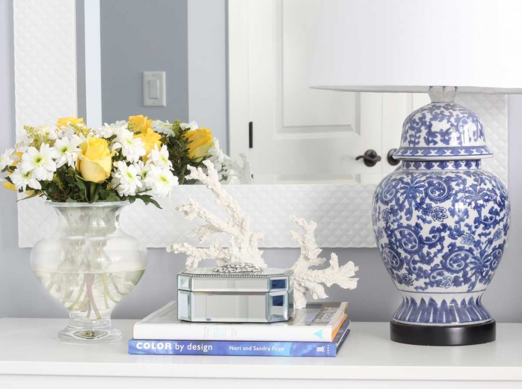
I love how the blue of the ginger jar lamps work with the room. This is much more pulled together than the Pottery Barn room.
The rug you chose is perfect. Buying a rug on-line can be hit or miss. And you hit it out of the park.
The crisp blue and white look fresh and up-to-date. Love the ginger jar lamps. Would you share a source for them. Thanks
yes they are from Lamps Plus! Maria
Amazing! That room is a visual feast!
You “hit it out of the ballpark”, Maria! What a gorgeous room. Pottery Barn should send its stylists to your workshops! The duvet looks much prettier in “your” room, where it isn’t “fighting” the overwhelming navy drapes/sheets, etc. and all those “off” undertones!
By the way–I have been looking for new bedding for my master bedroom and recently went to Houzz for some inspiration. After looking at over 40 pages of photos, I was surprised that the vast majority (I’d guess 90% off the top of my head) of these professionally designed master bedrooms seemed to have all white or cream colored comforters/duvets/coverlets with color coming only from some pillows and maybe a throw blanket at the end of the bed! Seeing this beautiful room with its gorgeous, colorful patterned duvet is like a breath of fresh air!
(Though personally, years ago I had a down comforter with duvet(s) and got SOO tired of wrestling with taking the darn things off and on to wash them, that I swore I would never again get a duvet! But this one is gorgeous enough to tempt me, ha, ha!)
Thanks for another informative and educational post!
Phenomenal transformation! Thanks for sharing. The duvet looks totally different in her room. Love her new nightstands and the lamps, especially with the tray and that adorable photo.
Hi Maria, What a beautiful transformation! My master bedroom is a similar blue and I am always trying to find accessories in that particular blue to repeat in the room. My other colors in the house are yellow, green and gray. Now if I see the bedroom you have showed, I feel the royal blue pillows/ quilt/accessories you have used is looking good with the baby blue walls. Does this mean we can use any blue to accessorise a room with blue walls (and not try to stick with the wall color blue?) ? Please excuse if I have asked a very basic undertone question 🙂
Hi Sangeetha, It’s a very good question, but no this is not royal blue, the solid bedskirt and pillow sham fabric is a blue with a purple undertone. It’s a custom fabric which is why it looks so great, you would have a hard time finding that colour off-the-shelf.
And the walls are also a violet blue not a baby blue. When all the blues work together it’s easy to think they are more royal when in fact they all lean towards purple. Hope that helps, Maria
World of difference! Love the little aqua chest in the corner.
Love before and afters; thanks for sharing.
Lovely, redecorated bedroom, but am surprised that your client didn’t choose one of her quilts for the bedcover.
Maria,
You were looking for a location in NY. This is 15 minutes from Manhattan, clean, has meeting rooms with big windows- very bright- open skies-right by airport. Easy travel for anyone from anyplace. Rated 4 stars. You will get a better price than Manhattan. 15 minutes for anyone that wants to venture into Manhattan & you can get transportation at the hotel. I go to many seminars here. Just a thought. If you want a place in Manhattan let me know I can give you some suggestions.
Courtyard New York LaGuardia Airport
3-star hotel · East Elmhurst
$124 per night
Address: 9010 Ditmars Blvd, East Elmhurst, NY 11369
Phone:(718) 446-4800
I am so excited you are considering a seminar in NY as I have wanted to attend so badly but have trouble getting away with my ill mom.
regards,
Joanne Paulino
515-410-5996
So pretty! Well done Maria. Your styling is particularly perfect! I for one have always loved periwinkle blue. That color combined with fresh green are my FAVE GARDEN combo which is everywhere in the spring. Actually if you’ve noticed blue flowers ALWAYS have violet undertones except maybe forget-me-nots. So, Awhile ago I seriously considered decorating my Living room in those two colors. I went to the KRAVET showroom and sadly they literally had nothing in periwinkle. It just wasn’t “in” and realized I would have to settle for green with greeny/ grayed powder blue. Oh well.
Twenty yrs ago I did paint my BR walls in a Martha Stewart violet pink with blue wisteria trim…..just white bedding and curtains .Kinda the two current Pantone colors. Haha.
I’ve been waiting for Violet blue to come back around and actually PB has a deeper Violet blue now called TWILIGHT BLUE and last spring tried a paler version. I believe that WISTERIA catalogue has some pillows in periwinkle. It may make a comeback very soon.
IMO a BR should always be decorated with the duvet as the STARTING POINT unless you want white bedding (which is the best choice in a small BR).
You have PERIWINKLE in your list of go-to-colors: White Satin. I have also used BM Jetstream, Oriental Iris and Misty Blue(aPhoebe Howard favorite). SW has a nice periwinkle called Icelandic.
Thanks for the inspirations!!
Call me crazy but I like the PB room. I love the navy and feel it pulls the blue from the duvet and the pops of green are fabulous. I do enjoy the room you designed very much but I don’t see why navy doesn’t work as well. ???