I was so thrilled when one of my clients recently shared these images with me of our on-line consultation in July. Here is her note as well as the images of the total renovation of their cottage. The exterior before shot is at the end of the post.
Hi Maria,
Had a session with you in July and I think the phone session really was key to helping me get clear in my vision for the interior space. It was a joy to create! Nothing went into the cottage that I didn’t love and that was always the question before buying anything..I know I paid you and in addition bought your ebook and colour boards but still, I feel I have received much more than what I paid : )
Wanted to share a few photos of our PEI cottage. We spent Christmas there and was it a merry one!! We love the atmosphere of this place. Carol M.
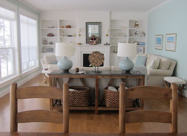
Wall Colour: Para #8692
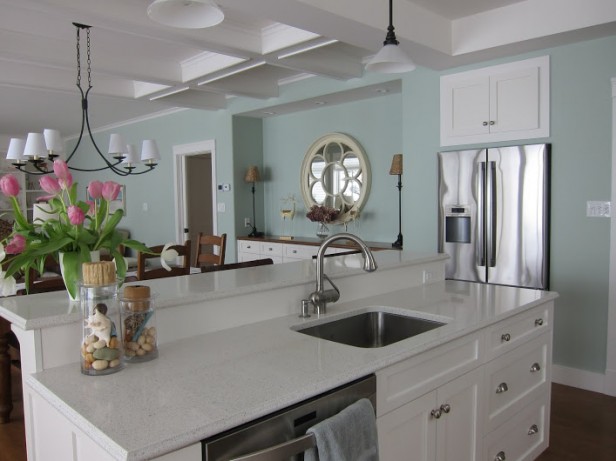
Do these countertops look familiar? They are in my kitchen too!
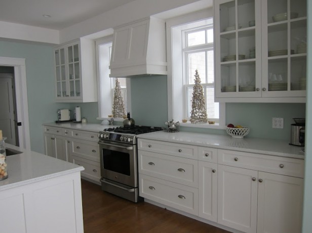
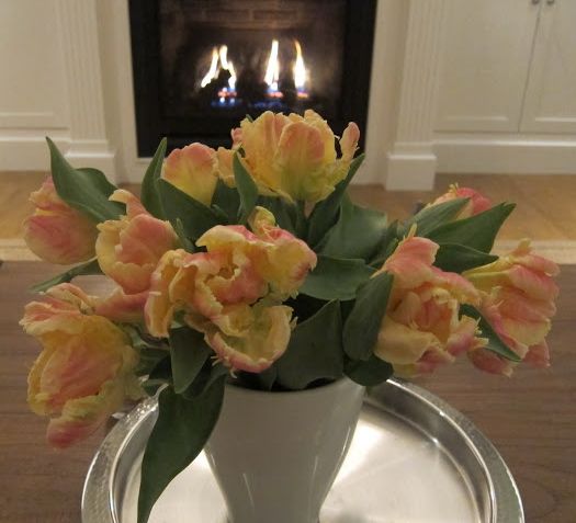
Love the little trees in the windows!
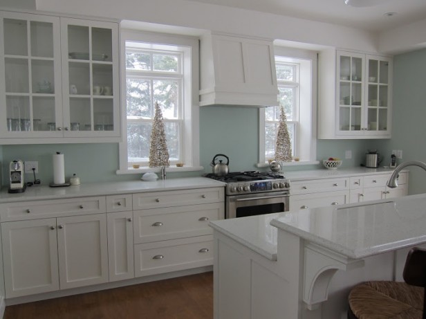
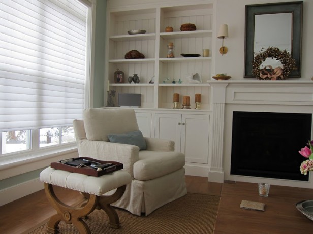
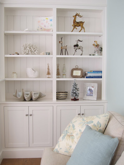
All Trim & Cabinets are Cloud White.
BM Stonington Gray
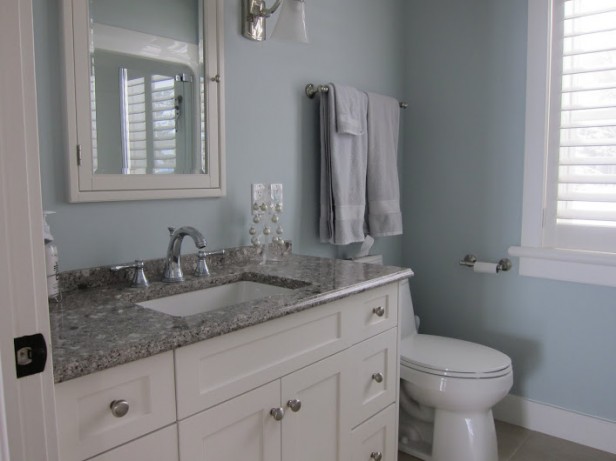
BM Pale Smoke #1584
Para: Alabaster from Sarah Richardson’s Collection. It works with northern light and doesn’t turn orange or banana in southern light. Has a warm feeling with night lighting.
BM Pale Smoke #1584
Here’s a shot of the exterior before:
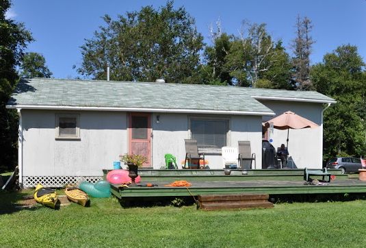
Quite the transformation!! Thanks so much Carol for sharing it with all of us!
Related posts:
Before & After: On-line Colour Consultation in Texas
A Design & Colour Consultation in Gibsons
Journey from Darkness into the Light: Before & After
If you would like your home to fill you with happiness every time you walk up to the front door, become a client. On-line or In-person.
Download my eBook, How to Choose Paint Colours – It’s All in the Undertones to get my complete step-by-step system on how to get colour to do what you want and to make sure the undertones in your home are right, get some large samples!
If you would like to learn how to choose colour with confidence, become a True Colour Expert.


So beautiful and serene. Love the colours they (with your help) chose.
Wow, Maria. I sincerely don’t know how you do that over the phone. Gorgeous. Love everything about it. How nice of her to share.
Gorgeous…it looks like a lovely spot to relax. Is there an exterior after page?
Wow, fantastic transformation! Just a curious question. The 10th pic down gives the impression that there is a second story, but the exterior shot gives an impression of a ground level only cottage?
I’m pretty sure it was a tear down, if I receive the after photo I’ll post it. Maria
Did they tear down the old house? No way are these interiors of the cottage shown in the pic. A beautiful new house.
Exactly what I was wondering. It’s a lovely new home, not the one in the photo, so I’m confused.
The colors are perfect. Even I could be converted to beach style with these rooms.
What a lovely home! Actually my dream home. Thanks for sharing.
So clean and lovely. Great job to everyone involved!
After pic of exterior?
All I can say is beautiful. Love it!
I am confused too… The staircase shows that is a two story house but photo looks like a ranch… Did they tear down the house.
Wow, the client has such a spirit of joy about the consultation. She should be proud of the outcome, and you, as well! Loving the soft coastal colors without the literal interpretation (screaming “beach”). Best, Ellen
LOVE LOVE LOVE!!! Thanks to both of you for sharing! I too, would LOVE to see the “after” exterior!
Beautiful interior! Love the flow of colors!
I’m confused about the last shot; the “before” of the house. Is there an “after” shot? Did they add a second floor?
I love everything about this- including white kitchen and pale blue walls. Beautiful!
Is there any way to get a color match of the Alabaster color here in the US? It sounds like exactly the creamy color I need.
Absolutely beautiful, soft and peaceful right on for a relax.
Congratulation on your article at the BC Home and Garden magazine
Magnificent transformation….although I too would love to see the exterior.
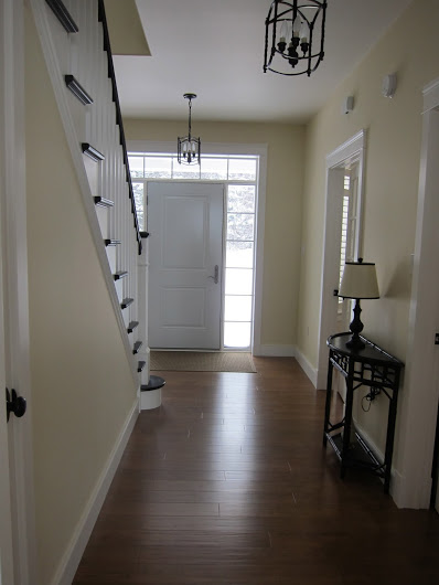
My question is (and I’ve yet, as a decorator, failed to provide myself with the proper answer) in the first photo where the lamps are on the console table, where are they plugged in? Do you think there are designated outlets in the floor?
So fresh, serene and relaxing. And the flow from room to room is lovely.
Marvelous with wonderful flow.
Now that’s talent.
I love the windows and the flanking glass cabinet doors. So airy!
Absolutely Gorgeous. I’m becoming a convert to the white on white kitchen. If and when I either renovate my kitchen or have it custom made it definitely would be a white on white kitchen. In fact I will convince my clients on making switch when they are ready to renovate.
Absolutely beautiful! I love all of the colors you helped them choose.
Hi Maria,
Beautiful cottage! That’s the atmosphere that I’m trying to create in my home. I’m definitely going to have to contact you for an on-line consultation!!
I have a question about the Alabaster paint. It’s hard to see the undertone in the floor because of the reflection from the windows around the door. If the paint colour doesn’t turn orange or banana in southern light, then would it be okay to use with furniture that has pink beige undertones?
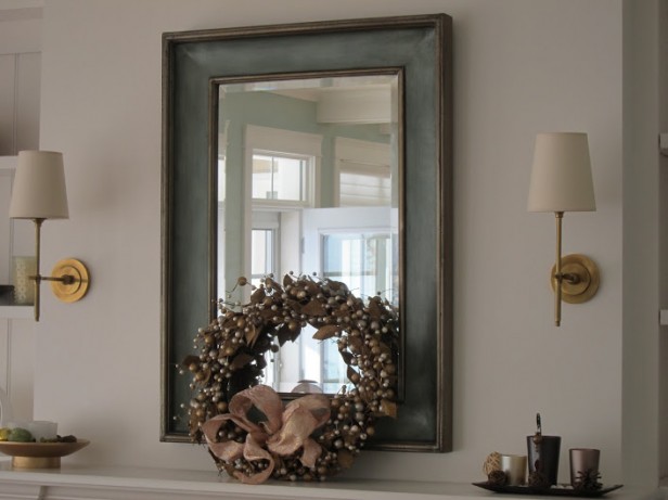
Also, would you know the brand/colour of the blinds that they used in the living area as well as the light sconces over the fireplace?
This house looks to be staged for a magazine photo shoot, rather than been taken by the owners to show you how your advice worked for them . The lamps could not possibly be plugged in behind the lounge in the middle of the room. The before photo is of a cottage, this is a huge home…a little bit odd to say the least.
I agree with Natalie on this. I think you got scammed on this one, Maria.
The house was a tear down and our consultation was about the overall design of colours and finishes. Which countertops, which colour whites, etc. Obviously my client did the decorating and I’m sure she will be thrilled to read that it looks like a magazine layout (and I agree). I was happy to post it because it also represents a look and feel that I would create for a client if I was in PEI myself.
My house has flush in-floor outlets in two rooms so that furniture can be placed facing the fireplaces. In fact, this is the third house that I’ve owned with this feature.
That’s right, I also recently posted about the same thing, it makes installing lighting much easier without cords and extensions running everywhere: https://mariakillam.com/2013/01/how-to-create-instant-atmosphere-in-your-new-house.html/
My house is a 1939 built California bungalow style. The kitchen is small, about 200 sq. ft. total. I just installed new white shaker cabinets, and pewter colored (12×24) floor tiles. I am deciding which countertop (color) to use, and have narrowed it down to two: via lattea granite (shiny black with with striations) and Caesarstone Belgium Moon (same as found in Tyler Florence’s House Beautiful 2011 Kitchen of the Year). What do you think would be best. It’s a small house, and the kitchen connected directly to the 225 sq ft living room (incl. pony wall with bar counter).
Hi Morris,
Since one pewter tile would be different from another one it would be impossible for me to give you an accurate opinion without seeing photos. I charge $50 for this kind of question, so if you email me photos I can tell you which one is best. [email protected]. Maria
Hi-
I’m loving the wall color in the first few photos but I’m in the US. Is there a Benjamin Moore equivalent to Para 8692? I just love it and since I just painted my kitchen cabinets BM White Cloud I’m thinking this color might be “the one” for my kitchen.
the colors are lovely and pale if you want that watery color look but i dont really think that BM pale smoke quite qualifies as turquoise… its more of a pale blue gray….i would prob use BM Palladian Blue, Ocean Air which are toned or grayed slightly, or an Eileen Boyd cerulean blue like Peacock Feathers if you want to go bold….but i think its very pretty and soft. Prob easier to achieve flow with paler tones……
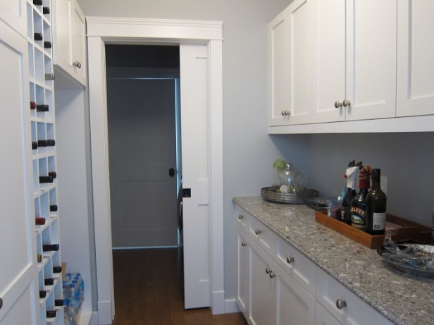
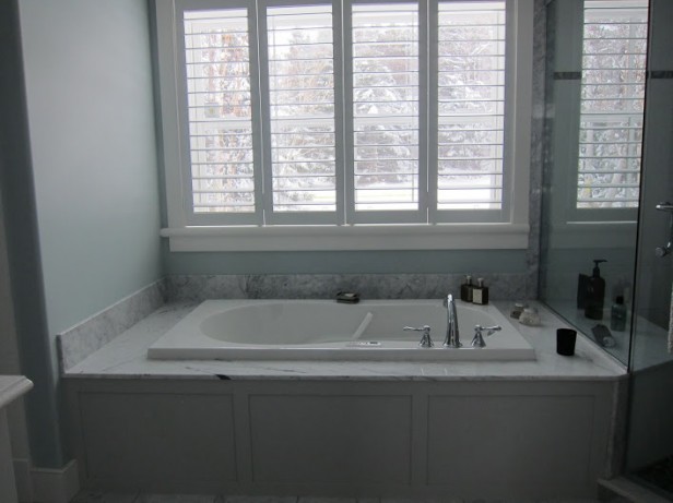
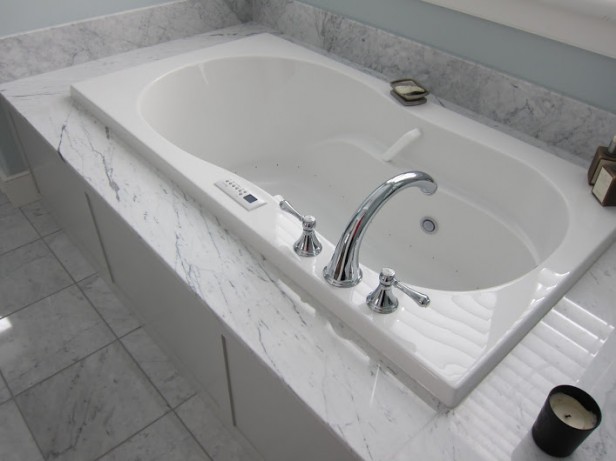
Beautiful colors. What are the countertops shown in the pictures of the pantry/bar and bathroom above? The are very nice – some pattern but not overly busy. Thanks!
I really like the range you selected. Can you share the brand.
What is the countertop in the butler’s pantry? Lovely home.
Hi Connie and Nicole, I’m sorry I don’t have that information, she chose that on her own. Maria
Your color swap out on your logo makes it so much easier to see!
Beautiful !
love it all !
So peaceful ! Great tansformation!