In my True Colour Expert Workshops I always ask “Who here thinks I have some kind of magical ability to see colour?” Everyone always looks at me like they’re thinking ‘Really? Is she that arrogant?’ Two or three might raise their hand.
 Blue gray Calcutta marble countetops, slightly pinky Crema Marfil Tiled Floor & roman shades (source)
But here’s the thing…
The single most important magical tool kit that I have, which has trained my eye over the past 10 years is my collection of 11″ x 14″ large painted colour samples. When I don’t have my large samples with me, I’m basically visually impaired in terms of specifying colour accurately. And without them, so are you.
Remember that post I wrote on The 80/20 Rule also Applies to the most Popular Paint Colours? Well if you are a designer/decorator/stager/do-it-yourself homeowner or painter and you have at your fingertips the most often used paint samples (ie neutrals) painted up in large samples it becomes really obvious to YOU as well as your CLIENT, which colour is correct.
And to be clear, colours (red, yellow, blue, greens, etc) have undertones just like ‘neutrals’ but it’s in the realm of complex neutrals where most colour mistakes are made. All you have to do is look in any magazine and if you have a trained eye, you can see it over and over again. That’s why you need my hand-picked set of neutrals and whites to get it right.
Bottom line, if your client can’t see that the colour you are showing him/her is right, then neither can you.
Next time you are in a living room and you want to see if the colour you have just chosen is pulling the room together, you prop up your sample (or 2 or 3) either on the mantle or behind the sofa and stand back. Easy.
 Undertone of Wall [Greeny Gray] Undertone of slipper chairs {blue gray} (source)
Or you are in a bathroom or kitchen (where the undertones of tiles and granite are the most confusing) and you just go through your large samples until you find the one that works. Simple.
 Combination of blue and green undertones of gray (source)
This set includes 40 neutrals and 10 whites with *free delivery anywhere in the US or Canada.
1) The best beiges in pink, yellow and green undertones.
2) The best grays, green, blue and purple undertones.
3) The 10 best whites.
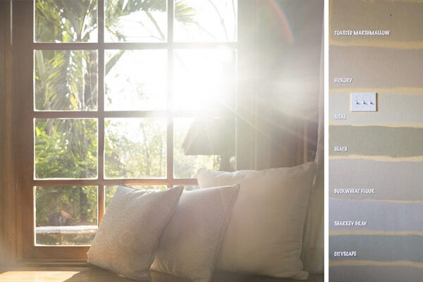
Here is what they look like and the difference between small chip and large sample!

There have been so many times when I have found the colour in my Benjamin Moore (below) architectural fan deck–which is a larger approx. 2″ x 6″ sample– that I was SURE was the right colour, and then when I pulled out the large sample and held it up, it was totally wrong.

When I had this conversation with one of the Benjamin Moore store owners locally he said‘that’s because the architectural sample is printed and your samples are real paint’. That’s the first reason why it’s more accurate but of course the second reason is that now it’s actually large enough to see in context with all the other colours and complex neutrals in the room.
How could anyone possibly make a decision on a paint colour which takes up the largest amount of space in a room, with a tiny, baby colour chip?

Green beige sofa with blue gray shag rug (Pinterest)
Years ago I was at a consultation and the couple showed me a brochure with stain samples that were 1″ x 1″ and asked which one they should choose to re-stain their hardwood floors. I looked at them like a deer in headlights and said “I’ll get back to you”. The minute I left the consult I called a design mentor of mine and said “OMG what should I have told them, I should know that right?”, and she said “There’s no way you can know unless you get some larger samples tested on the sanded floor right before you are ready to go. Every type of wood takes stain differently and testing is always required (below).

Photo by Maria Killam
When she said that I immediately thought ‘Duh, I am the same person who just finished specifying that house full of colours with my LARGE samples. Why would stain samples be any different?
Most designers think they should have a magical ability to predict what a tiny 2″ x 2″ paint chip will look like and make a decision. Well I have news for you, it’s almost impossible to be accurate trying to do it that way.

Greeny Gray Walls with Yellow Beige Sofa (Restoration Hardware)
Here are what my True Colour Experts are saying about the large samples:
“First and foremost, the selection of Benjamin Moore neutrals is beautiful and the presentation first class. I can’t imagine a more comprehensive range of shades. The boards also look pretty and feel good. They are fun to place around the room (behind art, against the cabinets). My clients are impressed that I have such a great decorating tool in my possession!” As a decorator, the samples provide a wonderful source of inspiration for painting a neutral canvas. I have actually picked up 2 jobs because of them!” Pam H.
“The large samples are simply essential to selecting the perfect colour. Because undertones are so important and can appear to change, you cannot know the nuances of colour without seeing it in a larger format. Before using them, I had clients go back and forth trying to find something they liked, or trying to see the undertone I was pointing out. With the large samples they are able to immediately say ‘yes or no”, thus making my job so much easier and giving my clients exactly what they want! ” Jil McDonald, Reflections Interior Design
“The large paint samples are simply wonderful tools. Each time I have used them my clients have a much easier time selecting a colour palette and seem to have a much easier time “seeing” what I am telling them. I love these samples and plan to expand on the collection”Brenda Swanky
You will also receive the list of colours categorized by undertone so the next time you go shopping for tile, you will never again end up with a pinky beige tile or carpet, because you’ll be clear which one is pink. And green. And yellow. And gray.
And the next time you need to know which countertop sample is right with the paint colour, you just lay it down on the big sample and it’s obvious. Or you hold it up vertically against your cabinets, underneath your existing countertop or lay them in a row on your tile floor leaning against the wall or counters to see which one is right. Totally painless.
So if you want to look and feel confident when specifying colour for your clients and/or for yourself, I have a limited number of sets of 50 samples that I’m selling (including delivery) anywhere in Canada or the US (Tax applicable for Canadian Residents).
They are all Benjamin Moore colours. That works out to $6.00 each. Last time I checked, buying a paint sample cost at least $6.99 – $10.00 never mind the time and cost of poster boards, rollers etc. to make up your own.
It took me 2 hours to paint 8 sample on my own a few months ago.
Click here to go to the store.
And you will have the most critical and important tool in your design or do-it-yourself world.


Maria,
I love when you take the time to put this kind of post together! I learn so much about color with you and I love that.
I simply cannot wait for the e-book. What a brilliant idea and project!
Have a wonderful day, my friend.
xo
Luciane at HomeBunch.com
What a great tool! I've always thought those tiny chips were not helpful. Here's a question for you – can you use a color you love over a color that works, but is boring? Light grey vs beige. Love the grey but beige is perfect with furniture. Always love learning from your posts!
You make it sound so simple. I just love how you do that in your posts! I am excited for the ebook and webinar to launch!
I always learn so much from your posts! I realized a few years ago that not everyone can 'see' the undertone in colours like I can….I don't say that to be smug, I don't know WHY I have always been able to see it, but I just can. You put into words, though, what I can never seem to do with my clients. Thanks for that!
I am so excited to receive mine! Great color tool!
OK, I've been a Maria fan for a while. The Benjamin Moore store here does stock 18×18 samples (or maybe 24×24) and they are $4.99 each. And they are only for their low VOC paint line! And they are always OUT of the best colors! So I think having these big samples will be just fantastic, so I don't have to waste a half hour buying a little tiny sample (which they are also always out of) and painting it and waiting until it is dry, just to figure out that it was the wrong one! : ) Thanks Maria.
Well put. I LOVE my samples! Seriously, I know I wouldn't be able to differentiate colors like I am able to now if I didn't have them!
Love this post! So informative and the undertones in a color cannot be overstated enough. It is so important to see paint in YOUR home not the store or someone elses space!!Stop by doing a great giveway ends tonight (if you haven't already)
I love your Blog. Such great advise. Thank you!
Can't wait to get my un-sexy, oh-so-necessary paint boards!
Hi Maria-
You are my go to when a question arises that I am unsure of. Thank you so much for being such a valuable resource.
On question –
Will your samples be actually painted?
Suzanne
Maria, This is a brilliant idea! If I was one of your designer friends I would hop right on this! Wow–what a great way to 'share the love' of helping designers everywhere! It makes so much sense!
My friend who is a SAHM but who re-decorated historic homes with hubby for several of their early years of marriage recently decorated their 'dream home'.
One of the things she did to choose the wood stains for some doors and HUGE entertainment center (12 feet tall and very wide) was to paint several stains on planks. The boards were about 2 feet long and 10" wide. She said that was the only way to 'test' the stain. They were also staining floors in the upstairs bedrooms and walkway.
Before choosing paint colors for walls, they painted samples of every color on large swathes of paper.
My other friend who loved decorating and had just bought a renovation home painted large patches on the walls because she said you couldn't possibly tell if a color would work until you had a big patch..and could see how the color changed in the sunlight.
Why do all my friends seem to get it when it comes to paint? LoL! These memories have stuck with me over the years and they certainly support your premise.
I say–buy the samples! :o)
xo
Donna
Hi Suzanne,
Yes they are hand painted.
Maria
In my color selection process….I think big swatches and while I at one time in my life thought that color was all about the color, it is in fact all about the light.
It is sort of like "over salting" one's food – I seem much more sensitive to color….and really prefer all shades of whites.
pve
Some women do have extraordinary color perception. I wonder if someone such as yourself who is very sensitive to color nuances of decor would be in this category.
"He estimated that 2 percent to 3 percent of the world's women may have the kind of fourth cone [color detecting cell in the eye] that lies smack between the standard red and green cones, which could give them a colossal range."
Source: Some women may see 100 million colors, thanks to their genes
http://www.post-gazette.com/pg/06256/721190-114.stm#ixzz1UpZj2mpp
Thanks for this post. This is my biggest struggle with color. I have such a difficult time TRULY seeing color. I always refer back to all of your previous posts when selecting a new color for a room.
What a great tool! Did you make all 32 sets? Holy cow that would take forever. Hope all is well!
Hi Ab Home,
Definitely no.
Maria
In my art classes in college, one of my professors said that we cannot remember color accurately. It is so very true. Having large color samples with you in the home and at the store is such a great idea. Don't forget to take them with you when shopping for fabrics too!
The large samples will be a great tool and much easier than the paint fans I have been using. Love your blog and all the wonderful information you share!
I have also used many of your tips for my food blog-dinnersinthehouse.blogspot.com
A double thank you!
Sorry to be commenting so late. Maria, you are so correct. No one can or should pick a color from a fan deck. I always have 8.5"x11" sizes sent to both me and the client. Plus I always recommend they purchase a sample pot and paint a floor to ceiling section of the wall. And then look at several times throughout the day and night because it will change with the amount of light and light source.
Dear Maria,
as always, great advise! I must have missed it, but what size are the samples? Are you still selling them? And last but not least, when are you coming to Chicago?
Have a wonderful Sunday!
Maria Teresa