Lynda was moving into this pretty little house in a new subdivision:

She needed some help with a new colour scheme and was stuck on wall colours. One on-line consultation with me and she had a plan.
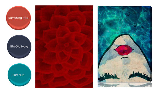
Lynda had some existing furniture and artwork she wanted to work with, and she sent me a glimpse of her last house (below). She was not afraid of colour!
 Lynda’s previous home
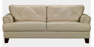 This was the colour of her existing sofa
Pop quiz: what’s the undertone of her sofa?
Well, if you’re looking at a beige anything and you’re not sure, ask yourself:
Is it yellow beige? NO.
Is it pink beige? NO.
Then it must be green beige. If you can’t confidently answer yes to any of the three, pull out swatches of each to compare them side by side. See it now?
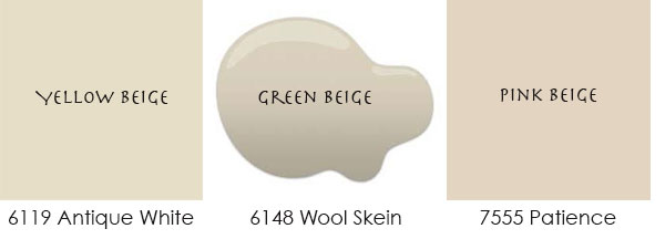
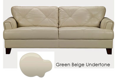
Asking those three questions is how I arrived at the main neutral we needed to use for her walls, and it’s what you should do, too. The first place to look is at the biggest pieces of colour in the room: drapery, furniture, and carpet. (Sometimes, the colour of wall-to-wall carpeting is so dominating that you have no other choice but to work with it.)
Armed with green beige as our main neutral, Lynda and I moved on to choosing some fun colours for her. On the left are the winners, alongside the red area rug I found, and her existing artwork on the right:
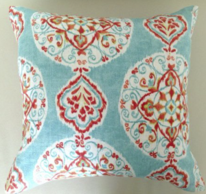
This turquoise-and-red pillow was the perfect accent:
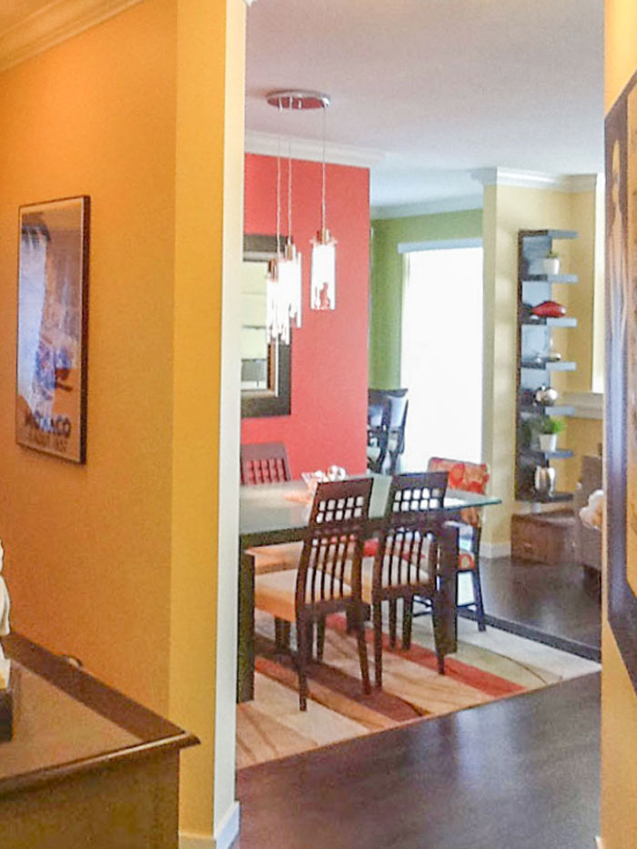
Lynda emailed me these photos she snapped, here’s how it looks all pulled together.
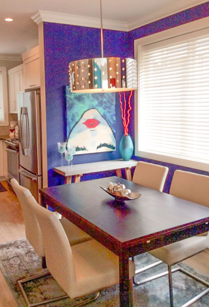
Dining Room: After
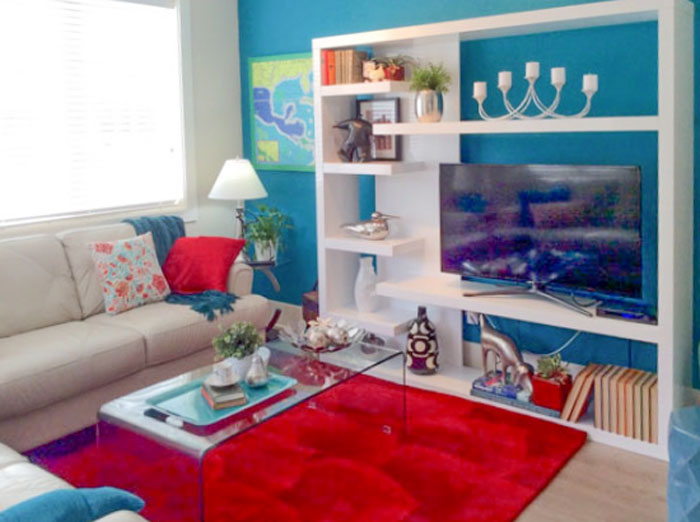
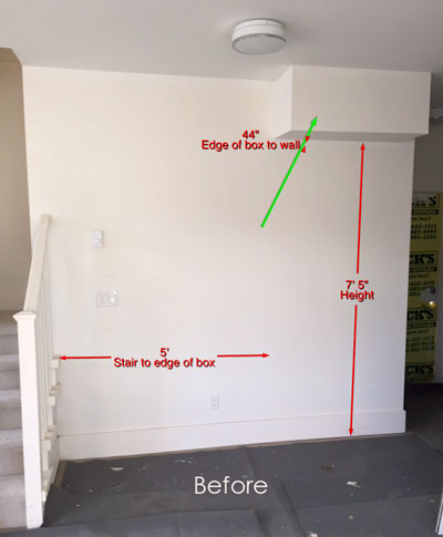
Here’s a before shot of the living room:
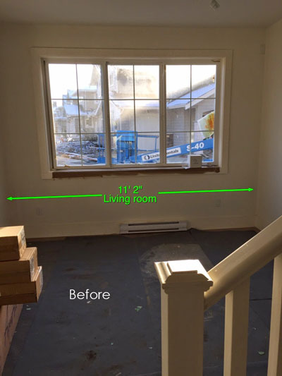
And after:
The entryway, before:
And after:
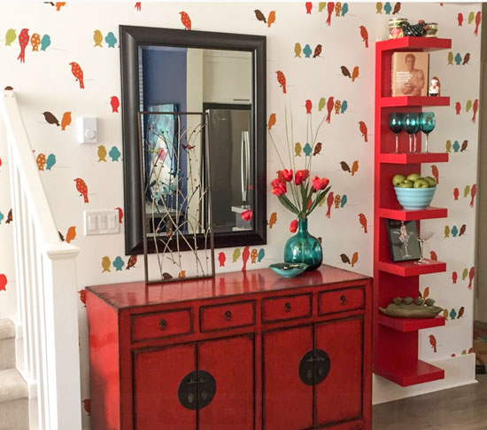 I love the playful bird wallpaper she found as an accent for the entry! Here are the details: York Wallcovering, Book: Bistro 750 totalwallcovering.com
Here’s what Lynda said about our consultation:
“I have moved three times since 2002 and had been using my favourite BM Historical colours each time and I knew I wanted a change.I had so many ideas floating around in my head that I wasn’t sure where to start. I was amazed that you were able to choose the main wall colour so quickly from a picture of my couch. I knew I wanted to work in my red cabinet, new couch and Oliver Gal picture. Your suggestions for the main wall colour, area rug, pillows and coffee table got me focused and from that point forward I knew what I wanted.Thank you so much for your help.” Lynda O.
If you would like your home to fill you with happiness every time you walk in, contact us! We would love to help you choose colours, select the right combination of hard finishes or create a plan to pull your room together. You can find our fabulous e-design consultation packages here.
Related posts:
4 Best Colours to Paint a Rental
How NOT to Choose Paint Colours (But Everybody Does it)


I love it!!!!
Lovely, and so artistic looking. Great job, Maria!
Lynda posted this design dilemma on Houzz. You may want to check it out. (She should have given you some credit for a beautiful job!)
Just to be clear, Lynda decorated this house! I helped her create a starting point with a few items including colour inside our phone consultation! Maria
So if you have the same pink beige wall to wall carpeting throughout the main parts of the house and bedrooms are you stuck with the same “main” wall color for all these rooms?
Great question! If you don’t like your broadloom colour you don’t have to choose the coordinating wall colour but it’s hard to ignore if it’s really bossy and dark and should be considered in your living room area when you decorate. Maria
Are there shades of purple/plum/violet that would work with all three undertones? Or do any of those neutral undertones preclude using a violet that tends to be cooler – but so popular? Which undertones would preclude the violet range?
Purple goes with them all! Maria
Love, love, love this!
looks good and very interesting. I like the flair of the colours.
Love the colors! It looks fabulous.
Love this and where she’s taken your suggestions!
Love the colors! What colors are used in the kitchen?
I like how the entry mirror reflects the dining rooms art and wall color. Maria, I would not call that a little house …very pretty though , love it.
I love the color combo!
Maybe it’s my monitor or the light coming in the window , the chairs in the dining room look like pink beige. Still looks stunning with the navy wall. Thanks to you I’m always trying to determine undertones , it’s like a game .
Yes this was a dark photo so I enhanced it in photoshop and might have distorted the colours a little. The dining chairs are cream leather.
Maria
I love the results, the shelves ar fun and contribute to the color scheme. Choosing the right colors makes a huge positive impact!
Great post. Was there a reason to choose that particular color of green beige over others in the same color family?
Because it was the neutral that related to the neutral sofa. You could choose a yellow beige, pink beige or even a green grey or blue grey but then it would simply look like you were ignoring the sofa.
Maria
Thank you. I was just curious if any green beige would work as long as you stayed in the same color family or if that particular green beige was chosen for a reason. Love your work!
I chose that colour because I know it works with the sofa. Inside my system, the colours get very finite and limited when you know how it works.
Not any green beige would work no if you choose one that has too much yellow in it for example, then it wouldn’t coordinate. Maria
Oh my, undertones within undertones! There’s your next book :). I’ll be waiting for it!
I love Wool Skein! It has been a go-to light neutral for me and my clients. Looks fresh and updated. The colors are so happy and fun. I have to ask about the white media storage in the living room. That is so cool. Any chance you could share the source? Thanks and great job!
I finally guessed the right undertone. Yea!
I love Lynda’s use of color. It’s nice to see someone who’s not afraid of it.
Lovely home Lynda …how about a bright fun color for your front door ?
Very cute! I even like that wall paper, even though I am at war removing the white textured wall paper in my guest bath. I think I may just have it re drywalled.
I’m so glad the Tuscan brown colors are not going into my house. Such a relief.
What an”absolutely me” home Lynda has created and how very smart of her to consult you for wall color and other accessories to help it speak so forcefully. Great job.
And, of course, the extra teachable moment for me was the reminder about choosing the undertone of your main neutral based on other prominent color in the room. This is helpful and important for me when I choose the paint color for my “white” kitchen cabinets. I know I want a warm white for the cabinets and I also know that the yellow beige walls in the kitchen (repeated from the LR/D’office) are totally washed out due to the south corner window and solar tube and the sun’s reflection off the beige house next door and they will be changed. But considering that green on the yellow side is the prominent color in my kitchen now, I now have an easier way of choosing the right warm white for my cabinets (or maybe other neutral depending on my consult with you, Maria.)
Thanks for the double dip this morning.
I love this color palette! Thanks for sharing this- it’s reminding me that bright colors are ok!! I tend to spec more atmospheric colors (Smoke, Sea Haze, etc.), but clearly the bright colors are where it’s at sometimes. Now that I’m thinking about it, I did use a bright coral/orange color for a dining room based on a piece of artwork with a giant poppy…and it turned out great. I think sometimes I hesitate when I don’t have the color sample on a big color board. When you’re just pulling a color from a painting or rug, is it pretty safe to choose it based on a smaller color sample like the Benjamin Moore square and rectangle samples that are on the rings?
Yes, colours are easiest to choose from a small paint chip because you just need to match it, hold the colour chip up behind whatever your matching with white paper though, that’s always the best test.
I love how this turned out, but I’m curious..if Lynda had a fireplace, brick or stone, would you have taken that into consideration as well? And what about the countertops and backsplash in her kitchen? If she had pinky beige granite, and it was staying in the space, let’s say. I’m just a little confused, as I’m unsure what the most important thing is to focus on.
Yes absolutely if she had stone that would have to be considered along with countertops, etc.
As always an informative post!
Thanks Maria for sharing your knowledge!
Maria, What a fun and happy house! You couldn’t help but smile when you walk in. The cute wallpaper just sets off the whole style of the house. She was so smart to get your advise on how to pull it all together.
I love this kind of post! It is like show and tell.
Hope you are now feeling well. Take care of yourself!
Hey—why isn’t that fabulous red rug paired with the great artwork in the dining area????
I think that would have be the bomb!
All else looks great, but those two elements NEED to be together……to be a Kabammm!
Just sayin’
Hi
Maria was correct when she said ‘pretty little house’ our new townhouse in Maple Ridge is 1300sq ft. Looks can be decieving I guess.
Since this picture was taken our front door was painted a colour similar to BM Peruvian Chili.
You cant see the interior front and back doors but they are painted BM Ravishing Red.
All this fun after a phone consultation with Maria, so worth it.
And Thank you Lynda for sharing your beautiful home with the rest of us…You must have had fun shopping!
Such lovely and fun colours – no wonder she’s thrilled!
This job could have gone horribly wrong, and I’m so very glad that she hired you! It’s perfect!
What do you do when you have one fixed element with a yellow undertone and another fixed element with a pink undertone, and you can’t change either of them?
It depends where it is. If it’s a bathroom, you coordinate with the undertone that is most visual and ignore the other one. If it’s big items like carpet or tile then you choose a green beige or green grey. Very general advice but hope that helps. Maria
Love it all! My kind of color choices. I have been looking for a white media wall unit. Can you tell me the manufacturer of the one in this home or was it custom made.? Thanks Maria for sharing your talents.
Here is the link: http://www.scandesigns.com/product/mountain-wall-unit/
I love it too! Maria
I’m so proud of myself for picking the correct undertone!! Following all of your blog posts for a few years now has really helped me learn about undertones. I like to use this talent in helping customers select fabric colors for custom order blankets at my online blanket boutique. Thanks for all your info, Maria!!!
http://www.BundleMeBaby.etsy.com
Pretty! And I love the bird wallpaper!
You’ve done it again! It’s snappy and bright and cheerful. Hope you’re feeling snappy, bright and cheerful after catching the “nasties”!
Wow, her new home is gorgeous — just love her boldness — and you gave the perfect advice.
So beautiful! I like how you showed the difference in beige! Thanks for a great post. I love seeing the pictures of how it all came together.
Great article, thanks Maria! How do you go about choosing your main neutral if you know that your biggest elements (sofas) will be changing within a few months but you don’t know what the new ones will look like? (house being renovated, must choose paint prior to getting new sofas). Thanks!
So, Maria, did Lynda use Wool Skein as the wall color behind the couch then? A green-beige white to go with the green-beige couch?
Any chance, Lynda could tell me who makes that leather couch? I have been looking for a nice cream leather couch, that one is lovely! Love all the color in the rooms!
We got the couches at the Brick about 6 months ago. It also comes in a soft blue
Hi Maria….great article, I’ve learned much! I’ve went for the BM Manchester Tan in my north facing apartment and I just love it! It gives a warm cozing feeling and glow to my LR and it matches just about every color I am in love with….for sand and sea themes which are the ones I am in love with, Manchester Tan is champion. Like the blogger said above, by looking at the chip, i thought no way am I going to like this and even when it was up on the wall I wasn’t feeling it…but over time, I am in love with it….bc it is warm, inviting and goes with everything! Now my current dilema for my bedroom…I am a chocolate lover and want to create this in my bedroom with the option of changing up accent colors, decorations and bedding…My bedroom in north facing very small with one small east facing window and a large north facing window. In the morning the light is so subtle and gentle, I have great views of the mountainside and woods, the room is about 10×15, not much room and my bed is a king, so this takes up the majority of the room, not parting with that lol i love my bed and it has a leather HB and FB in chocolate, of course….i want to create chocolate walls so rich you will want to eat them, use all colors as accents such as sand and sea corals blues pinks greens etc, interchangeably whenever my mood strikes…that is why i love paint colors like Manchester Tan, bc whenever the mood strikes me to change up accent, i have the flexibility to do so..these are the paint colors I lean towards…In my personal experience, I have had better luck with neutrals on the wall instead of bold colors bc I am lacking in knowlege and skill to choose the correct color….that is why chocolate makes me very nervous but I am just dying to do it….bf I made it to Manchester Tan, i went thru 4 other colors bf i nailed it….it is very difficult especially if you have never worked with paint bf…it’s not as easy as I had initially imagined…it is difficult, especially when considering lighting. Can you steer me in the direction of my chocolate dream bedroom or is is safe to play it safe and stick to a light neutral?…Thanks for the knowledge and teachings…Josi
I’ve always thought BM Mascarpone had a yellow undertone but saw a kitchen post that it has a green undertone. Is it green or yellow? Thanks! Norma
yellow undertones for sure. the formula has a bit of yellow and half as much red. it’s my trim color and it’s a bright warm white in BEN semi-gloss on my trim. IMO, it reads too yellow in flat on my ceilings. however, yellow and blue make green, so if you get a lot of blue light somehow…big windows with lots of blue sky, blue carpeting or couches or draperies or exterior house color it makes sense that it could cause the yellow to appear green.
I loved how she painted the black bookshelf red for the new home. Perfect!
I’m new to your site Maria. Wow, wish I would have found you a long time ago! If a SW colormatched paint has 11 Black (B1), 23 Deep Gold (Y3), 2 Maroon (R2), is it a beige with gold or pink undertones?
Thank you!
NO idea, that isn’t always helpful when trying to determine the undertone. Sorry I can’t help. Maria
Fabulous post Maria! Thank you for all the before and after pictures along with teaching the why’s of it all. And Lynda also did a fabulous job taking your suggestions and putting it all together with her choices of accents and furniture! Hits all the rules of number of accents of colour and a Big one, medium ones and small ones. I applaud her for her boldness of colour. Not me, but I sure do like her home and would be soooo comfortable in it!
Great collection of furniture Lynda has, I must admit. It’s worth thinking about the colour combination to be used on wall in order to give these furniture an exotic look.