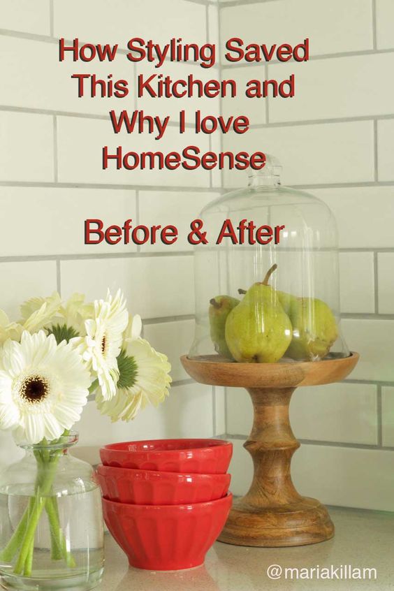
My favourite part of the decorating process the styling. I love how a vase of flowers, along with some well distributed accent colours, can transform so many interiors into ‘Wow it looks like a magazine’.
My sweet freelance writer and editor of both my eBooks Irene Hill, had a main floor that needed some styling magic.
Irene and her husband have lived through a very long renovation. As long as I’ve known her (almost 6 years) they’ve been renovating this house because they’ve done most of it themselves. It’s been completely gutted and they even added on a second floor, still, while living in the house.
Related post: Two Magic Words to Move Your Design Project Forward (written by Irene)
As a designer, Irene admits that she’s always been really good at designing space. She designed the kitchen styling and the layout, but the renovation took a toll on their budget and didn’t leave much for furniture and accessories.
This is where HomeSense comes in. They are not paying me to write this post by the way, but here in Vancouver, we simply don’t have amazing vintage and antique stores to create a collected look, but happily, you can do that at our HomeSense stores.
Sometimes, I’ll drive to two or three of them in the same day to find what I’m looking for.
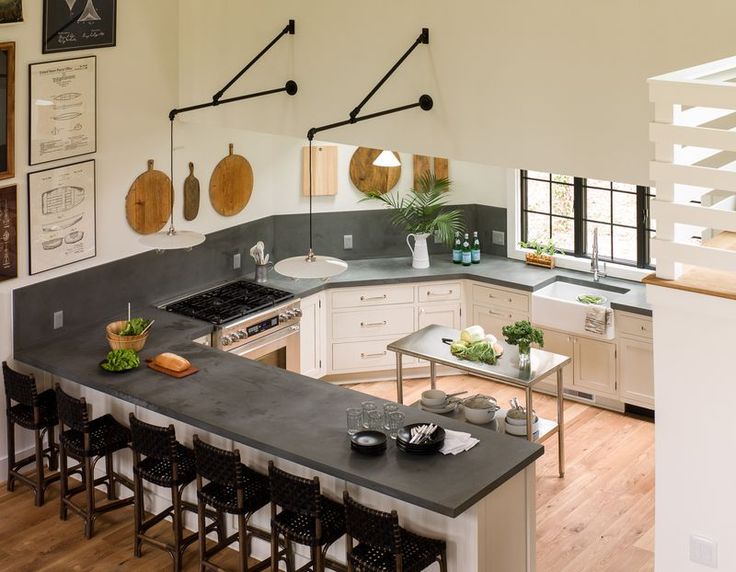
I love when I get to use a kitchen styling idea I’ve seen and when I walked into Irene’s kitchen, I immediately showed her this photo my good friend Lauren Leiss recently posted on her blog:
Here is Irene’s kitchen before.
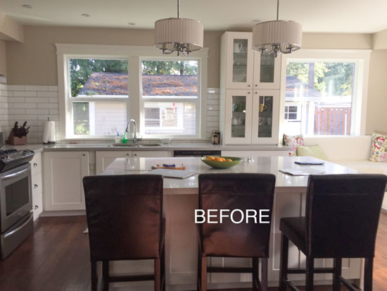
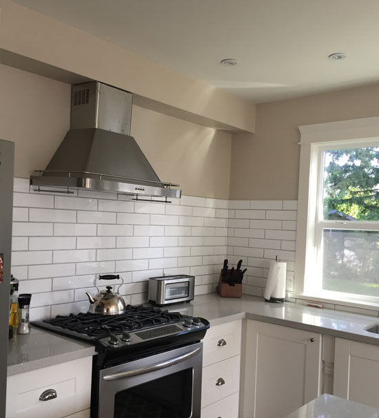
When you first see the subway tile in this kitchen, you wish there was more of it. But then there’s the problem of the bulkhead (below). When you focus on that, you realize why the subway tile ended where it did.
It’s not like you can wrap it around the bulkhead and if you stop at the bulkhead, it gets awkward around the windows. If you kept going up to the ceiling behind the windows, the bulkhead would look naked and unfinished.
So that’s when I decided, cutting boards, inspired by Lauren, needed to come to the rescue.
And here’s the after picture:
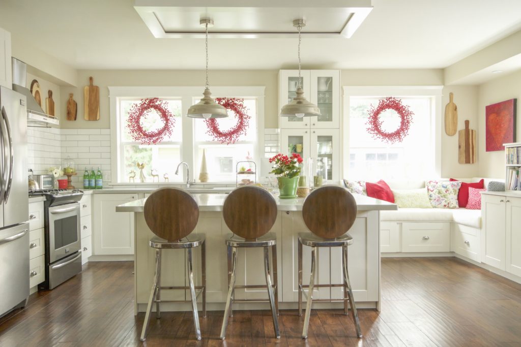
Kitchen design by Irene Hill | Styling and Photos by Maria Killam
Irene’s colours (below) are green, red and blue. So we decided to add red to the kitchen styling as an accent.
I arrived last Sunday morning at 10:00 am, and by the time I left at 8:00 pm that night, we had transformed her main floor.
Almost everything we found came from HomeSense. We found two of the stainless counter stools at one store and then Monday, Irene drove to three other stores to find the third chair.
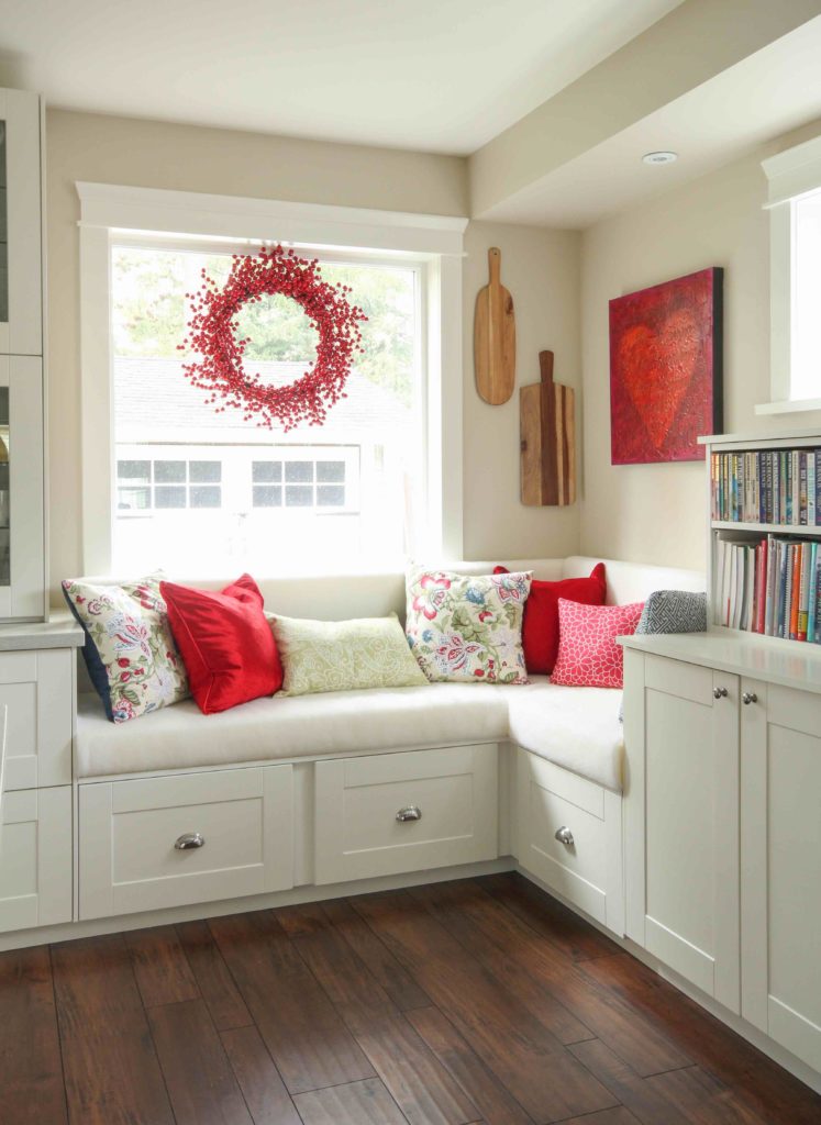
Notice that the wreathes now obscure the view of the old roof outside.
We still have some dining chairs to order, which is why I’m only showing her finished kitchen in this post, but her living and dining room was also transformed that day.
There is no way I would have been able to create this kind of magic in just one day without HomeSense (it’s HomeGoods in the US. I love that store for accessories and miscellaneous chairs and accent tables.
Irene had found the patterned red and green pillows (below) at HomeSense months before. She was only able to get her hands on two of them, so she took them apart, and sewed solid coloured fabric backs on them.
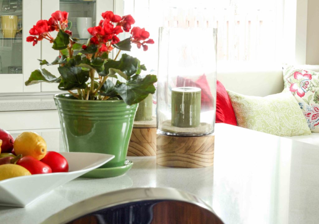
If you can’t afford fresh flowers weekly, a vessel with some Begonias or Kalanchoes last up to two months! So really there’s no excuse for not having fresh flowers in the kitchen or wherever you need them.
Love the curvy white fruit bowl and the hurricane candle holders with the wood bases to repeat the wood theme in this kitchen.
Related post: 10 Styling Necessities to Transform Your Home ASAP
Cutting boards are fabulous for warming up a white kitchen! And where, in one place, would you ever find this much variety? HomeSense of course.
And now we don’t notice the bulkhead anymore, there’s so much pretty to look at.
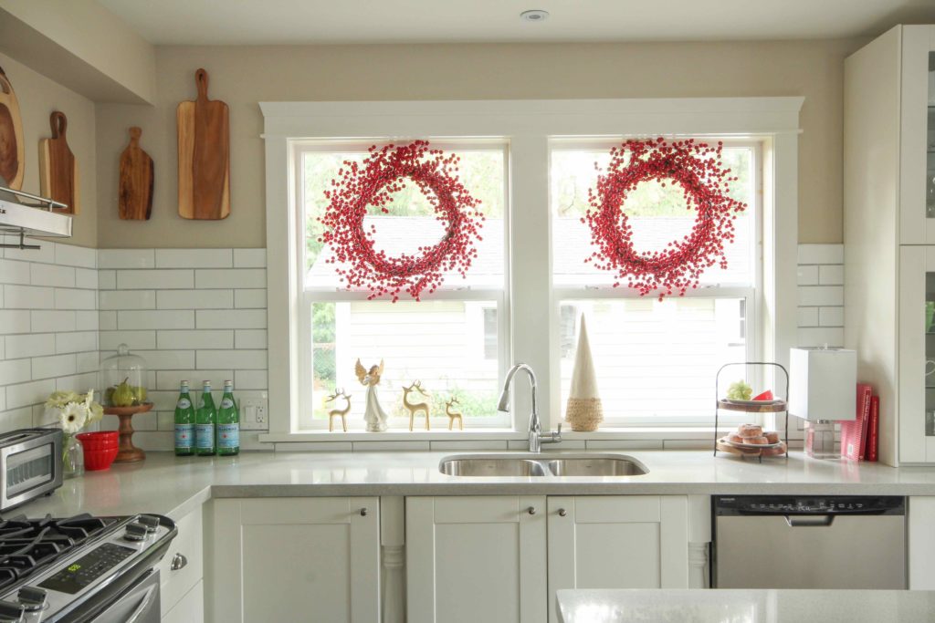
The red berry wreaths can last through the holidays until February. Less expensive than window coverings if you’re on a budget.
Irene and her husband chose contrasting grout for their more contemporary subway tile.
If you have room for a table lamp in your kitchen, install one. This way you can have it on during the evening without any other light just for atmosphere.
Or if it’s just a damp and miserable day outside and your kitchen feels dark, leave the lamp on. Every time you walk into the room, the soft glow of the corner lamp will brighten your spirits.
So look, did you read that? I’m giving you permission to have the light on in a dark corner during the day. Lamps are a wonderful thing.
I arrived at a call this week, where I created a new furniture and colour plan for Rosemary my lovely client and her husband. As I chose lamps for every corner of her dining and living room she said “I knew you would say I didn’t have enough lamps”.
Related post: The Enchanting World of Atmosphere
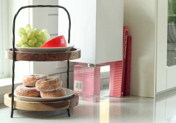
I hid the cords from the table lamp behind the two red cookbooks. The sugared donuts are strictly for show. We don’t actually eat them 😉
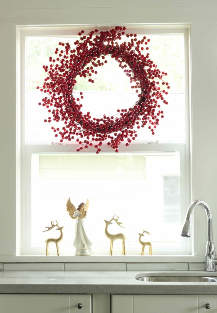
Irene loves God and angels, so we bought one for her windowsill with 3 reindeer.
Don’t look too closely at the white window seat. It’s dacron waiting to be re-covered in blue. The heart artwork was their wedding present from an artist friend.
The cabinets are from IKEA. The medium brown floors are perfect.
We carried the warmth of the cutting boards over to this side of the kitchen.
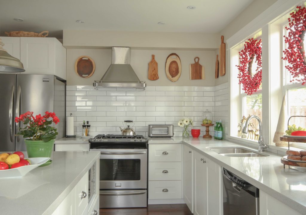
The new pendant lights were also from HomeSense. Way better, and the right length.
You don’t often see red on the blog because it’s not my colour but it sure is pretty in Irene’s holiday kitchen styling!
Here’s the before and after again:
after
After
I’m off to Tampa on Monday morning to meet a whole new crop of True Colour Experts! I’m so excited. And my new website will be up very soon! Stay tuned!
Related posts:
Atmosphere: The One Thing You Cannot Buy
How to Style a Kitchen for a Photo Shoot – 3 Rules to Follow
Style your Home Like the Pros Using the Triangle Principle


The floors look much darker than med brown.
That’s because wood does not photograph well in general. Maria
Love it! It looks like you changed the wall color to a lighter shade. What color is it?
Oh, wow…I’m speechless! I seriously don’t know how you do it (and so well), but thank you for showing us such beautiful “Before & Afters!” Styling is definitely where I get stuck. Love the berry wreaths and cutting boards–especially the ones that are simply tree slices. I’m going to start perusing our local Home Goods store and hope I can add some zing to my home, too.