Whenever I give colour advice on this blog (which is often), I inevitably receive a comment from a reader who will generously post their advice or opinion, and then end with, “Colour is a personal choice”.
The other day, I got to thinking about this highly overused phrase, and I realized that there are times when colour should be a personal choice. When you are buying a car for example. That’s an individual colour choice that won’t impact anything else combined with it.
However, if you are choosing colour and it needs to be combined with other colours, that’s when having a guide to choose the right colour is kinda critical.
I’m also asserting (don’t hurt me) that designers often use this phrase when they don’t know how to guide their clients to the right colour. So they simply say, “Colour is personal.” If you are a designer reading this, it probably doesn’t apply to you, but to everyone else. ; )
My fabulous design assistant, Tricia, worked in commercial art for ten years, where she noticed a similar tendency. She’s taking over the blog today to debunk the myth about colour always being a personal choice, and to share some ideas about how to make informed colour choices.
Hi, Tricia!
Maria’s right: a popular comment on this blog is, “Colour is a personal choice.”
And yes, colour is highly personal, psychological, and even emotional. But that doesn’t mean you can just slather your mood all over the walls of your house. It might start to feel… psychological.
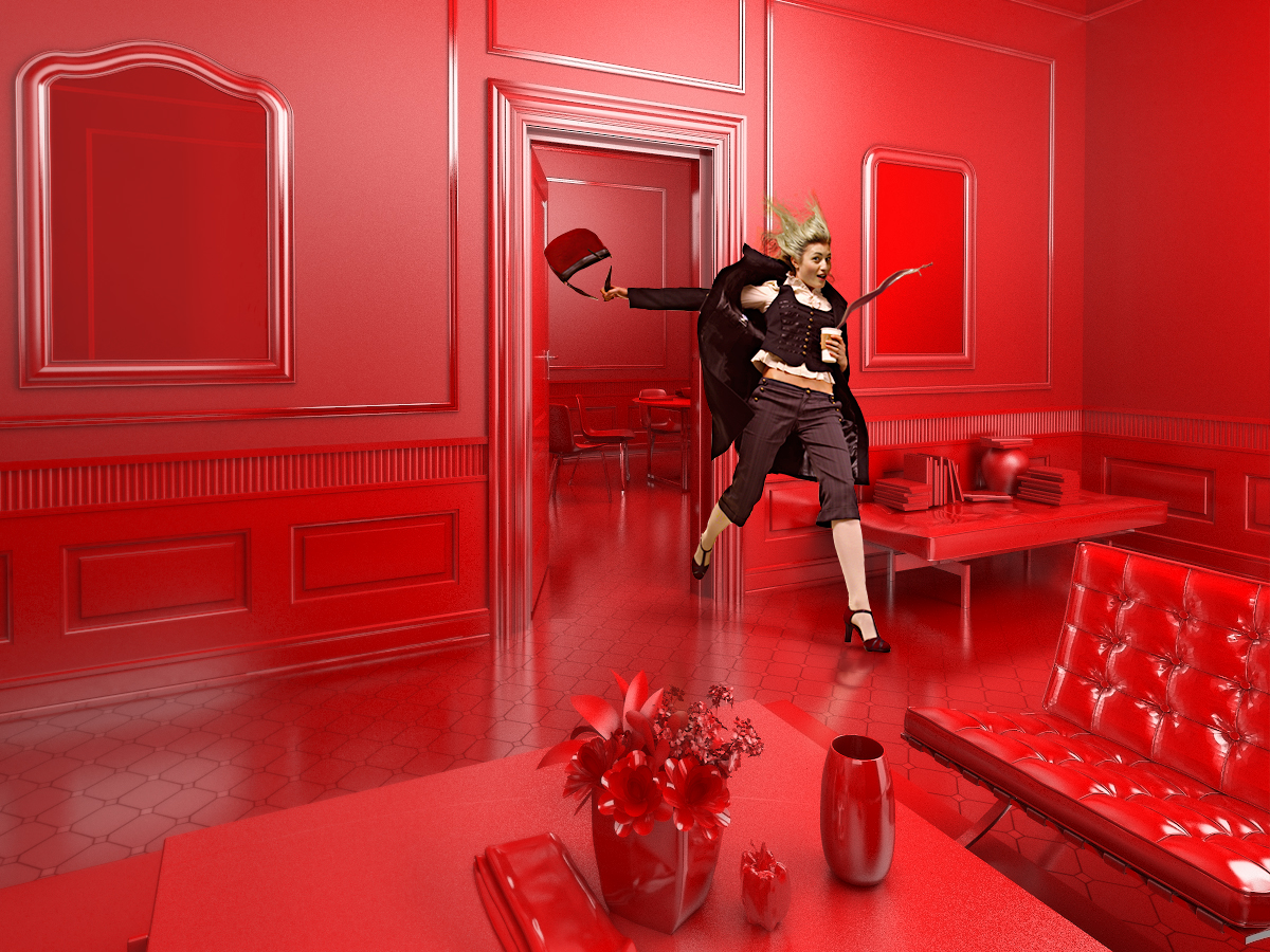
Red Room by Josh Kitney
I’ve spent the last ten years in commercial art. In the gallery, every day we hear clients say, “I don’t know much about art, but I know what I like.”
Increasingly, contemporary art is about context—that is, where it fits into the various dialogues about what art is. If you are not aware of these contexts (and they are many and disputed!), you will have no criteria for judging art except by what appeals to your eye.
If it matters to you whether you’re investing in a relevant piece of art that will retain its value, and you don’t have time to make a career of it, you need to find a professional dealer or consultant you trust. This is the best way to find something that both appeals to you and has some quality and relevance.
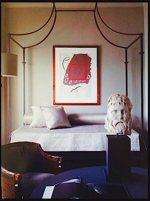
Design Nancy Braithwaite
For similar reasons, choosing colour for your space is not as easy as picking your favourite colour. It’s about context, too. Thankfully, the context here is more concrete, and there is a whole lot less BS to wade through.
From Pinterest
Still, there are many factors to consider:
What are the undertones of my fixed elements?
What do I want to draw attention to?
What do I want to make disappear?
How will the colour coordinate with my furniture and flow with the rest of the space?
If the way your space looks matters to you, you can agonize with uncertainty trying to anticipate outcomes and making your best guess, or you can run your preferences by a professional consultant and get not only something you like, but also the best colour solution for your space.
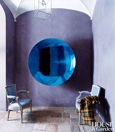
via Pinterest
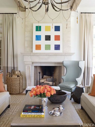
Veranda via Pinterest
The only time that picking a paint colour feels like picking your favourite candy at the corner store is when you have nothing to go on. No starting point, no plan. And maybe you’re blissfully unaware that it needs to work with your tile.
This is why you need a plan, some context. Your favorite colour should absolutely be part of the plan, but it’s very likely not your paint colour. It probably belongs on your couch, or a throw pillow, or maybe in your carefully curated art collection.
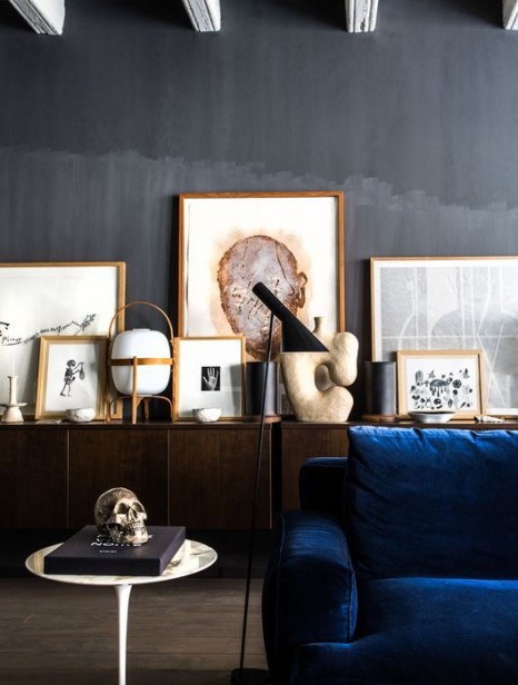
Anish Kapoor
You might be surprised that the colour that works best to offset the things you like is a soft grey or cream—something that never, ever would jump out at you in the candy store. You are not being boring. Its just might be the best solution for your space.
And sometimes you just need someone with experience to reduce your options and guide you to the right answer.
Understandably, people who don’t make design or art their lifelong focus underestimate the complexity of it. I’m here to tell you there is more to it than meets the eye.
Developing an eye for art or design is a long and convoluted process.
Those amazing rooms don’t just make themselves.
Of course, personal expression is a big part of collecting art or decorating your space, but getting the right advice can take you that much further with your vision.
—
Thanks, Tricia!
P.S. I’m excited to announce my new Interior Colour Solutions, similar to the Exterior Colour Solutions I launched last spring.
If your renovation or new build has come to a screeching halt because you don’t know which colour is right for your countertops, walls, cabinets, etc., go here to find the solution that will give you the answer you need!
I’m starting these at a low introductory price which may go up as soon as we get a true sense of how long they will take.
My colour advice comes from conducting literally thousands of consultations over the last 15 years, 7 years of writing this blog about colour, and my proprietary system of Understanding Undertones™, which is taught nowhere else in the world.
My system has saved clients all over the world from expensive colour mistakes. Will you be next? Click here to get colour happiness.
Get the advice you need here to make your home a work of art!
Related posts:
Ask Maria: Help! I Just had my First Real Colour Consultation


Tricia, I really liked reading your analogy to buy art. I find that the more context I have for interior design the more I understand what goes together and what doesn’t.
I also find that it’s true for everything in life that you are really ignorant about something until you can pinpoint why you’re really ignorant. Then, finally, you have some smarts.
Penelope
Thanks Penelope, I’m so happy that you enjoyed my post because I have read and learned so much from your blog! Love it!
Great post! And “Color isn’t a personal choice” is a brilliant phrase to shock-n-stop during a consultation without making a client feel wrong, since you’re not challenging them. (Well you are, but not directly.)
{applause}
BTW, my father collected art, which ranged from a $5.00 water-color by an artist in New Orleans (long ago!) to pieces by well-known or rising artists. The glue that held his collection together was his absolutel love for each piece. And careful framing. So “I know what i like” has its place, as long as context is meticulous. (Oh, and framing. So important!) Just my take.
Great job!
Great article! I would LOVE for Tricia to expand on the concept of buying contemporary art too! You’re never supposed to select a painting to match the colors of the room, but lots of times with the new “trendy” contemporary art (i.e. google Mallory Page), what else is there to go on? I’ve always heard that for this type of art, you buy it because you’re buying a “mood”– and for how the art makes you feel. But those are really the only 2 tips I know for buying art; I’d love to have more sophisticated advice to share with my clients…
Tricia is the expert and may disagree (which is great, but meanwhile, lessons learned from my father:
1. They have to love the piece.
2. Size/scale/placement* must make sense – like for a sofa or table.
3. It has to be framed beautifully if it needs a frame. That can mean spending more on framing than on the piece.
4. Unless they’re looking for an investment, which is best left to a real expert, it doesn’t matter if it costs $10.00 or $10,000.
My additions:
1. Color matters. Wall color can enhance or mess up a piece, like for any design element. I’ve found white can often suck the breath out of a wonderful piece.
2. Color matters. While matching is the booby prize, like you alluded to, paying attention to what other colors are or should be in the room can also enhance a piece.
3. Put art in the garages among the hanging shovels, in laundry rooms, and other unexpected places. .
If they don’t care about art, just about decorating their space, we can do the above.
If you don’t think you have an eye, google phrases like, “art above sofas” to look at hundreds, thousands of photos and copy those that have something to teach you.
Clients of mine were collectors, and once I asked if we could just swap two pieces that were in two different rooms. The difference was so far beyond what I imagined. So correct placement, and moving a piece around can make the difference.
I’d love to hear what Tricia says. Sorry this is long – it spoke to my heart.
Hi Beth,
I’m so happy you responded to the post. I agree with you. There are so many ways to approach collecting and decorating. I have a few reproduction pieces torn from old books and beautifully framed in my own collection. But I have confidence in my eye and my interests, I’ve done the leg work. I find so often when buying expensive art, people who don’t trust their eye or expertise “play it safe” or buy something somewhat boring or cliched because they don’t take the time. This happens with decorating all the time too, and that’s why it’s always smart to hire a pro. They can help you learn what’s worth it and what’s not and save you time and money 😉 I agree too that very often a piece needs a strong colour to support it. So many gallery clients proudly proclaim that they painted their whole space white to showcase their collection. While some all white spaces are breathtaking, in galleries those white walls mostly function as a neutral backdrop. Art in homes should be a part of the overall vision and feel, it’s whether it works or not.
Thanks 🙂
Hi Joanne, I am stewing up something more to say about collecting art for you all. There is no real shortcut or formula though unfortunately, but I’ll try to distill some insight. In this post I’m saying you need to find the advice of someone in the know, just like you would find a lawyer or real estate agent so you don’t get in over your head. If you’re purchasing inexpensive prints (which is totally valid!) or canned art (I feel like they don’t carry the energy of something genuine, and you’d be better to look for student work or reproductions of better stuff), then just experiment and allow your interest to guide you. I would caution against picking something because it has the right colours as the first or only criteria. It should tug you on some other level at the least, and the more informed you become (about art in general, and your particular interests), the stronger your collection will be.
Thank you, Beth, for your thoughtful reply. Art selection isn’t a subject that is covered much on blogs!
This is particularly true for my specialized design focusing on marketing homes here in Seattle. Clients may love a color but choosing shades that have broader appeal or updates upon some hard finish selections that are now dated often are not their personal favorites. Those busy tile designs often rule out any personal choice on wall colors. I spend most of my time gently telling clients why we can’t keep their favorite color choices for resale. Color choices can have a big impact financially. Purple houses and purple cars will be harder to sell down the road and see a greater decrease in value just for the color choice.
So refreshing and reaffirming to hear from you that cream may be your best choice as my palette is cream and not the fresh white that everyone is into these days. And fun to reevaluate why the yellow beige walls the previous owner painted my open LR/DR (now office), kitchen and hallway reads a soft leathery yellow in the LR/DR and has been the perfect background for my most favorite piece of art, yet the same color in the kitchen with it’s shaded west window/patio door and boldly unshaded south window sometimes seems a bit washed out, and why I’m very grateful they didn’t change the 30-year old slightly creamy white of the bedrooms. The east-facing guest room works well for now but will be painted in a perfect color later, thanks to Maria’s wonderful summer school course in 2014, but the west-facing master bedroom with its 8′-wide window looking out on grass and green trees (here in sunny desert Arizona) takes on a wonderful magical quality at certain times of day, particularly great for waking up from afternoon naps, that I’m not sure a “color” could achieve. Maria’s not only a fantastic teacher but she’s great at bringing in others to share their particular expertise. I hope we’ll hear more from you, Tricia.
“fresh white that everyone is into these days.”
Everyone? If you’re talking about on walls, not me, ever. Not most consultants who I respect. It’s a trend, that’s all.
It is often suggested that a person buy a piece of art they love and use that to determine the colors of the room, therefore the art would “match”.
And I understand I am ignorant about art because I see nothing wrong with buying art based on what is appealing to your eye. Buy what you love if you are looking at it everyday. Why would you do anything else? Buy a piece of art in anticipation of it increasing in value, but is so unattractive you have to hang it in the back of the closet?
It probably depends on the depth of your pockets!
I agree Karen. I am talking about when people are looking to spend some real money on art. Often when clients are looking to have their home painted or decorated they are going to spending a big chunk too, so this is when professional advice makes real sense. I am not suggesting you buy something you don’t like, but to seek guidance to find something that both appeals to you and has merit. As I mentioned once already, if you are playfully expressing your own interests and what appeals to you on less expensive pieces, go for it! Just don’t play it too safe 😉
Tricia and Maria, Fantastic post! I will be sending this on to several of my clients who say that they do not agree with my color advice. (Why they ask an expert and then reject the advice I will never know). However that being said, it is so much easier to show them why the certain color works with Marias’ color boards. Along with being designers we are also teachers.
Well done article. Thank you very much!
Loved this article! Would welcome more on art. 🙂
I loved reading this. This is going to sound so juvenile (my background is tech but I come here to learn as we’re updating floors and counters in iur home) but it made me realize why one of the best paper colors I used in making family scrapbooks was called “cement”. It made the photos pop.
The title of this blog post made me think of a few local homes that have languished on the market. I didn’t want to deal with them because of the highly personalized color choices. Eek!! It probably wouldn’t take THAT many coats of paint to cover eggplant but there were plenty of other homes that didn’t have those issues so we passed. Oh and jade granite? Be as personal as you like but be prepared that your choices may stay personal!
2 coats max to cover even the darkest or brightest colors if using Ben Moore Aura. And I believe SW may have a paint product that does the same now.
so true! I do interiors and constantly SHOW clients that certain colors will fall flat in their homes while others sing! Plus I tell them that being on trend is not as important as using what looks best for the space.
The colors I chose in my own home are not necessarily on trend or what I would have liked BUT they relate to the cabinets and floors that exist in my home…and therefore it all looks like it works.
Not to mention these are big homes and changing for the trends is timely and costly!
Im sure there are some people that would come in here and wonder why I dont have all gray stuff!!! 😉
But if they asked Id tell them!
Amateur speaking here: I think of art as “tying it all together.” Even when art is chosen first, it will look like the dot over the eye, yes?
My problem–which I imagine is a common one–is all about proportions and mixing shades of a certain color. For example, my LR is Stonington Gray; the curtains are charcoal gray (pretty true charcoal, not green or purplish undertone–probably). These relate to some different (lighter) shades of gray in wall art (along with beige in same art, which gives a shout out to beige sofas). BUT: Are charcoal gray and Stonington considered different colors? Or are they considered variation of same, both relating to art on wall?
I have same issue with blue in another room; navy and lighter blue (muted blue, not a bright blue; ie, I don’t think I’m mixing dirty and bright). Considered same color, or too different? Which shade of blue am I striving for in the art?
It’s impossible to say without seeing your colours Mae, but I would have no hesitation about putting any colour of artwork in a stonington gray setting, with any shade of blue to relate, or not. If you’re too careful about matching, it will look static and flat.
If the art is seen as the dot on the “i”, it might as well be a throw pillow. A real collection is the meaning of the sentence 😉 😉
Ha ha, oh boy, I think I need demotion from amateur to…what’s below? Even though I pay so much attention to interiors, I guess I’m not that visual a person (reading and listening takes up much more of my head space). And yet. My father is an amateur photographer and I have resolved to put a collection of his photos on my wall; they are beautiful AND meaningful (with beautiful colors).
Also, was waffling on decision to continue Stonington from LR to stairway off of it (where I am planning a photo wall). Your comment helped me decide: Stonington it is. Thank you,
Mae, you are obviously a very visual person or you would not be here! We’re all on the same learning curve 😉
I never cease to learn something from you and your team, Maria. Tricia has made me think hard about that turquoise wall I had painted when we moved into this home. I debated back and forth but my husband finally said, “It’s only paint and we can repaint if we don’t like it or it doesn’t work.” I’m still not sure if it works and if the art works. So I am finally going to do what you always tell us to do…hire a professional! Will send you a message soon, Maria and Tricia! 🙂
Speaking about color being a personal choice, in our last neighborhood, the houses were little cottages from the early 1900s. We used to love to walk around our block with our dog. One day we rounded the bend, and were shocked that one of the houses had be painted a bright royal blue. At a later point we were talking to the owners, and we mentioned their new paint job. They said they loved the color on the chip, but were shocked when they saw it on their house! You really do have to think about color in context!
Hi, we have Hickory cabinets in our kitchen. The flooring is vinyl 12×12 in sq with a “rough” darker grey grout separating the squares. The stones look a little rough with shades of grey (lighter) and dark and a little taupe. Our house is”open floor” and we are having a hard time deciding what color of vinyal plank flooring would look good with the kitchen. We live at a lake so thus the decision to go with vinyl flooring. The living room is painted a medium grey w/ windows across the whole front, however the room between the living room and kitchen is quite dark. We call it the fireplace room because it has a fireplace with almost a peachy brown brick with other having a yellow shade. The grout on that is a medium grey. Help please!!!!!
This truly answered my problem, thankyou!