
Anthropologie
When I was a new designer and I had to choose a sofa for a client, I would show up with my binder full of every sofa style available.
Then as I gained more experience, I realized that doing that made me look like I had no idea which sofa was the right one. And looking back, I mostly didn’t. I was hoping my client would choose to take me off the hook.
It works the same with paint colours.
If you hire a designer or colour consultant and you are left with 10 (or more than 2) different shades of neutrals or colours to test for one room or one exterior?
Well, she (or he) doesn’t know which one is right either.
And she is hoping that one of them will be right or that, in the end, you will choose.
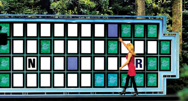
Vanna White doesn’t choose letters for you, she simply reveals them for you and points.
And just to be clear, every designer is Vanna in the beginning of their career. You can’t possibly know all the answers until you gather enough experience.
I used to follow my mentors around and write down every single thing they said during a consultation. I thought doing that would give me all the brilliant answers to why they made the suggestions that they did and soon I would sound just like they did.
But every consultation is different, and as I soon discovered, I simply had to put in the time and make all the mistakes that would eventually turn me into an expert.
There are basically 9 neutral undertones, 3 greys, 3 beiges and the secondary undertones which are outlined, in detail in my first eBook, How to Choose Paint Colours; It’s all in the Undertones.
Therefore, if you know what they are, the paint colours you are specifying for your client get very limited really fast.
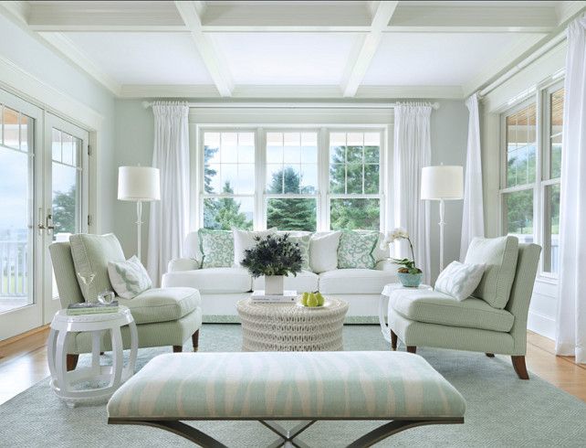
Interior Design by Maria Killam SW 7555 Patience (pink beige)
Tobi Fairley Green Beige
If your client wants a grey palette, you’ve just eliminated pink beige, green beige and yellow beige (above).
Same with gold beige, orange beige and taupe. Now we’re left with violet grey, blue grey, and green grey.
If your client does’t want a blue house, that eliminates blue grey right now.
What about a purple undertone? Could be, there are some pretty ones that might be right.
Then green grey. That’s the grey that often looks the most like a neutral grey.
So now we’re at the end of the neutrals.
Pretty easy really. If you know your neutral undertones.
And this is the reason you should have a maximum of two paint colours to test for any given space.
Because we’ve just taken the world of thousands of neutrals and eliminated all the undertones that are not a consideration down to one or two.
By the way, I wrote an article the other day on Medium. The DIY Guide to Getting your Dream Kitchen. Don’t miss it.
And come back here and tell me what you think!
Related posts:
6 Ways to Choose the Perfect, Neutral Paint Colour
What Everyone Should know about Beige
What Everyone Should know about Gray
If you’d like to become the next True Colour Expert™ in your area register here.


love the article on Medium! I agree completely…if you are doing DIY you have to follow ALL the rules. Only a designer knows enough to know when you can make an exception.
What I would do if I was the person from the Medium article is find the piece of granite that I wanted (as close to the dream kitchen as possible) and send a sample to Maria (and a sample of the subway tile) and let her pick the white that would go with it. That way at least the undertones will all go together and your kitchen will look great!
That was me when I started out, schlepping all paint colours, willy-nilly, looking for the perfect one. Now I know how to give my client the perfect colour the first time!
I read your DIY Kitchen Guide article Marie, but I am wondering if a similar rule applies when choosing a quartz countertop for a bathroom where the colour of a white sink for example is dictated by the manufacturer (i.e.: Kohler). That said, I am currently renovating two bathrooms and just looking at flooring and wall tile can also be mind-boggling as they too definitely have their undertones … ☺. -Brenda-
Informative and interesting article as usual, Maria. When I first read the title, however, I thought you were talking about not specifying a color called “Vanna white” (which I had misread at first(on my small phone screen) as “vanilla white”)–and I was curious as to why that particular shade of white was so particularly bad,LOL☺️
I thought the same thing…that Maria was saying no expert would specify a silly name for a paint like “Vanna White” — HA!
Wow, you’re good Maria! But hey we already know and that’s why we follow your advice 😉
I work with coordinating and matching colored fabrics on a daily basis. Knowledge can’t be faked. It is something that needs to be learned with experience over time. That said, I love my job too!!
Darlene
http://www.BundleMeBaby.etsy.com
I think you just walked us thru your whole color theory in a
simple form……..great article………really liked the one on Medium….made a lot of sense. I will be reading more of
them.
Thanks,
Carol
Maria, I love your new way of teaching color. Teaching by example is the best way. This is such a good post!
By the way, you are already the Vanna White of color.
I love your article on Medium. No hem-hawing around, just this is what will work! You can pick out colors and finishes in a couple of days rather than a couple of months, or years, sigh. Wonderful.
Brilliant article. Love the cut-to-the-chase attitude! And all SO true.
I definitely agree with Maggie – the only way to get that perfect piece of granite is to pick it out yourself. I know from experience in the week that my late husband and I thought about getting granite for our kitchen, went looking and found the perfect 12″ square of soft white with the faintest thread of maroonish red to coordinate with our pinky beige 90’s cabinets and the SW Barn red accent wall in our family room. The very wise salesman urged strongly that we drive down to the warehouse on the other side of town to see the slab. When we walked into the warehouse, they pulled out the chosen slab and our mouths fell open. We saw absolutely nothing that looked like that 12″ square of soft white with faint thread of red and I don’t think we ever found it in the unbelievably dramatic swirling of reds and turquoises and some creams and who knows how many other colors. We would have needed a 4’x7’ slab just for the island. I would have shot myself if my husband wouldn’t have shot me first before himself. Granite? Never!
Loved your article and agree with Carol. You’ve summarized your entire book and course in a few sentences. And, with Lucy, I’m loving all the examples that exemplify the colors and those that name them as well so one can check them out for real against different monitors. This was a summer school course in less than 30 minutes and it was priceless.
Great article on Medium. You are tireless in your quest to convince people to go with classic white kitchens! You go, girl!
I find gray tile can be one of the hardest to choose with clients. So many of the tiles get really purple. There aren’t many true neutral gray tiles out there (well at least from my suppliers).
Maria. You really simplified it for me. Thank you thank you! I totally got it. Finally. It was so overwhelming at first. I’m a store decorator/designer and have no issue with creating and coordinating all types of displays-big and small. But for some reason paint choices make me crazy, lol! I now feel confident that my next pick (oh and it’s coming alright) will go much smoother. I am looking forward to less of a struggle as is stated over and over in the comments. I love design/decorating/creating. Some of us are just color/colour junkies. Fact. Thank you for allowing us to allow ourselves to make mistakes–knowing in time and with your awesome guidance and direction, we will succeed. I am one grateful reader.
This is why you are brilliant! And why I love the paint colors in my house!
And “Boring equals timeless…” That is so funny to me because timeless is so not boring to me. It is gorgeous!
Luckily, it turned out great and was just what the brick needed to bring it into this century. I love that ceiling rod holders are available for situations like this.