The difference between the Tuscan Brown Trend and The Colour Trend is this: one gave us more of a monochromatic feel (or a look not built around contrast) for our homes, while the latter is more about creating contrast.
It’s not that we decorated our homes without contrast but for lack of a better word, basically colours blended in together more.
Here’s what I mean by this:
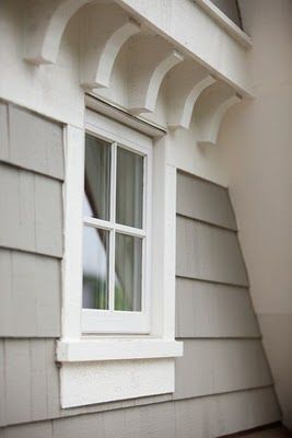
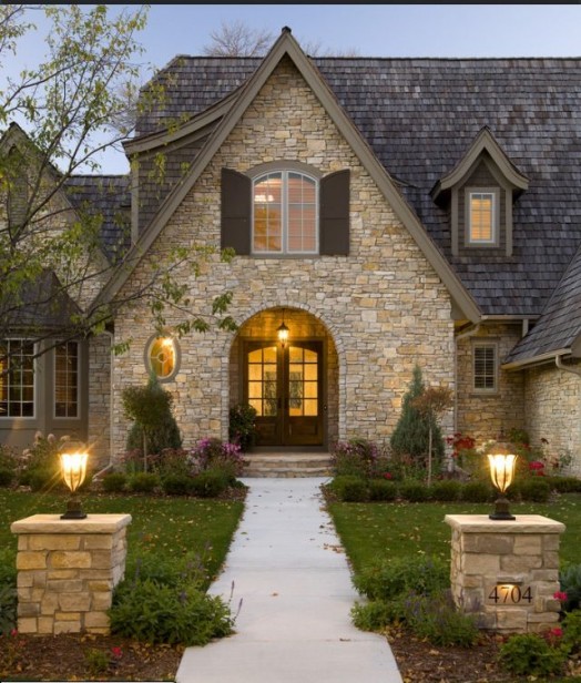
MONOCHROMATIC During the Beige/Brown/Cream Trend, I specified a lot of trim that was dark. Sometimes I simply chose a darker colour than the main body colour.
Colours were more muted and dirty, and they just blended in together.
Here’s an example of what I just mentioned but in a current colour scheme (above).
There are many, many homes all over the country that look just like this one (above). Not a lot of contrast, all colours blending in together.
Nothing wrong with this by the way, it’s just what we were doing in the Tuscan Brown trend.
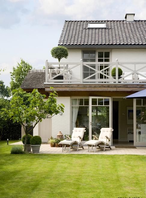
If you were building this house now, you might go for cream instead of brown (above)
CONTRAST
Now that the Black/White/Grey/Colour Trend is here, a lot of trim is white or cream, which creates more contrast.
Colours are more crisp and clean, and again, there’s simply more contrast.
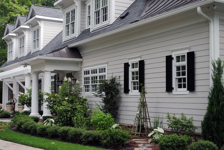
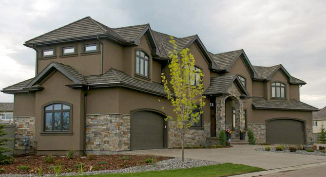
Light grey house with white trim and black shutters. A very trendy colour scheme.
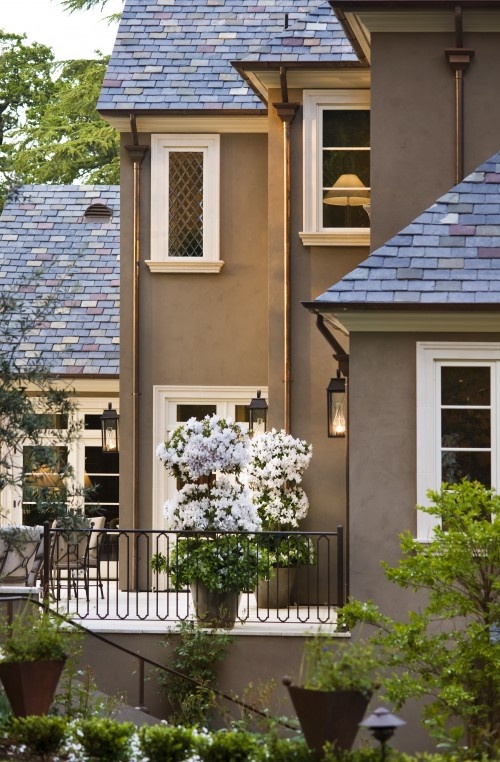
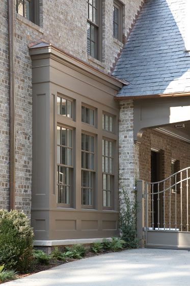
And here’s a brown house with creamy trim.
So, if you are looking at your house and wondering what to do to make it feel more fresh? Simply painting the trim white or cream might just do the trick.
If you need to know which white or cream will work with your house, my exterior masterclass will help you find the right one.
My live, online workshop will teach you how to compare colours so you AND your client can see exactly what you’re specifying.
It seems a little magical until you discover it for yourself in my two-day training.
And then, once you’ve got it, you can create as much magic as possible back home with your clients (and for yourself, too).
Through the art of comparison, you’ll discover how to explain to your clients WHY the colours you’re suggesting are correct. And this moves your business from one where you’re giving advice via your intuition vs. using your intuition to guide you to give the right advice and then at the same time, being able to explain why it’s right.
This builds trust, and the more your clients trust you, the better your (and their) experience of the entire job will be.
If you’d like to become the next True Colour Expert™ in your area register here.
If you would like help creating a beautiful and classic exterior, we have e-design exterior consultation packages available here.
Related posts:


Our whole subdivision is packed with homes that are all monochromatic in the trim. It looks boring to me. Only a few brave home owners picked a white or cream trim. Those houses do look fresher and I like them so much better.
Different Martha here!
I was one of those brave souls who bucked that trim and went with white to go with my house that is the color of decomposed granite (golden color), instead of the drab grayed down colors the consultant was pushing.
I’m so excited you’re going to Italy! I’ll be in Sonoma, CA, (my sister lives there) and spending time in San Francisco next week. Thank you for the great post, too, even if it was a lead-in to sell your course! As a TCE graduate, I can’t tell you how much your training has helped me grow my new business AND make decisions in building my new house next year! It’s truly my dream come true. XOXO
Ten thousand hours?! Shades of Malcolm Gladwell!
I’d never heard of the Tuscan Brown Trend. And I read all the decorating magazines. I don’t know how I missed it. Thank you for enlightening me!
I agree 100% with the trend to contrast our colors. All of the houses pictured are beautiful! I especially like the classic light home with black shutters and the final picture of the brown home with creamy trim. Have an amazing trip, you’ve earned it!!
Darlene
http://www.BundleMeBaby.etsy.com
Certain trends seem to skip regions of the US. And some trends only appear in new construction, never really “catching on” with owners of existing homes. What you’ve labeled as “trendy” Maria, the grey with white trim and black shutters, is a common “classic Colonial” among older homes in the South East of the US. I haven’t seen Tuscan brown in the SE, except on new construction in the Craftsman style. Though I have seen some mono chromatic schemes. Browns were popular on contemporary homes with wood siding in the South in the 80s. Historically, we see light pastel colors on house bodies here- perhaps due to the prevalence of wood siding and red brick. And the fact that it’s HOT here in the summer (100 today)
This is a great comment because it brings up a good point: the fact that something is labelled ‘trendy’ right now doesn’t mean that at the same time it’s not ‘classic’ as well. Hardwood floors in kitchens and subway tile are really trendy right now but they are also classic and stand the test of time much longer than trendy tile which you can identify when they were installed within 5 years or less. Walk into an 80’s house and most likely the tile you encounter will be some shade of pink, 90’s grey or busy slate, 00’s brown, mosaics, dark slate, and today, charcoal.
Boring equals timeless wins every time. Thanks for your comment.
These colours are also prevalent on older homes in the NE, such as Maine. I think the brown trend was and is popular in the SW. One problem with incorporating trim in a white is that’s all one sees: the trim. It needs to be the correct white, otherwise it’s just jarring.
Yes it does and that is all outlined clearly in my Learn to Choose Exterior Colours with Confidence on-line training. Maria
And it needs to be placed properly. I think a lot of people don’t understand where to place the trim and/or accent color on their homes; it’s done wrong a lot around here.
I agree J. I am in Atlanta, and in the more expensive areas, which I feel are generally on the forefront of a trend, you are seeing trim color close to the body color of the house. Maybe it’s a regional thing?
I love the black /white. But very afraid to try it. I live in a neighborhood that is not very pretty, I hope whatever I do will be an inspiration. The house next door is dark gray trimmed in white. How do I blend without copying?
Hi Crystal that is hard to say without photos, I would love to help you choose a colour via eDesign, you can check out our packages next month. https://mariakillam.com/shop/#exterior-solutions
Maria