Whenever I have introduced the concept of clean and dirty colours, without fail, someone raises an objection to the term “dirty”. They wonder why I don’t use a term that implies less of a value judgement like “muted” or “toned-down” or “complex”.
I’ve been effectively teaching the difference in my Specify Colour with Confidence workshops for years and lately, I have come to the conclusion that my very old post on Clean and Dirty (written within two weeks of starting this blog 9 years ago) needs an update for this very reason.
When is ‘dirty’ the only appropriate word to use when describing colour? When the cleaner colour makes the more muted colour look dirty. First, let’s talk about the most important distinction you need to know anytime you’re choosing a colour:
COMPARING colour
The only way to know you are moving in the right direction with your colour scheme is if you are comparing one colour to another colour.
It’s why (as I teach in my White is Complicated eBook) to show your spouse or client which white you are selecting or specifying, you compare to a ‘true white’. That’s the only way to see the white accurately. Waving around the paint chip you’re considering with conviction is useless without the comparison.
It’s the same when you are comparing colour to determine if you have created a clean and fresh palette or a muted or dirty palette.
The red in the first image is way muddier than the red in the second image. So if you were choosing colours to work with either colour scheme, you could choose brighter colours to coordinate with the cleaner red sofa than you would with the burgandy walls in the first image.
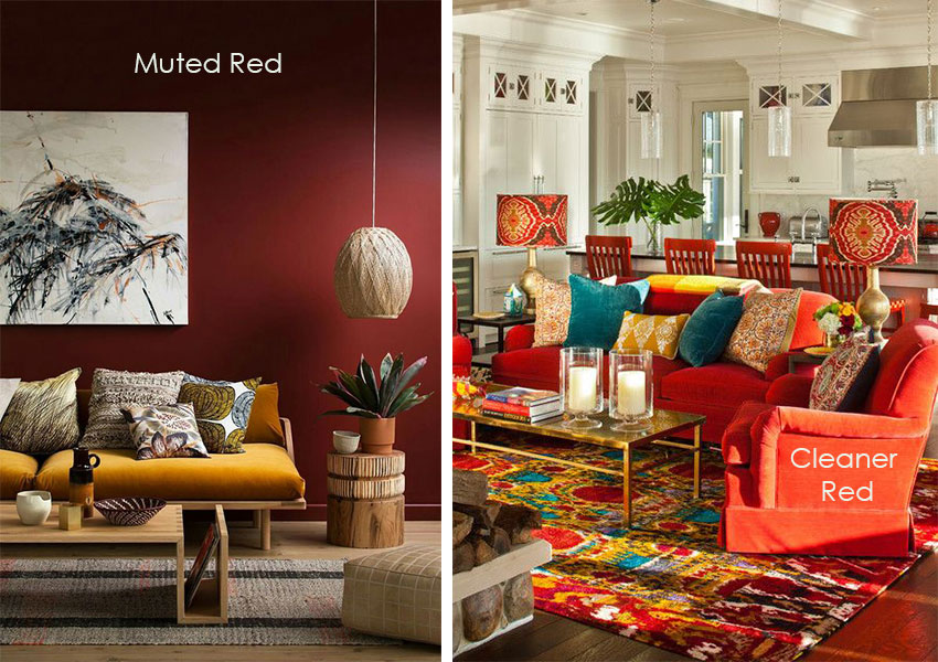
Source, left | right
When there’s something wrong with the balance of clean and dirty
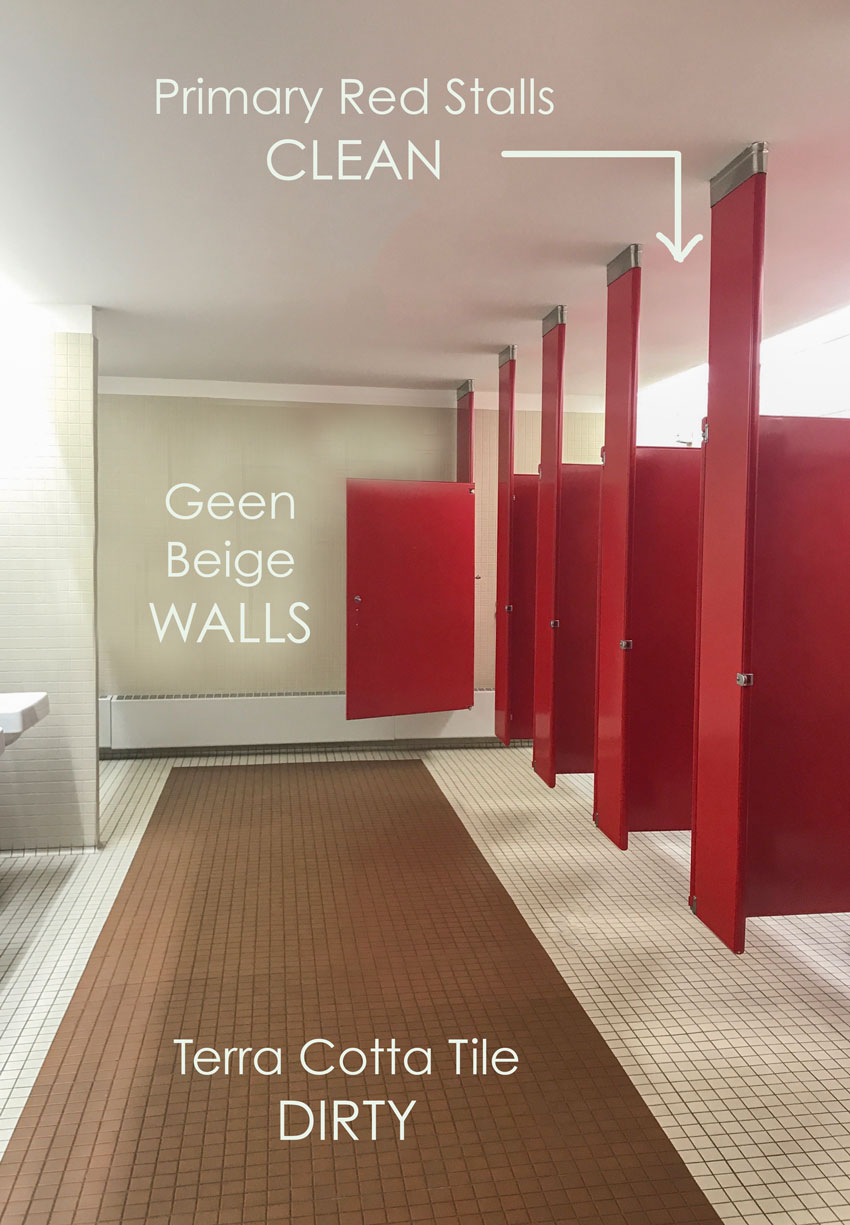
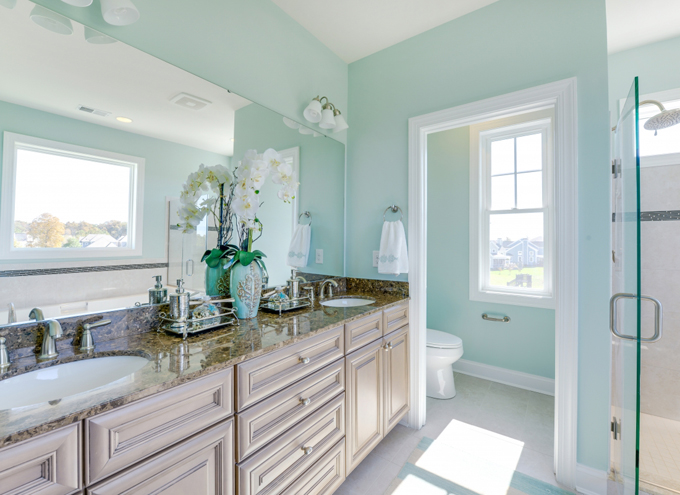
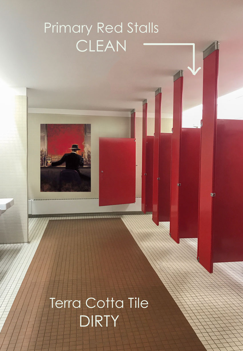
In the above colour scheme, you can use a less judgemental term like ‘muted’. However, I recently saw a commercial bathroom that illustrated perfectly, when DIRTY is the best way to describe what’s wrong (below).
The most accurate way to describe what’s wrong with this bathroom is that the primary red stalls make the terra cotta tile look dirty.
You simply wouldn’t say “The tile looks muted” in comparison because it just looks dirty.
This is the reason that I’m a fan of classic white bathrooms, because if you have tile similar to this colour in your bathroom, especially if it goes up the wall around a tub, shower or backsplash, basically the only way your bathroom is ever going to look right is if the walls are painted a colour that relates to the tile. There’s nothing wrong with that, however, it would feel limiting after a while.
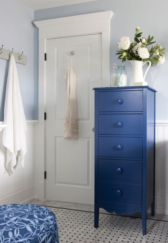
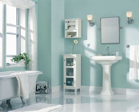
If you choose white (or off-white or cream) tile you can decorate with cornflower blue if it strikes your fancy (below).
Related post: The Best Cream Bathrooms
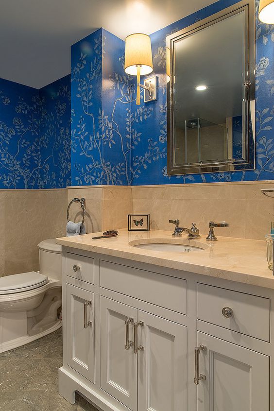
The green beige floor tile and pink beige wall tile in this bathroom (below) is solid enough that it doesn’t really clash with the clean blue wallpaper, however, it would have looked much better if the tile was white.
The introduction of blue wallpaper here makes it look like this bathroom has received an update from what it orginally was.
Otherwise, why not choose a wallpaper that actual picks up the colours in the tile? That would have made this bathroom look less like “New wallpaper, old tile”.
Related post: How to Make Earthy Tile Look Expensive
Here’s an example of an “updated” bathroom (below) with the vanity painted pink taupe, deep gold earthy granite, pale taupe tile and a clean turquoise on the walls.
See how the clean turquoise makes the pink taupe on the vanity look like some kind of weird fleshy mud? It doesn’t help that the granite is much too gold and doesn’t relate to the floor tile I’d change the countertop and vanity here to white, the floor looks pale enough to ignore.
Better if the tile had been white (below):
There is nothing wrong with “dirty” colours. It’s just better if you don’t combine them with clean colours.
Here’s a room decorated in more earthy colours with lots of texture and white like this room (below).
A Clean Colour will always Make the Dirty Colour look, well Dirty
It’s important to understand that clean and dirty generally don’t look good in the same room (or exterior). Clean will always trump dirty and will make your “sophisticated muted colours” look awful and simply DIRTY.
Here’s another example with a clean yellow colour scheme. Since yellow is the brightest colour on the wheel, it tends to look too bright by default. In most cases, yellow needs to be muddied down a lot to play well with other colours.
This kitchen (below) has super clean yellow cabinets and pale creamy yellow beige everything else.
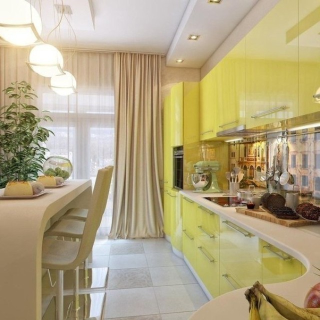
The clean lemon yellow cabinets make everything else look a little dingy. White (or black) or other shades of cleaner colours would have created a better colour scheme here. However, the styling is good in this kitchen and the mural backsplash looks like it relates to the more dirty, beige tones in this kitchen.
If all else fails and you can see that you’ve got some fixed clean and dirty elements you have to live with, start styling.
Find a piece of art (or carpet or fabric) that makes the colours work:
This bathroom suddenly looks so much better with just a piece of art that pulls in both colours to make it look intentional.
So, as I love to say in my workshops, “If all else fails and you’ve made a mistake, start styling to make it look like it was what you intended all along”.
The concept of clean and dirty is especially important when choosing colours other than neutrals. In my system, when we’re talking about neutrals, the main goal is to identify the undertone, but when we’re talking about choosing other colours, that is not the conversation. Choosing colours that work well together (if we’re not talking about neutrals) is not about undertones, it’s about clean and dirty.
If you’re choosing accent colours to decorate with, it’s important that they are all similarly clean or dirty. How can you tell? If you lay out your fabrics and colours together, and one jumps out at you while another sits back and looks relatively muted, you have a clean and dirty combination going on, and you’ll need to tweak it.
In my live colour events we do an exercise on this with paint chips and create a palette where all the colours are similar in the relative clean to dirty scale. Because comparing colours is the only way you can see it.
Does this mean that your accent colours need to be as dirty as your neutral finishes? No, but earthier paint and finishes will look better with slightly dirtier accent colours, where as whites, grays and greiges can handle much cleaner accents.
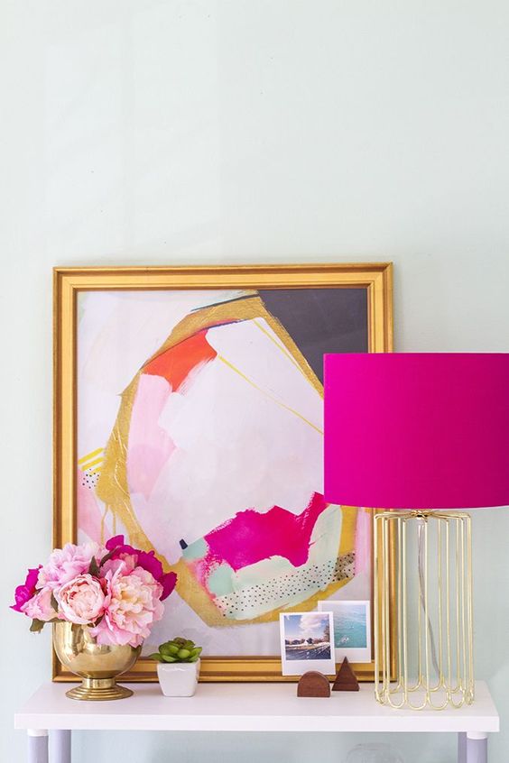
This hot pink and gold vignette would look pretty garish in a sage green room, but with all that white it looks lovely and fresh.
Clean colours in the right context look vibrant and fresh, but in the company of dirtier colours, they can look garish or harsh. Dirty colours in the right context can look muted and sophisticated, but in a room full of clean colours, they will look muddy and dull.
Just like with anything else, there will ALWAYS be exceptions to the rule, but it’s important to learn the rules before you break them.
Clean and dirty is relative, just like warm or cool. So just like you can’t technically look at a colour in isolation and call it ‘warm’ or ‘cool’, clean and dirty is the same. It depends on which colour you’re comparing it to.
Learn to compare your colours to determine how clean or dirty they are because when it comes to colour, context is everything and guess what? I’m sticking to the term “dirty” because it’s the same with words 😉
Which colours do you prefer, clean (fresher and brighter) or dirty (muted or complex)?
Related posts:
This Pie in the Sky is Clean and Dirty
This Colour Mistake will Make your House look Bad


To me, that clean turquoise wall color in the bathroom photos is really lovely! I know context is important and it is even lovelier in 2nd version with white tiles and fixtures. I could certainly see the temptation to paint the walls that color even in the top bathroom photo (even thought that might not be optimal).
And there’s nothing wrong with that, it’s just easy to see what I’m talking about with that image. Thanks for your comment! Maria
Maria, I will have you know that you sent a referral to me from a woman who discovered you by googling “dirty white trim”. She knew that her trim looked “dirty” compared to the other colors and finishes in her home and she was trying to understand how to fix the problem. She was savvy, she had a great eye for color and knew what she wanted. She just needed help getting there. Thank you so much! ?
And this must be the reason why your clean green front door looks so great. It only has white and beige around it and the greens from the garden. Great post – thanks
This post made me go back and look at the post about the pretty/famous painted front doors in Palm Springs: https://mariakillam.com/best-front-door-colours/
Well, isn’t that so interesting how much better the bathroom with the red and terra cotta floor looks when you add the picture? It looks interesting and artsy, whereas above, it looked awful. Amazing!
And purposeful (in the lower picture), I meant to say!
Great post and information; thank you!!
if the walls are clean and your not going to repaint ….then you go out a purchase a new sofa in a dirty colour… not only will it look dirty … it will look old like it needs to be replaced the day it delivered… it will not look new & you will never like your new room ! cannot tell you how many times I have explained this to clients as I am measuring their room to fit their new sofa or sectional… most with this problem have just spent thousands on getting the rooms painted before looking for furniture and will not do it again for the colour of fabric or leather they have picked… we find a better (cleaner colour) for the new sofa etc…
Spoken like the True Colour Expert you are, thanks Carolanne!
Hi Maria, I have been following you for a few years, have your color boards and did a phone consultaion. I thought I understood the color/dirty concept but I read an article from another decorator that when painting a whole room and trying to match an item (like bedspread) you should go 2 shades lighter and 2 shades more muted. For exampe, if I had that abstract at the top of this article and wanted to paint my walls pink, I would not do the pink in the art as the walls would be too bright. I am confused. What would you suggest? Thanks
That is really generic advice given to the novice who is about to pick a paint colour all on their own without consulting with anyone. If someone is choosing a colour using my system, they don’t need to follow fluffy advice like that. No, you probably wouldn’t paint your living room that bright of a pink, but you might paint your powder room that colour without a problem. That’s the reason why grey is here, to provide a crisp backdrop to a colour scheme like that entry table. Hope that helps! Maria
Cleaner colors! Muted colors always look tired and worn out to me.
Love the hot pink with gold! Would not have thought of that.
What is the paint color of the earth tone room? The door appears to be a grey but on my computer the wall is a white. Love it. My house is dirty earthy right now and want to brighten it up to the clean side of life 🙂
THat paint colour is an off-white, (like BM White Dove or SW Snowbound) however, most people can’t pull off plain white walls without decor like the one in the image or without lots of white being repeated. I would suggest a greige instead. Whichever one works with the existing undertones in your house, if you need help you can buy just a paint colour consultation in the eDesign section of my site!
Thanks for your comment, Maria
You’re a colour expert and I’m an editor. So I prefer the words clear and muted over clean and dirty. While context does matter with words, many (perhaps most) words and phrases carry baggage, whether we like it or not. That’s why I never refer to dark blonde hair as “dirty blonde.” or soft brown hair as “mouse brown.” In general, I like a slightly softened clear colour, since pure clear colours often look a little cheap to me (another word with unfortunate connotations!).
Hear hear.
You took the words right out of my mouth, hehe. 😉
MUTED colours in the wrong context can LOOK dirty, just like CLEAR colours in the wrong context can LOOK garish. It’s all context.
Yep…the baggage is there whether intended or not when it comes to words. No doubt when “dirty” colors are more the style they will not be called “dirty”…likely muted or earthy….even rich.
Hi Sharon, I appreciate what you’ve said as well. I was explaining WHY sometimes dirty is the word that best describes what’s happening but you beautifully clarified why sometimes people can get triggered by it. Thanks for your contribution to this post! Maria
Great post and really helpful pictures. You’re so right about yellow often needing a bit of muddiness added. I’ve seen rooms that were supposed to be a pretty pastel lemon but they ended up not quite lime. Add bad lighting and ick!
Great article, thanks Maria. I can really see and understand exactly what you’re saying. And that last photo – I absolutely LOVE it! WOW!. Talk about stunning.
I first learned this concept from the Color Me Beautiful system where colors are Clear or Muted, and that’s how I still think of them in my mind. Being someone who looks much better in muted colors, I like the word muted instead of “ewww, dirty!” (I have small children so dirty really means dirty.)
I prefer muted colors in my home and in my wardrobe.
In art school, colors were referred to as bright, or muted. To mute a color you would mix it with its complement on the color wheel. Muddy or dirty usually described something overworked, and not a complimentary description, though sometimes someone would say that a color needed to be muddied down if it was too bright for its context.
I like the terms bright or muted so much better. I know you, Maria, prefer your bright colors. As much as I enjoy seeing a room with brighter colors I would never want to live in a bright house like yours. You must feel just opposite. I have always felt you put down those of us that enjoy our home on the muted side.
What I see as most important is knowing your preference. And being content with your pick.
Hi Rebecca, I’m glad you posted this comment, the answer to your question should be in a blog post which I will write very soon. The reason I talk about clean colours all the time is because they are what is trending. . . before the ‘fresh’ trend arrived on the scene, the interiors I decorated (including my house) were most definitely more “dirty” or muted because earth tones were trending back then.
It’s hard to even find an ‘earthy’ interior image right now that MOST people would love WITHOUT a lot of white in it (like the image I posted above) for the very reason that earth tones are not trendy at the moment. So an interior with earth tones (from the tuscan trend) generally looks dated. And does this mean there is anything WRONG with an earthy interior?? Absolutely not!! However, given that I’ve been talking about the grey (fresh) trend much longer on this blog (I started writing this blog in 2008 and the grey trend arrived on the scene in 2009-2010) than the tuscan (earthy) trend, I can see how it might occur to some readers that I think there’s something wrong with a more muted interior.
Having said that, I will always stick to my guns with my statements about colour being way more classic than the current trendy neutral, that is a fact that I can prove over and over and over again. But does this mean everyone has to have a sunflower yellow sofa like mine? Nope. Just a colour you love over charcoal or brown is what I would recommend.
Thanks for your comment, I will clarify this further in an upcoming post, if you are saying it, there must be a hundred others thinking the same thing!
Maria
I very much appreciate the helpful points you made in your post, and not offended, just participating.
And I really appreciate that you posted a comment! Thanks Gery! Maria
Thanks!
I really am not an on trend type of gal. (Currently my sofa is a Wedgwood blue and before that white.) I have not decorated with either Tuscan nor the popular gray tones. My most sincere wish is that people/families really enjoy the furniture and decorations in their surroundings.
As Mama once said “things either wear out or ugly out. Your goal is not to live with ugly.”
This is one of your best posts, Maria!
That kitchen with the yellow cabinets makes me crazy. The cabinets look so happy and the rest of the room so dull. I would be unhappy every day of my life if I had to live with that.
I prefer clear colors, hands down. I think most people decorate with muted colors. Maybe that’s because they’ve seen strong color done so badly, that they’re afraid of it.
I love the “dirty” and “clean” language because that’s how it looks. We are not insulting anyone with the word; they’re the clearest descriptors. That said, I see these concepts at work all around me. Even in expensive hotels, they get it wrong. It’s a killer app. And whe I r do my bathroom, I’m coming to you for a virtual consult. Thank you for this update of really great material!
As long as it’s a shade of blue I don’t care if it’s clean or dirty. I love it!
My decorating is monochromatic. With very little contrast. It seems to calm the space. So bring me all the blues! As long as the tone works.
Now keep in mind no one from ElleDecor is knocking on my door.
Haha, I have seen your house Mary and it looks pretty designer to me! Thanks for your comment as always! x Maria
Seriously how is “dirty” when used to describe a color even a word that needs discussing? Who gets offended? The sofa? The color? The paint chip? I understand maybe not calling someones HAIR or EYE color “dirty” but that’s about it. People really need to stop being so “offended” by certain terms they choose to view without context and just use it as a hook to scream THIS DOESN’T ALIGN WITH MY PRECIOUS VALUES. I can’t eyeroll enough.
This is a great post, Maria, and I love it when you explain things in simple terms like that. Everyone knows what you are referring to and I can’t believe we live in a world where you seriously have to answer to this kind of shit. Oops sorry is that a muted word? My bad!
Ditto everything Gerley said! I like the terms clean and dirty because they’re easy to understand for most people. This is your system so call it whatever you want!!! Great post by the way.
Me too, I paint with watercolours and mixing “mud” as my teachers call it, is hard to do. It requires all primaries in different quantities. What is wrong with ‘muddy’? I think your terms are fine, and most accurate.
Haha thanks Gerley, I loved your comment too! Thanks! Maria
Great post! I needed that little bit of a refresher!
Maria, your explanation was perfect. Didn’t the floor in the red rest room look dirty? If you’re editorializing that’s one thing, but it suits the narrative, when getting your point across, to describe the color differences using the word “dirty.”
Great post. I like the word muddy more than dirty. 🙂
Great, informative post, Maria! A few years ago I graduated from RH Silver Sage to SW Sea Salt (love the greyed blue-greens) but now I think I am ready for some Cornflower Blue in my next project! Yes, in my watercolour class dirty meant flat, dead and a big mistake but I think your clean/dirty vocabulary gets the point across in your educational posts and seminars. Looking forward to your next e-book.
Sorry, just re-read. Didn’t mean for “dead” to offend anyone, it was just the terminology my instructor used.
Maria
Is the clean / dirty
The same as warm / cool
Concept ?
Thank you
No, warm and cool refers to if you were comparing two colours like blue or green, you would say the blue colour is cooler than the green one. Hope that helps! Maria
I think I would go crazy if I lived in the house that had the garish yellow kitchen cabinets. This post had really good pictures to back it up, thanks.
Great examples! “Muted sophistication” is my new watchword!!
Maria you are certainly the queen of color! I love all of the examples that you have used. As far as using your descriptive words I think that they make your point very clear! All that you are trying to do is jolt our senses to get your point across. It has become so clear to me rather than saying muddy, muted, clear or whatever. I really don’t think anyone should be offended by your verbage! Don’t change it!
I love to accessorize and the bathroom example with ” clean and dirty” was perfect. Using the artwork to pull the room together was brilliant. To me that was one of the best examples. Love this post and needs to be read often as a refresher course!
Wonderful post and great images that clarify things so well Maria. Recently I have noticed a lot of white,tan and grey at my local Homesense. (I live in Southern Ontario) and I recently fell in love with a grouping of plaid pillows in this colour scheme. They were
fringed and had a “woodland” feel to them. They had them displayed on a tan, mid-century style sofa with some fake fur throws and although I didn’t purchase them, I loved them. Just curious whether you would be able to paint your walls either white, grey, or
tan and pull off that clean/dirty combination successfully. I thought they would look great with wood, and you could reinforce the
woodland look, or go very mid-century, depending on the furniture choices. Your opinion on this would be much appreciated !
Hi Lindy,
When you say tan I assume you mean pink beige? There’s nothing wrong with pink beige and grey together, they don’t create a clean and dirty problem. So start shopping! Hope that helps! Thanks for your comment, Maria
I love the muddy (dirty) colours SO much more. Clean colours seem to look cheap to me, no depth or character to them. Good thing we are all different.
One reason I love Mexico so much is the colours. Today I was in a town where everything is painted a dirty yellow, the same shade as part of my living room! You can google images of Izamal to see for yourself.
This is so interesting! I’ve always loved color but after reading this I realize I like the muted shades. Lately I felt our tan living room needed a pop of color and I bought some throw pillows. I just checked and luckily they are in muted colors too! No wonder they look so nice. Thanks for explaining the differences.
I think dirty is the right word in that the wrong combo will make the “dirty” colour look actually dirty, as in, it’s stained, aged in a bad way (like yellowed plastic), or has actual dirt on it. I am not sure if you agree because your posts don’t get that concept across to me. Similar to using a professional for design, I think a professional editor could be of great help to your writing.
Very well worded, this will definitely help me out when communicating why I do or don’t want something in my house. I’ve always used “deep” or “vibrant” however dirty definitely applies better to many things.
The subtlety of color is endlessly fascinating to me, even though I struggle to keep a consist color scheme here at home. It usually doesn’t last more than a day. But maybe with these tips (and discipline) I can make it work. thanks!
Hi Maria, wondering if you would consider SW Sea Salt to be a clean colour or is it too muted to be so? I have BM Moonshine and BM Newburyport Blue in am adjoining room and don’t want to make the clean + dirty mistake! 🙂
Not clean relative to those colours, it will work great! Maria
Super! Thanks so much for the reply and for an awesome blog!
I just went back and re-read this post, and I have to admit, some of these pictures make me a little nauseated, haha.
Thank you for this article! I found it very informative without being confusing.
The pictures helped so much!
I didn’t list a web site as I’m still working on one, but I do have a few clients and learning more is always helpful!
Hi Maria, Is SW Sea Salt a clean or dirty paint color? I was considering using it, but now I’m worried. Wish I had read your article before putting light beige tile around the shower. I should have gone with white!
It totally depends on what you are comparing it too, if you compare it to a much cleaner kids room turquoise then it looks dirty, if you compare it to even more muted turquoise colours, it’ll look clean. If you need help with your colours, we can choose them for you in the eDesign department here, https://mariakillam.com/product/interior-paint-colour-consultation/
Hope that helps, Maria
Very nice and enjoyable. My house is five rooms offalarving roofing with red color ‘wich colors am sapost to paint out side the wall.
<> People’s comments on definition of terms describing undertones–why so controversial?
When I first heard the words “dirty” and “clean” I thought, what? Is she talking about tints vs shades vs chromatic grays vs chroma saturation? Why not use color system definition terms to specify? In my head I just redefined dirty to “shade” (adding black to a color) and clean with “tint” (adding white to a color). But, would I be correct 100% of the time? In the past this is how I always defined colors on a fan deck. Was I correct?
As time went on I came to realize “dirty” and “clean” are genius terms because color definitions and theory can be complex and misused for the majority of people. “Dirty” can be a result of color mixing a certain way. “Clean” is a result as well.
“Mute” just doesn’t cut it in the color theory world of housepaint mixing [understanding undertones] because some people use it to mean mixing complements, perhaps referring to full-spectrum paint lines? Or oil paintings? Other people use “mute” differently. One could become confused with terms and color theory definitions unless all these concepts were reduced to words we understand in our daily lives (clean and dirty).
Did Maria come up with dirty/clean herself? A very clear way to instruct people Again–genius if she did.
So I’d like to include a link to this living room from Heidi Caillier on photo 7 (https://heidicaillierdesign.com/portfolio/pacific-northwest-tudor-home-renovation-seattle/) as a sort of case study of this concept of mixing clean and dirty colors. As you have already stated above, there are always exceptions to the rules but I find that I am consistently drawn this type of design that appears to break the rules and create a more eclectic and unexpected space. I’m going to take a stab at the reasons why this room works and ask you to add to that or correct me on anything I may be wrong about.
Why it works:
1. Repetition: In the room I noticed both clean and dirty elements but they are both repeated throughout the room. The fireplace, vintage rug, side chairs, some muted pillow colors and antique metal accents all appear to echo an aged feel. The artwork, sofa, pink flowers, yellow pillow and peek of the minty wallpaper in the hall all have a more clean feel but are also repeated around the room. In addition to colors, the shapes of the soft furnishings are mostly contemporary but include a traditional looking side table and a sofa that appear to mix a traditional and contemporary feel. These mixed shapes further enhance the “new meets old” feel of the space.
2. Limited pops of clean color applied to an otherwise muted space: In this room the overall feel is probably muted but Heidi C. appeared to use small and controlled pops of cleaner colors and contemporary furniture shapes as a way to modernize and bring excitement to the otherwise traditional feel of space. I’m guessing that if she had used more of a 50/50 ratio of clean and dirty it would feel off, but the fact that she limited the clean pops to a smaller fraction and spread them around the room makes it work.
Like I said, would love to hear your thoughts on this. I’m a new interior designer and have finally after a few years really found the styles that speak to me the most, now I’m just trying to pin down how to achieve them for myself!
VERY helpful article, and I also can’t stop laughing about “weird fleshy mud” which is an excellent description of that color in that context. (Would probably be lovely in a different color combination.)
Hi Maria.
We are building a house and I am trying to learn all I can about paint/colors before we get to that stage. I am planning on going with a muted green(almost light enough to be a neutral I think)so what you would probably call a dirty color, for the living room. Wondering if I can use a bright white for trim? Or would that be mixing clean and dirty? Also, worried about the fact that it is open to the dining room. There is a small room stepped out between the two(completely open to the rest too) like a bumpout in a camper. Hope that makes sense! Anyway, I am wanting to do a yellow in the dining room and a light grey in the small bumpout with yellow and green accents and either the same green from the living room for trim in there or white trim. There will be white trim in the dining room too. The yellow in the dining room will probably be BM Hawthorne yellow or maybe 1 shade brighter since there is not a whole lot of wall to paint- lots of windows. The gray will probably be SW Alaskan Husky and the green maybe Sherwin Williams (I think) Liveable Green or one shade greener. I would love to know your advice on this and if you think this color scheme will work. Thank you
Clare