A paint colour by itself is neither warm or cool, clean or dirty. Because the ONLY way to describe colour is by comparing it to another. If you’re trying to help a client with a paint colour (or choose one yourself) you need context. Let me explain.
Colour Needs Context
The best explanation of context that I’ve ever heard was this one:
Take a plain old stick.
In the forest, it is actually a stick.
In mathematics, however, it’s a number 1.
And in the alphabet, it’s a lowercase letter l.
Therefore, colour needs context. That’s why you cannot call a colour cool or warm unless you are comparing it to another colour. Why? Because you can always find a warmer colour and you can always find a cooler colour, it just depends which direction you are going on the colour wheel.
Here’s an excellent example:
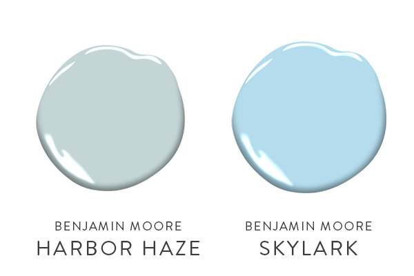
Benjamin Moore Harbor Haze Paint Colour
This blue is actually quite grayed on the chip, which is what it has to be because otherwise blue gets very baby blue on the wall. Remember colour painted on the wall is usually twice as bright as your 2×2 paint chip. Whenever I have a client that wants a pale blue, I always have to show it in context.
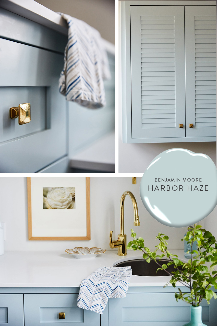
If I just show them the blue colour I think is right, many times they will say – but that’s baby blue!
Read more: Help! My light gray walls look baby blue
So that’s then I show them what baby blue really is. And then they can actually see the difference and they understand that the blue colour I’ve selected is the correct one.
Comparing Paint Colours
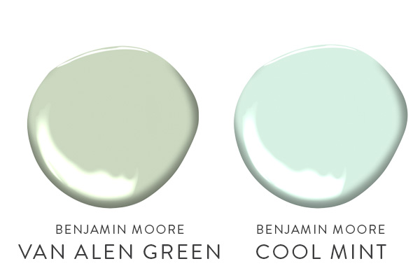
The same goes for greens. If I just pull out a fresh green colour like Benjamin Moore Van Alen Green, which is in my VIP Collection, they will say – “but that’s mint green!!” So then I show them a true mint green. When you compare that to Van Alen Green, then they get it. Because they can see the difference.
How about greys? There are a million of them! Some greys are warm and sophisticated and some are as cold as an icy winter’s day. So, if I am standing in a bathroom (for example) and looking at tiles that I can see have some warm taupe-y gray tones in it like this colour:
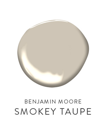 Read more: What everyone should know about taupe
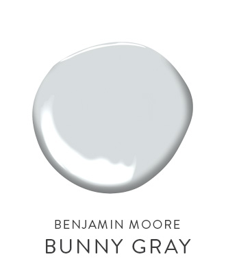
I often get the “it’s too gray” response. Until I go to my gray deck and pull out a cold blue gray like this one:
Always compare your white paint colour with the whitest white.
Make sure you compare especially when you are choosing white paint colours! Take the white you are considering and compare it with the whitest, white in the deck – say Benjamin Moore OC-65 Chantilly Lace or Decorator White, or Ultra White.
Now you can see what you are doing since you have the truest white to compare it with. The gradations of white in my System for Specifying Colour are also super helpful for nailing down the right white.
Read more: 4 Reasons Your White Walls Look Bad
While you’re here, subscribe to this feed so you don’t miss out and grab my free paint colour guides!
xo, Maria
Related posts:
Clean vs. Dirty Colours
Three ways to describe Colour
The best Trim colours – NOT Cloud White


Context is indeed everything! I also feel like this is why I have more confidence selecting colour from a manufacturer with a huge paint deck (Benjamin Moore, for instance) – you can see the colour in relation to the vast family of colours around it, instead of viewing the colour in isolation, which is how I always feel when selecting a colour from a highly edited deck like Ralph Lauren’s. Interesting!
Maria, I agree with Brett – I use my Benjamin Moore decks a lot to show people the range of colors in one color family. Thanks for another great color lesson!
Thanks for the interesting post. I often reread your older post as you share so much knowledge and information.
I miss the Benjamin Moore paint store we once had in the area. When in doubt I like to paint a sample and live with it for a bit. It cost me a bit more to buy a sample or pint of paint yet it is well worth it in satisfaction.
I think blues are the hardest to get right. I lived with a blue for many years that looked great on the paint chip but was too sweet for my tastes.
Great post! You do such a good job illustrating your points with pictures and color samples. Thank you for all the thought you put into your posts, I learn from them all!
Blues are very difficult. Especially the lovely spa blues we love…can appear green or gray.
Thanks for the lesson. I often lack confidence when selecting blues and greens. You’ve given me the a very useful tool.
Your blog is so helpful, I feel like I learn something new every time I come here. I love it!
Great post! It’s always so interesting how context changes everything. You point out how important it is to compare what’s in hand with preconceived ideas on color. You’ve given us a great process to make better color choices.
as always – great tips. I should have those true colors: baby blue, mint green, and gray gray bookmarked on my deck for reference.
Love those colors, Maria!
gah, context is so key! And a lesson that I often have to teach myself through errors 🙂 I am thankful for your blog, it teaches me great color lessons without painting my whole room!
A wonderful teacher once told me, you need the low notes to appreciate the high notes and color is like that, like music, you need harmony, and balance in a room. I have always admired those that could be “Monochromatic” and then add one pop of color, gray with a pop of yellow – again it is all about context!
pve
I;m guilty of always saying – thats a cool color or thats a warm color!!! I learn so much from your blog!!!
Great post! I can’t wait to take your colour theory course next fall!!
Victoria @ DesignTies
So true! This is why I give clients a swatch of colours that they can use as a comparison tool when shopping for clothes!
While reading your post, informative as always, I was thinking about white…and white you mentioned at the end. How true!
You are a master of colour.
Very informative. You always make such valid points and they are so helpful. Thanks!
marcie
Thank you, Maria! I love reading your posts. It’s just fun…even though I don’t do much with my house at this stage in my life, and I’m not a designer. I just love what you write, and I do love color. I’ve noticed some of what you’re talking about on the days I get to work at a local floral studio–how the colors change each other, sort of.
My eyes are “hazel,” but when I wear purple eye-liner, they appear very green.
xo, sallymandy
As always you always provide the best tips!
Very helpful post. Love the idea of comparing whites to the ones you mentioned. Thanks!
Couldn’t agree more!!! I always have to compare!!
There’s a shelter magazine in the USA that includes colour swatch suggestions in every monthly issue, and it has always seemed to me a great waste of words and printer’s ink. Context is never alluded to, and the hard cold truth that all colour is relative, well, that too is overlooked. This post and indeed all your posts address the issues in beautifully clear prose, for which, many many thanks. You do know your stuff.
Great post. I have taupy tile in my bathroom. I realize that now. 🙁 I picked a grey that is not right. So frustrated. I don’t want to paint it TAUPE. Any recommendations.
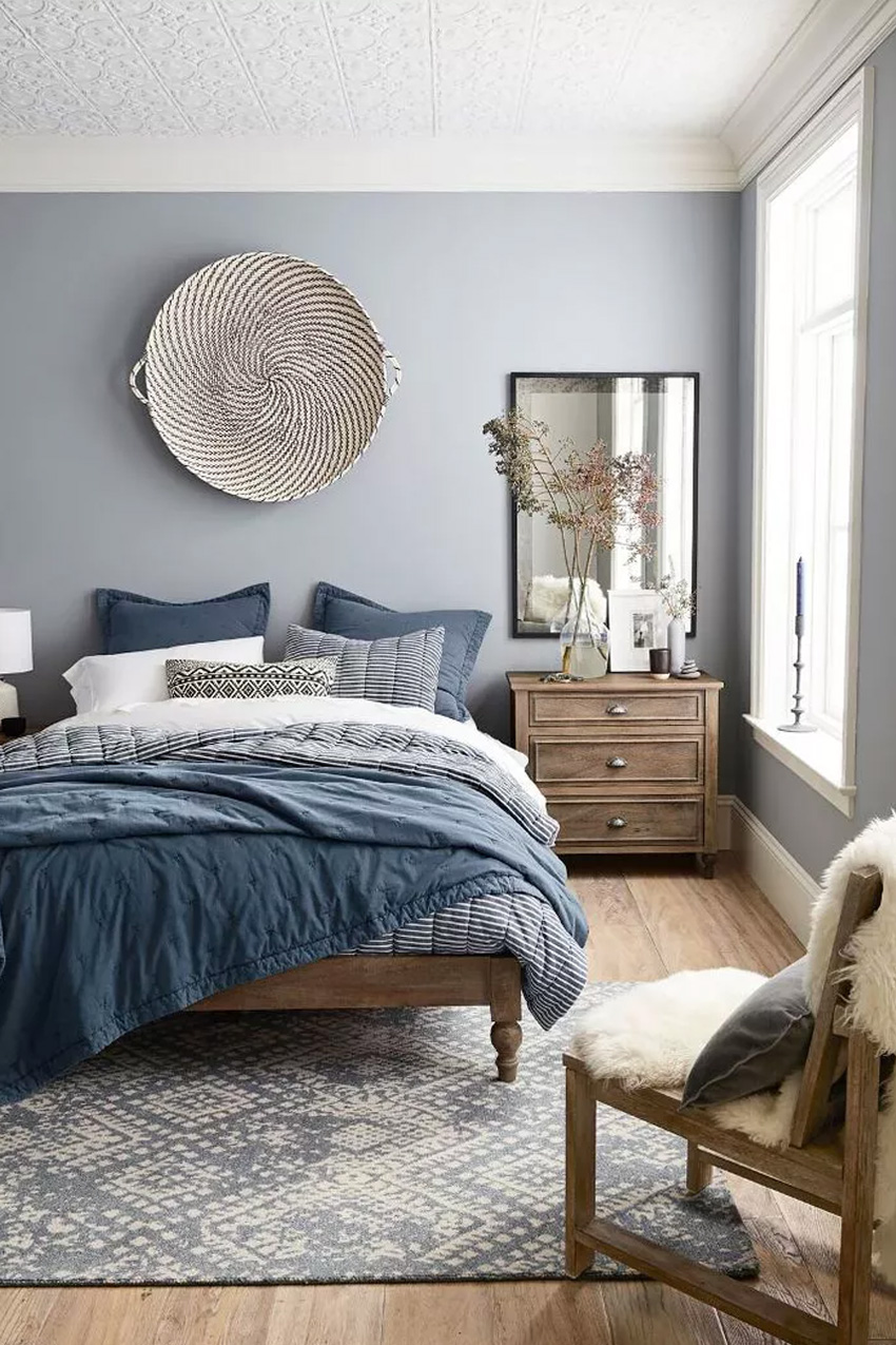
What color is the blue on the wall of the bedroom in the first photo? Thanks!
I would love to know the color of the bedroom as well. It’s a beautiful color!
I would love to know the color of the bedroom as well
What color is the bedroom pained in the very first picture?
What is the paint colour on the walls of the bedroom in the first picture?