Dorothy emailed me back in November and asked if she could pay for one hour of my time to consult on her daughter’s home. It was to be her Christmas present.
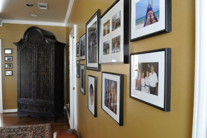
The den (below) was the biggest reason. Beth hated the colour so much she was starting to be convinced that it was time to move.
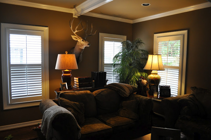
Before
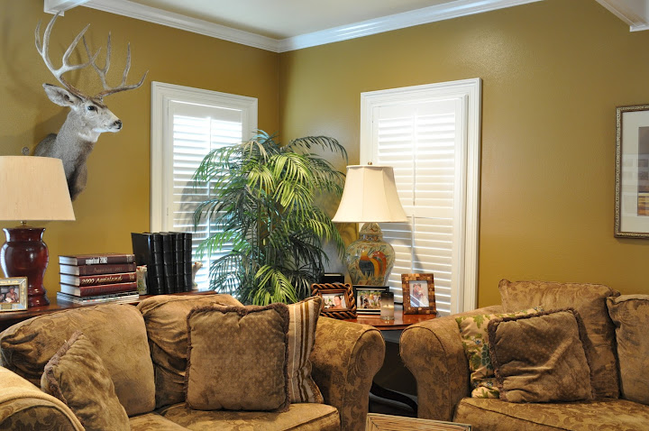
After: SW 6131 Chamois (walls) BM 1046 (ceiling)
Before: Ceiling
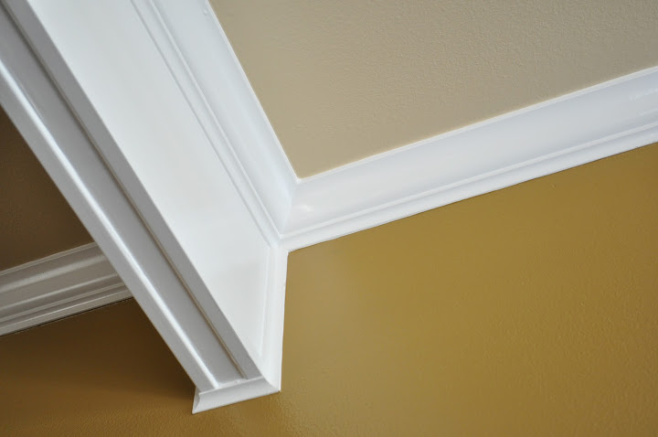
After: Ceiling
When you have a richer colour like this for the walls and you need a ceiling colour, it’s best to choose one, instead of getting it made “1/2 strength” at the paint store. It takes more colourant to make a darker colour so this means there is less paint in the can to begin with.
When I consult with my clients on-line they take a pile of photos for me without flash (flash totally distorts the colour) and send them to me on a photo-sharing site. Then they have a paint fan deck and I have the same one and we go through the house live on the phone to choose colours.
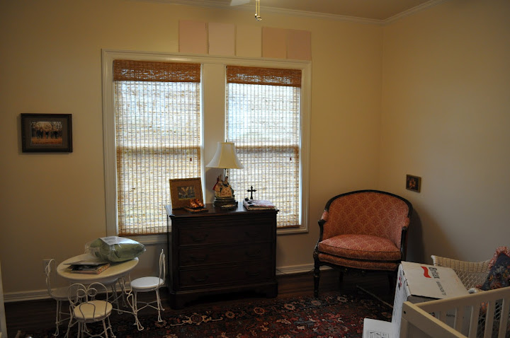
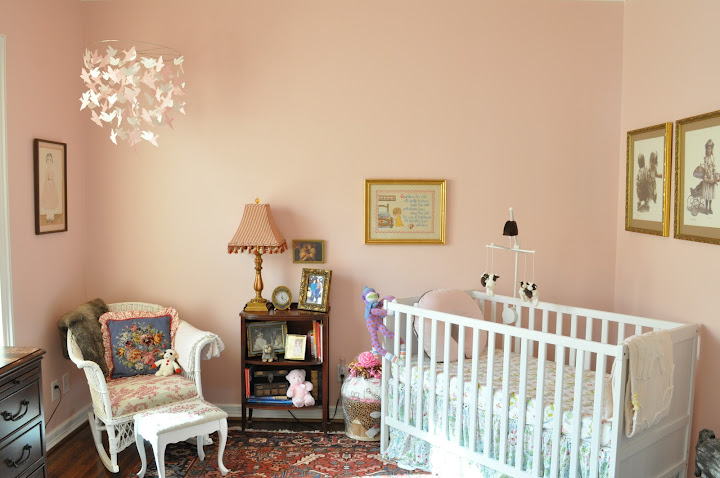
Before
After: BM 1276 Petunia Pink
We chose this pink from the area rug in the room. You’ll notice if you look at the paint chip it’s slightly grayed. Pink goes bubblegum really fast if you don’t gray it down from the tiny sample. Beth said the pink in the nursery is her favourite, she called it “an adult powder pink that would look good with anything.”
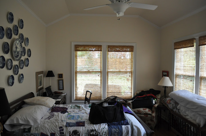
Before
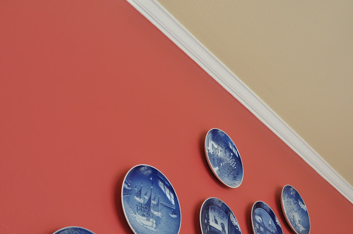
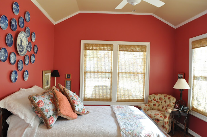
After: SW 6312 Redbud (walls) SW 6127 (ceiling)
I love how the raspberry walls brought the blue plates to life, and the way the ceiling colour relates to the woven wood blinds. The whole room really is wonderful now.
My clients consult with me on a huge range of decisions, from “What colour furniture should I buy?” and “What colour should I select for my floors, countertops, backsplash, cabinets?” as well as “What style of dining table and chairs would look good in this room?’ to “What colour do I choose if I have to pick just one?”
This consultation was just colour. Beth and her mom Dorothy do a beautiful job of decorating their homes on their own. Like mother, like daughter.
Download my eBook, It’s All in the Undertones. If you have a computer, you can download my book!
If you would like your home to fill you with happiness every time you walk in, contact me.
To make sure the undertones in your home are right, get some large samples!
If you would like to learn to how choose the right colours for your home or for your clients, become a True Colour Expert.
Related posts:
A Happy Sherwin Williams on-line Colour Consultation






LOVE the new colors. Totally gorgeous!
Love the colors you chose for the bedrooms! Redbud looks so awesome behind that plate grouping. Bravo, Maria.
xoxo
Kristie
I love the nursery color. Pink is a very hard color to “get right”, your explanation of it needed to be “greyed down” really helps me.
Thanks!
Love the Master Bedroom!
I love, love, love your blog and the sharing of your wisdom! Keep up the colorful work!!
One word about cutting paint formulations down into percentages: smart paint stores can help you domthat if you are set on a monochromatic scheme – they are aware ( and hopefully educate the consumer) that you cannot just add half the tint into the same accent-base pot of paint and expect it to hide as well. Lighter colors go into paint that has more titanium dioxide than deeper colors. So the tinter needs to be smart enough to know when to switch down to the next paint base… This will also affect the color, some more than others. Also, reds do not cut done well at all. The most important thing, no matter what you are trying, is to TEST YOUR COLORS. Nail down your ideal hue before committing to gallons of the real stuff.
The nursery Is my favorite. I have to go look at my fan deck to check it out. Fantastic tip about the cutting the color in half. Have a great day!
You worked that fan deck girl! LOVE!
Ruthie
Chamois blends right in with the furniture – great monochromatic look. I really like the nursery – soft, classy pink unlike those ‘bubble gum’ pinks. Beautiful!
Absolutely love the petunia pink – Donna is right, it’s very grown up and will work wonderful as the baby gets older. Well done!
I am in love with that pink nursery; such a gorgeous subtle color.
Hi Robin,
Okay so maybe I wasn’t very clear, when it’s a dark colour, you must choose the lighter colour for the ceiling. You can only specify 1/2 strength on lighter to mid-tone shades and even that doesn’t necessarily work everytime but it’s a guideline.
Thanks Robin for your comment!
Maria
Hey Maria, love to see the photos from clients. It lets everyone see into the process and to see the results. Even with an Online/phone consult, when you have someone who knows what they are talking about it proves that yes indeed it can be done. The one thing that I have always admired about you is your use of colour (notice how I spelled it?). You are not afraid of it. I don’t get why more people and designers/decorators don’t use more colour. This is especially true of those of us that live in Northern climes!! Colour can breathe life into a space- the right one of course. Thanks for always bringing your insight to the masses. Have a good one!
Wow! What a difference!
Color IS magical and you are fearless Maria!!
Really nice! Especially love the red room.
Janice
sure makes the rooms so much more cheerful
Beautiful combinations. I have a site devoted to color, and once you open the possibilities about color your life changes.
Maria, I love the light pink bedroom with the pink rug. However, in my BM Color Preview deck, no such number or name as BM 1276 Pink Petunia is listed or included. Would there be another number or name used in the US sample deck?