
I have read all your posts about white and cream and still have one more question: our house has white vinyl windows, and I have painted the wood trim around them Cloud White to make them disappear. Is this the right white for all the trim?
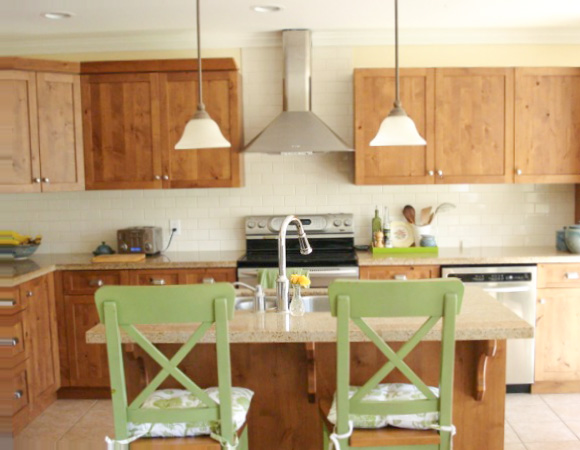
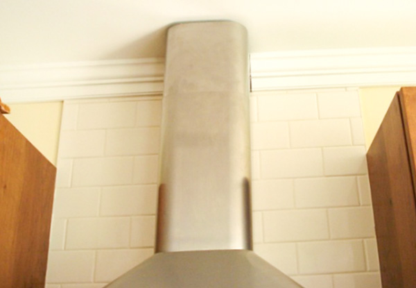
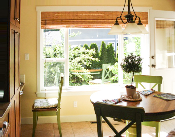
There is a big window in the eating area of the kitchen, and the kitchen cabinets are a cinnamon colour of knotty alder. (I would paint them someday except for the knots.) There is a coordinating granite counter, and tiles which are close to OC-9 Ballet White, OC-19 Seapearl, or in some lights White Down. These tile go up to the ceiling behind the hood fan and intersect with white crown moulding painted Cloud White.
The white of the moulding and the ceiling, not to mention the pale yellow wall paint which is about to be changed to green, makes the tiles look dirty. A local colour consultant has specified to paint all the trim in the house White Down (which may not in fact be the exact match for the tile) but White Down makes the vinyl windows look cheap.
I think I should stick to only one white in the house: is that right? (It is an open concept house). Thanks Susan.
I love the green chairs in your kitchen, they really add a fresh feeling to the space. I agree that your current wall colour is too clean compared to the more muted yellow beige tones of your countertop and floor.
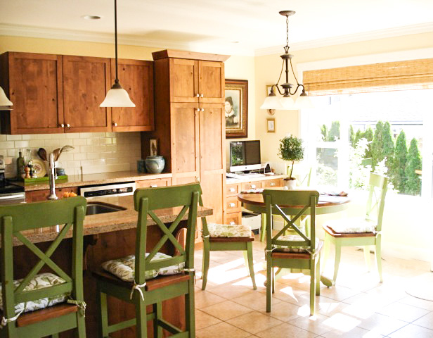
If you do paint your kitchen green, make sure the green you choose is in the same family as the chairs. Otherwise I would suggest a more muted yellow beige like HC-32 Standish White to relate to your finishes.
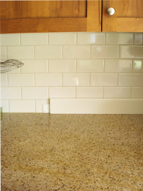
Your creamy backsplash is definitely the white that should dictate the trim colour in your kitchen and therefore the rest of your house, however unless your wall colours are much richer and darker everywhere else, I would keep it Cloud White and ignore the transition between your tile and crown in the kitchen.
And you are right, a much creamier trim would make it more obvious that your windows were white vinyl, better to have it look right everywhere else rather than change everything to work with the crown moulding in your kitchen!
Love your subway tile backsplash! But of course I would say that!
If you would like to learn how to Specify Colour for Interiors, Summer School with Maria Killam is for you!
If you have a question for an Ask Maria post, email me here.
Related posts:
The Best Trim Colours NOT Cloud White
The Truth About Cloud White
The Best White for Carrara Marble
If you would like your home to fill you with happiness every time you walk up to the front door, become a client. On-line or In-person.
Download my eBook, How to Choose Paint Colours – It’s All in the Undertones to get my complete step-by-step system on how to get colour to do what you want.
To make sure the undertones in your home are right, get some large samples!
If you would like to learn how to choose colour with confidence, become a True Colour Expert.


Another great white is Westhighland White by Sherwin William’s. I use it when bright white is just too much contrast for the wall color. It seems my clients just love to see the trim and moulding “pop” rather than blend. Keep it the same throughout the home especially for open concept homes. Cloud White or White Dove by Benjamin Moore are also my go to colors for trim. Great advise Maria!
Susan, what color will you use for the walls?
Is out possible to pick trim color in a vacuum, without wall color?
I love the green in the kitchen – it really warms the space up.
This is great advice, I think. It makes no sense to have one, 36″ transition where the tile meets the crown dictate the trim color for a whole house. That would be one ‘bossy’ transition! 🙂
All great advice.
My house came with developer finishes . I was going to change the kitchen ASAP, but had to do the yard etc, and I never got to it.
BUT I painted the walls a deep color to tie the wood cabinets & the floor tile together. While I would never have picked the wood cabinets or the tile floor , I get compliments all the time. I have white trim too. I notice the same issue in this kitchen . The floor tile is too pink beige in comparison to the counter and wood cabinets. The counters have more gold and the cabinets have more gold/brown. and the matchstick shades are very gold/yellow , which only makes the floor tile more pink.
So if it was an ideal world I would change the floor tile … or I would do what I settled for, and paint the walls a deep color that bridges all these different beiges.
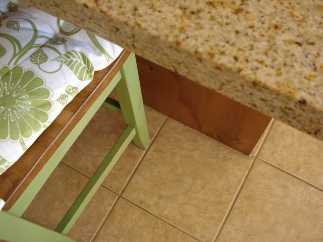
On another I noticed the island does NOT have a kick base or a base board …someone needs to start talking about this !!
🙂 if a kitchen island is built-in, it needs to have a kick base or baseboard trim. I cant believe how many developers and contractors are getting away with leaving this off….. it is a pet peeve of mine … sorry
Another serendipity for me, Maria. Even though my kitchen is smaller and a totally different shape, there’s so much here that is similar, with your great advice when I tackle my kitchen in the future!
Susan, love the green chairs and table (I would, of course). And though I generally don’t care for backsplashes (mostly too busy) and have never cared for subway tile (guess it reminds me of “subway” tile that is usually old, drab and dingy), yours is so lovely – the color, the tile shape and the grout – I could be converted!
Thanks, gals! This post is being saved into my kitchen ideas file for sure.
Thank you very much, Maria! And thank you to the other commenters!
Love the green chairs! I wanted to paint our dining chairs green, but Jim vetoed that idea, so they’re being painted white.
I’m one of those people who will use all different shades of white everywhere. I think if it is done with intention it works.
Loribeth, maybe I will paint the doors, which need repainting anyway, cream.
why does the backsplash look so new and the counter top so old?
We are very serious cooks and use the countertop heavily. That may be why. Six year old house.
Love the room the way it is. I think that you just need to accessorize with more of the same green through out the kitchen. For instance, the pictures by the desk need to have the same green in them. And where the big picture is instead have a collection of plates that have all the colors of the room on them to add some pattern. Or add some prints of herbs to tie in the green and all your whites. Make that green pop!
Thanks for those ideas.
For those in BC who like the chairs, they are from True North Furniture in Aldergrove and the stock colour is “Cottage Green.”
Maria, I am so glad I don’t have to repaint all the trim in the house!
Your kitchen is very warm and inviting. I like the idea of continuing the green around the room, perhaps in varying tones and shades. Maria, if she chose the Standish White could she just continue that colour up and onto her ceiling or at least paint the trim the same whatever colout she chooses? I think it might visually raise the height of the ceiling above the cabinets and downplay that transitional space, but I’d love to hear your professional thoughts. CTD
Thanks Teresa, and thank you for asking that question. I was wondering the same thing myself. The only thing is we were going to add wainscotting and crown to the entry hall which leads into the kitchen and that crown would be cloud white. It really is mind boggling.
Maybe the trim could be painted the same colour. . . doesn’t hurt to try, if it’s bad it can always go back to the way it was. Or maybe it could be Ivory White. Not as creamy as White Down but not as white as Cloud so it could be a better transition. Maria
I love Ivory White. It was what I painted the trim in our first house. I wonder how it looks with vinyl windows?
What a lovely kitchen, Susan. Love the subway tile, your cute green chairs and the topiary on your dining table!
I had the same question about trim matching the white vinyl windows!
I’ve read this a few times and am still not quite sure I understand the recommendation.
What is the recommendation?
1. “Yes” paint the trim to match the white vinyl windows always if there are no other white/creams in the house.
2. “Yes” paint the trim to match the white vinyl windows unless there are other whites/creams throughout the house that should be used instead for the trim. (If it is just a small amount of other white/creams elsewhere, ignore it and pain the trim the match the windows.)
3. “No” paint the trim a different color to make the white windows stand out regardless of what other white/cream you have in the house
4. Something else…?
Thanks!!
“Your creamy backsplash is definitely the white that should dictate the trim colour in your kitchen and therefore the rest of your house, however unless your wall colours are much richer and darker everywhere else, I would keep it Cloud White and ignore the transition between your tile and crown in the kitchen.
And you are right, a much creamier trim would make it more obvious that your windows were white vinyl, better to have it look right everywhere else rather than change everything to work with the crown moulding in your kitchen!”
What I read here is keep all the trim white in the house because of the windows since my colours are all light/pale. If not for the vinyl windows, I would repaint all the trim to match the tile. I hope that is the answer because that is what I am happy to hear.
Hi Susan
Just chiming in to say that if it is the knots in the cabinets that are holding you back from painting, a shellac based primer such as BIN will solve that problem – no bleed through! (Just completed painting mine for the SECOND time – this time Cloud White – and totally love them!)
Hmmmm…. wont painting the walls the same green as the chairs (even a lighter shade) reduce the lovely “pop” that the chair colour makes right now?
I think this kitchen is really cute. I typically love a white on white kitchen, but something about these wood cabinets is just great. I would love to see white painted beadboard installed on the remaining kitchen walls around the window and above the cabinets. I feel like it would freshen up the space even more and simplify it, while allowing the green chairs to really pop even more. Also, the hammered hardware is really pretty.
Thank you Amanda. I am thinking about putting in white beadboard somewhere in the kitchen if it will fit when it goes in the front hall next year. We special ordered the hammered knobs from the building supply store because I thought they suited the cabinets. By the way, Maria, we bought a sample can of Standish White and started testing it out. So far, we love it, as it feels the same as the old colour, Summer Harvest, without the yellow glare in the western light. It feels calmer and and a natural match. Brilliant call! I’ll send a picture after it is painted.
I think it’s the yellow wall that is actually making the tile look “dirt” not the white trim. When I cropped the photo to show just the tile and trim it looked nice. The yellow is quite “clear” (without much grey) I think that in comination with the white is making the tile look like the odd one out. Painting the wall a toned green with the trim the same should help.
Just painting the wall to one side of the tile Standish White makes the tile look fine. You are right – the white is not the problem! How funny that such a subtle adjustment in colour can make everything all right.