This is a guest post from my Virtual Design Assistant Tricia Firmaniuk:
Hasn’t this year whizzed past? I’m catching up to the fact that it’s already December and I’ve been busy gathering inspiration for holiday decorating. I have to say, I’m pretty excited about some of the trends I’m seeing.
There are so many more options for holiday decor these days than traditional red and green and many of the trending holiday decor colours translate really well into everyday decor. So I got to thinking how you could potentially use holiday decorating as a way to test drive or transition to a new colour palette for your house. (And possibly even do it without your significant other really noticing what’s happening haha).
Red and green really do look good in traditional interiors with a lot of wood and heavier furnishings, and it will always be a classic and festive choice (there’s nothing wrong with a little tradition). But the association between the red and green combo and Christmas is so strong that it’s generally not used in non festive decor.
Plus, arbitrarily combining red and green with your existing decor doesn’t always work very well, especially if you have moved towards a fresher look.
But now it’s easy to find really fun pieces and ideas for holiday decorating in trend colours that would be lovely to live with year round. And if you’re on top of things and already have these colours in your decor, you will have no trouble finding holiday decor to coordinate.
Another related trend in holiday decorating that feeds into this idea, is the move away from having everything in traditional motifs such as reindeer, snowflakes and Santa hats, and towards a more inclusive and holiday neutral approach to festive decor.
Rather than picking up a collection of plates with hand painted holly on them for the season for example, you could get a set of chargers in a rich jewel tone or metallic that are festive without being so limited to one week of the year.
There’s nothing wrong with themed prints and accessories, but you can build up your festive palette with things that are more versatile and related by colour, and layer in a few charming items with holiday motifs if you want.
Consider new toss pillows and throw blankets, decor items like trays, candle holders and vases, napkins, runners and mirrors that can be used past the holiday. Then add in some festive greens, twinkling candles and lights, and a few holiday baubles and you’ve created a gorgeous festive atmosphere without having to stow all of it away in a few weeks.
This Navy and Blush palette would be a great jump off point for a new colour scheme
If you commit to the palette, you could even treat yourself to a new pair of accent chairs or a rug that pulls in the new colour and really transforms your room.
Here are some trending colours I think it would be fun to invest in this year either just for the season, or to change up your decor into the New Year.
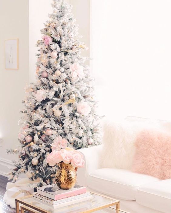
Blush Pink
Although pink was ignored for quite a long time, its resurgence has been decisive and seems to have some staying power. Shades of blush are surprisingly versatile. Muted pinks warm up cool gray and palettes, and they work well both in modern Scandinavian decor and transitional rooms alike.
The pink from the tree is repeated with a simple cushion on the foyer bench. Pink looks lovely with lots of white, green and black.
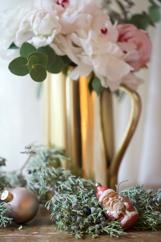
Love this gold vase with pink flowers which could work anytime plus a festive vignette with a vintage Santa ornament.
Source
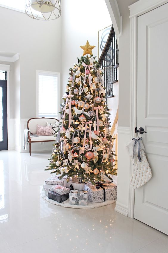
If you have a white, gray charcoal or greige sofa and walls, you can do a blush pink scheme on a flocked tree and repeat the pink and white on your sofa with pillows and a throw.
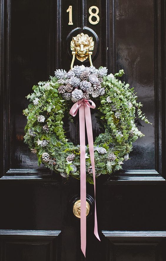
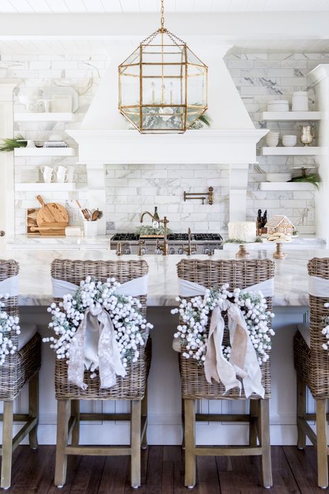
Don’t forget to continue the pink and white into the kitchen. Love the white wreaths with blush ribbons.
And the banister.
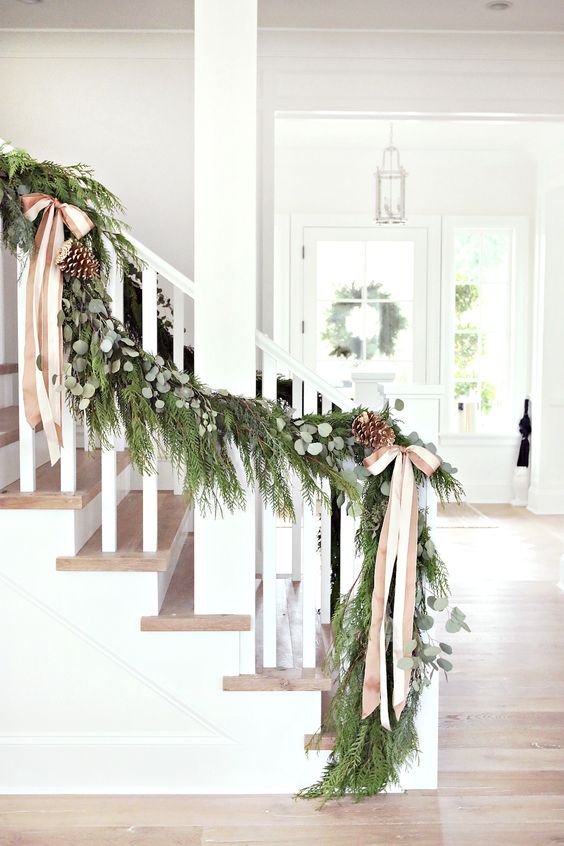
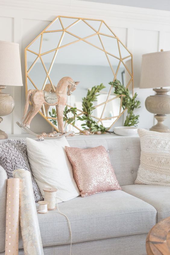
Blush pink is soft and sophisticated and pairs well with metallics, blues, grays, greens and deep, rich tones like emerald, charcoal and navy. It works well with both of the trend colours below too. If you’ve been drawn to pink lately like the rest of us, holiday decorating is your opportunity to try it on for size.
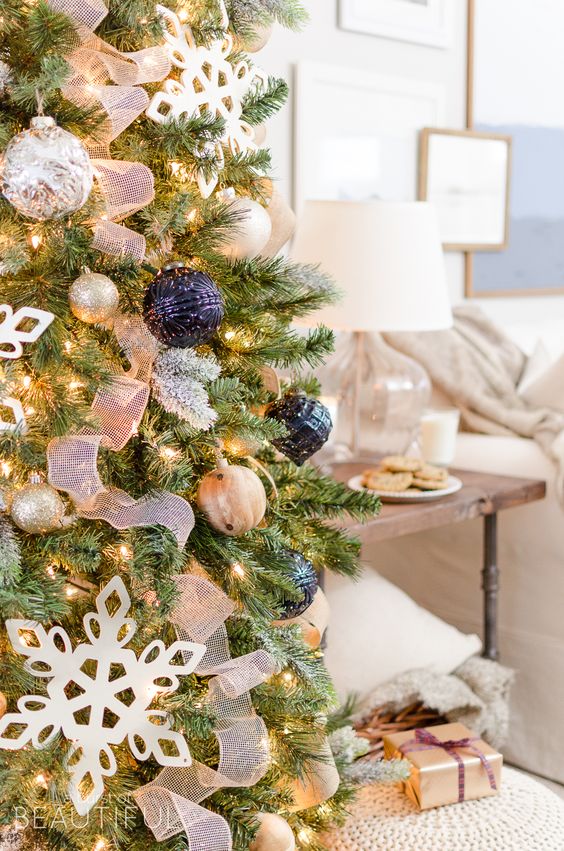
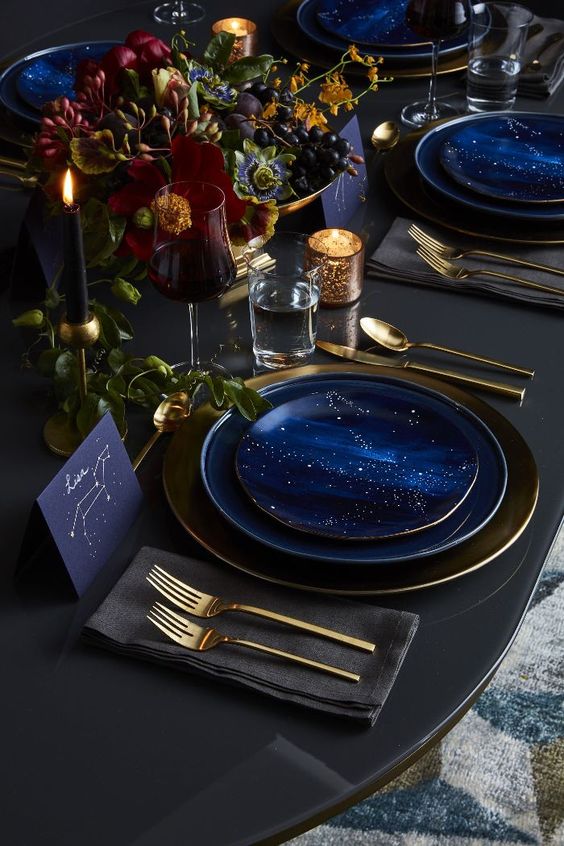
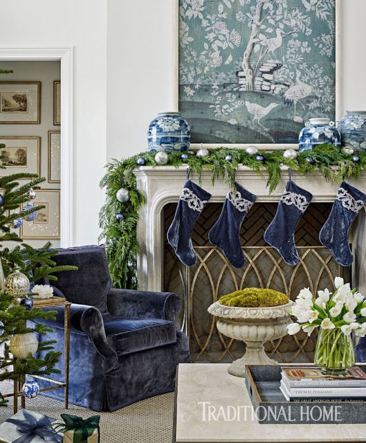
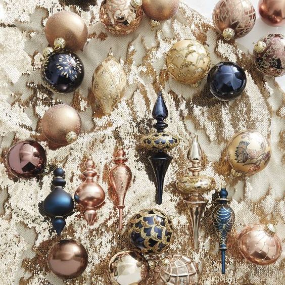
Moody Blues
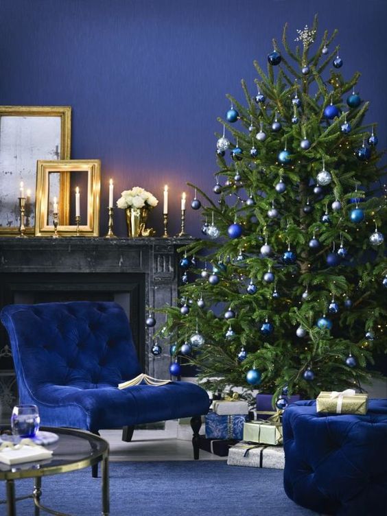
Rich jewel tone blues from cobalt to indigo to navy have been hot in interiors for awhile now and show no sign of waning. Pair them with gold, silver and bronze and the look is decadent and perfect for the holidays. Blue is an easy colour to commit to, treat yourself to some blue velvet pillows or accent chairs.
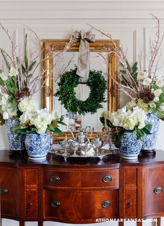
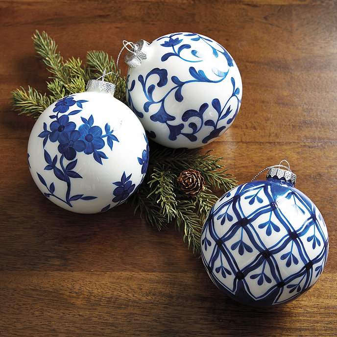
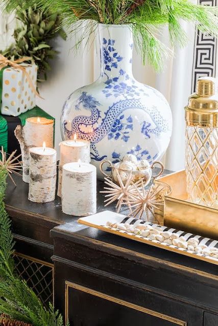
Deep blues can be rich and moody for a decadent holiday look. But they can also be quite fresh. I’ve seen a lot of blue and white Chinoiserie incorporated into holiday decor lately and it’s just lovely.
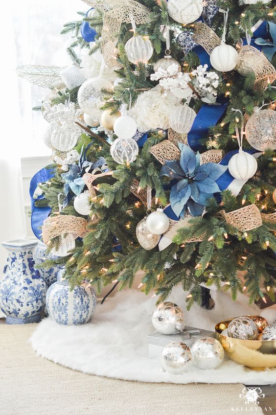
If you’ve been pining after some blue and white ginger jars, the holidays are the perfect time to indulge, they add polish to any room.
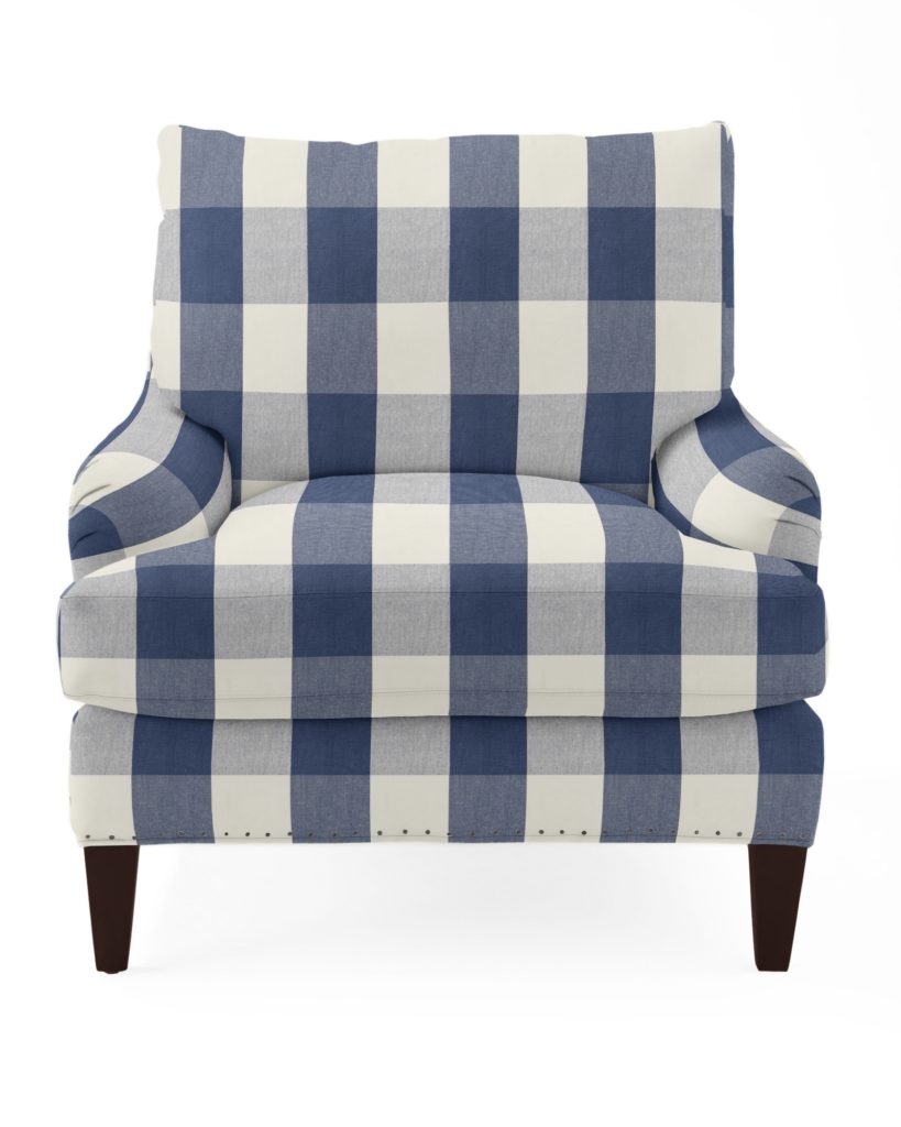
Serena and Lily has a lovely selection of upholstered chairs with lots of fabric options. How cute is this blue and white check?
Graphic Black and White
Black and white looks amazing with fresh holiday greens. While black can easily go a bit too “A Nightmare Before Christmas” or get into the realm of really austere (yawn) minimalism, it can also be surprisingly classic and glamorous.
Black and white pairs beautifully with green and gold. Just make sure not to get too heavy handed with it (err on the side of green, gold and white with smaller hits of black).
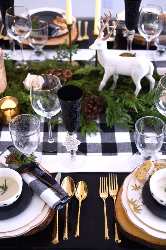
I’ve been seeing a lot of this pretty, bold black and white buffalo check in holiday decor as well as refined black and white striped ribbon, with fresh greens and gold of course. Love the dot pattern balls and striped ribbon on this tree (below).
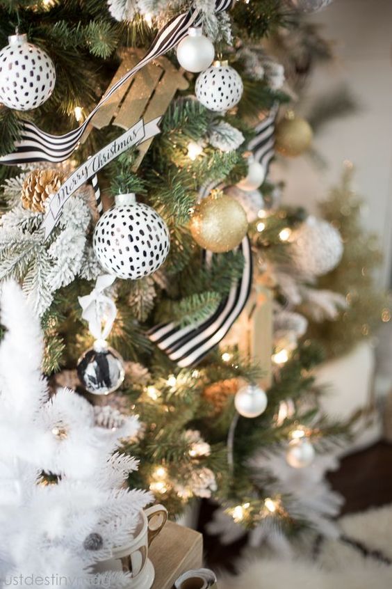
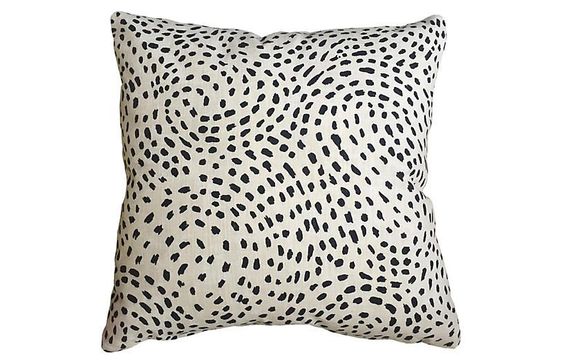
Here’s a really cute black and white toss pillow inspired by this tree. Black is such a hot trend, why not try adding some subtle black accents to your decor this year?
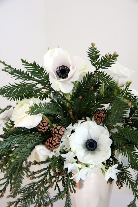
Here’s an elegant black white and green holiday floral arrangement. I can never get enough of black and white anemones.
Metallics
Metallics really is the overriding trend that ties all these colour palettes together. Adding some glam metallic finishes is a great way to add a festive feel and bounce around some of the twinkling mood lighting of the season.
So whatever your accent colours are, you can always repeat them in your holiday decor and bring in a healthy dose of metallic finishes to create some atmosphere. Just add in some silver and gold, holiday greens, candles and lights and you’re done!
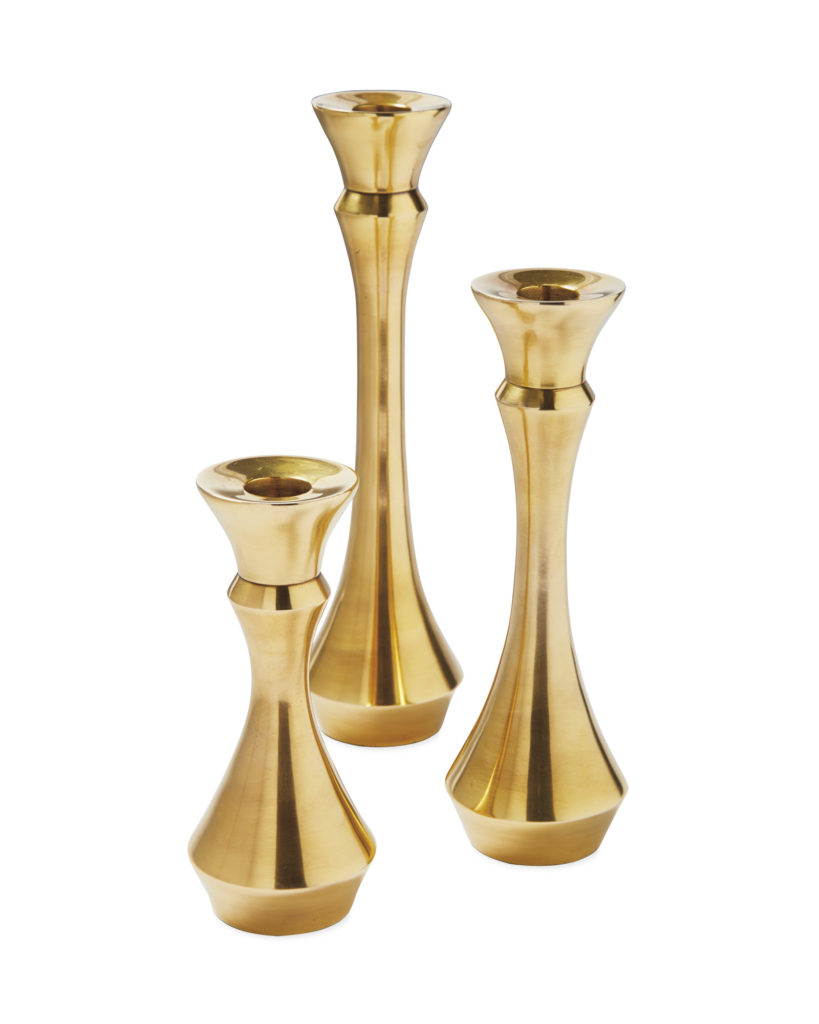
This set of classic brass candlesticks would be versatile for any vignette
Holiday decorating is just like regular decorating, choose a colour palette and repeat it liberally. It’s a good time of year to challenge yourself to create more atmosphere in your home and practice styling and pushing your decorating comfort zone. One reason that everyone loves holiday decorating is that it’s the one time of year they really focus on creating a mood in their homes. Why not invest in some decor that you can keep up into the new year? Or treat yourself to a new colour scheme this Christmas!
_____________________________________________________
Thanks Tricia for writing this post so I could have a few days off while we were enjoying Christmas in New York with my Mom! I arranged a fun photoshoot in Central Park which I’ll post about as soon as I receive the photos, my Mom snapped this pic of Terreeia and I:

Terreeia Rauffman and Maria Killam
I can’t believe there’s only one weekend left before Christmas!
xoxo Maria
Related posts:
Sneak Peek of a Blue Christmas with the Owner of Studio B Yoga
How Styling Saved this Holiday Kitchen: Before & After
The Iris Apfel School of Holiday Decorating


Great post. Love the sweet photo of you and Terreela. And those boots are adorable!
Great post! Maria, cute pic of you and Terreeia! I love your boots!
Tricia & Maria–
As someone who celebrates Christmas and Chanukah, I love this line of yours: “towards a more inclusive and holiday neutral approach to festive decor.” I have been moving in this direction the last 10 years or more. I love incorporating metallics, especially. Red and green actually seem static to me.
I also love your point re why not focus on creating moods throughout the year. Yes, why not!
Moody blue, black, silver and gold metallic……(singing) these are a few of my favorite things! I have always had black as accents throughout my home but, I have just finished a powder room remodel using Benjamin Moore, Satin Impervo in Royal Blue on the walls. I have gallery walls with the artwork framed in black and gold. The “permanent” fixtures are a hammered pewter sink, black and pewter faucet and yes, a black toilet! It is really quite striking and rich looking. Using the dark blue in this room has given me the confidence to also use it when I redecorate my living/dining area next year.
Fun post! Loved all the Christmas eye candy! Idk how you do it, but you ALWAYS look perfectly lovely in every photo!!! Merry Christmas!
You and T are adorable. Can’t wait to see the rest of the photos. Great post Tricia. I pick blue 😉
Great post, Tricia. I haven’t used red & green in my Christmas decor in over 10 years. I prefer to use just whites with fresh greens. My husband thinks it’s boring but I find it calming. He wants our home to look like Christmas threw up in it. It’s a struggle every year.
But in the end…it doesn’t matter. As long as we’re together.
And I’m looking forward to seeing your photos from CP.
Terreeia is the same, she thinks my decorating is not colourful enough which is why I worked so hard to get the pops of orange this year, haha, she thinks there can never be enough christmas decor 🙂 Maria
Lovely post Tricia and so inspiring! You gave us such an assortment of color and style. I’m not a fan of pink but it does look so soft and feminine in the pictures that you presented. I love metallic at Christmas time because they bring everything to life. Also I use black accents in my decor to give it a little sophistication!
The Traditional Home photo brought back such wonderful memories. My parents were married on Christmas Day and we always had a blue and white tree. It was my mom’s tribute to Hanukah and their anniversary. We also had a blue mohair arm chair which my brothers and I loved to to sit in.
I especially loved the photo of you and Terreeia – your happiness and love js apparent and looking at it brought a huge smile to my face too!
Thanks go out to Tricia for always posting such wonderful articles and photos. I recently finished a project for a client and we found many wonderful blue accent pieces at West Elm.
I always loved design and color but I’m enjoying my business, Kumquats & Olives, so much more since taking your course last year.
Thank you to you, Tricia and Terreeia for sharing so much of yourselves with all of us.
Thanks Elynn for your thoughtful comment! x Maria
This is a wonderful post, and a truly new paradigm. I think that too often we get caught in tradition. As my hippie brethren used to say, “Question Authority”, especially if its the common wisdom of red and green.
So many great ideas in this post – thanks for sharing!
And the cherry on top – that adorable pic of you and Terreeia! Love the matching cuffed jeans . what cuties!
GREAT post! Love the fresh ideas!!
Loving the pink!
LOVE the deep blues! And that is one sweet photo of you and Tereeia. Your trip to NY looked fabulous- loved following your Instagram stories! 🙂 Such classy holiday decor everywhere.
This post is filled with beautiful inspiration! I’ve always hated Christmas decorations because everyone kept giving me Santa and snowman cutesy stuff. I hate all of it!! I love the look of simple and elegant! Maybe I can wrap my head around thinking about decorating for Christmas (and maybe more)…
I have to confess I went online and found some boots that are similar to yours, Maria! ? Imitation is the highest form of flattery, right?? Ha ha!
Haha awesome! I love those boots, especially because they work so well with my favourite colours, yellows and oranges! Thanks Ann! Maria
I love these colors! Old enough to be tired of red/green. Pink+ green, black& white!
Thank you Trisha! A happy departure!
Let’s all shake it up and think in a newer cleaner way.
Good post!